Year: 2018
Rebranding by Folch
Production by White Horse
A campaign for Xavier Garcia

Barcelona
Passatge d’Iglésias, 10, 12
08005 Barcelona (Spain)
T +34 93 485 65 36

Positioning the brand in the world of fashion, while projecting a contemporary attitude.
The Barcelona based optical brand Xavier Garcia was ready to enter new fields. To do so we needed to rethink its identity – embarking on a comprehensive rebranding process covering every aspect of the brand. We opened up new ways of embracing the values of transversality, empathy and authenticity, using a language that positioned the brand in the world of fashion, while projecting a contemporary attitude.
“Folch has brought us the desired change: clarity, fashion and strength.”
Xavier Garcia, CEO & Designer at Xavier Garcia
Rebranding Xavier Garcia
Beyond the logo, an identity has to capture the brand’s voice, look and feel. One of our first realisations with Xavier Garcia was the lack of coherence between these three elements, even with the success and increasing growth of the company. We needed to rethink the brand from the beginning – and the redesign of its identity marked the start of just that.
“Sometimes, branding is not about who buys your products, but being seductive to the one who will prescribe your brand make it appealing for the buyer.”
Rafa Martínez, CEO & Head of Strategy at Folch
Working contemporaneity through typography
The combination of upper and lower case characters gives the brand a youthful personality and makes it more distinctive and iconic, while the overall shortening allows for its representation across a wide range of environments. Moving to the chromatic field, we proposed a synthesis in colour, embracing the fashion world through elegant simplicity, while simultaneously making the identity more contemporary. We decided to stick with black, grey and white as primary colours, while adding a broad spectrum of secondary colours. This meant we could maintain the consistency of an Art Direction while defining a chromatic palette.
“The new identity works as a throwback to the origins of the brand while brings it closer to the world of fashion.”
Núria Antolí, Head of Communication, Marketing and PR at Xavier Garcia
Amplifying the scope of the brand
After identifying and defining the key areas where the brand could potentially connect and engage with its audience, we created a wide range of assets – from social media and online newsletters in terms of digital, to editorial pieces such as printed catalogues. In order to visualise the Xavier Garcia rebrand in a physical sense, we have conceptualized the first of the newsletters that would be sent out. The modular system allows for variation, so the content can be split across different levels, combining product and mood images, and creating a visual balance between product and text. User friendly features guide the reader throughout the reading process.
Xavier Garcia’s values had to become implicit in the content and language of the brand, moving away from product-centered communication and projecting an iconic identity, one that speaks to its audiences with an authentic, recognizable voice.
Giving Xavier Garcia a voice
Communicating is all adapting a voice to an audience and creating empathy to make sure the message gets through. With Xavier Garcia, the aim was to create a new tone of voice – a contemporary language aligned with the visual approach and rebranding as a timeless fashion reference.
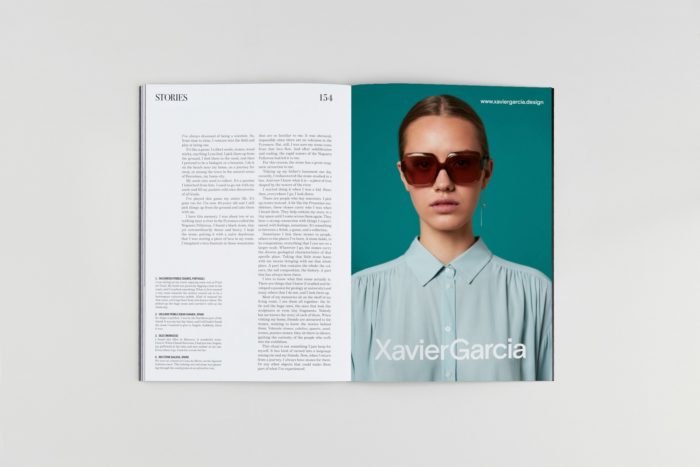
“By avoiding the overuse of technical terms and flee generic and obvious features, we conceptualized a contemporary, sophisticated and artistic tone of voice aligned with a modern, cultured and urban style.”
Emmy Koski, Communication Director & Editor
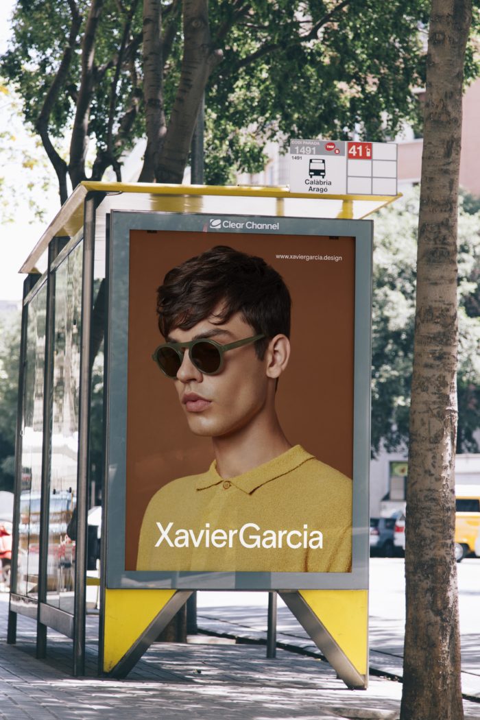
“The essence of a brand is based on perceptions, a well-executed identity defines a solid brand.”
Alex Ortega, Design & Marketing at Xavier Garcia
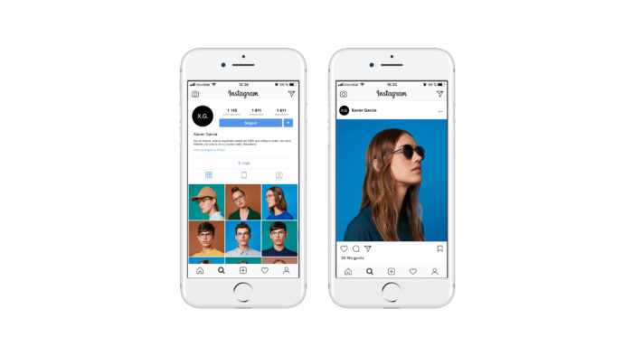

Creating a unique, contemporary visual mood
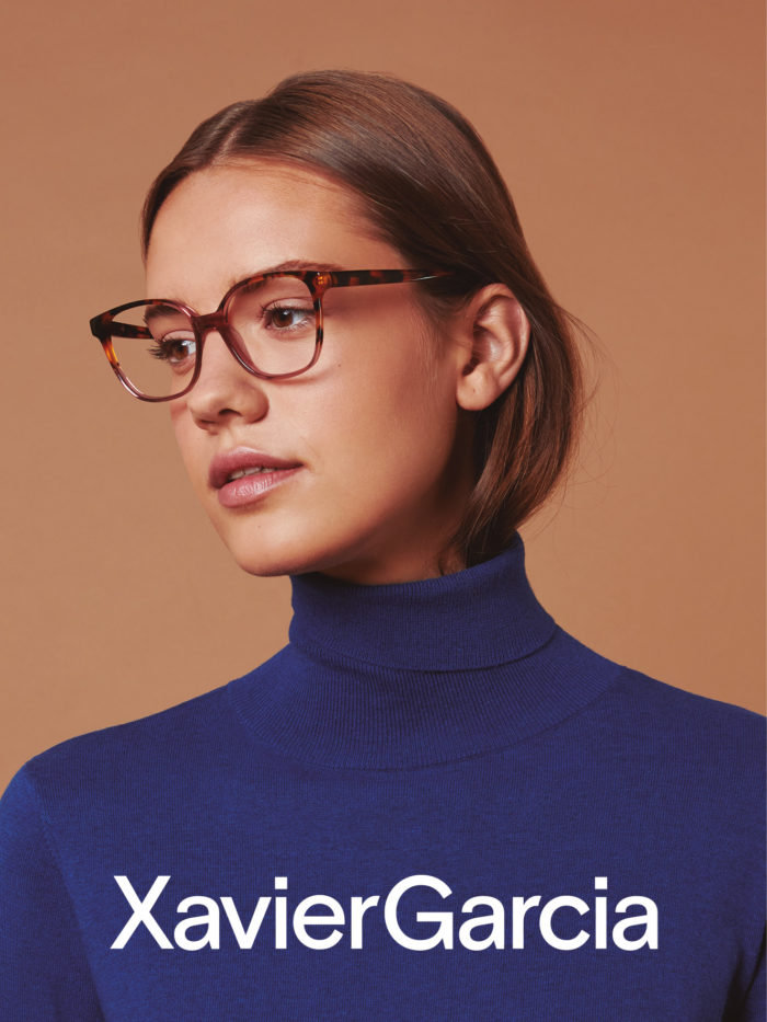
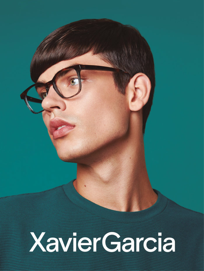
The Art Direction had to be very specific and consistent to have a powerful visual impact. Photography was key to the new identity. Determined by a harmonic yet vibrant colour palette and defined by a broad range of tones – we came up with a flexible Art Direction that could be applied across different campaigns while maintaining consistency. We kept the photography simple but strong enough to induce empathy with the brand, using a series of unique images that project attitude, contemporaneity and style across the different channels.
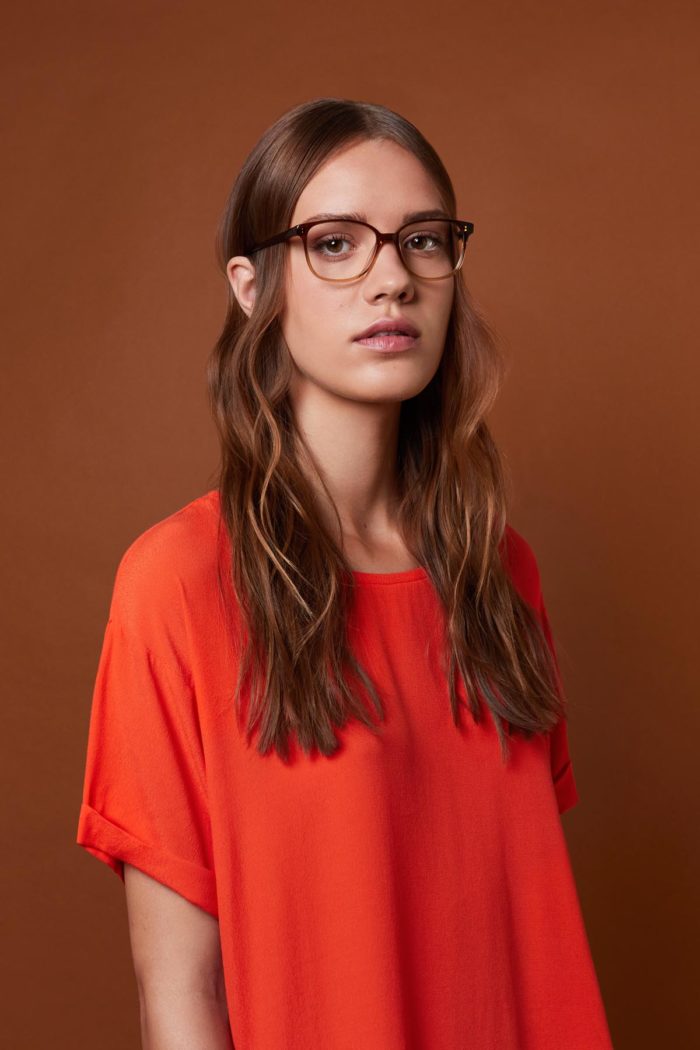

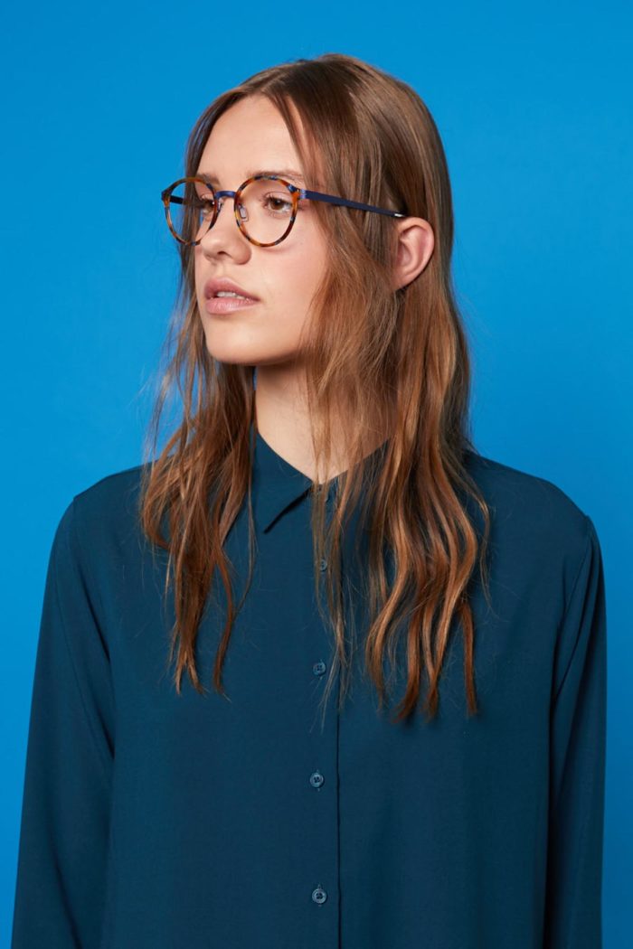
Shooting an attitude
The whole shooting was developed on a single set with three colorful block backgrounds and two models. Behind the camera, Carlos Moreno acted as Photographer and Rocío Durand as Photography Assistant. Vika Hudyka and Bart Krystian, our two young models were made up by Matilda Beltran and styled by Jaume Vidiella. The shooting was managed by White Horse – Folch’s creative company for production – with Art Direction from Folch. Through photography we were able to add another layer to the brand language, amplifying the scope of the company’s communications by bringing it closer to the world of fashion and projecting a bold attitude and distinct voice.
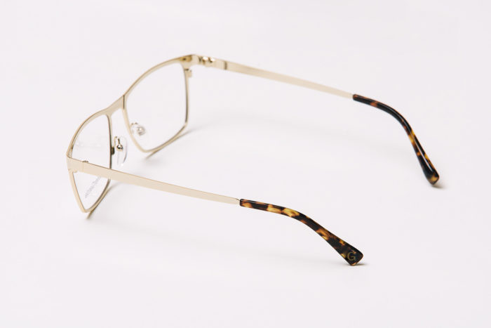
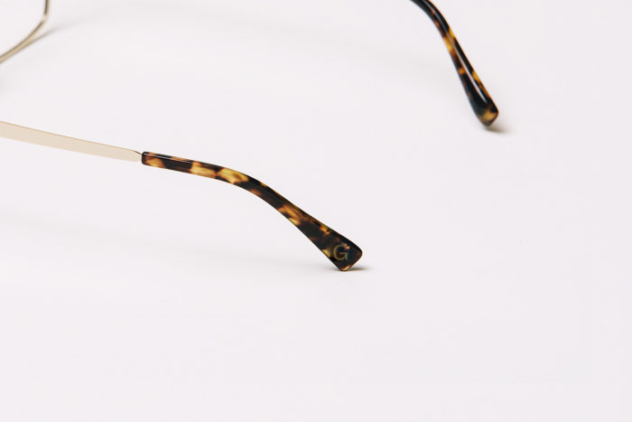
Still life photographs
Xavier Garcia needed high quality photographs of its products to showcase each collection on its e-commerce site. We commissioned Dizy Diaz – a still life photographer represented by White Horse – to shoot the product lines based on his elegant and contemporary approach.
Year: 2018
Rebranding by Folch
Production by White Horse
A campaign for Xavier Garcia