-
 Share
Share
Cities, institutions and companies are brands. Brands that also think and act as media with a multitude of supports at their reach and with a narrative capable of seducing their audience. It is in this context, a brand –let’s say a liquid brand– must be able to adapt to different media and audiences at all times not only through simple graphic design but through its language and narrative. Perhaps circumscribing the Santander brand to the field of graphics –with a purely stylistic solution– would be insufficient. It is for this reason that our proposal provided solutions across three specific areas: Narrative, Naming and Claim. We started the repositioning of the city and partnered up with designer Francesc Ribot.
How many city logos can you picture? – Maybe a logo is not the right way to identify a city.
The creation of a collective imaginary
There is no brand – and even less a city brand – capable of surviving without its image being recognizable. In the age of digital and social networking, much of our time and attention are focused on the creation, diffusion and sharing of content. Brands require not only a graphic identity, but a whole narrative and photographic aesthetic.
We can no longer only rely on what communication looks like; but what it sounds like.
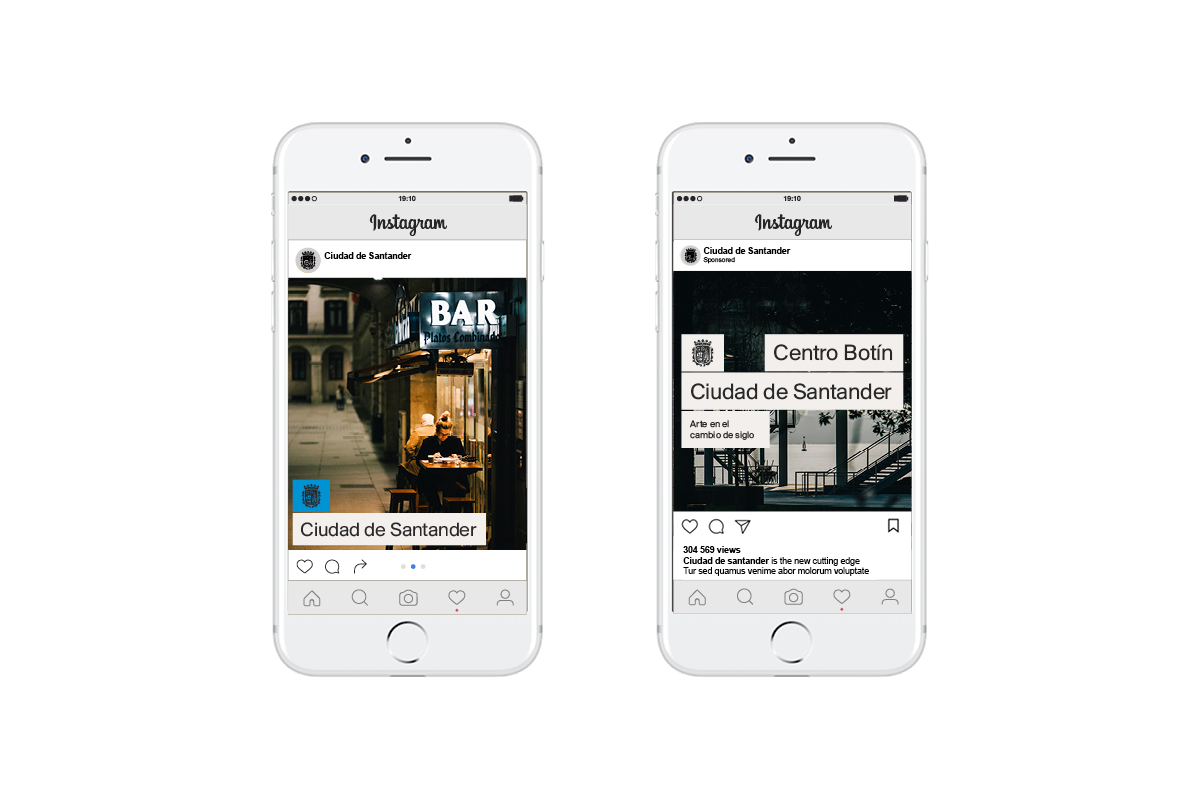
"City of Santander"
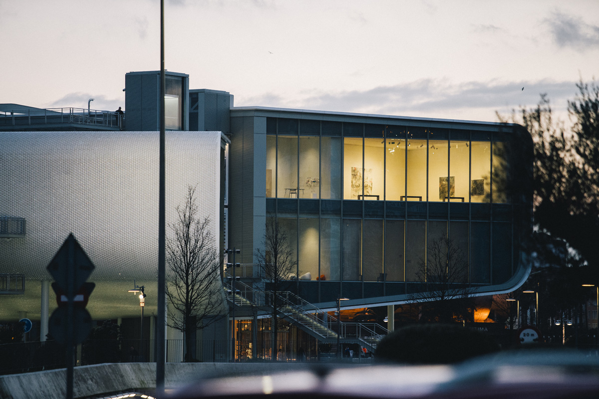
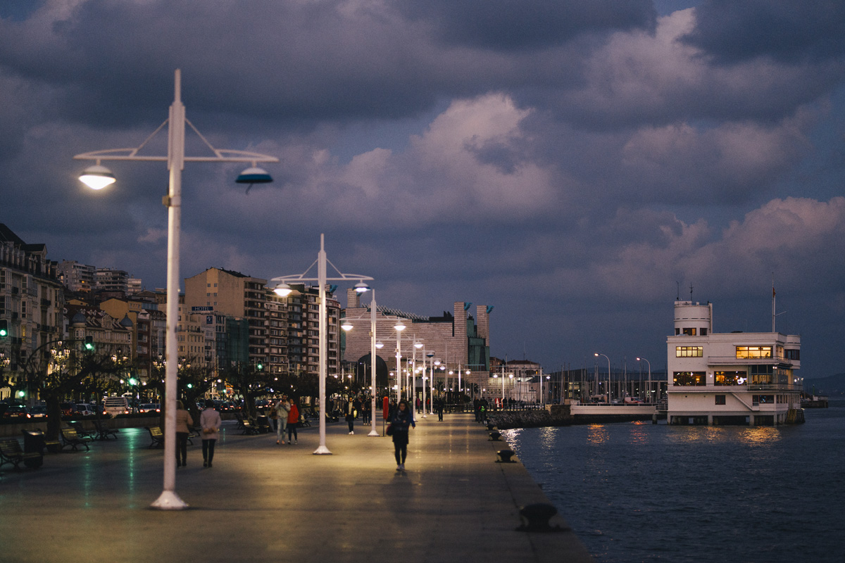
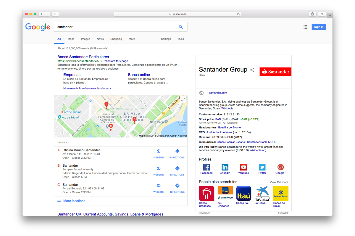
For the case of Santander – we are not competing with Bilbao, Madrid or Barcelona. We are competing with a brand with the same name, a brand with a lot of recognition. We don’t have a visual image attached to the name of Santander as a city. How can we gain digital presence, recognition and availability due to this simple fact? Taking into account the previous considerations, brands are names before logos: if there is no name, the brand cannot be verbalised. These brands flow between society via oral transmission and therefore an important part of the promotion of a brand is its verbal prescription. Santander must distance itself from the Banco Santander entity by adding “City of” –referenced an infinity of times in the brief– in its name and brand.
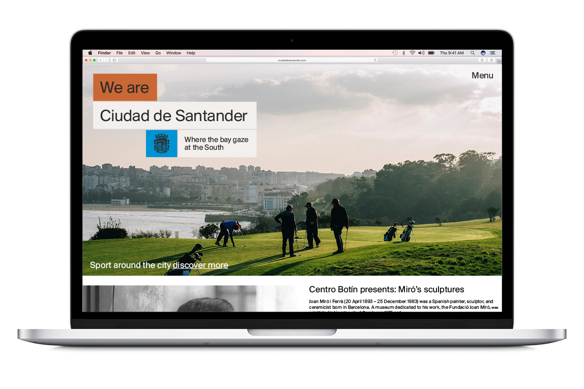
"We are City of Santander"
Having coined the term “City” as an essential part of the identity and as the main differential element from the entity Banco Santander, we had to set the next narrative level. The claim “We are the City of Santander” becomes a vehicle – clear, direct and inclusive – to empower the citizen as Santander’s main ambassador.
-
 Shareof
Context and performance
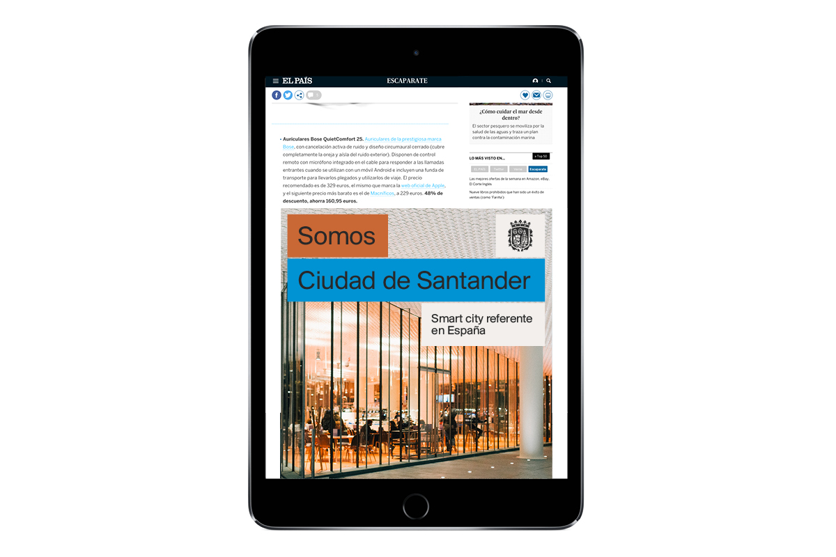
Given the popularity of the banking company, which has the same name as the city, there were two considerations in terms of formal aspects that condition subsequent decisions in the creative strategy: avoid fonts with classic serifs and avoid the colour red.
The new program of the visual brand identity is subject to a balance between the inhabitant of Santander and the visitor of Santander. Substantial questions arise in terms of communication, for example, around public services vs. economy/ tourism. The first focuses on current administration while the second is proactive and promotional.
Designing a system
The graphic proposal for the City of Santander is based on Suisse BP typeface, a neo-grotesque font of high formal quality inspired by centuries of Swiss typographic excellence and designed by Ian Party for Swiss Typefaces Foundation. The reason for this austere and modern typographic treatment is to give a strong identity to the urban environment of the City of Santander.
By pursuing a system that seeks functionality, innovation and harmony between tradition and contemporaneity, we designed a modular system for Santander’s identity. We claim the heraldic and historical tradition of the city by inserting its coat of arms into a modern, flexible and Swiss-inspired system. The modular system not only guarantees flexible application, it also allows its narrative declination, allowing messages to be transmitted through the same visual identity. The added value of the proposal resides precisely in this ability to transmit narratives through a system of modules. The chromatic system emphasizes this: the blue highlights the most typical elements of the city (coat of arms and “City of Santander”), while the orange is applied in the modules with a narrative function (“Somos” and message”).
Historical coat of arms of the city
An important part that shapes the identity of a place is its history and its people. Heraldry is the science that studies the use of the hereditary emblems that are embodied in armorial bearings. There are numerous Spanish cities that, for the sake of modernity, have relegated to oblivion the coat of arms they represent. The proposal advises to conserve this emblem since a human establishment with more than 1000 years of history is represented, not as property of any institution, but property of its people. With respect to the norms of heraldry, the updating of its form will allow anchoring the past in order to look to the future and thus strengthen the identity of future generations that inhabit in “City of Santander”.


The brand architecture that we propose responds flexibly to these needs, it can house administrative organisms, municipal types of equipment, municipal companies, logotypes of internal promotion campaigns, as well as tourist, cultural and economic promotion.
Francesc Ribot, Designer, Menage Design
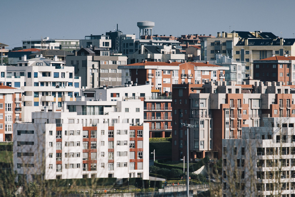
When Santander becomes a city
A city laid out by two essential factors; its people and where they live their lives. And without a logo. When Santander becomes a city.
As a part of the proposal, these social media profiles and domains were registered; Instagram – @ciudaddesantander, @cityofsantander, Facebook – @ciudaddesantander, @santandercity Twitter – @ciudaddesantander, Domains – cityofsantander.es, cityofsantander.com, ciudaddesantander.com
-
 Shareof
A few months ago, a contest was held for the honour of rebranding the city of Santander, Spain. We got selected for the contest and participated under a budget. Finally, the winner of the contest is Pepe Gimeno from Gimeno Gràfic – the new identity of Santander has just been announced.
Response to the contest:
Los diseñadores reclaman y eso es bueno, by Víctor Palau, Director and Editor at gràffica.info
https://graffica.info/los-disenadores-reclaman-y-eso-es-bueno/
¿Está el branding muerto?, by César Martín, El Plural
https://www.elplural.com/leequid/2018/04/17/esta-el-branding-muerto


