Year: 2021
Tags: Editorial Environment, Graphic Design, Identity, Naming, Rebranding
-
Share
10,314 views
Cuidem Barcelona is the new brand of the Barcelona City Council’s maintenance, waste collection and cleaning service, which covers all municipal services related to public space. A commitment to the green and circular economy that focuses on reducing waste and increasing recyclability.
-
Shareof
-
Shareof
-
Shareof
Context
The campaign is preceded by BCNeta! (1999) and Barcelona pel Medi Ambient (2008), identities that have been representing Barcelona’s cleaning services for the last 20 years and which quickly took root in the urban imaginary.
These brands demonstrate that the services provided by the City Council have traditionally been understood in a unidirectional way: Barcelona works for the citizen. However, it is also the citizen who, as well as receiving the service, has an individual responsibility to take care of the city, adopting an active role in their environment.
-
Shareof
-
 Shareof
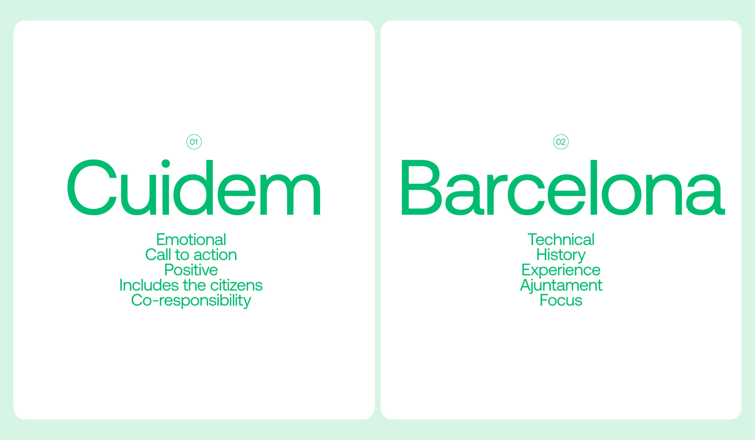
Naming
In order to express these values, we decided to rename the brand Cuidem Barcelona. The naming, with a technical and corporate appearance, emphazises the co-responsibility between institutions and citizens for the maintenance of the city. In Catalan, this conjugation of the verb Cuidem has a double reading: in indicative it means we take care, which expresses something that is being done at the same moment; in subjunctive it means let’s take care, a wish or request. This word is an appeal, a call to action, a demand for individual and collective responsibility. This emotional component generates tenderness and a sense of community, making the city and its citizens part of the same objective.
Symbol and logotype
The purpose of the logo is to empathize with the user, connecting them with the brand and all its fields of action. The symbol is an abstraction of the initials C and B, adopting both a heart shape and anthropomorphic traits that make us feel closer to the brand. This element can be separated from the logotype and become a character that allows giving extra information and communicating special messages. An iconic element, easily recognizable on its own, that can be used as a decorative and highly visible element on the supports of the activity, such as vehicles or employees’ clothing.
-
Shareof
-
Shareof
Emotional dimenssion
The symbol’s affective expression plays an important role in the identity. Through small changes, it allows us to communicate a great variety of messages in an expressive and close way. In the same way that the name brings us closer to the user, the symbol gives it an emotional and close dimension.
-
 Shareof
 -
Shareof
Sub-brands
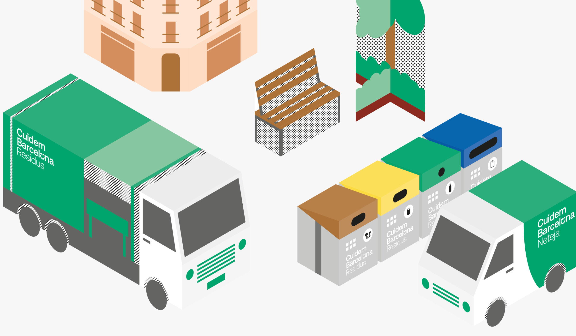
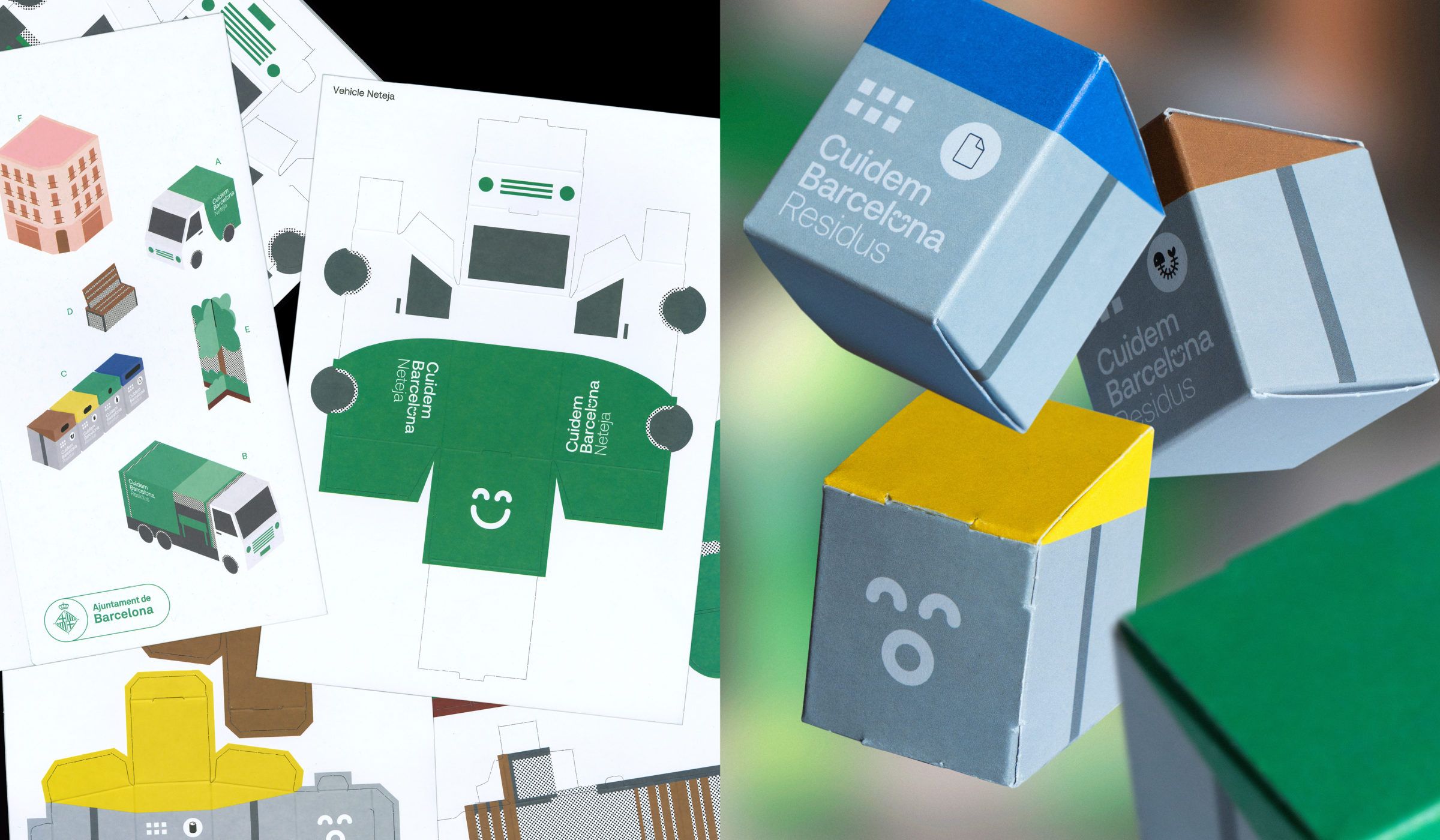
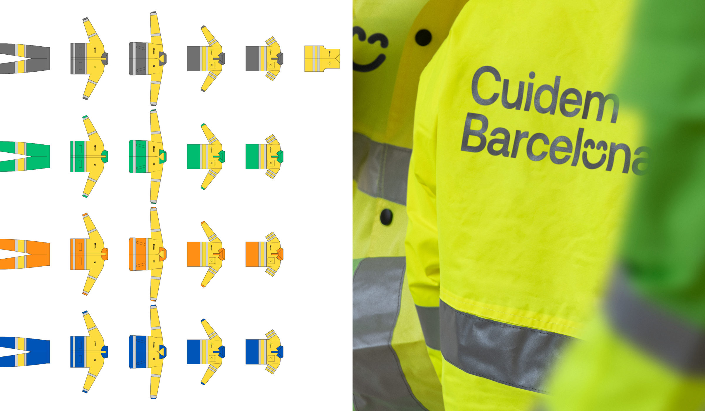
The new contract’s redistribution of efforts and resources is reflected in the graphic identity and its new chromatic palette. The services offered by the City Council are organized into sub-brands, which are now unified as follows: Neteja i Residus (Cleaning and Waste), the two largest subdivisions of Cuidem Barcelona, are now sharing the same shade of green, making the presence of workers and vehicles in the public space much more visible. Manteniment i Soroll (Maintenance and Noise) both share the same tone of orange, while Platges i Aigua (Beaches and Water) use blue as the main color.
-
Shareof
-
 Shareof
 -
 Shareof
 -
 Shareof
 -
 Shareof
Aplication
The new brand, which will be implemented in the different districts of the city, covers all municipal services linked to public space: more than 870 electric vehicles, 25,200 containers, the clothing of more than 2,100 employees, as well as hundreds of physical and digital supports that make up the communication campaign.
-
Shareof
Graphic communication system
The communication system adopts the graphic and interaction codes of text messages, which are so close to technology. A conversation is held between two parties: city and citizens, shaping the concept of bidirectionality developed throughout the project.