Designed by Folch
Production by White Horse
To cast aside its corporate image and convey a sense of contemporary elegance, Fluvia needed a stronger identity and a new art direction. Brands increasingly have to evolve in order to maintain a contemporary image and challenge their competitors. Fluvia – by LED Simon – was no exception. Superfluous elements and technical detail were taking audiences away from Fluvia‘s core values. A product-focused brand, each light has its own identity, functionality and particular characteristics. We decided to bring these unique qualities to light.
Our main concern was how to create a visual mood for a brand that creates such beautiful types of light, but through “invisible products”. In those circumstances – where the product tends to disappear – visual moods, narratives and graphic appearances become more important in making the brand appealing.
Rafa Martínez, COO, Partner & Brand Strategist, Folch
Elevating by association
After some initial research, we realized that there were unexplored territories in the sector that would allow us to generate a distinct language and identity, setting Fluvia and its products into a new sphere. Fluvia produces professional, architectural interior lighting. Avoiding decorative design, its products are based on function, simplicity and precision. Rather than focusing on functionality, we wanted to indirectly elevate the brand and its products by associating them with the realms of architecture, art and fashion. To do so, we decided to take on certain characteristics of each of these creative industries and apply them to the Fluvia universe.
A friendly face
Our first realization was that the identity was too corporate. The cut out line through the centre was superfluous, damaging the typography and decreasing legibility, particularly when applied to smaller assets. In addition, the purple F was creating a level of visual confusion as there was little differentiation between the purple and black lettering. Finally, the typeface produced excessive vertical lines.
We wanted to create a identity with depth and meaning, something that maintained the essence of the brand while also referencing the products.
We proposed a synthesis in colour and shape, making the identity clearer and more contemporary. We changed the typography from Futura to Matter, a Displaay font chosen for its geometry and the amplitude of it’s typographic spaces, which allow the letters to breathe. The overall effect was to open up the typography and convey a warmer, friendlier look. In order not to complicate the transition the brand was going through, the final logo was in fact a compromise, maintaining a level consistency with the previous version.
Creativity through colour
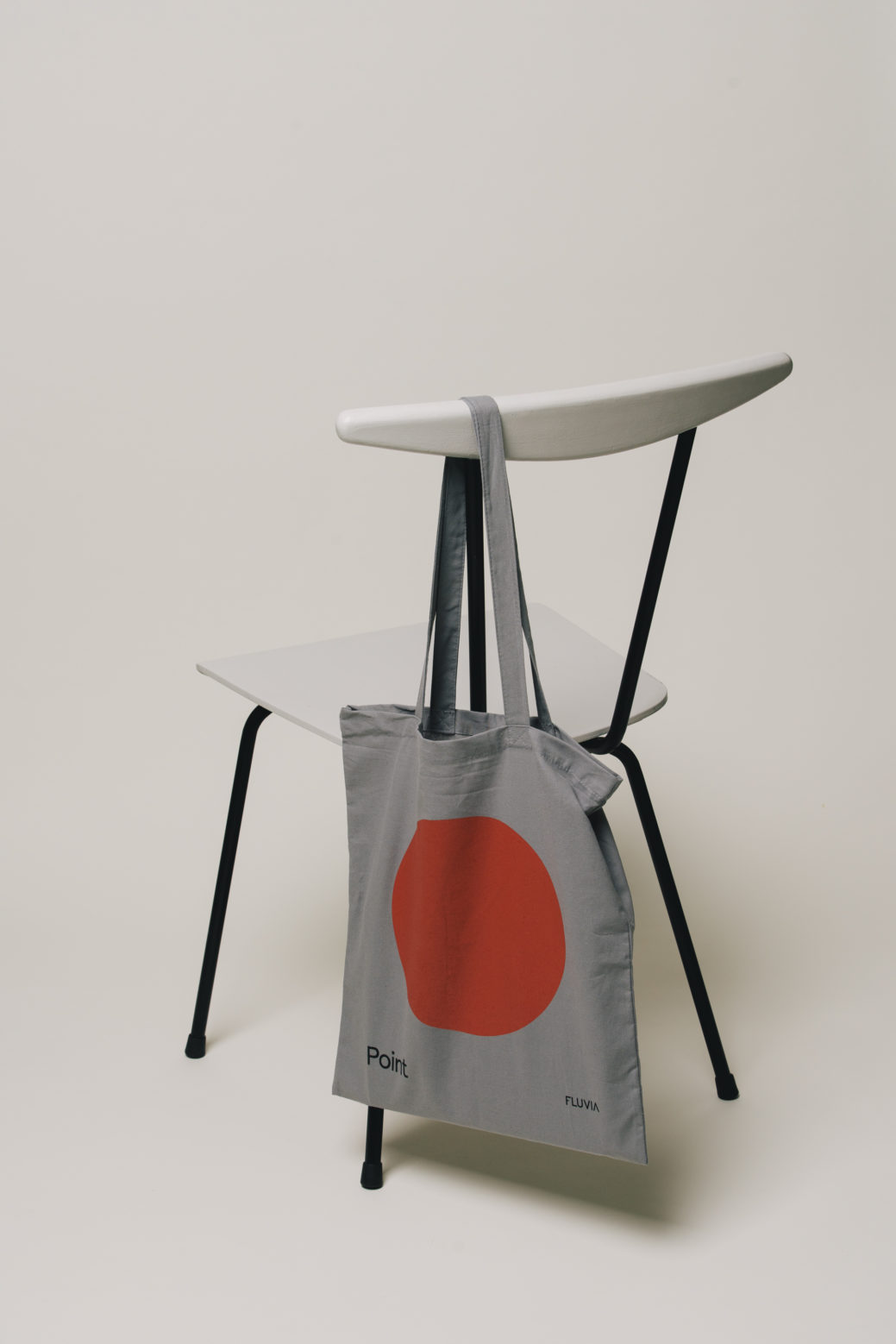
The original palette used by Fluvia was a combination of black and white with a dash of dark purple. In order to modernise the colour scheme we decided to stick with black and white as primary colours, while adding in a broad spectrum of secondary colours in soft, tonal hues. This meant we could maintain the consistency of the current art direction, while defining a chromatic palette with more light, increasing contemporaneity and making Fluvia recognizable.
Fixing Fluvia in people's minds
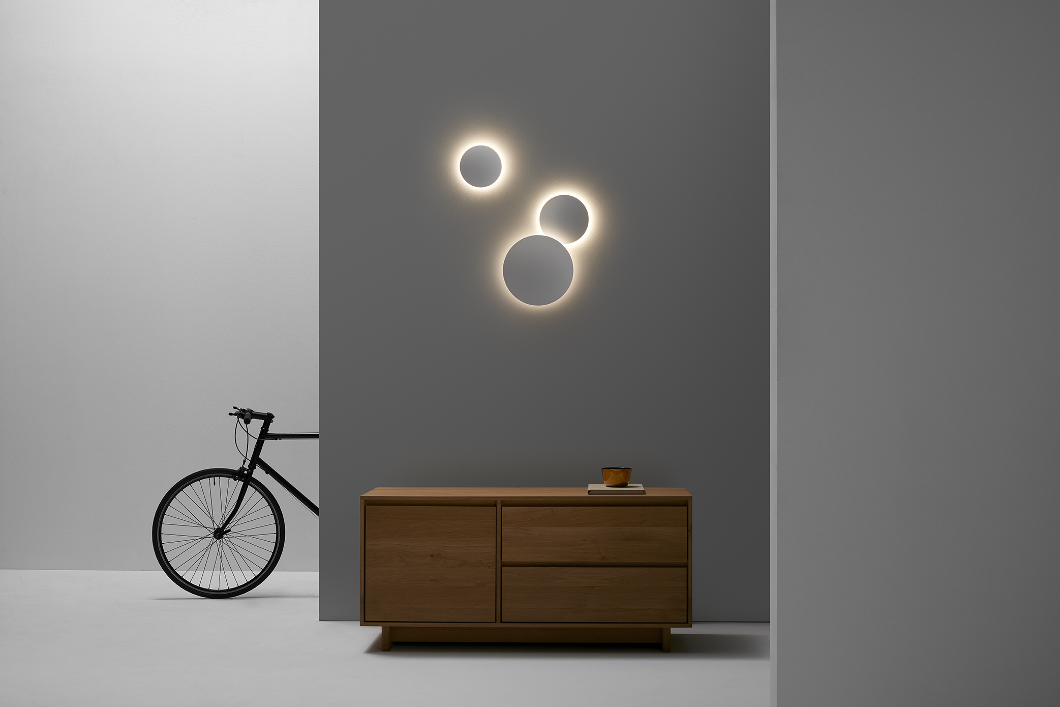
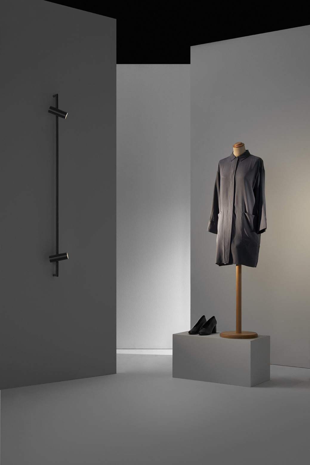
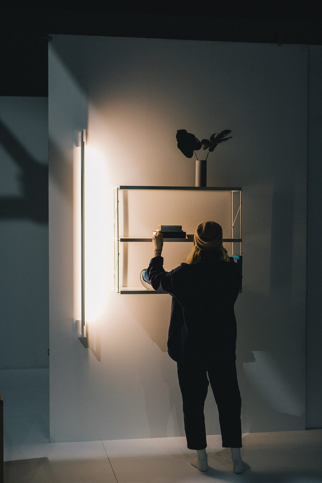
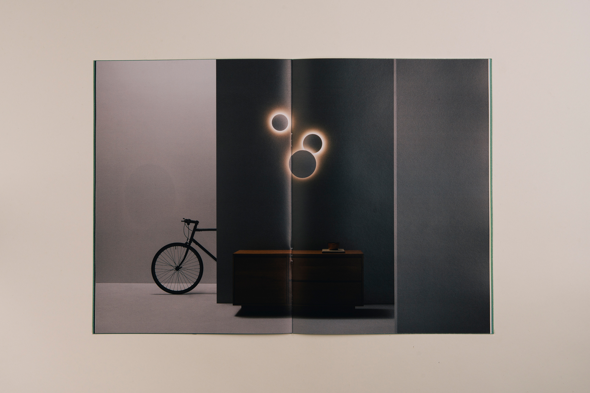
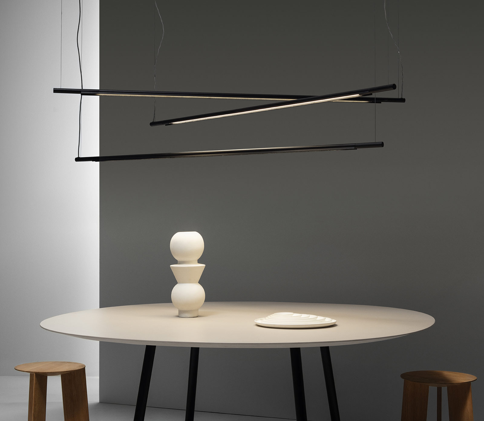
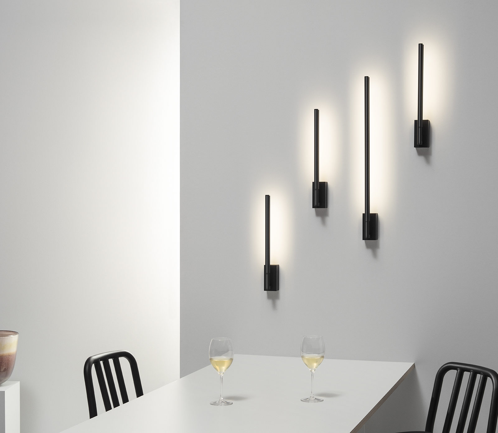
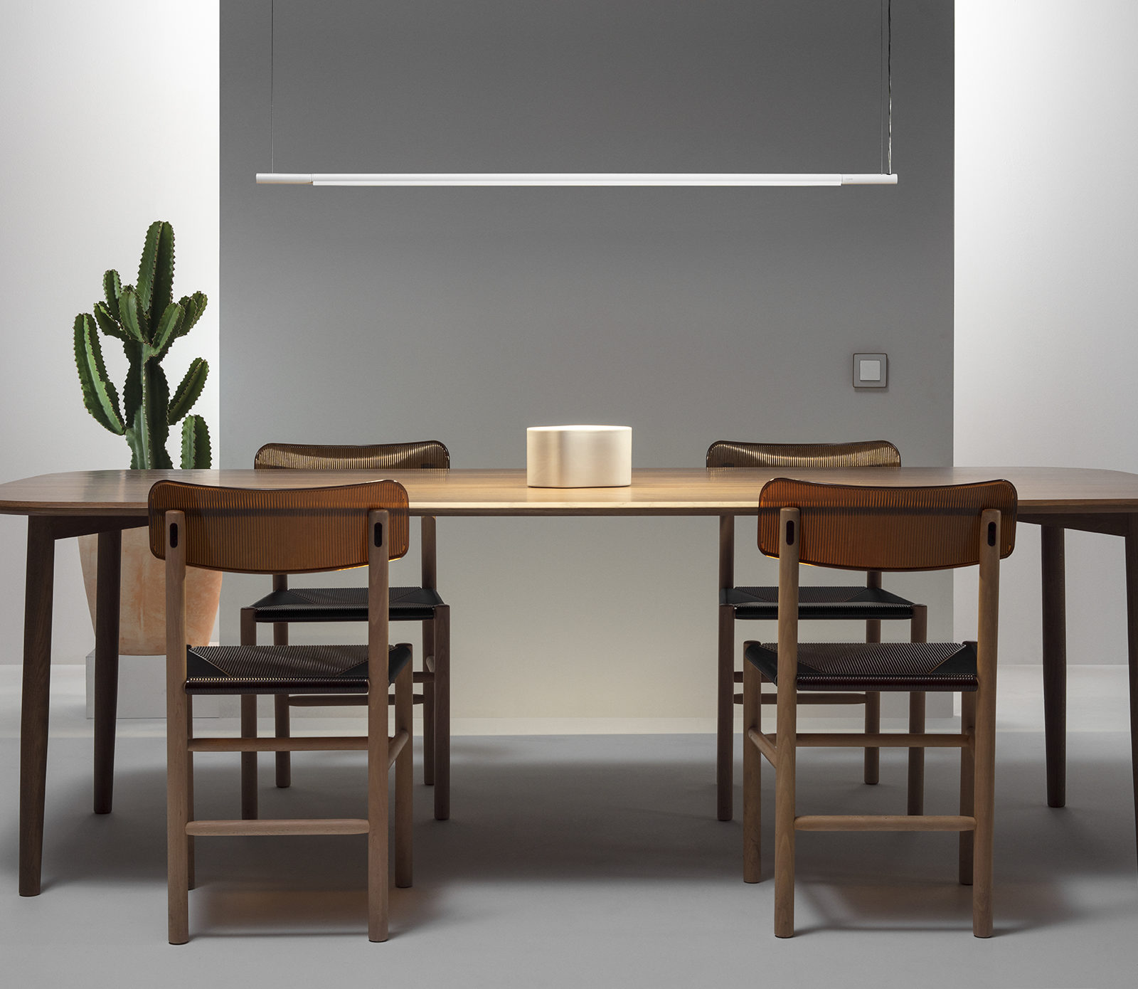
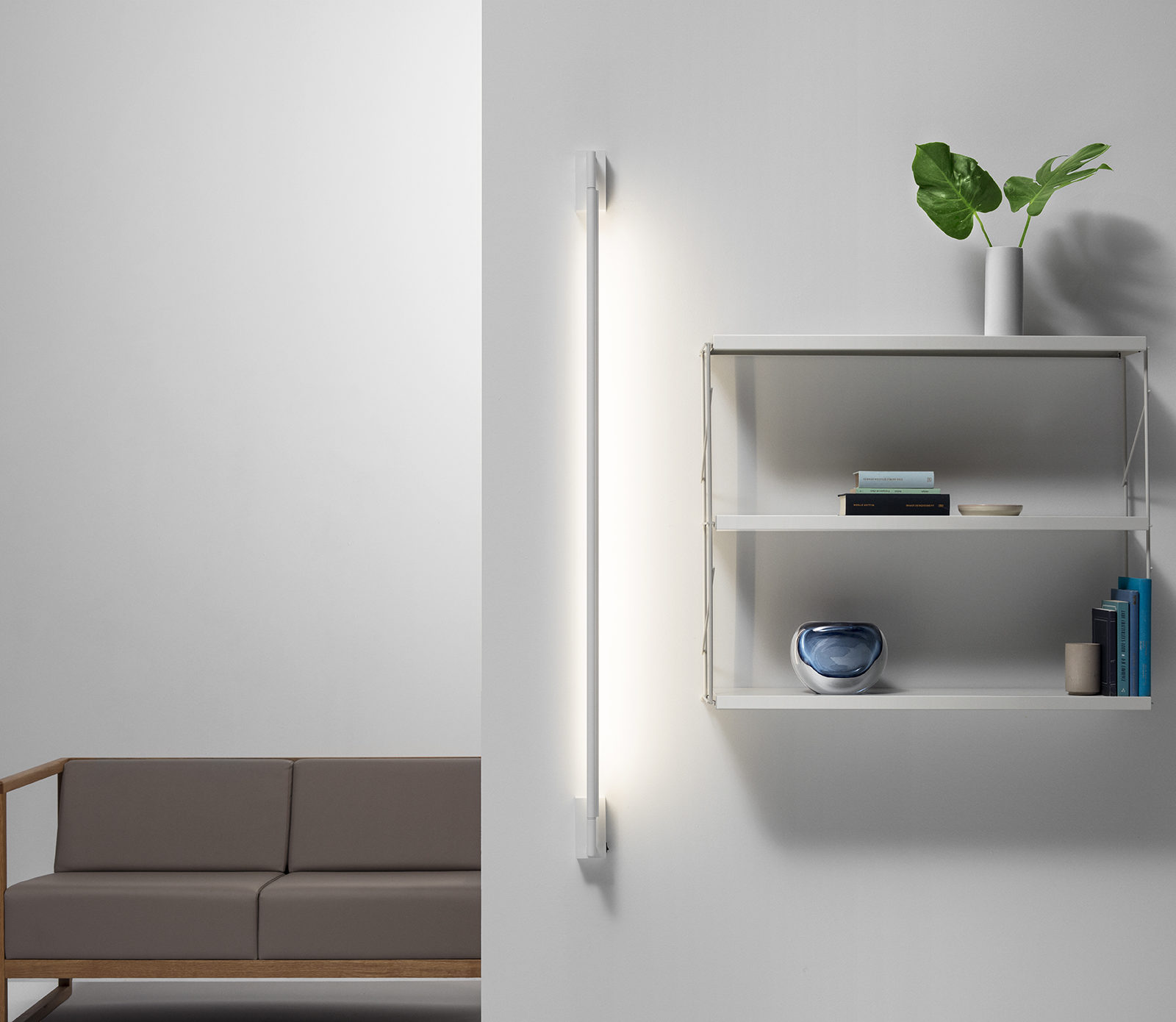
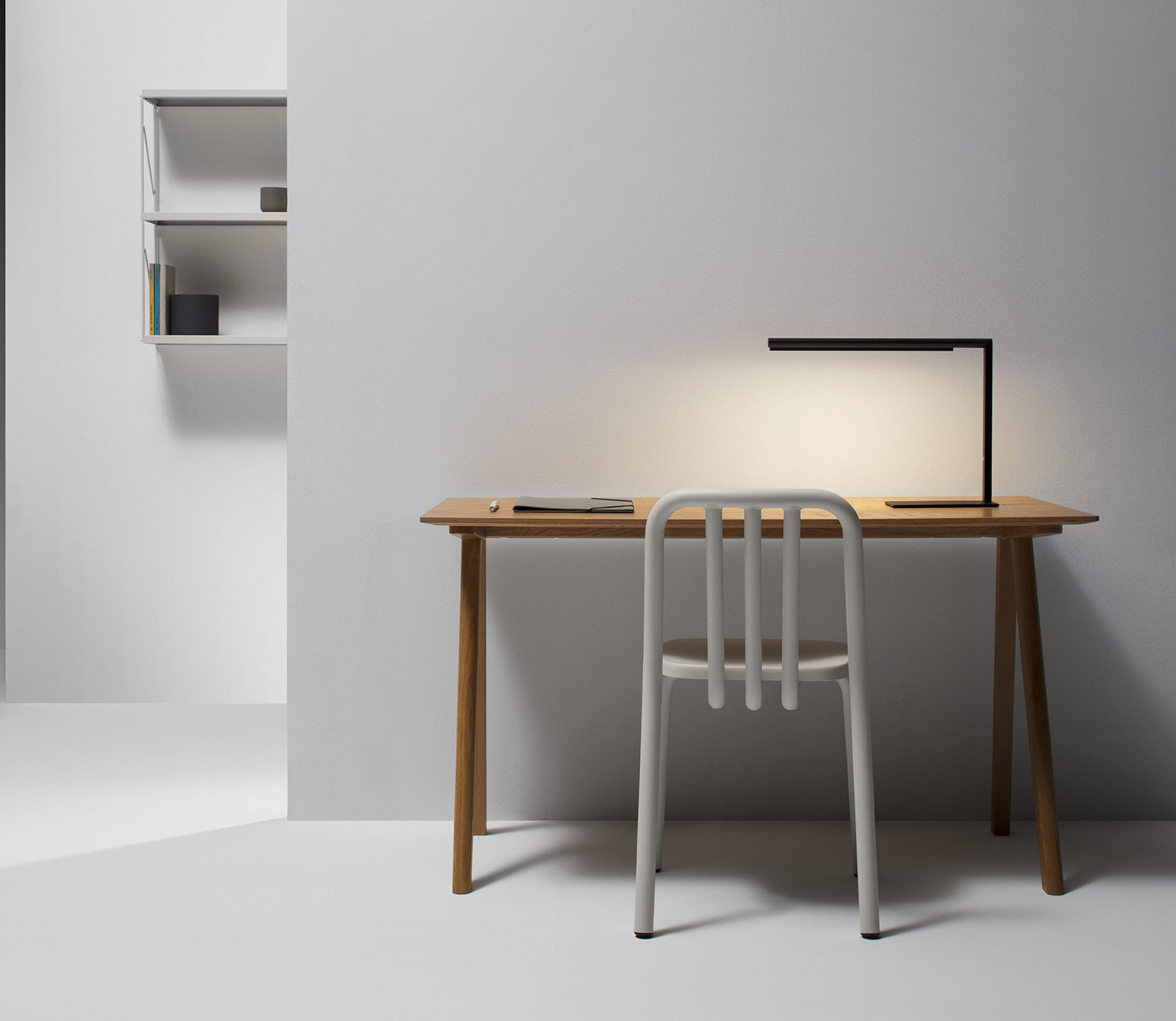
In the field of art direction we proposed to open up new ways of seeing and explore new territories, addressing fields that are not associated with the sector and building innovative dialogues and metaphors. We needed to visualize the product well in order to fix it in the collective imagination and evoke an emotional response. So when people think of lighting, they think of Fluvia. To do so we had to improve product communication in context, showing more spaces and less renders to attract the viewer.
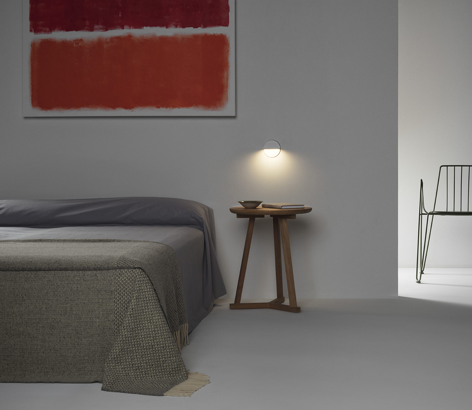
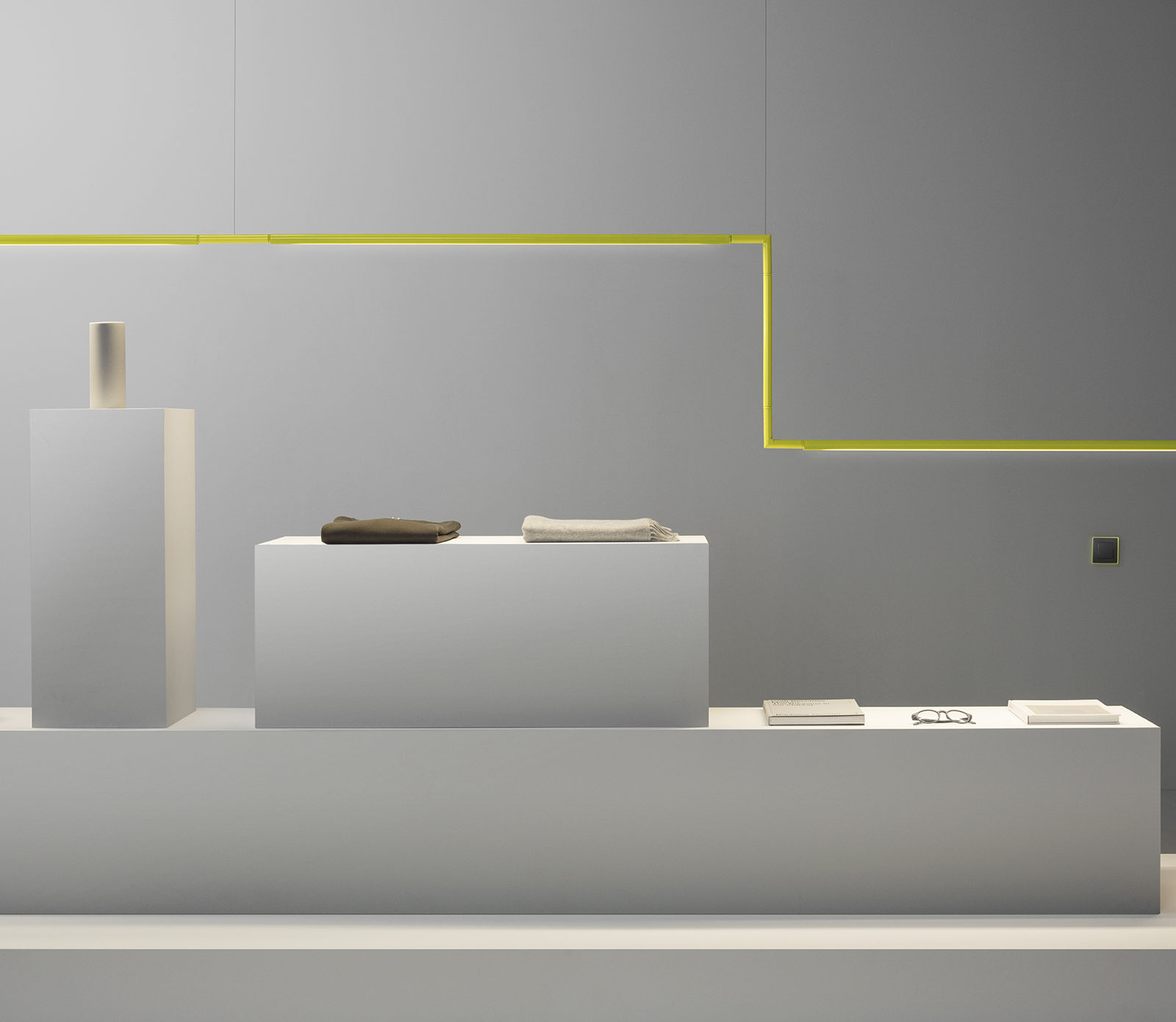
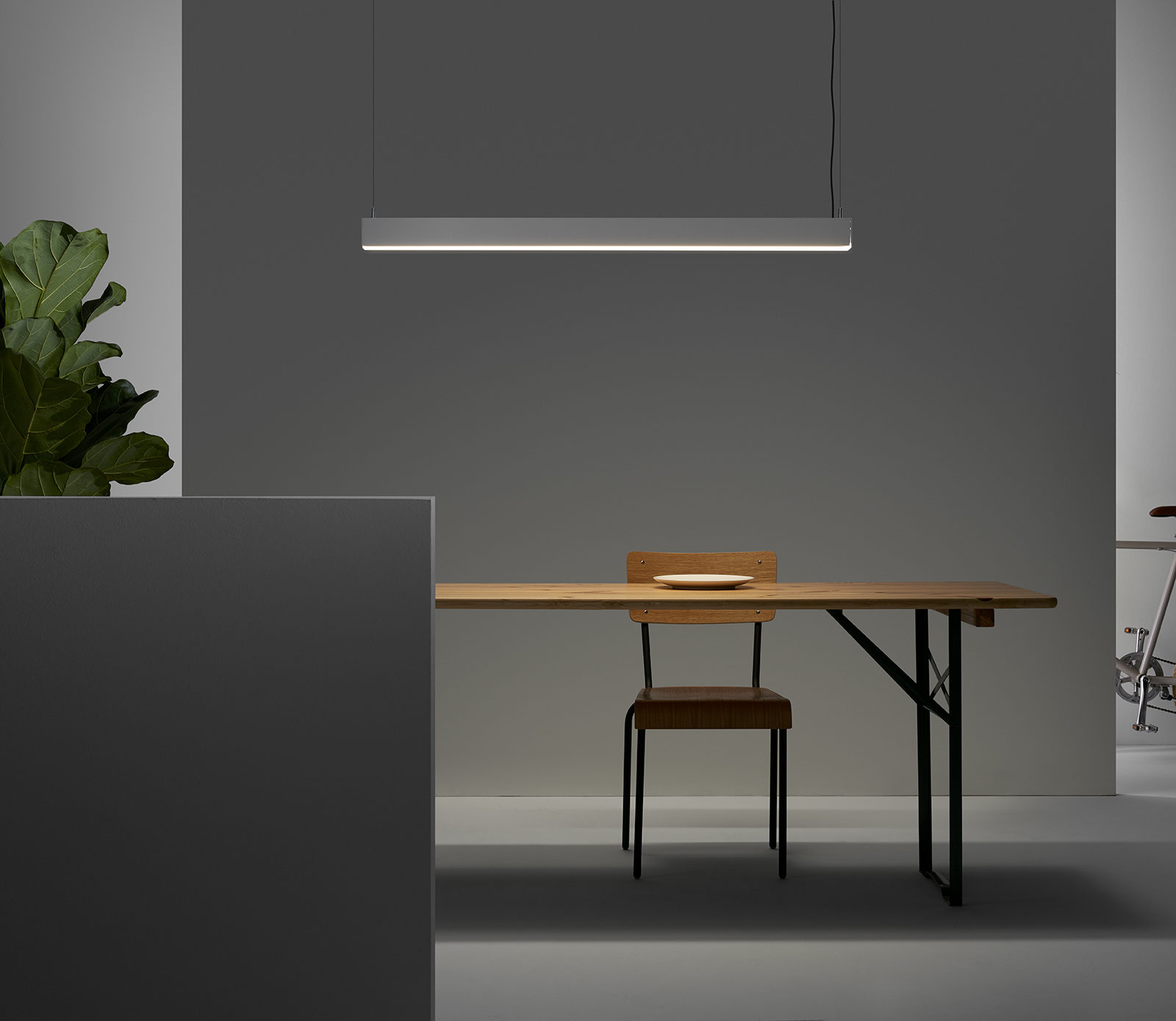
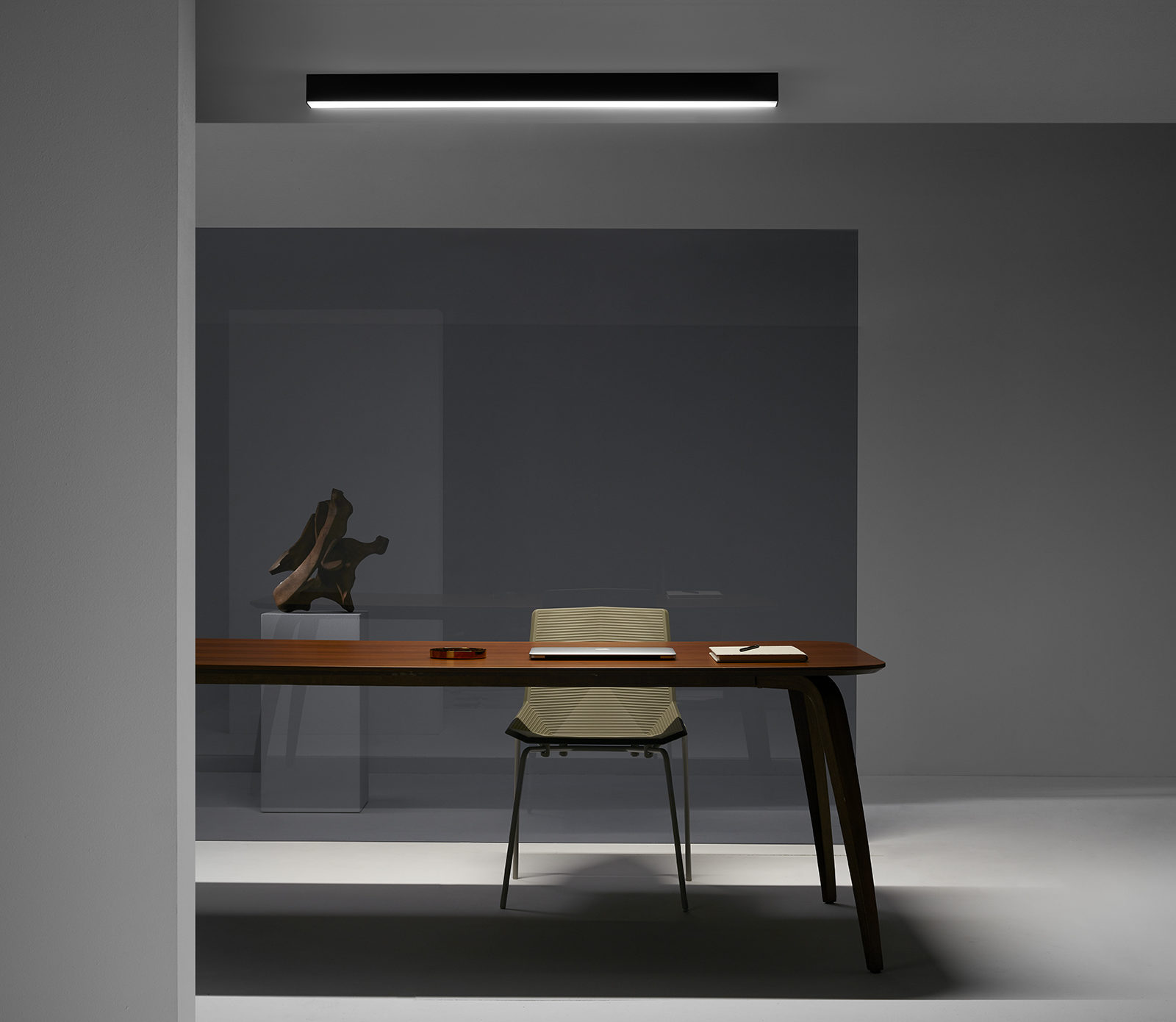
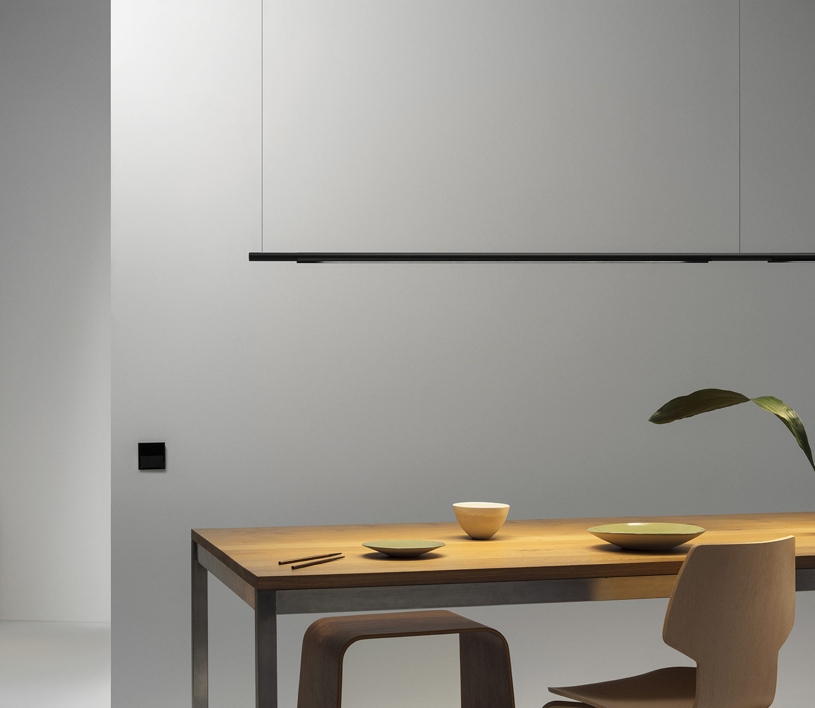
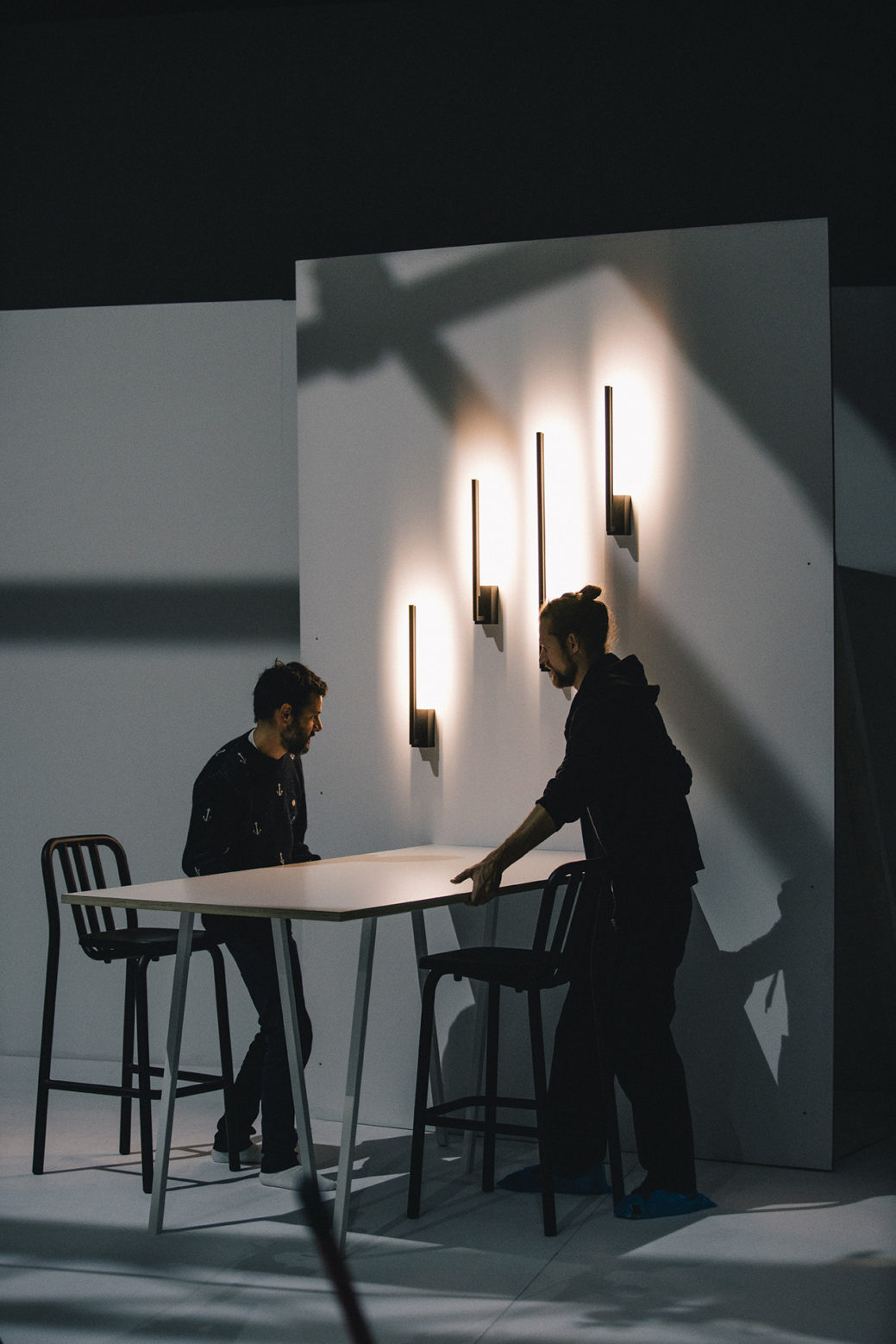
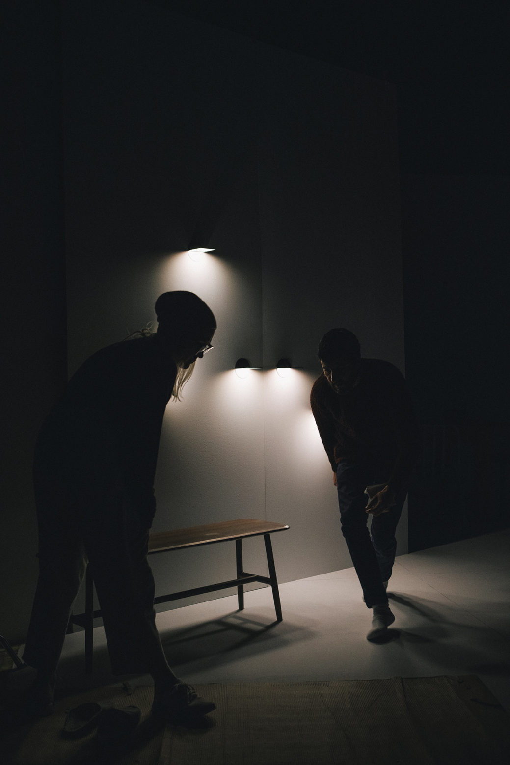
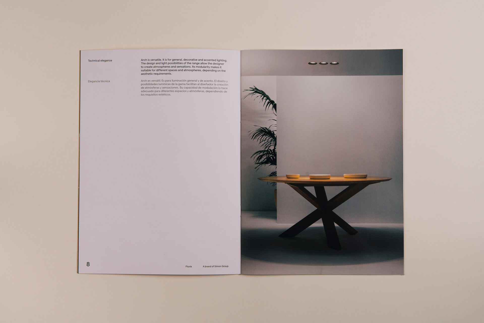
We wanted to create a set of images in which the light is the protagonist, the focus around which different recognizable scenes were constructed using the minimum possible elements.
Josep Puy, Senior Designer and Art Director
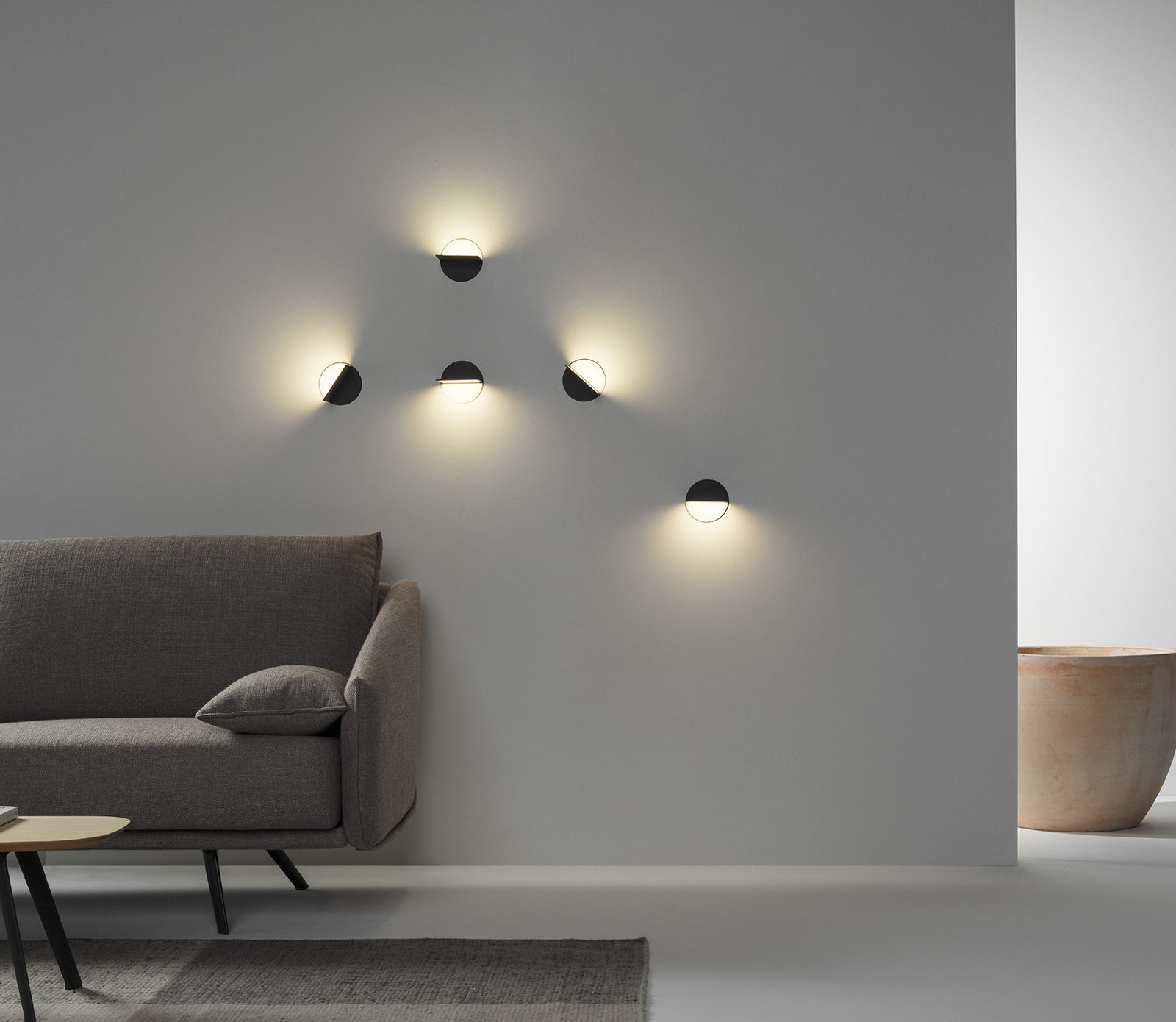
Setting the scene
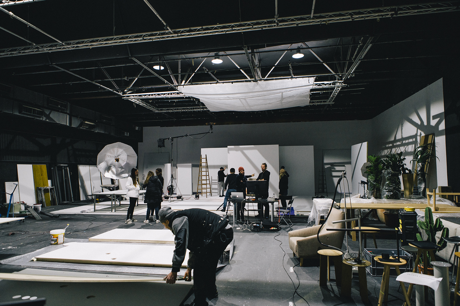
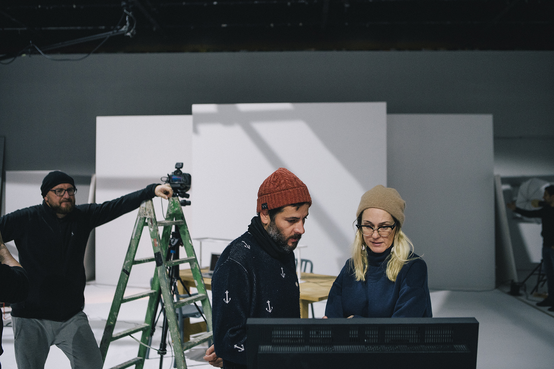
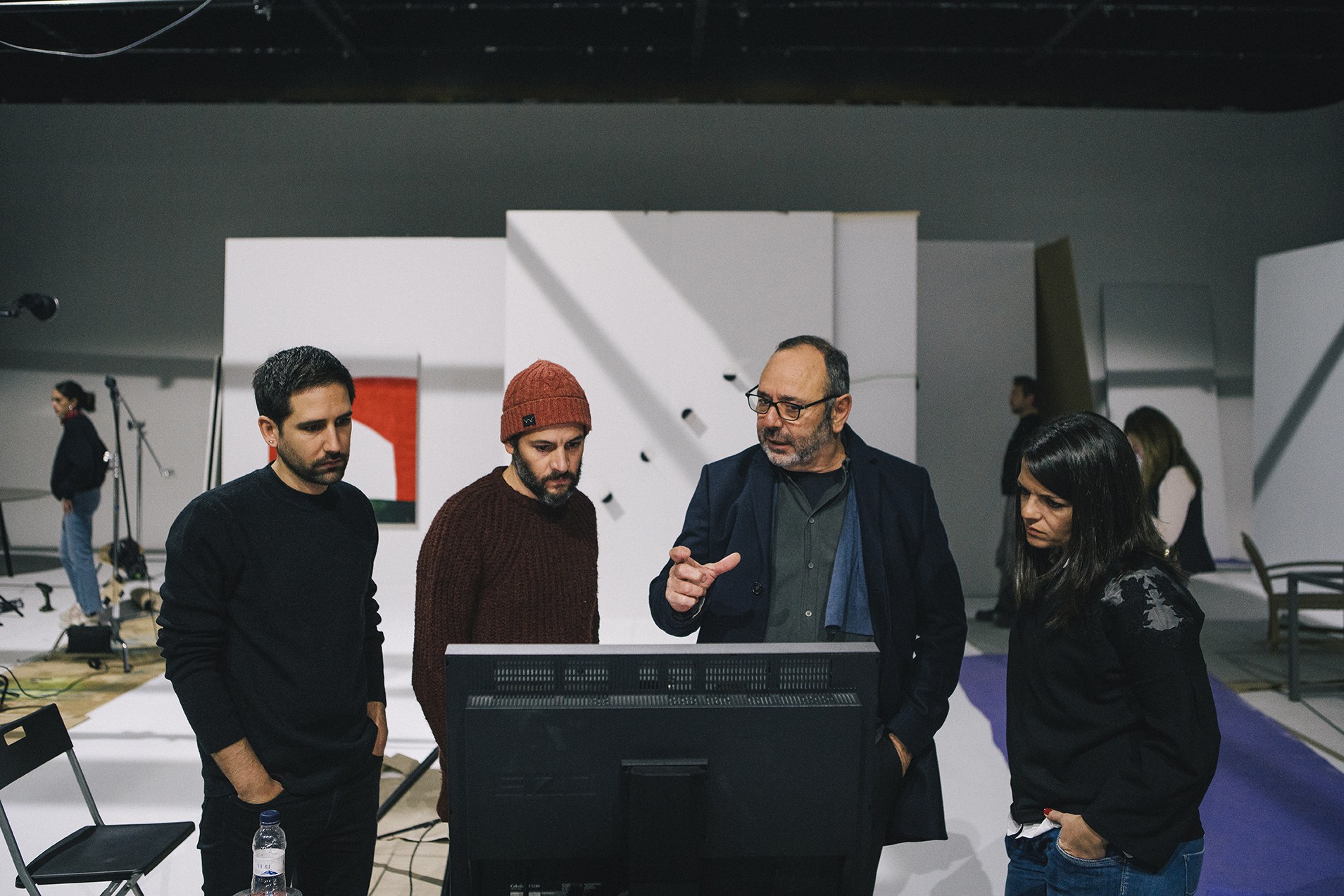
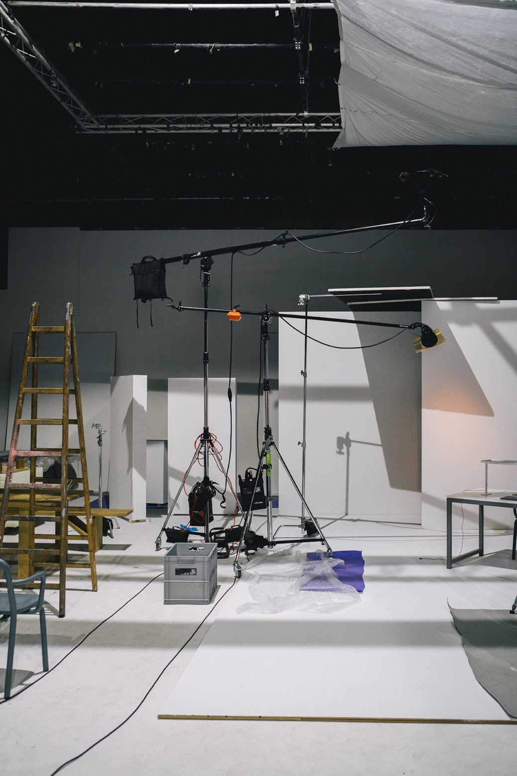
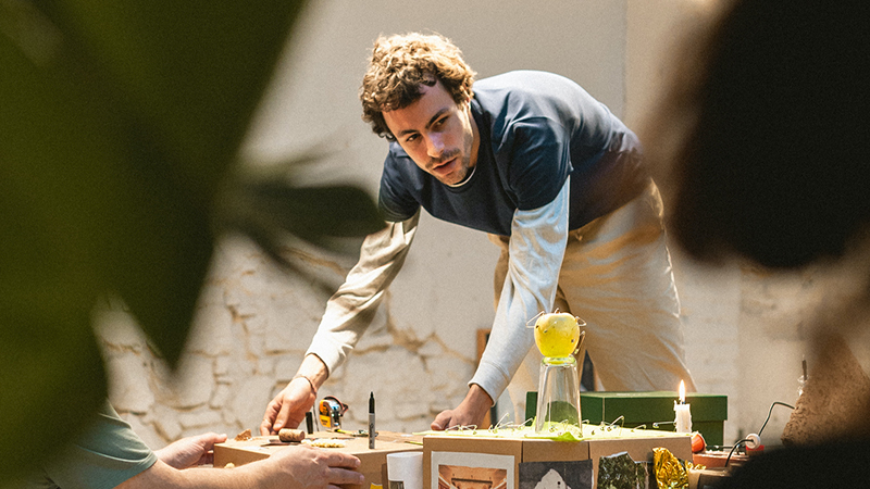
Fluvia products are often set into the structure of the building, offering functionality rather than occupying a space. In order to shoot the lamps effectively our production company White Horse built a series of stage sets to re-create the environments in which the lamps would normally be installed. Working with Cristina Ramos, who specializes in set design with impeccable execution, we created a series of unique and perfectly suited spaces for each product. Chosen for his passion for objects and light, Marçal Vaquer perfectly captured the ambience created by each type of light. The tables are designed by Mobles 114.
Catalogue: from corporate to contemporary
Until now, Fluvia had been producing a large A4 catalogue containing excessively detailed technical information about all of their products. The production was dense and the design corporate and dated. Overall it did not evoke any emotion or convey the brand’s values. So how could we communicate Fluvia’s individuality and elegance more effectively?
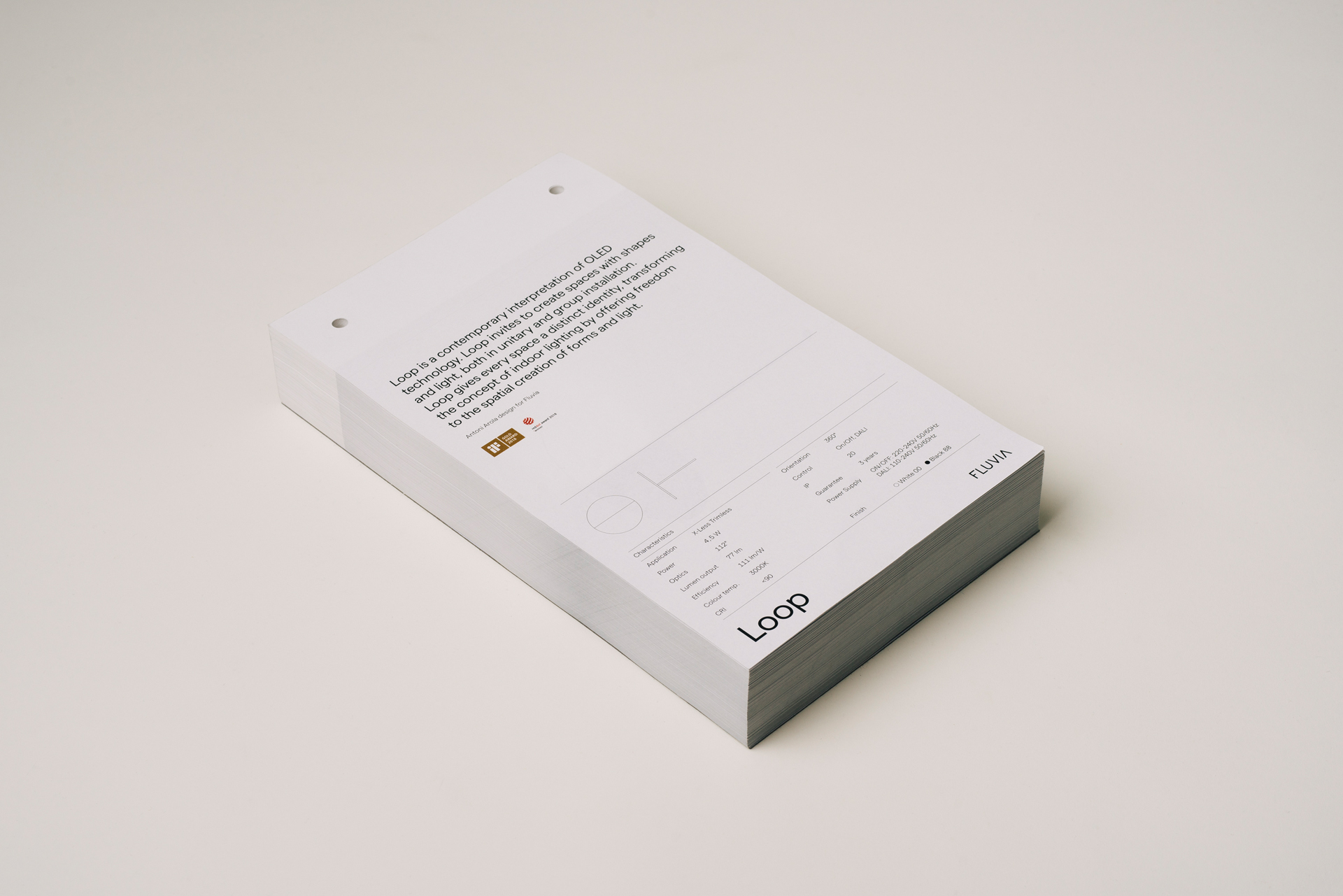
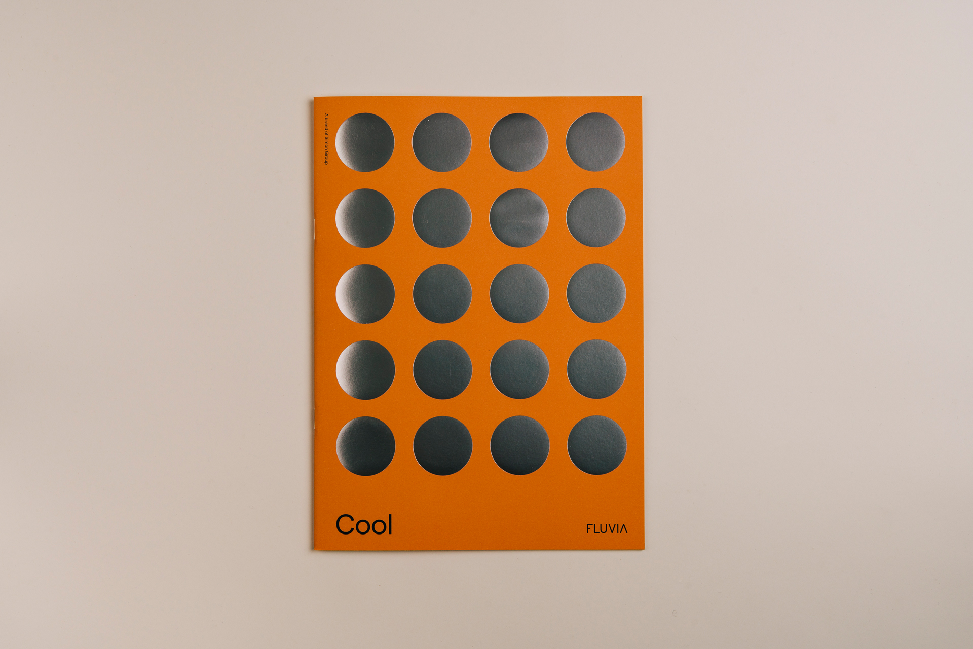
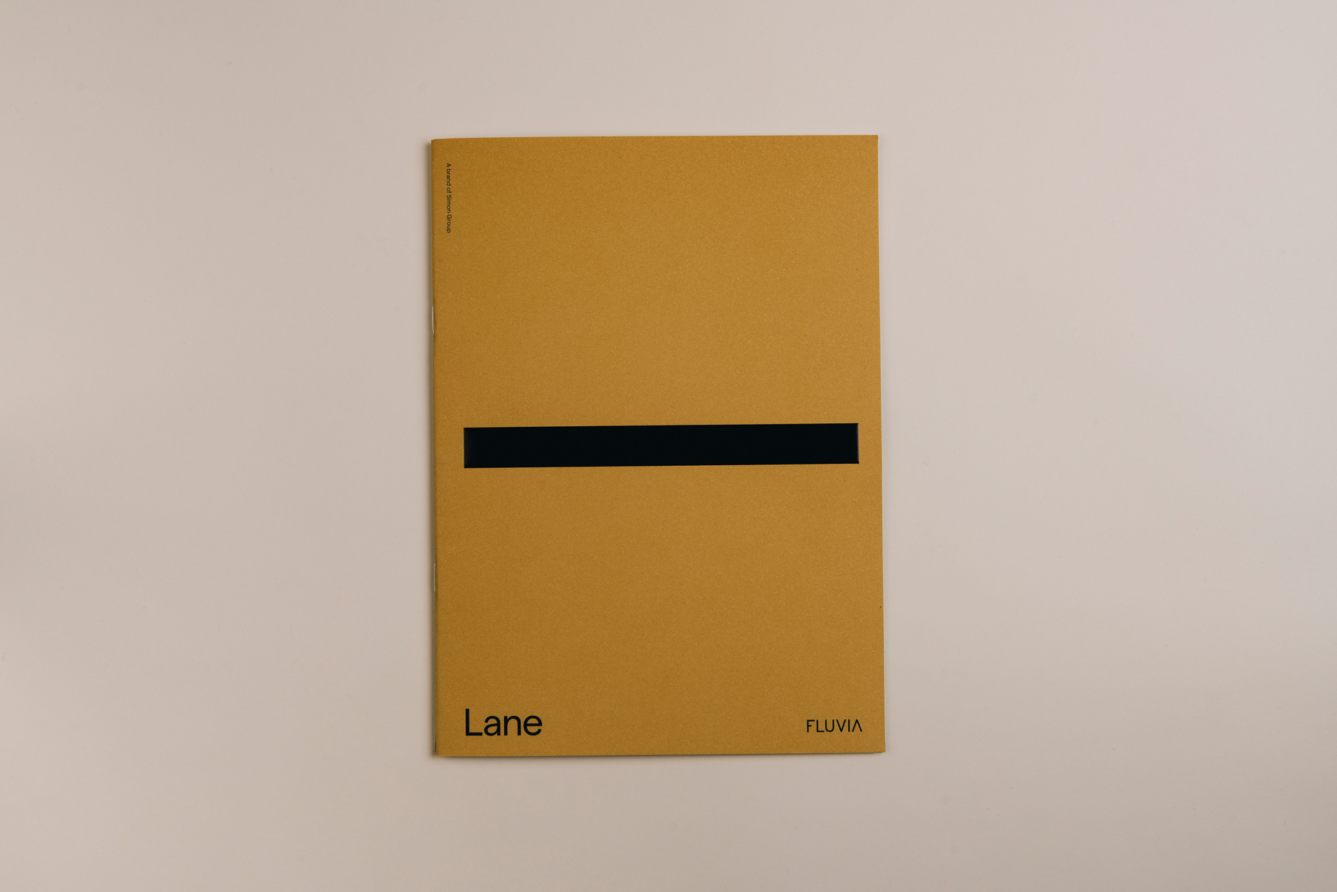
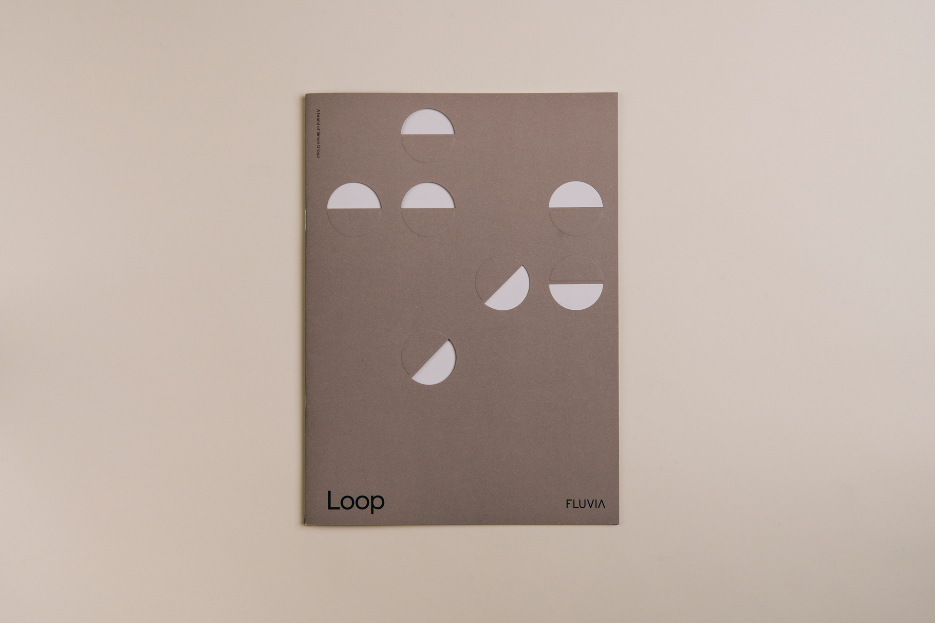
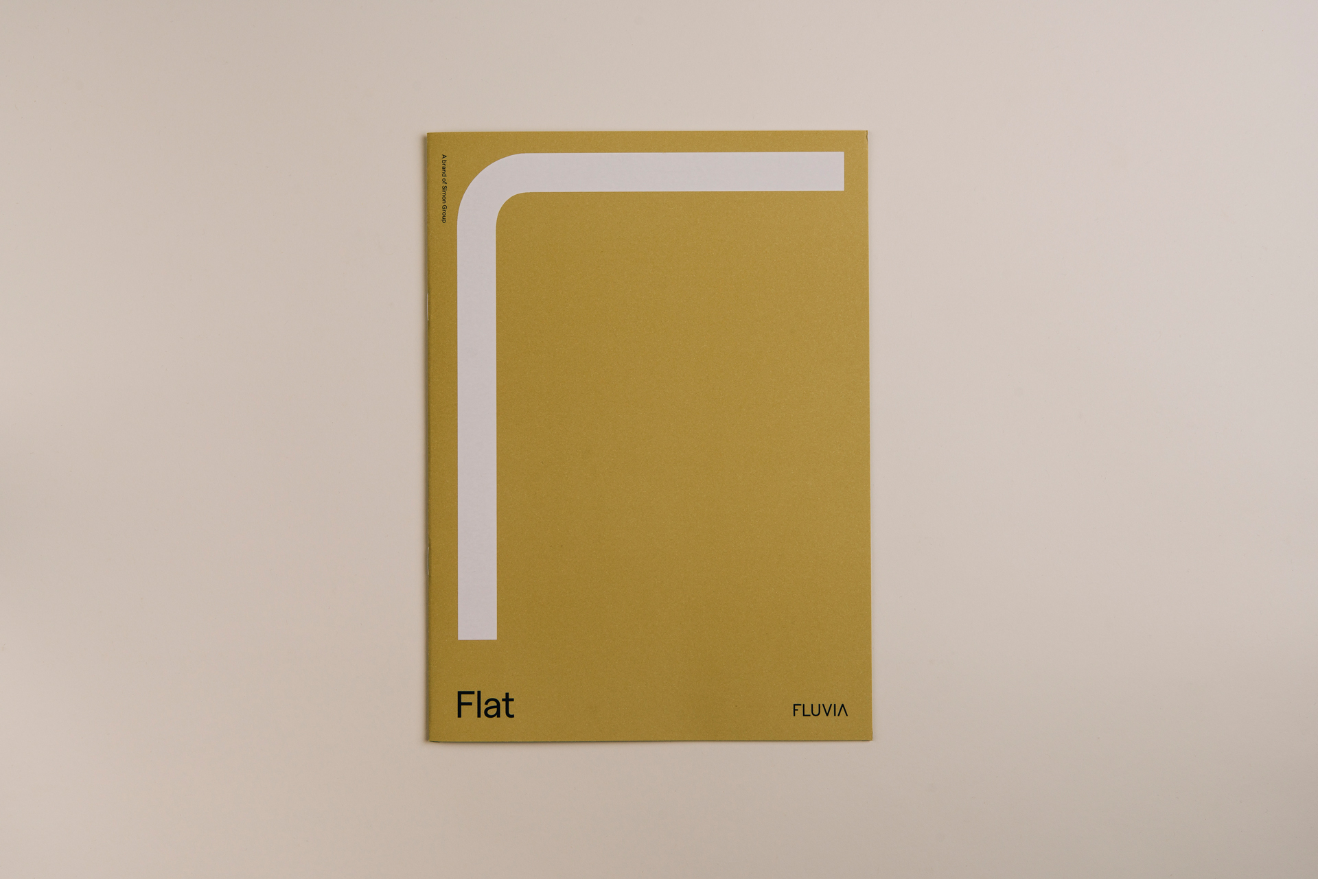
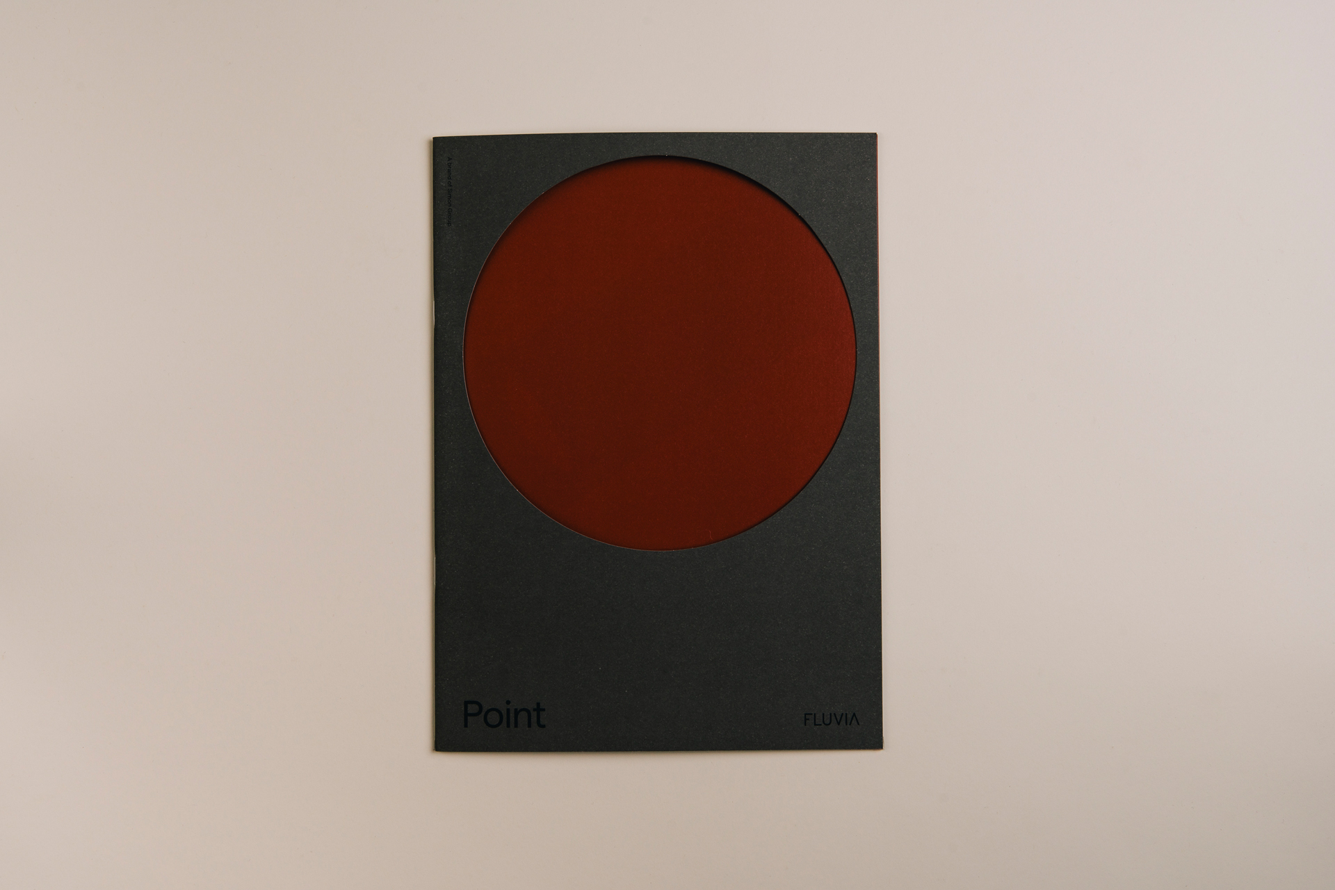
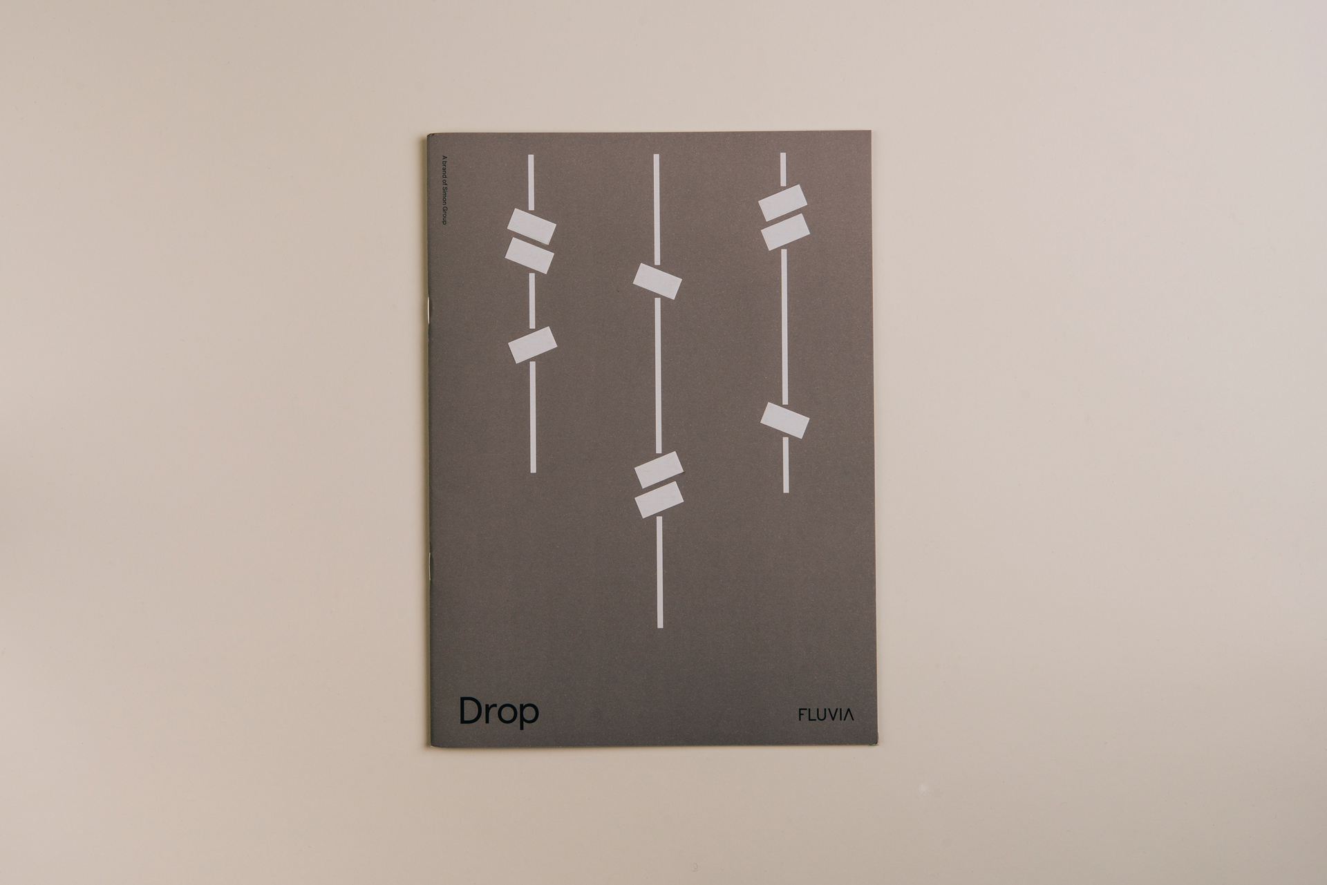
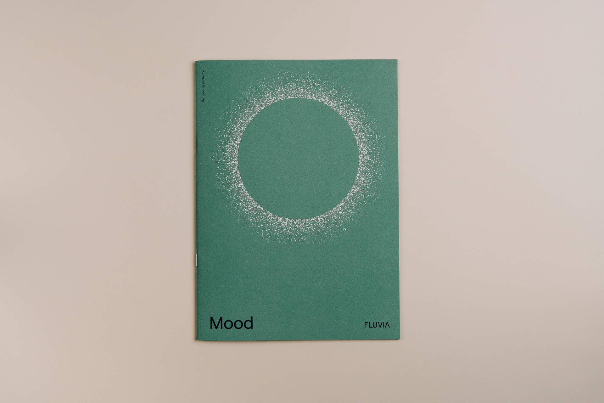
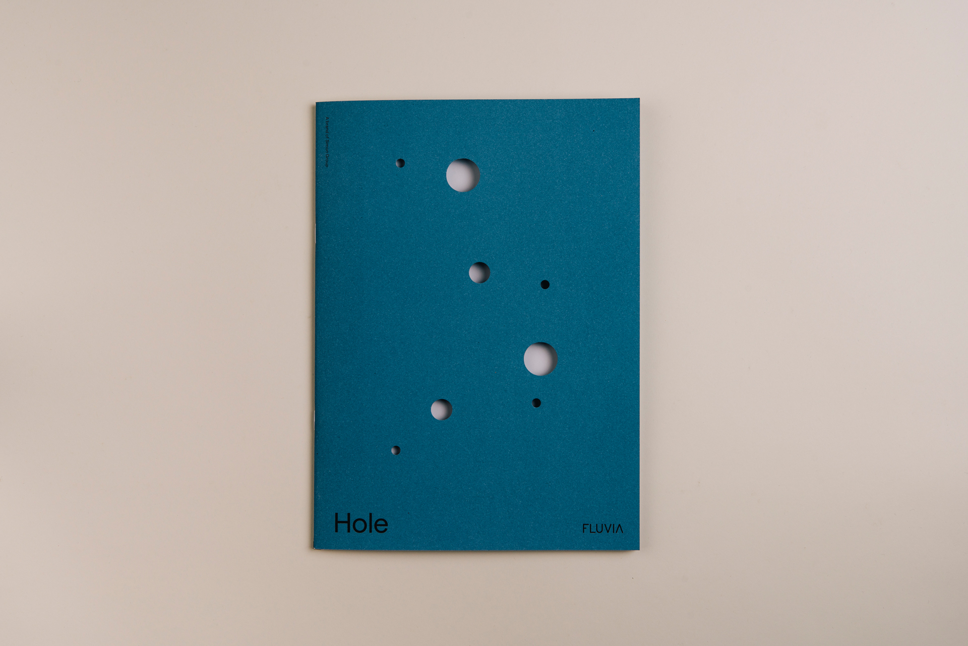
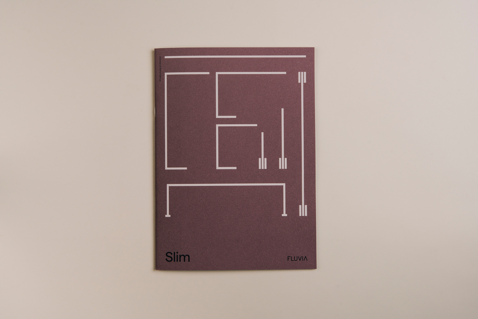
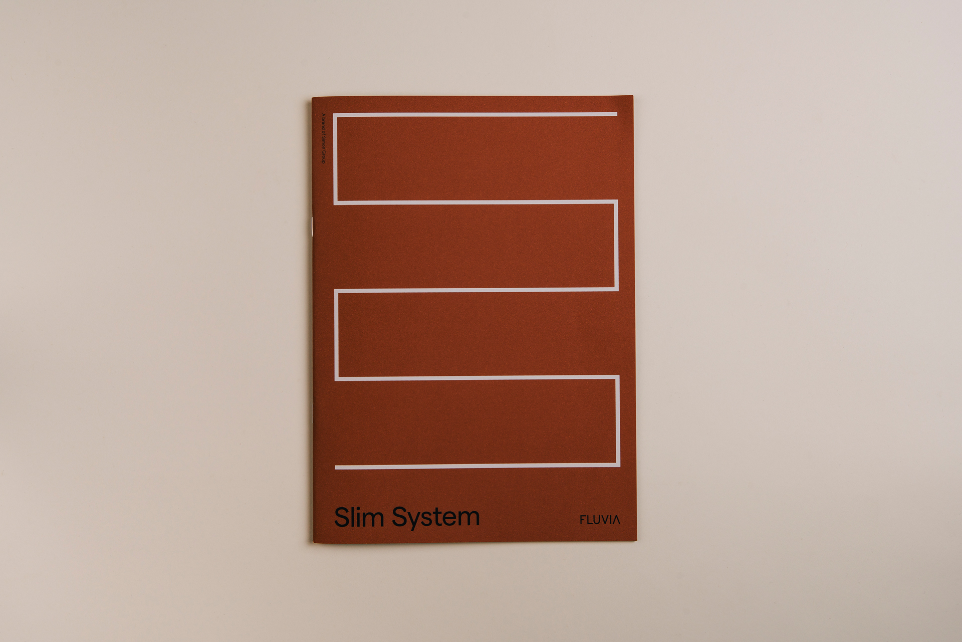
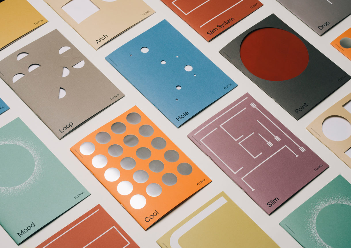
Every light has its own identity and personality so we wanted to capture this essence through the design of the catalogue. Using a warm colour palette and clever use of production techniques, alongside abstract illustrations, we brought individuality to every product.
Allie Heesh, Senior Designer
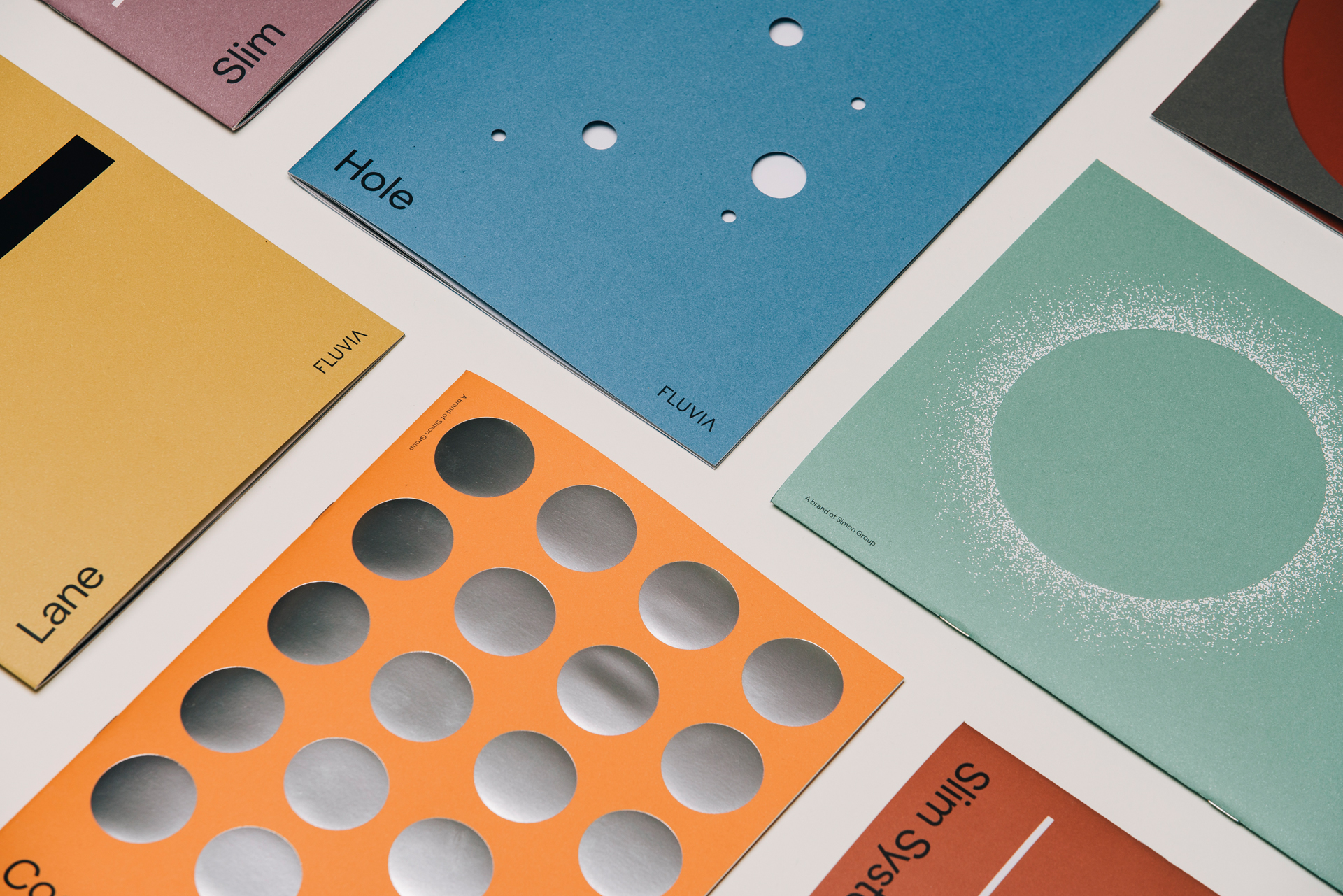
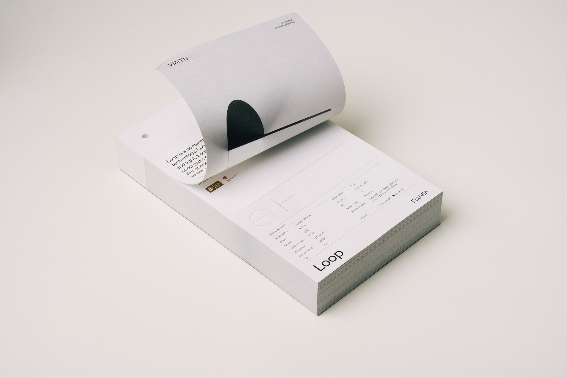
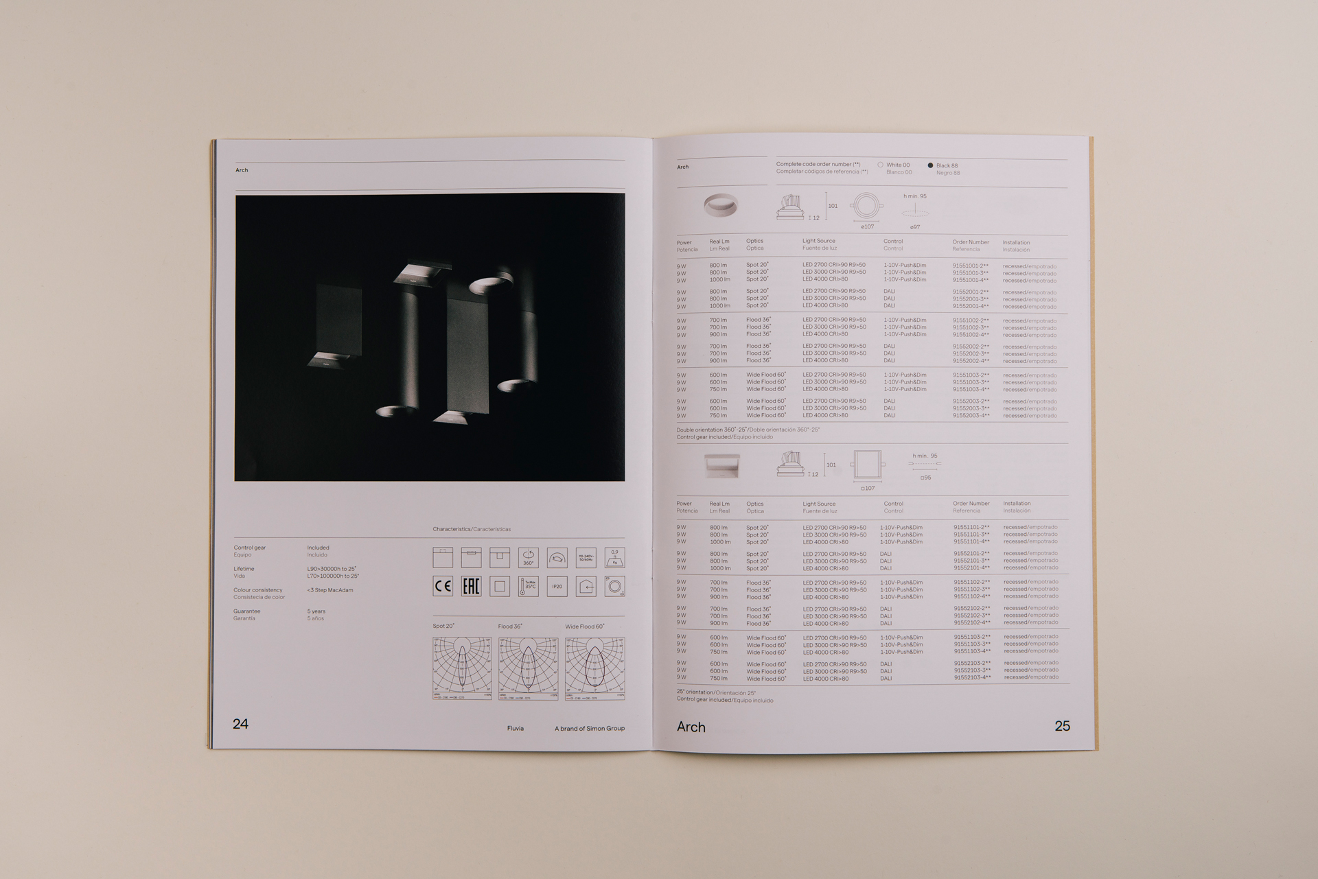
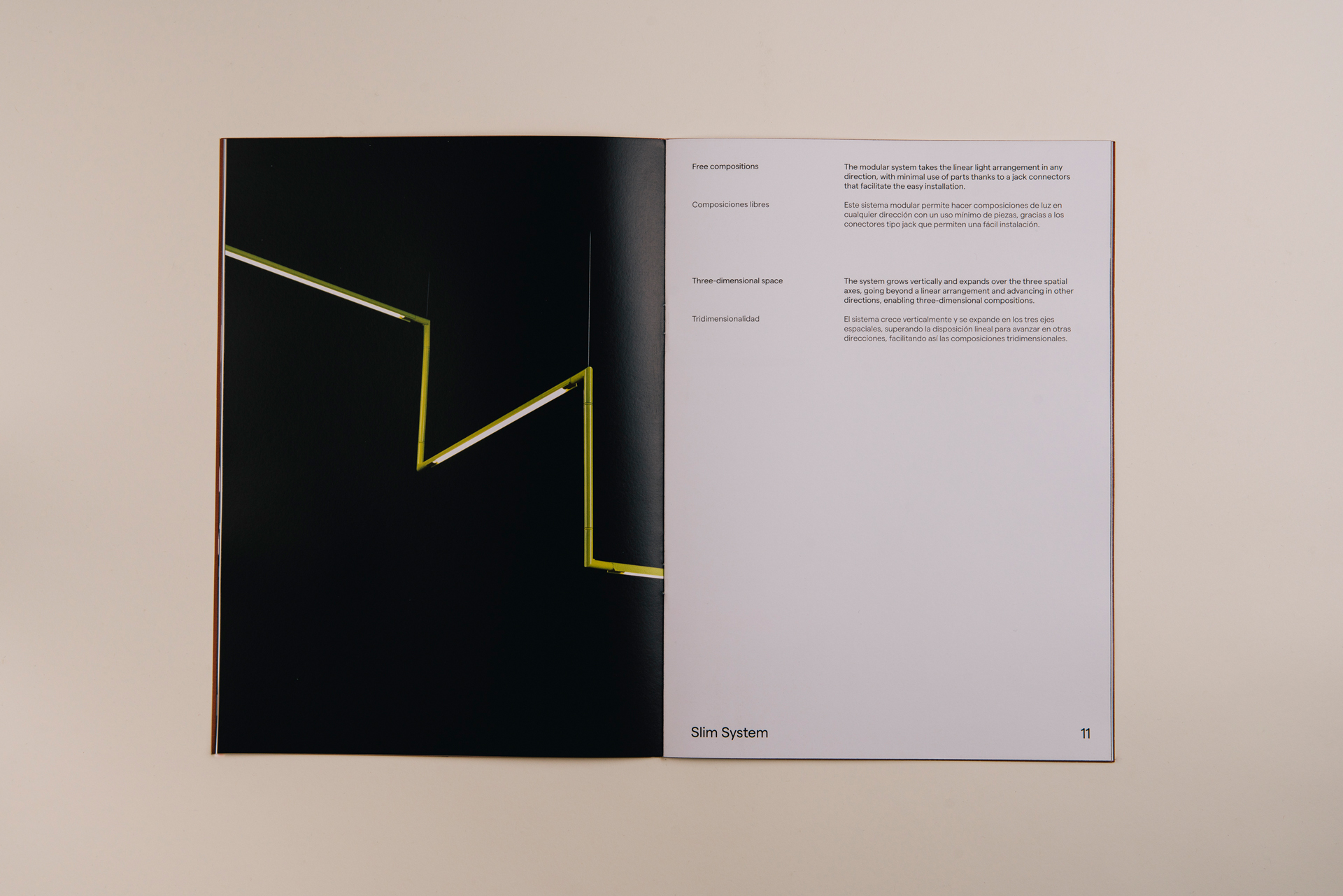
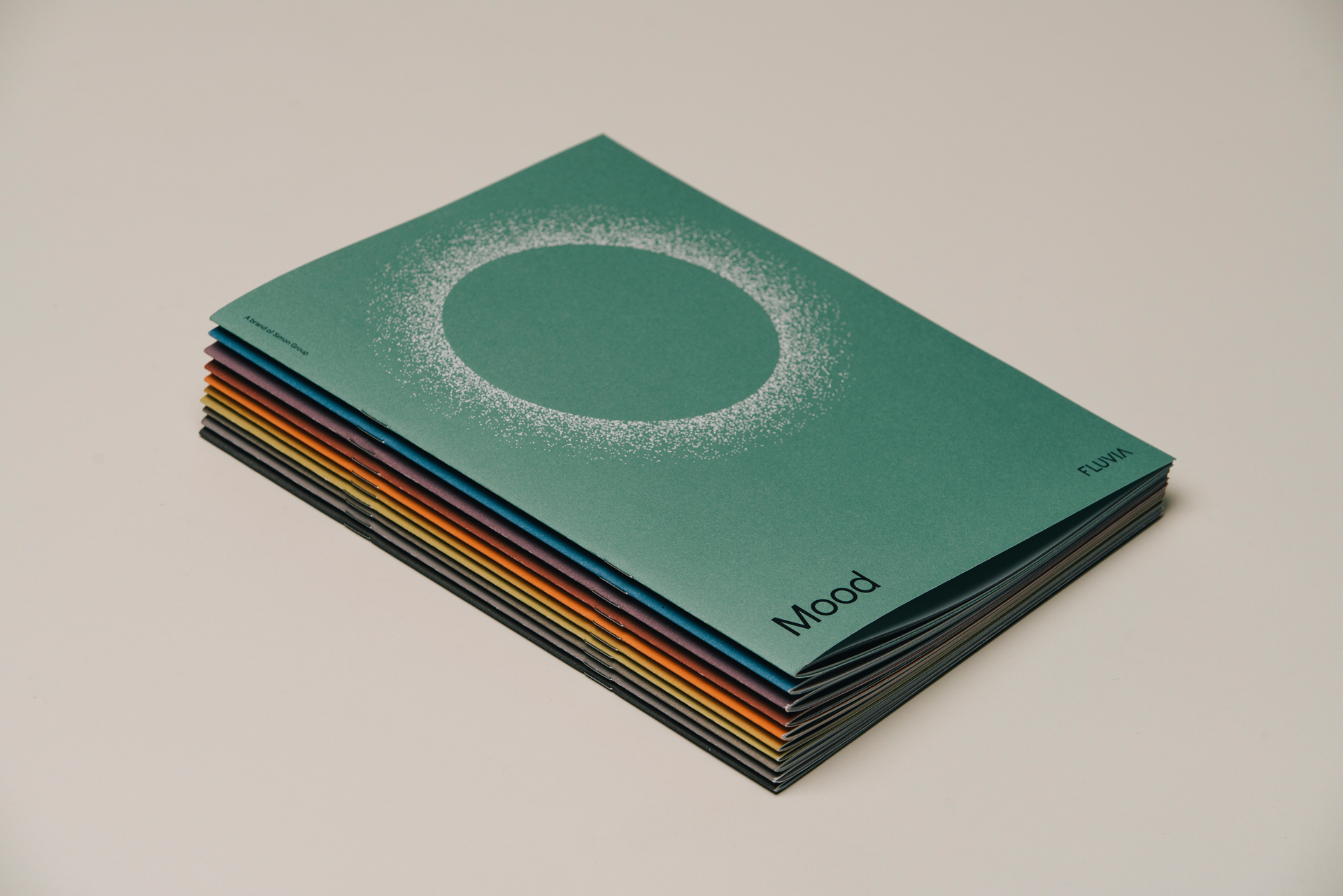
We wanted to make the catalog more desirable and give greater importance and individuality to the products themselves. Then we decided to split the catalogue into a series of mini booklets, each one for a particular product. The booklets, distinct in content and cover, are unified in the overall structure. The interiors have an editorial, balanced feel with graphic elements alongside single and double page spreads of the new images. The versatility of Matter allows us to create hierarchy amongst the technical information and differentiate the bilingual text. The result is contemporary, clean, and logical.
Defining products through abstract illustration
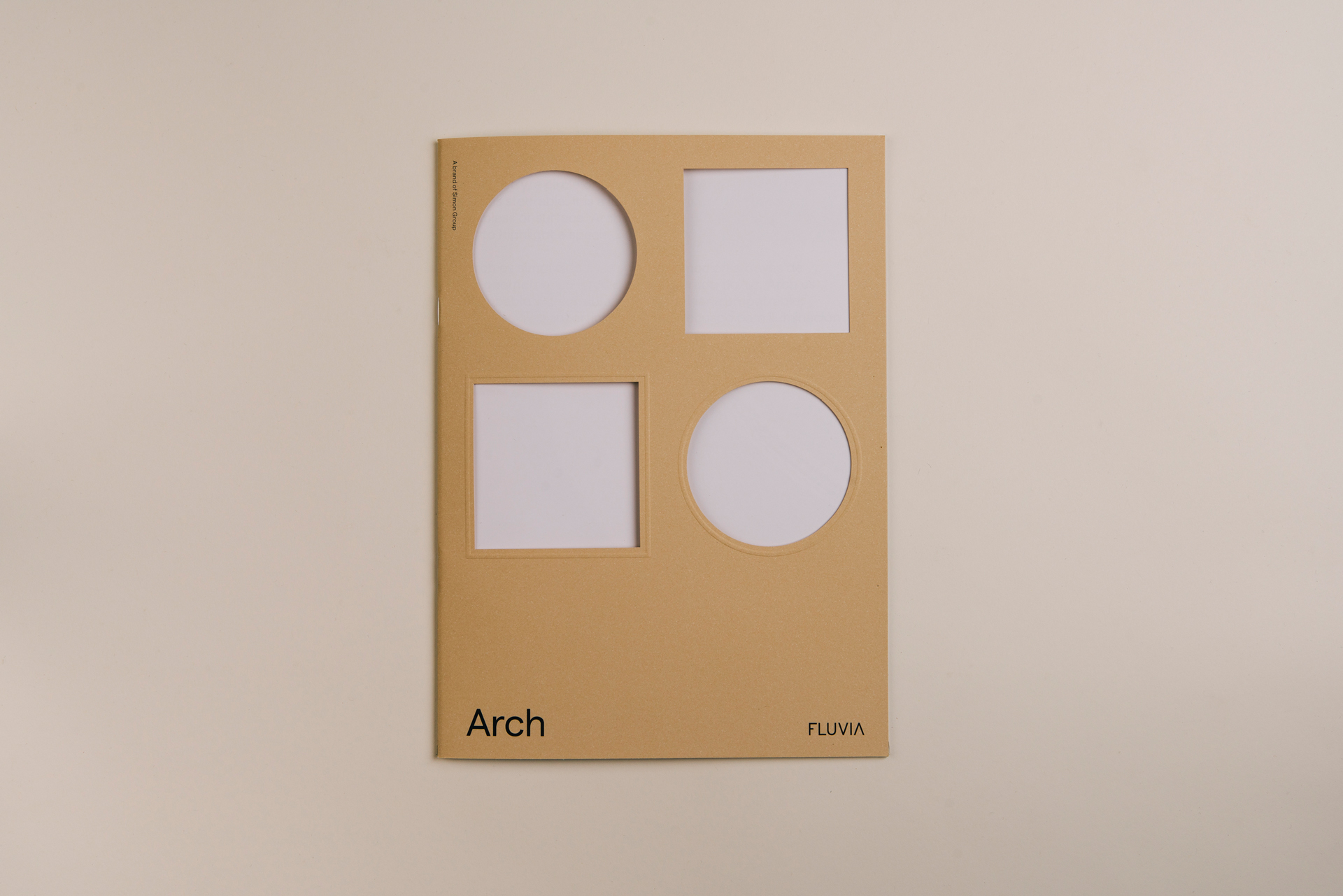
We also needed to rethink the materials and finishes to raise the perception of the brand. For the covers we played with graphic elements, following the geometry of each product and creating a unique abstraction of each lamp. In collaboration with Artifact, we explored different printing techniques, cut out sections of the paper, and experimented with embossing, stamping, and fluor. Each cover had a different colour, creating distinction characteristic to each design in the same way the products have unique personalities.
We generated a set of imaginary illustrations that abstract us from the product itself, but bring us closer to the characteristics present in the lamp.
Josep Puy, Senior Designer and Art Director
A digital ecosystem
For the website, we proposed a central homepage to introduce Fluvia, linking to a number of microsites – one for each product – which act as satellites and provide all the extra technical info about each design. The idea was to maintain the individuality and distinctness of the products within the brand, while connecting them to form a powerful, recognisable collective. The website navigation is designed with the same graphic elements found in the products themselves, such as simple lines and geometric shapes. This is a feature that we wanted to use across the Fluvia universe. The overall design is clean, simple and geometric, providing a sense of harmony and sophistication.
Packaging to reflect product
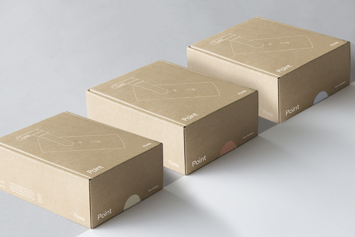
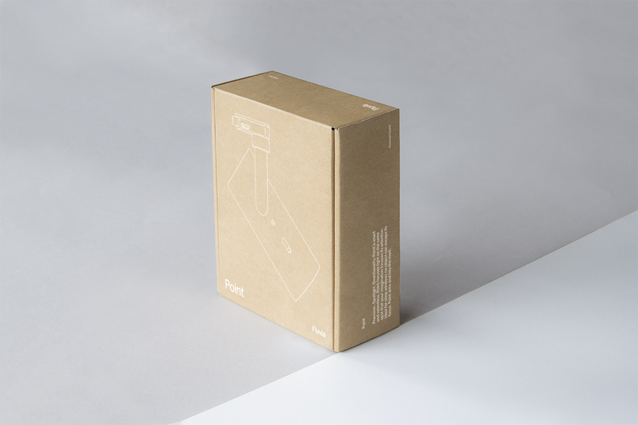
Fluvia’s packaging is unified through the use of typography and illustrations that show the products each package contains. The lights are packed in single layer micro-channel brown cardboard with black printing. After some initial analysis we felt that the product could be shown better on the outside of the packaging if we added a bit of volume to the illustrations, making them more iconic and recognizable. In addition, we proposed to improve packaging production, bringing the packaging closer to the quality and style of the product.
A unique, contemporary brand
Fluvia’s values have become implicit in the content and language of the brand, moving away from the concept of lighting and projecting a recognizable and current mood. Through art direction we are exploring new territories in the sector, creating dialogues and metaphors that link Fluvia to a more emotional environment and differentiate the brand from its competitors, at the same time as fixing the product in the minds of its target audiences. To further enhance the project, we also secured coverage in a number of graphic design blogs, including BP&O, Inspiration Grid, and Insight Found.
