Year: 2011-current
Tags: Art Direction and Design, Brand Narrative, Strategy and Design Thinking, Label design
A special co-branding venture
Some projects come up from unique and synergic combinations. The winemaker Salvi Moliner and the sommelier Sergi Montalà had a long and extensive experience in the wine industry and a strong desire of launching their own project. In 2008, they created Vins de Mas Sersal, a winery producing wines with his own style and at the same time identified with the DO Montsant from Catalonia. Salvi and Sergi happened to be friend with David Carabén, singer and songwriter of the Catalan indie band Mishima. Inspired by the lyrics of Qui n’ha begut, a song from the band’s album Set tota la vida (Thirsty the whole life), this special connection led to one of the country’s first cases of co-branding in the wine industry.
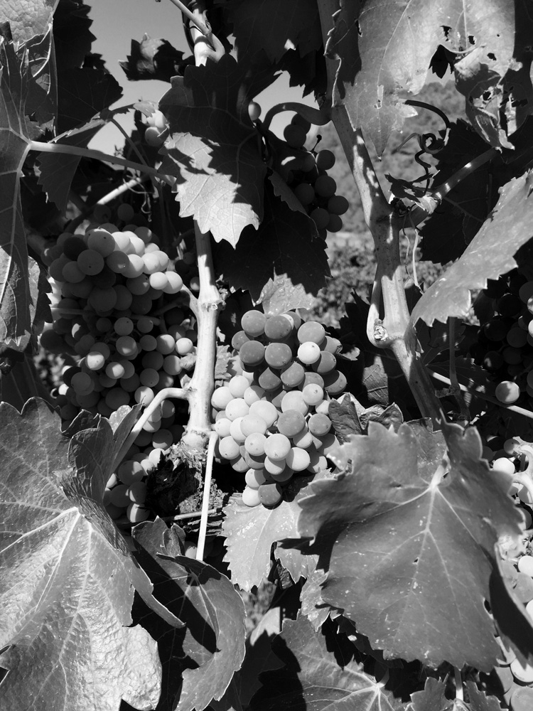
The Catalonian lands that give birth to the amazing grapes variety used for Estones de Mishima
Estones de Mishima
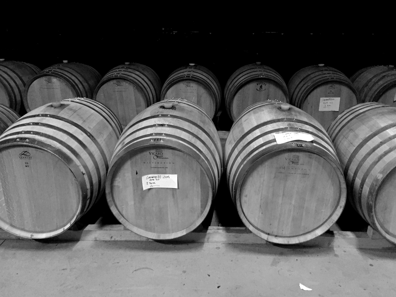
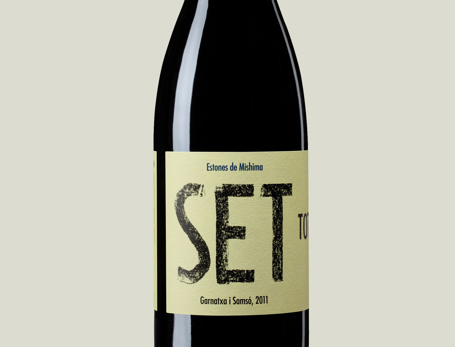
The collaboration between the Catalan winemakers and the band of David Carabén gave birth to a special and unique edition of Estones, a praised and successful blend wine: Estones de Mishima was born out of the mix of the most precious grapes from Northern Spain. This harmonic red wine is a blend made out of Grenache, Syrah and Carignan grapes, which ages 7 months in barrels. The name of the first production under the co-branding Estones de Mishima is Set tota la vida, named after a line from the band’s album which inspired the collaboration. Being us long-time collaborators with Mishima and the authors of that specific album sleeve, we have been entrusted of designing the label for the wine in order to establish a graphic fil-rouge with the album.
Organicity, synergy and cleanness in design
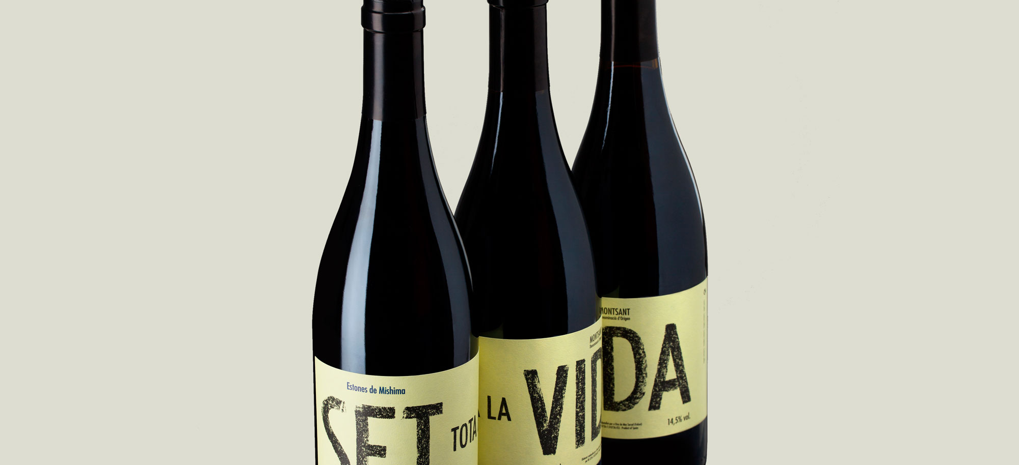
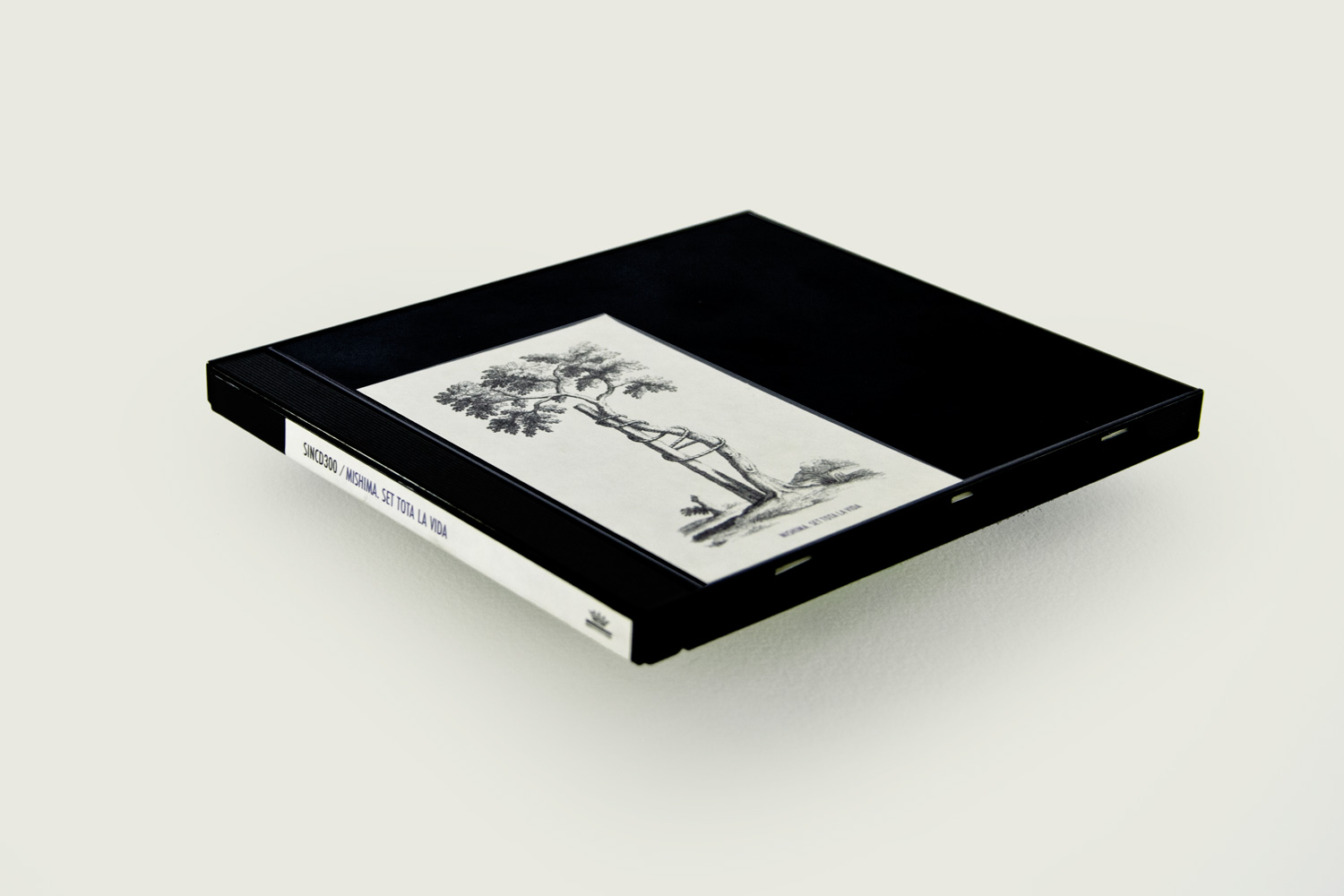
The artwork and the new wine label must breathe the same air. The album cover we had designed for Set tota la vida featured an ancient engraving representing a straight stake tied to a crooked tree, from the frontispiece of Nicholas Andry’s Orthopaedia. We wanted to establish a connection between the two pieces but we also had decided to maintain the label just typographic: we chose to reproduce the density of the cover engraving within the typeface used for the name of the wine. Set in Futura Condensed —as it was the typeface used in the sleeve— the script immediately resembles the feeling of the album cover while giving humanity and organicity to the label.
The cover sleeve for Set total la vida (Mishima, 2011) that inspired the labels design.
Black chalk did well for us: the lettering Set tota la vida stands out for its great dominance on the label.
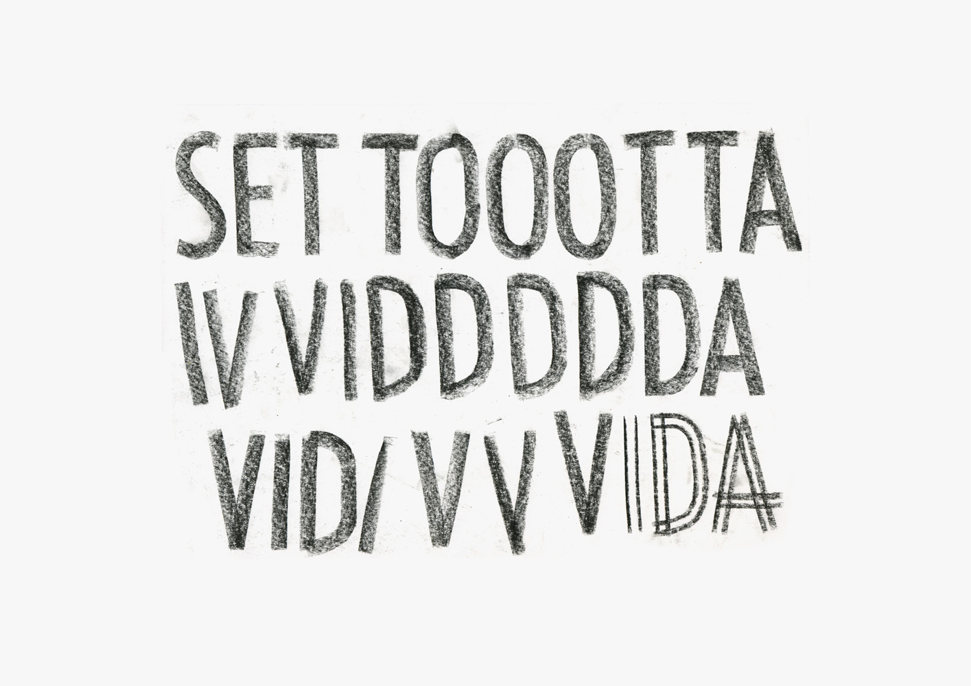
Some sketches from the design process.
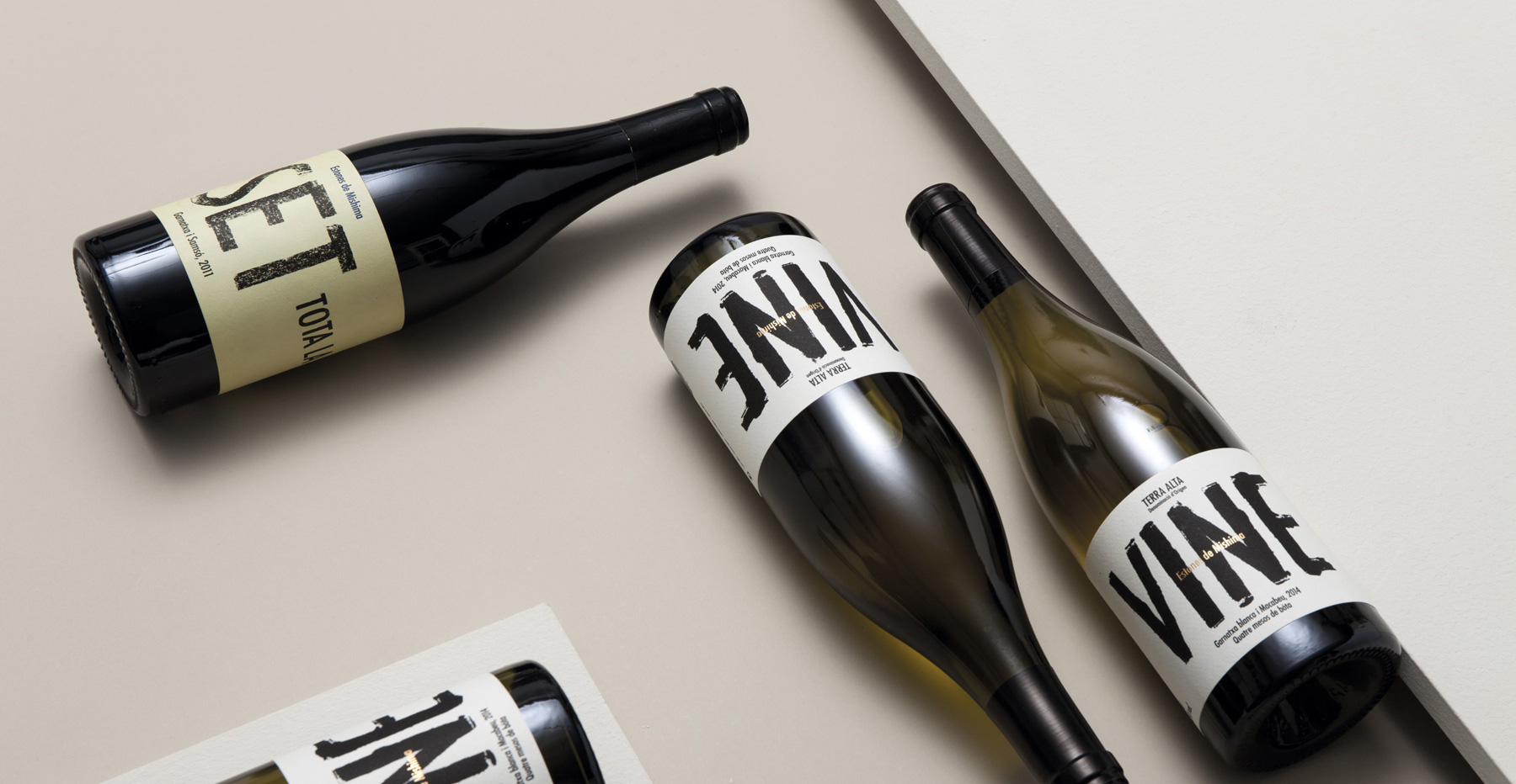
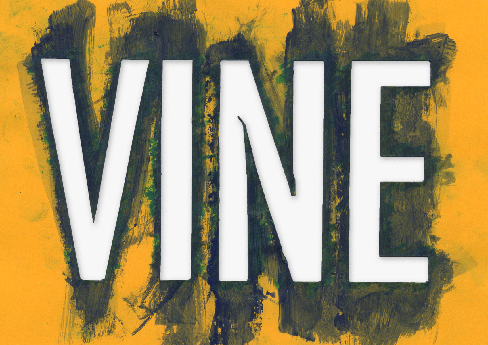
The first year’s Set tota la vida production sold out completely and gained diffusion on media such as La Vanguardia. Following the success of the first release within the name Estones de Mishima, a second wine was produced: a bright complex wine, slightly fruity and delicate balance of White grenache and Macabeo, called Vine after the song by the Carabén’s band. For the Vine label we wanted to follow the same path and reproduced the title in Futura Condensed with Indian ink. In this case, we seeked a counterbalance to the manual typographic gesture: we compensated the sketchy title with an elegant and minute golden stamping, overlapping the title itself. Bright tones and a clean composition are a common denominator for the two labels.
