Year: 2015
Tags: Art Direction and Design, Brand Narrative, Creative Production, Strategy and Design Thinking
-
 Share
Share
2,956 views
As a letter in the mail
Sébastien Planas is a philosophy teacher. One day he laid his eyes on our biannual publication ‘Odiseo’ and got in touch with us. Besides teaching philosophy for high school students, Sébastien has a great passion for books, art and films. Preferably combined. This passion has resulted in an independent bookstore in the old neighbourhood of Perpignan where he sells books and magazine related to art. And last, but not least, he is the director of the Festival International du Livre d’Art et du film, popularly known as FILAF, held in the historic centre in the south of France. For several days, the public has access to an international selection of books and films via screenings, lectures and meetings with authors. Furthermore the annual festival releases a publication in conjunction with the event in order to present emerging and established artists, writers, filmmakers and other creatives. Going back to the beginning of our story, ‘Odiseo’ came as letter in Sébastien’s mailbox. He had a clear vision and did not hesitate to contact us regarding the redesign of the FILAF annual.
-
 Shareof
A new identity
After our first meeting with Sébastien we realised that we had to start at the other end. The identity of the festival had many different shapes and disguises and we all agreed that the key to improving the brand lied in a new, bold identity. A consistent yet flexible identity that could be applied to a broad spectrum of media with improved legibility and with the ability to reflect the pillars of the festival through an efficient and graphic form. The recognition and consistency had big importance in the first steps towards a new graphic identity system, still we wanted it to be evolvable and fluid. Inspired by the analogue photographic film stripe, a common determinator and recognisable object in the art industry, we started to discover our possibilities.
Identity development for FILAF, based on the repetition of a filmstrip.
An analogue repetition
Energised by the repetition of the frames of the film stripe we built continual horizontal messages with the condensed typeface Champion Gothic by the famed NYC foundry Hoefler & Co. The words became frames in an animated communication where the bulletin could be developed in colour among the black and white footage. The condensed Champion Gothic is accompanied by the geometric and clear shapes of Graphik, designed by Christian Schwartz for Commercial Type. The combination gives a solid expression to the identity, still a fluidity with possibilities of variations. As a ribbon, the identity can be applied horizontal, vertical or tilted on any image, communication piece or format.
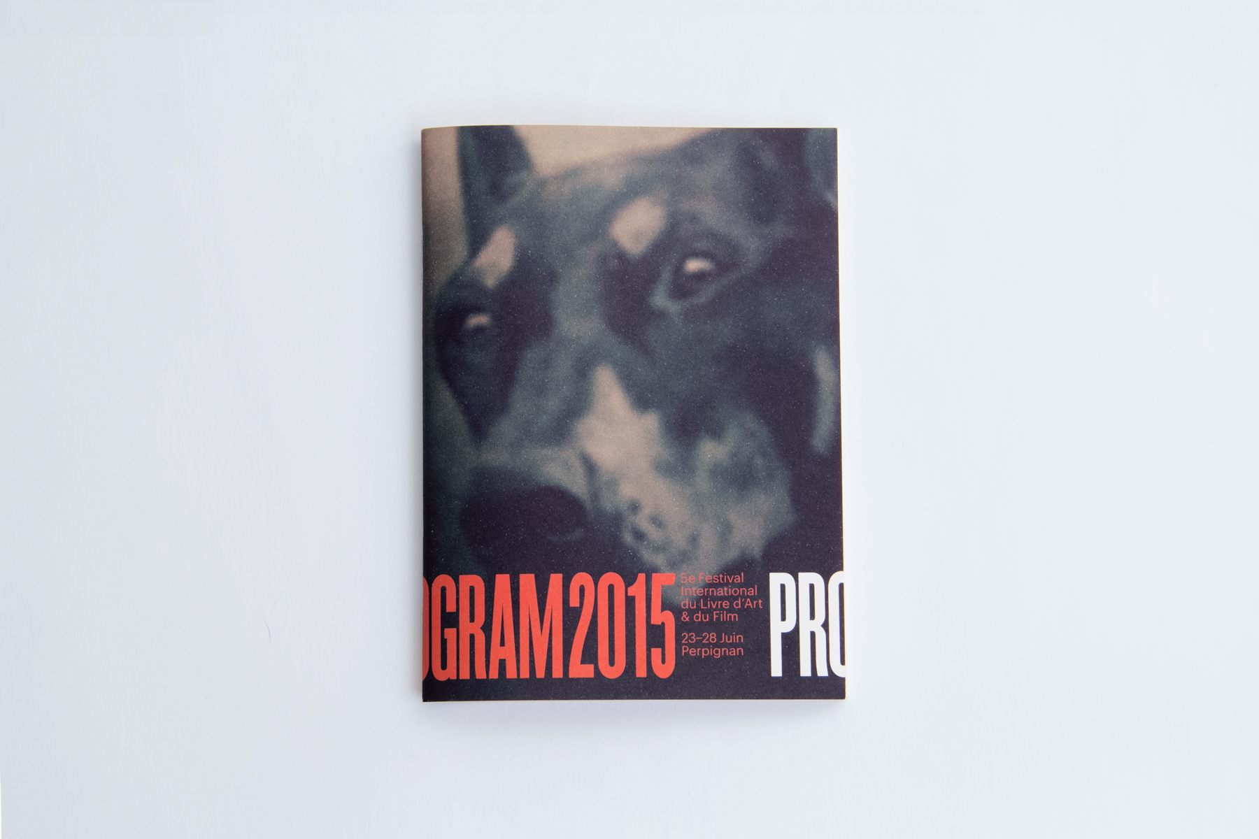
Program for FILAF 2015
For posters, leaflets and programs the identity is used through repetition, one representative colour for each year and the clear use of typography. The solidness of the identity was a requirement to be combined with any type of photography based on a continuity play.
In between a book and a magazine
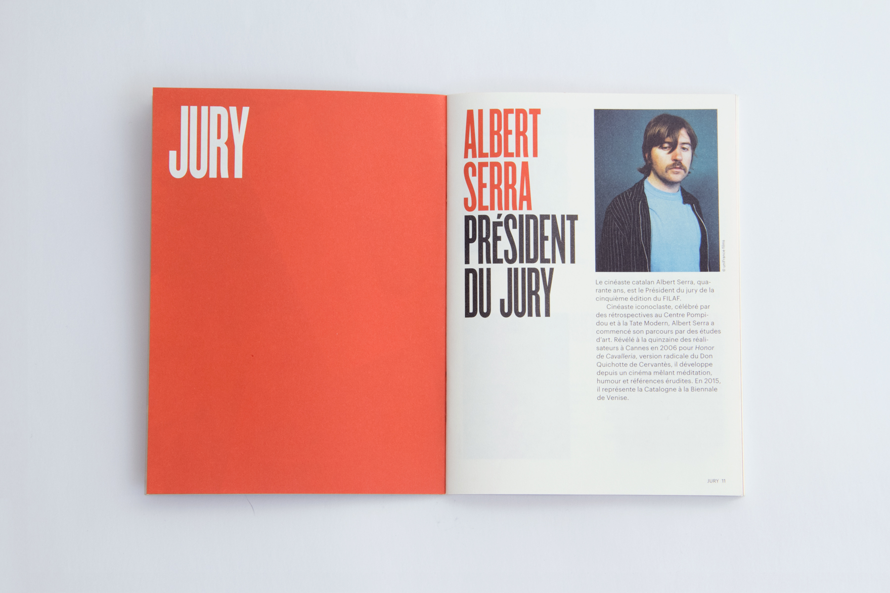
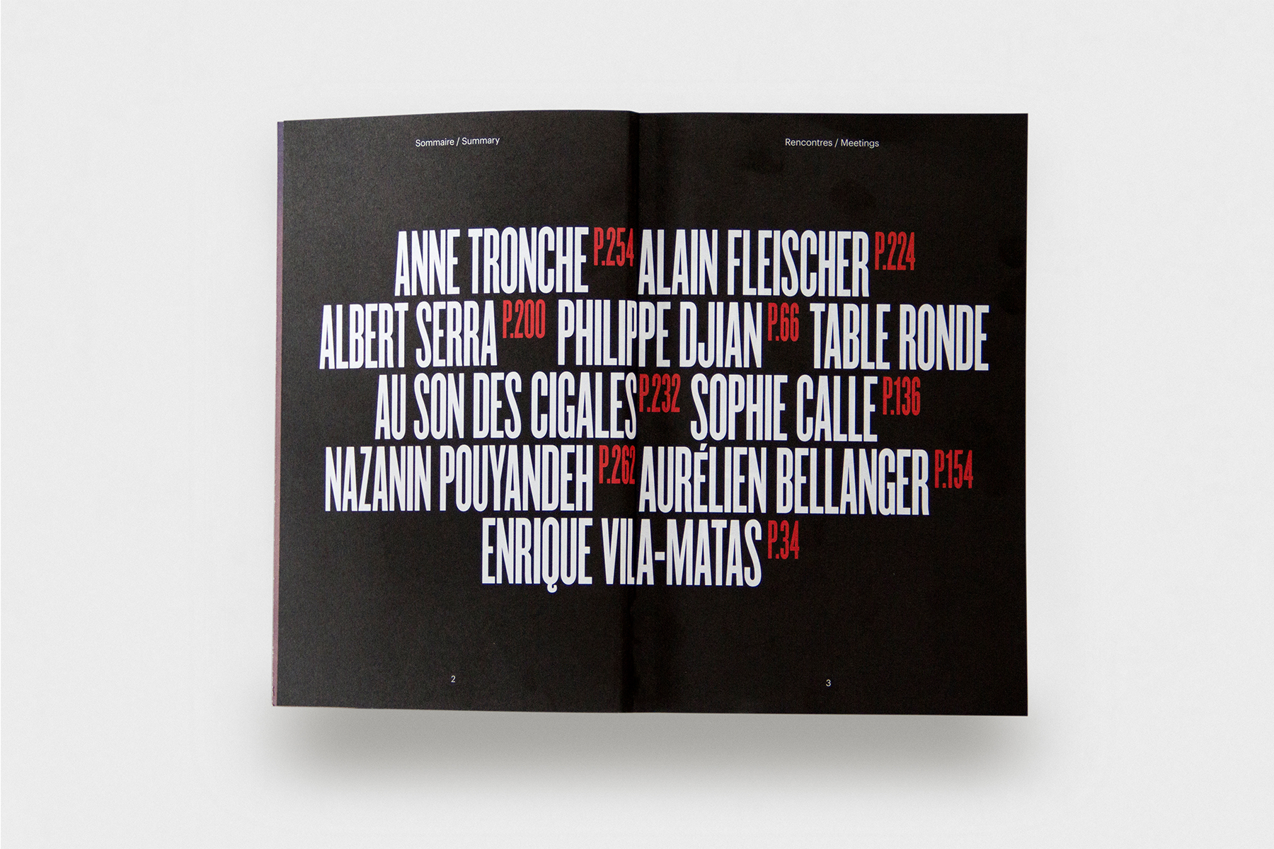
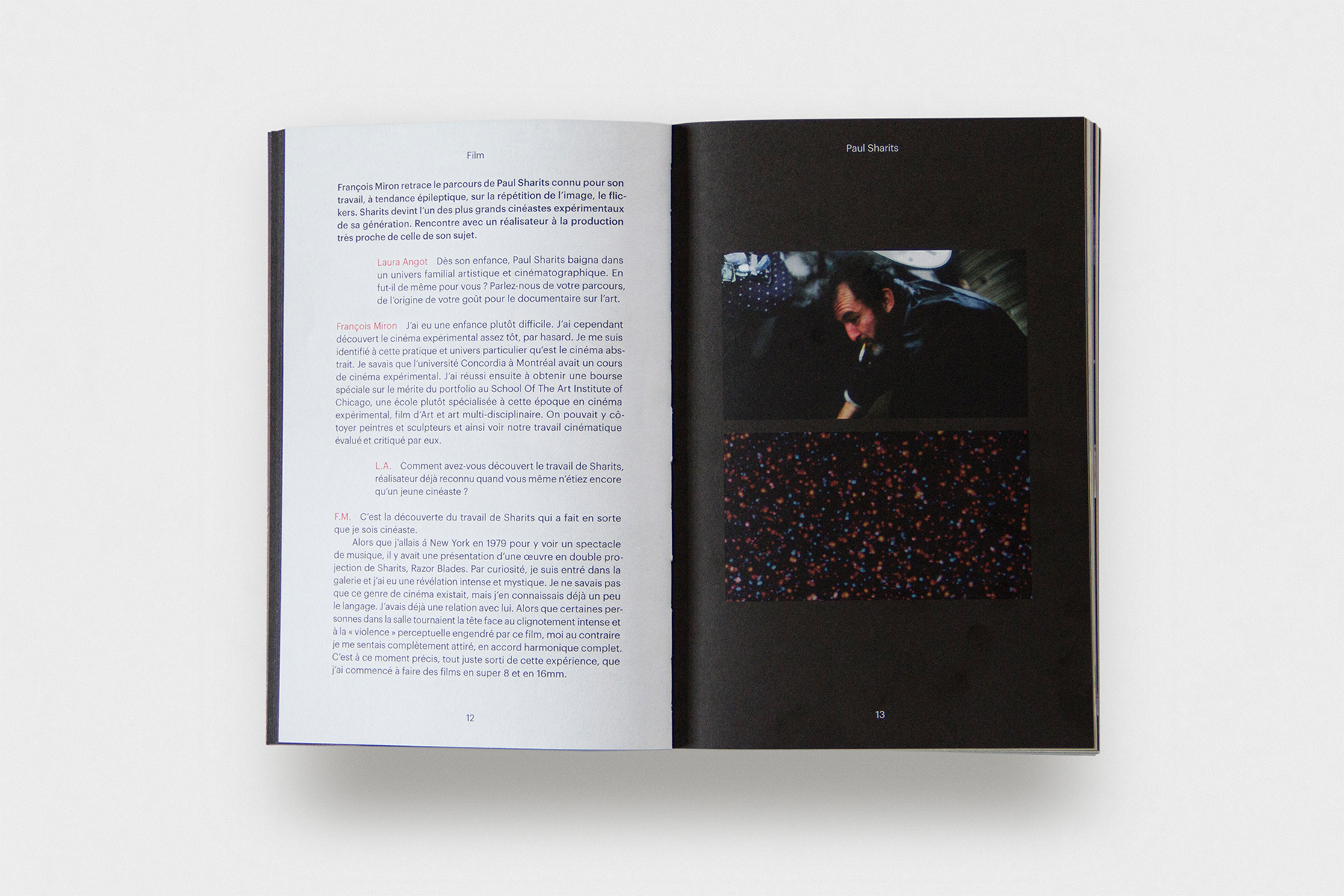
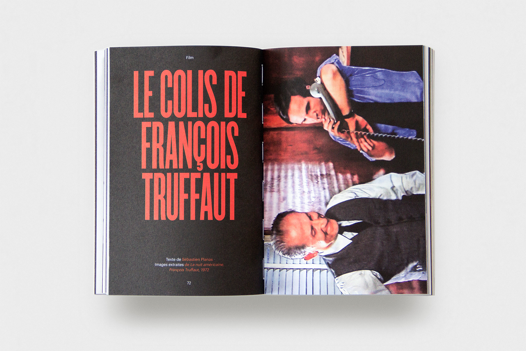
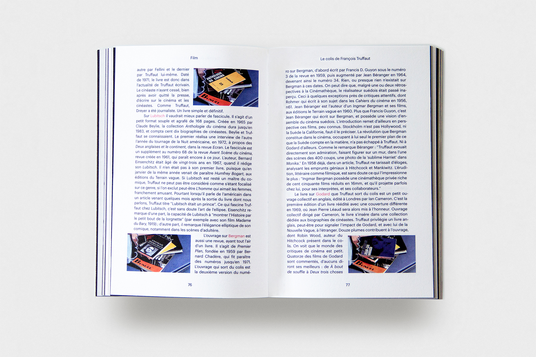
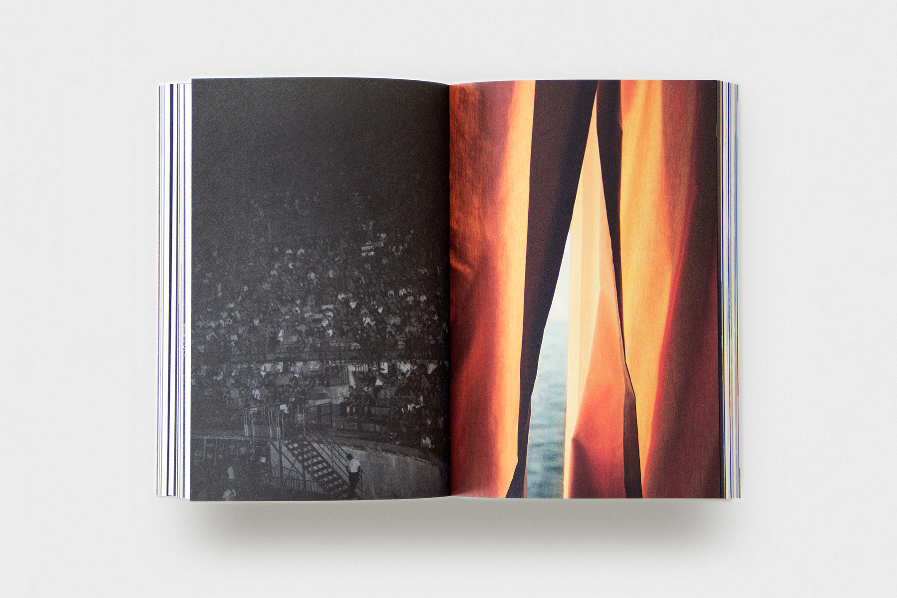
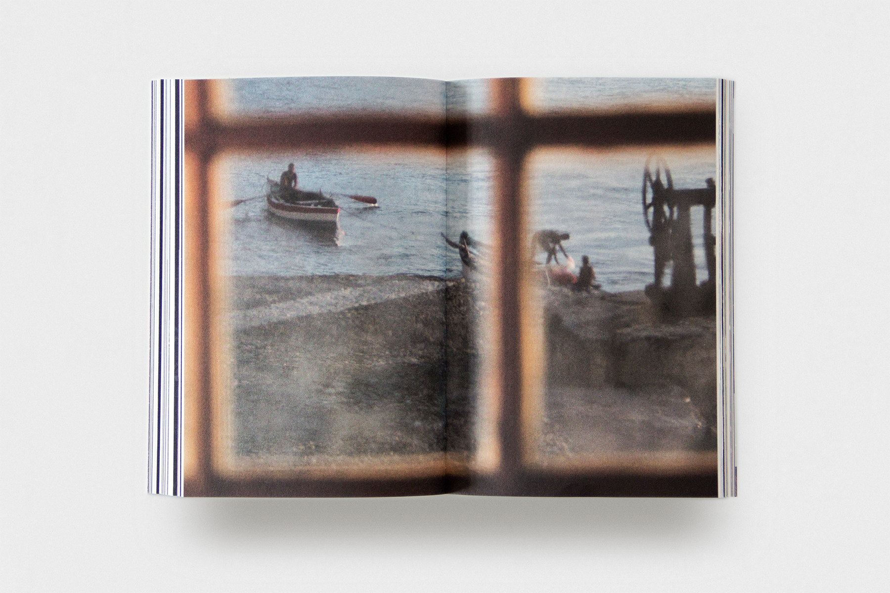
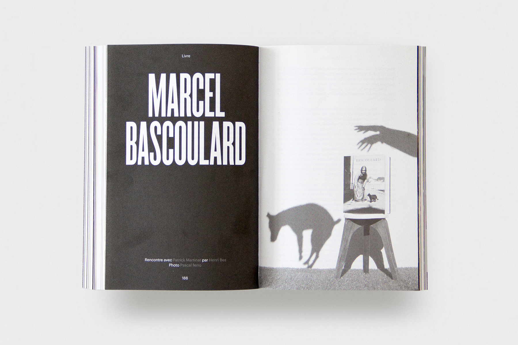
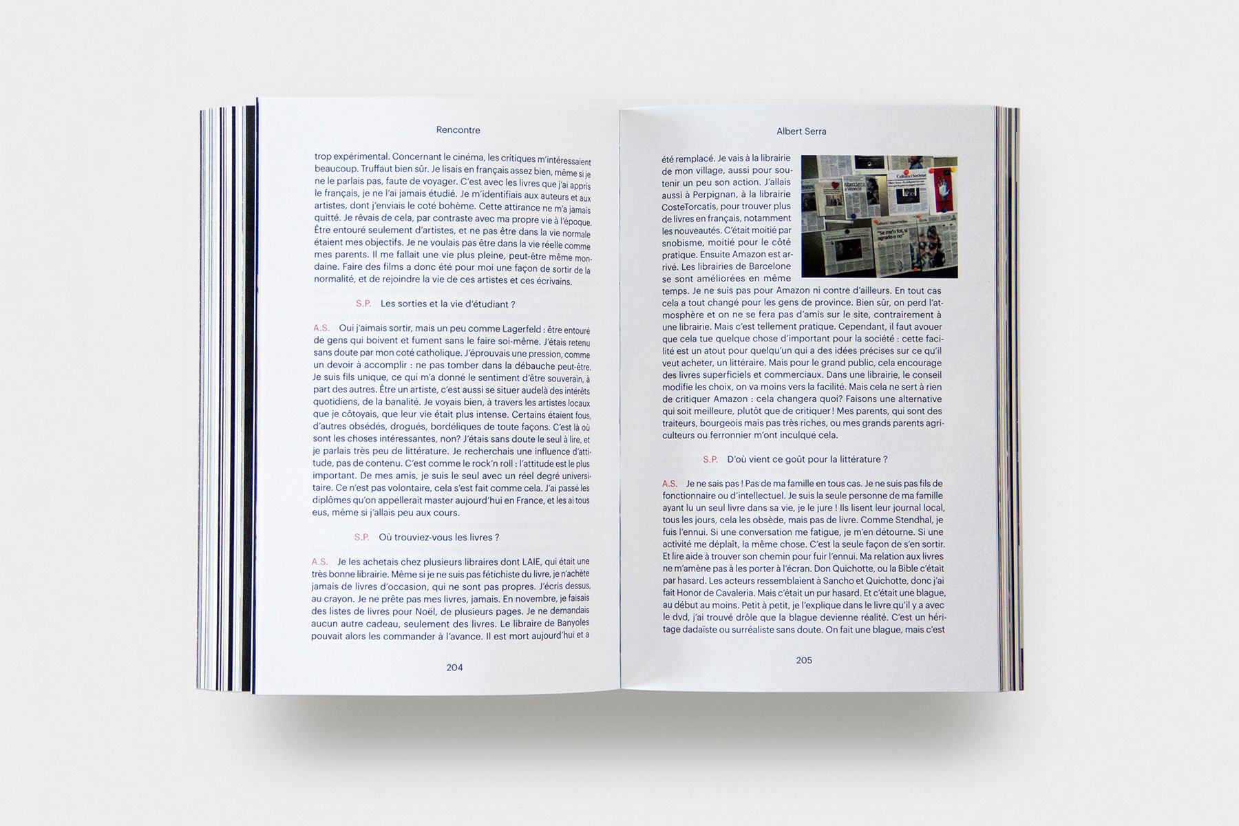
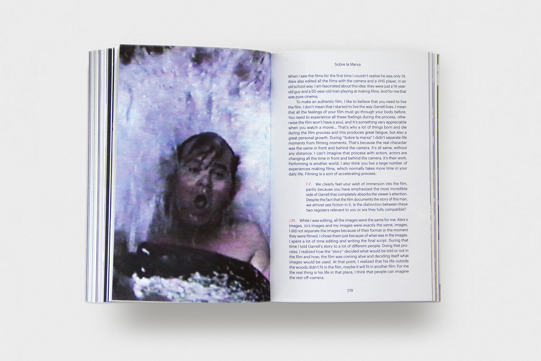
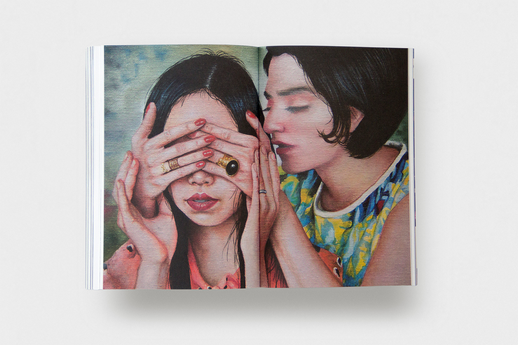
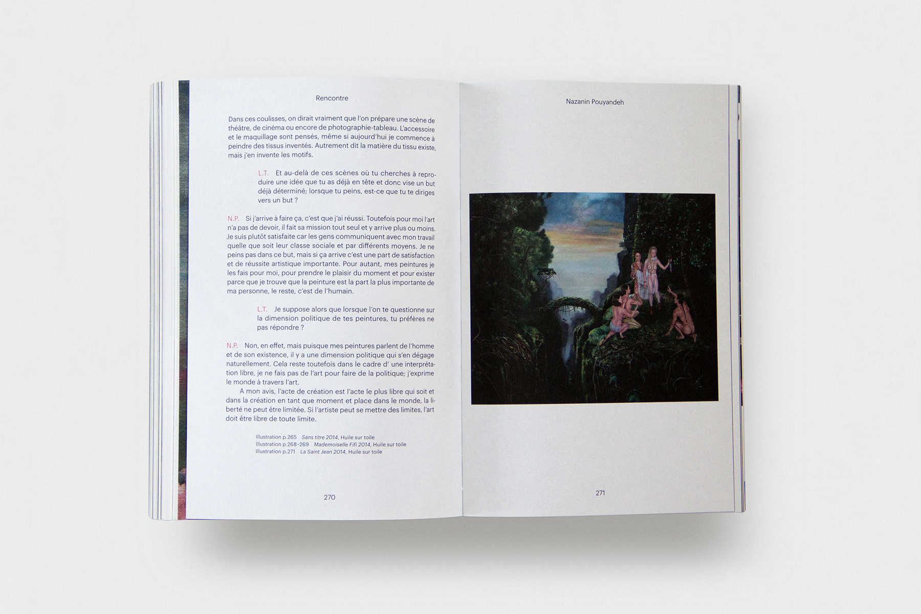
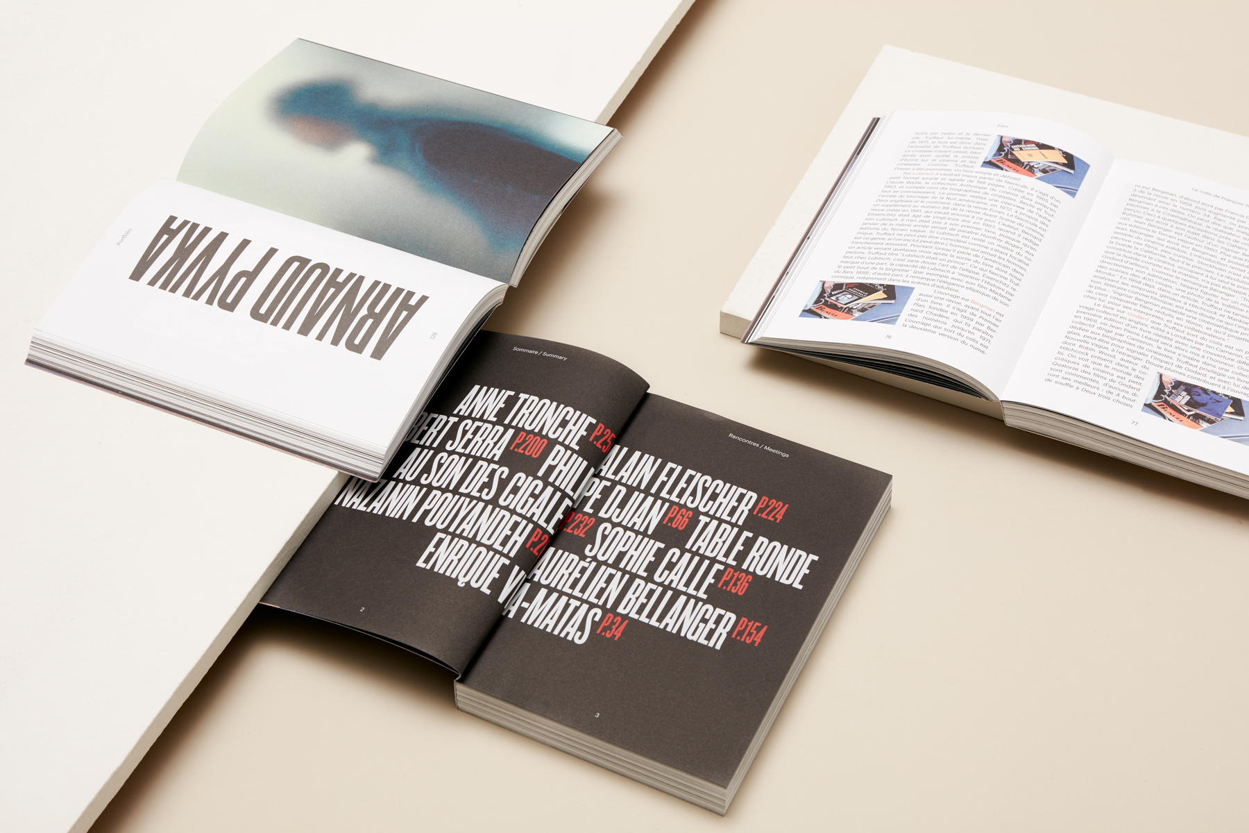
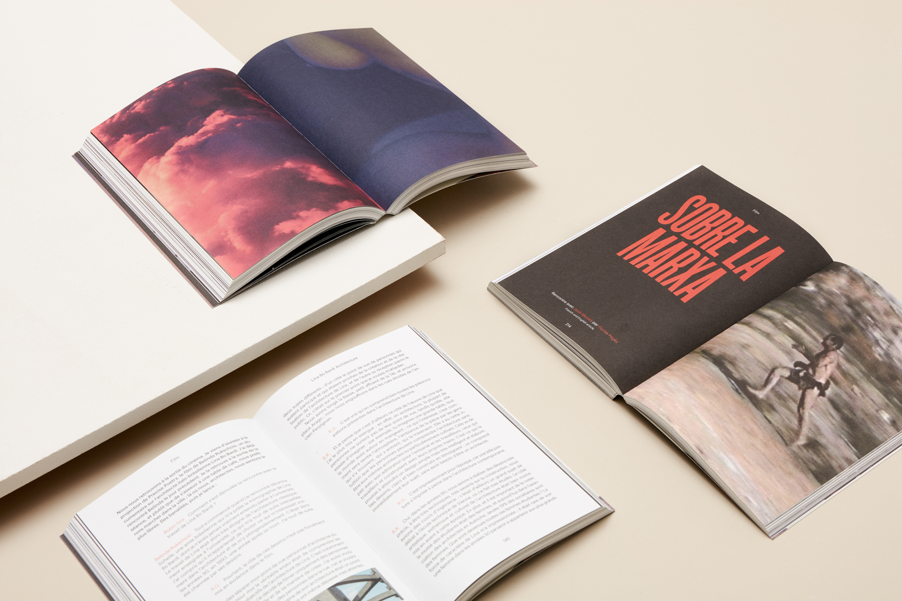
As soon as we had a fixed identity we got back to where we started––the annual. With Odiseo as a guideline, with its attractive compound of a book and a magazine, we wanted to reach a racy expression. We had a great amount of both visual and written content from excellent artistic personalities such as filmmaker Albert Serra, the novelist Enrique Vila-Matas and multitalented Sophie Calle among the contributors. The content was divided into four categories presented on the first index pages––conversations, portfolios, books and films were then mixed throughout the publication. To gain a good flow throughout the almost 300 page publication the articles from the sections are distributed separately. The opening page of each article is characterised by its category through the use of colour combinations and playful type treatments to give the reader guidance and a visually interesting experience. We tried to keep the production cost low and decided to print half of the page blocks in black and white and the other half in colour. Rather than this decision being a restriction, this structure allowed us to get a great balance between luminosity and crepuscule.
“The team of Folch combines two opposite qualities, which are rare to meet together. On one hand, everyone has a great creativity. During our work process, the most important thing for Folch was having a new idea and a free mind. On the other hand, the whole studio is really professional. Problems with time and material are always solved easily because of the organisation.” Sébastien Planas
-
 of
of
Leaving editorial stains
Still influenced by the idea of a blend between book and magazine the typeface Graphik is used for the text in a sizable point size, combined with the dense titles in the now corporate typeface Champion Gothic, in order to leave a legible editorial stain. Earlier editions of the annual were quite big and ungainly, to create a lighter and manageable format we chose smaller dimensions and the light high quality Munken print white paper, used throughout the whole publication.
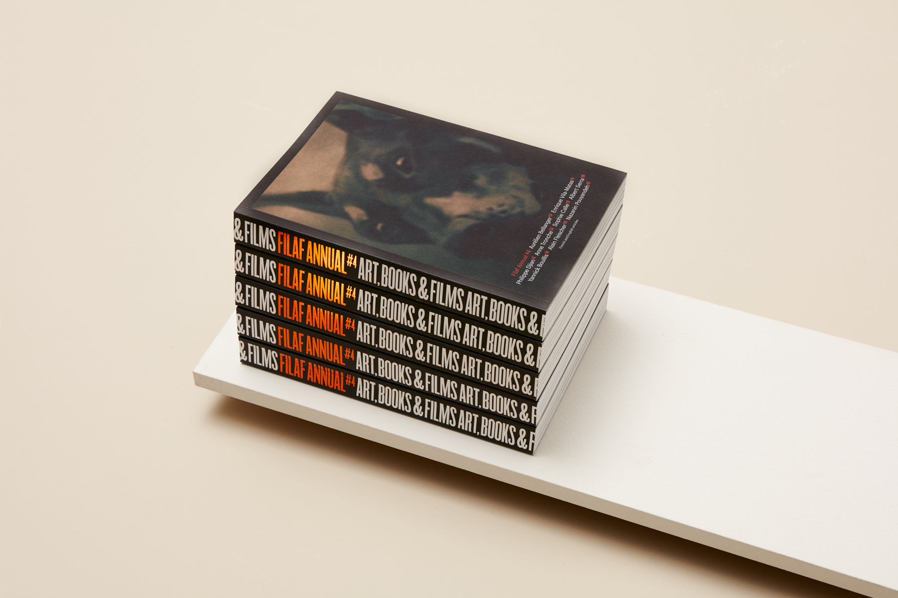
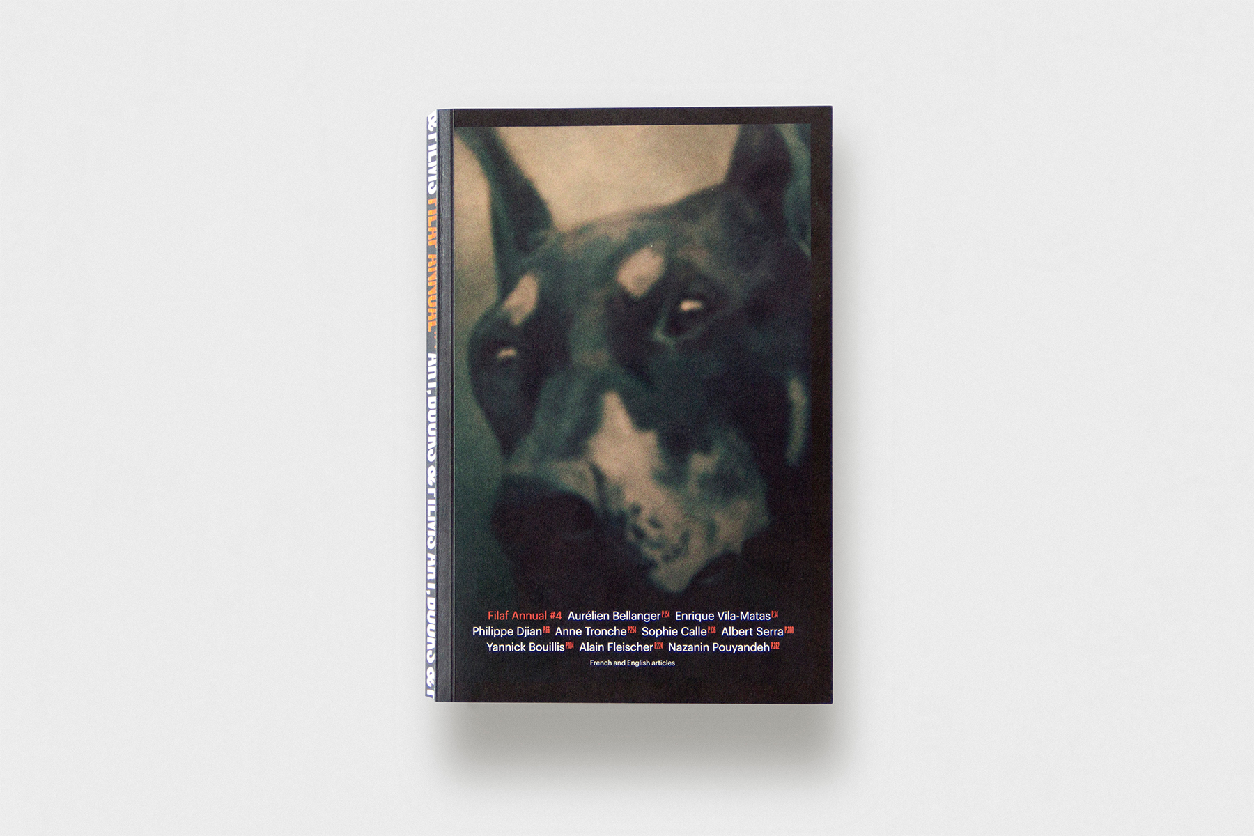
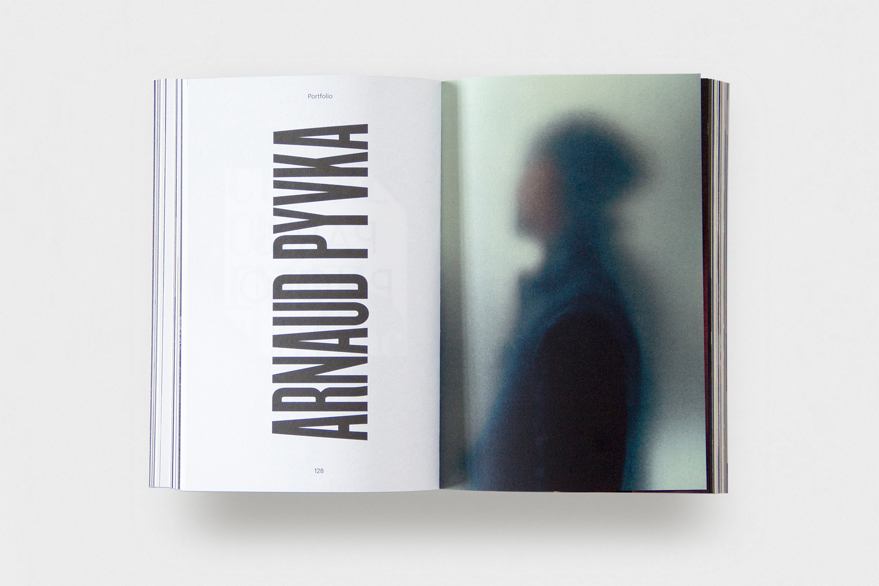
Arnaud Pyvka has been the cover photographer for the earlier annuals and we decided to continue with his expressful approach and extend his presence on the back cover and inside covers as an introducing portfolio. The identity stripe has been applied to the spine and FILAF ANNUAL #4 coloured in the orange of the years event with a foil stamping. The repetitive spine can develop through the typographic frames and create a coherent animated collection.
“Sébastien was charmed by Odiseo and its meaningful harmony between content and form. It wasn’t just about well designing and editing content, but it also involved creating a specific context which would make for a pleasant reading experience. Sébastien wanted the FILAF Annual not just to be well-designed: he wanted it to be sexy too.” Albert Folch
-
 of
of
A project close to the heart
For the launching of the publication FILAF #4 Albert Folch drove up to Perpignan to participate and give a speech for this special occasion. This important professional relationship has grown to become a project close to the heart. Even though FILAF is an independent festival, the importance in its niche is significant and is now a highly prestigious award with internationally emerging artists, filmmakers and writers.


