Year: 2015
Tags: Art Direction and Design, Creative Direction and Filmmaking, Strategy and Design Thinking, Brand Journalism, Branded content, Branding, Catalogue, Concept, Identity
Creative idea by Folch Studio
Creative idea by Folch Studio
Our story with Marset goes back 8 years. Founded in 1976 in Barcelona, Marset is a lighting design company which has a very clear creative vision and a strong attention to innovation and detail. Their mission looks beyond the lamps and the physical appearance, taking care of light in its different nuances and effects. Having built a strong working relationship with the Team at Marset, with successful collaboration over the years, we thought the time had come to refresh the brand. Marset had continued to grow and develop as a lighting design company, positioning the brand confidently and distinctively within the lighting design environment. This lead us to sit together with Isabel Valle (Marset’s marketing manager), and her team to discuss the next steps that needed to be taken for the continual growth and progression of the company.
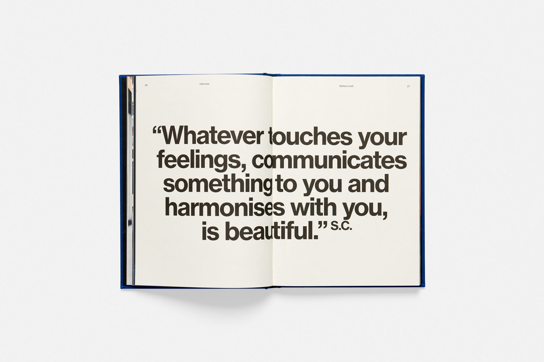
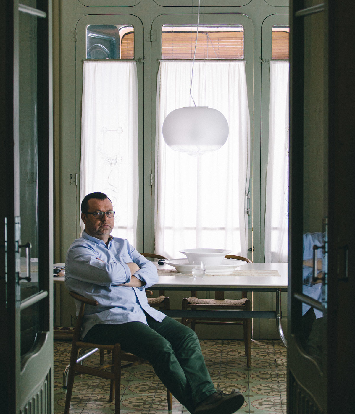
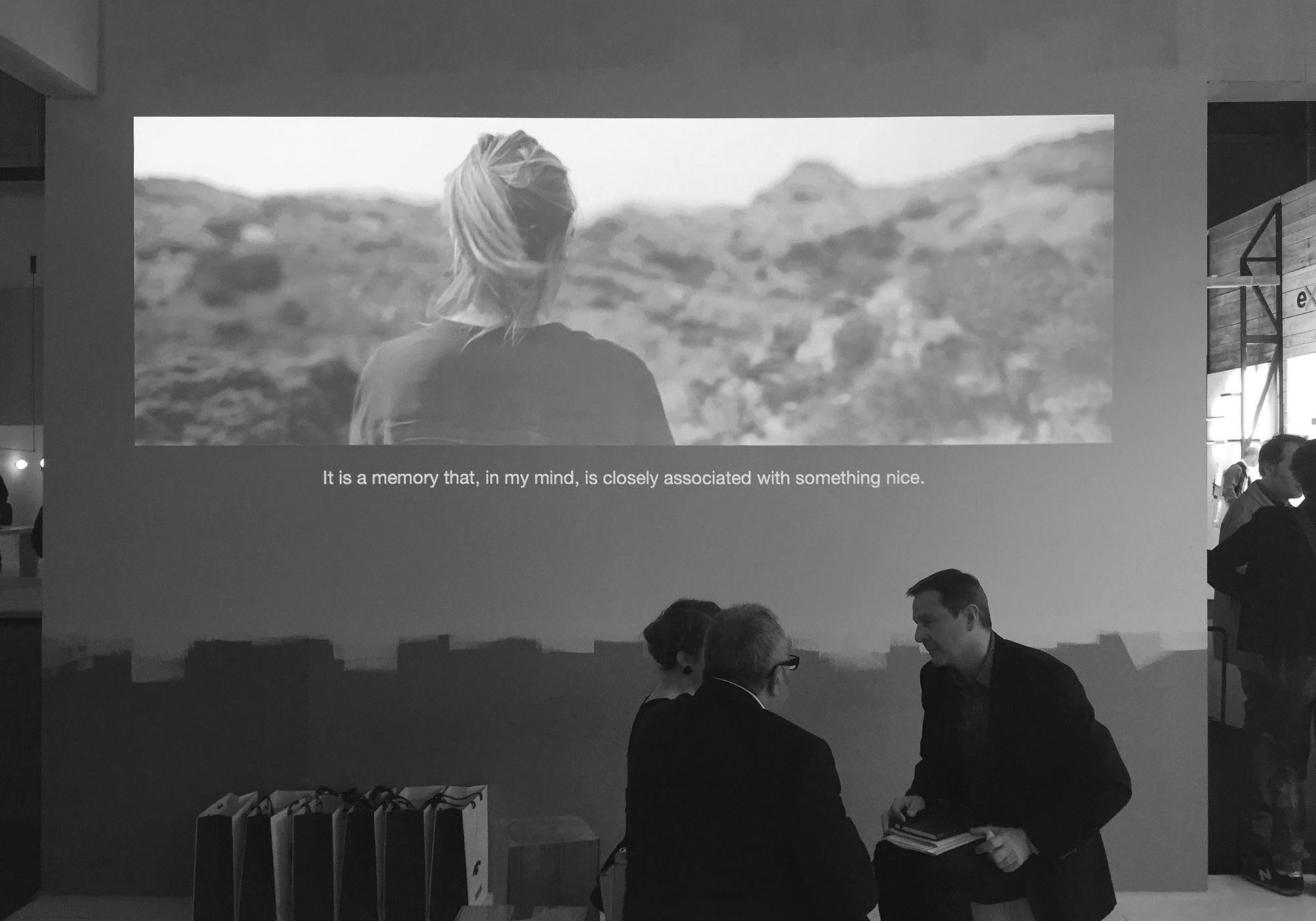
The integrated campaign “Reflections on light” was the final result of all this thinking. Aimed at highlighting not just the products but the people and the company behind them, the campaign was designed as an extensive cross platform process —following the concept of Editorial Environment— including a printed publication and a series of short films. The architect Stefano Colli and the industrial designers Joan Gaspar and Inma Bermúdez were called to reflect on their relationship with light. For the first time in the Marset communication, the products don’t play a protagonists’ role, but instead the focus is on the professionals who have built the brand.
The campaign revolves around conversations with architects, designers and artists who work with and think about light.
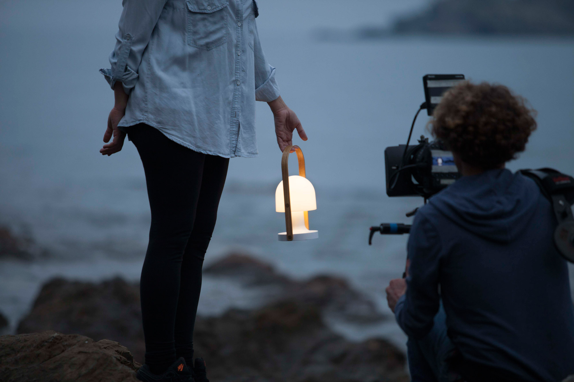
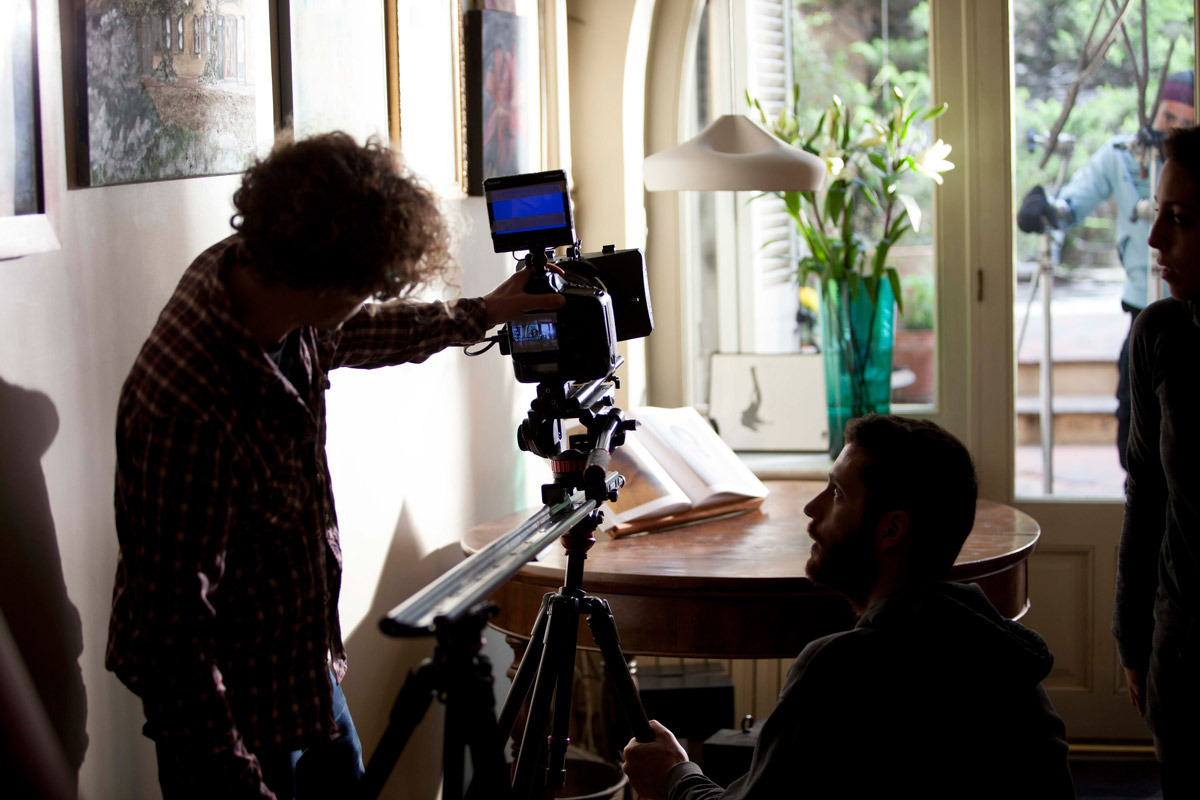
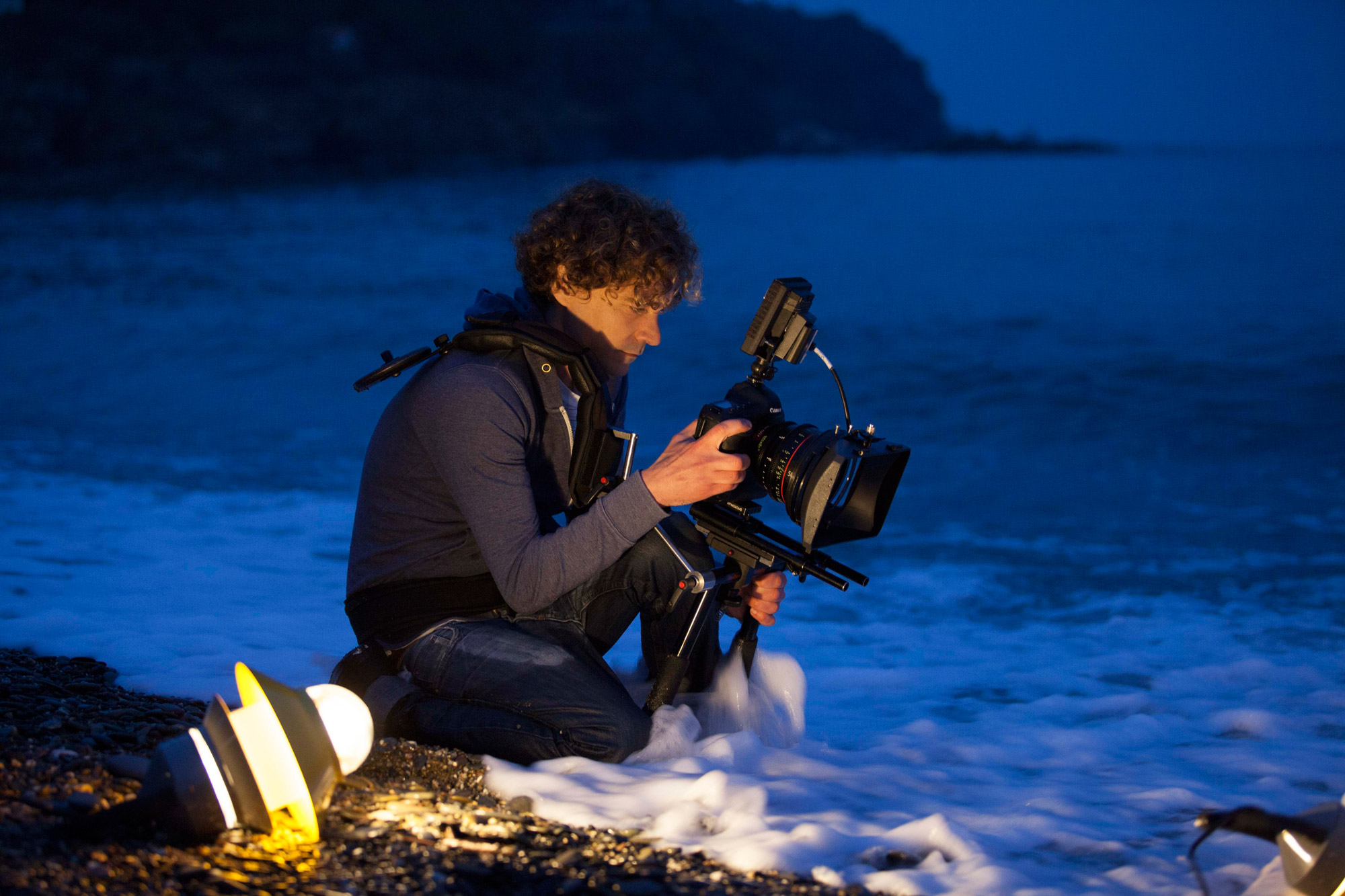
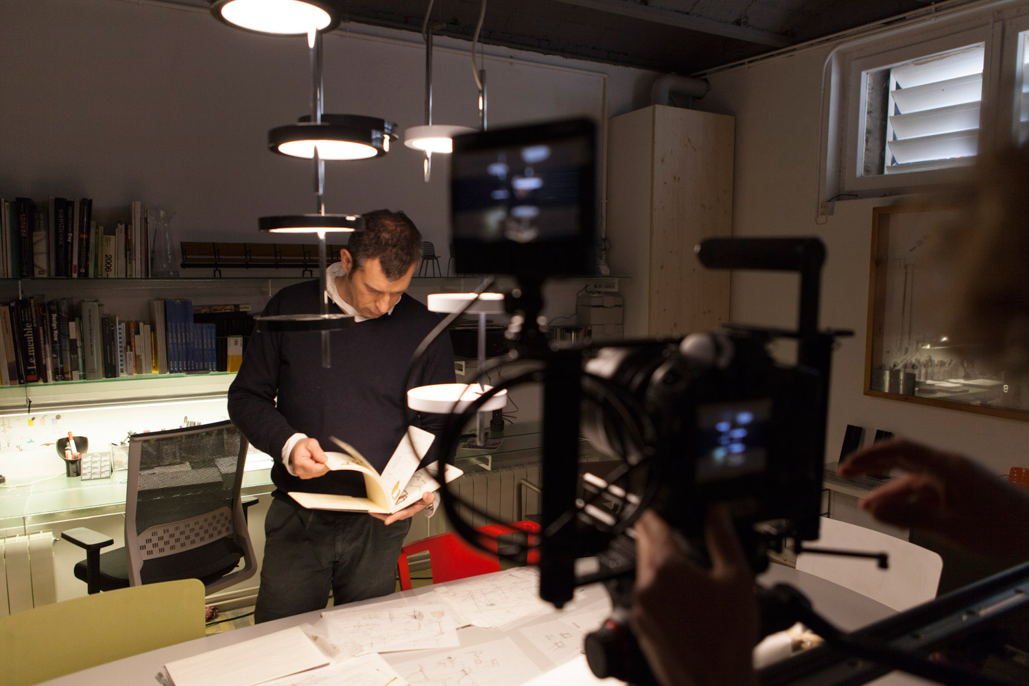
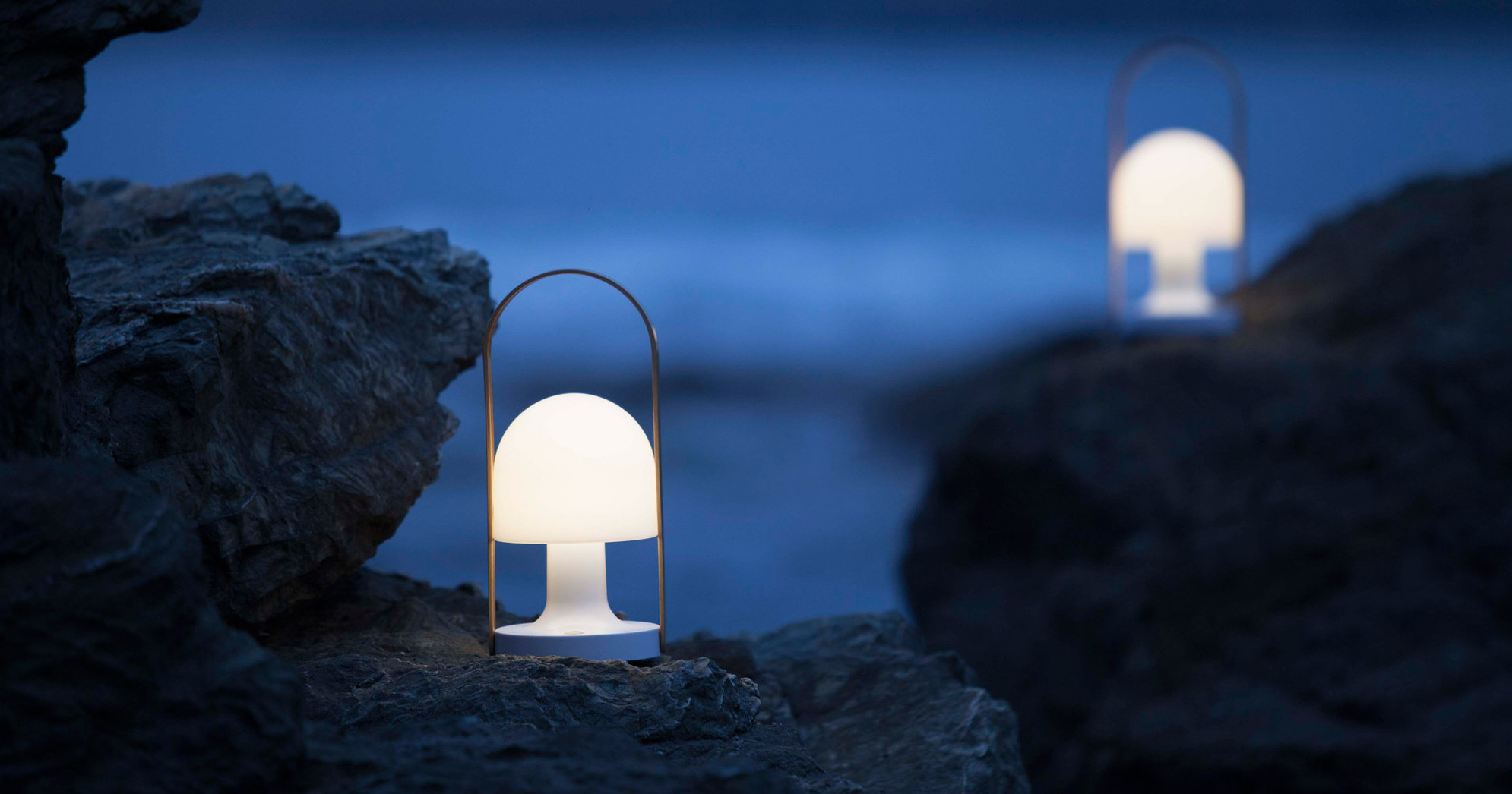
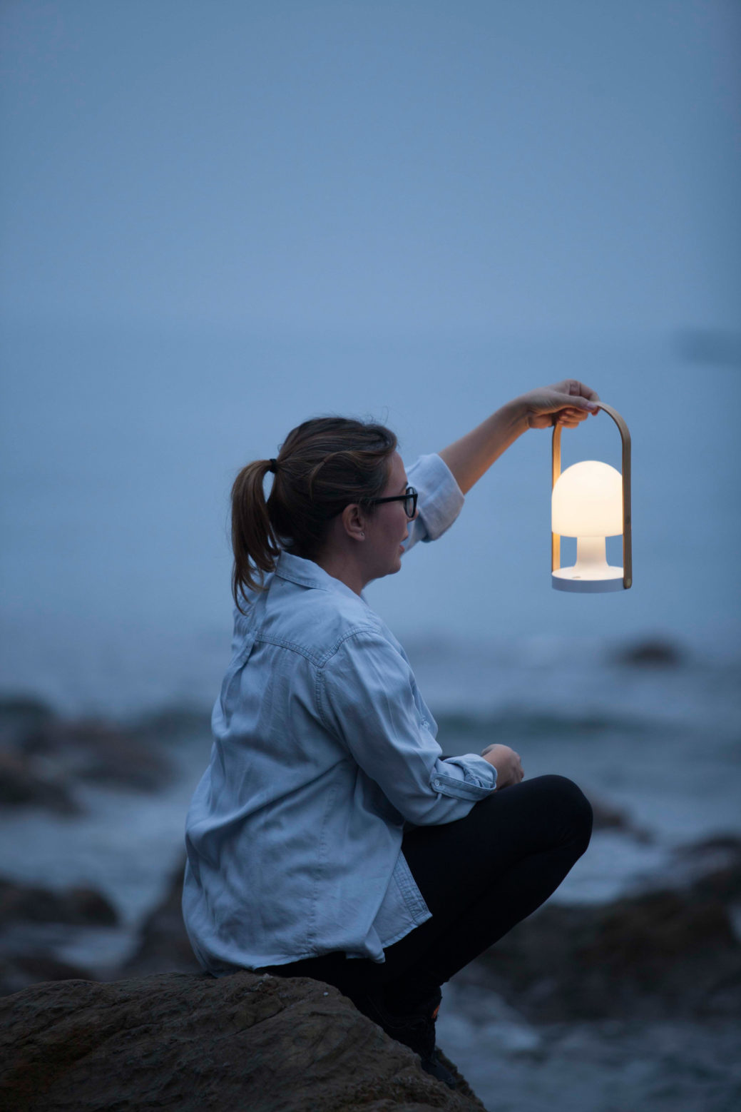
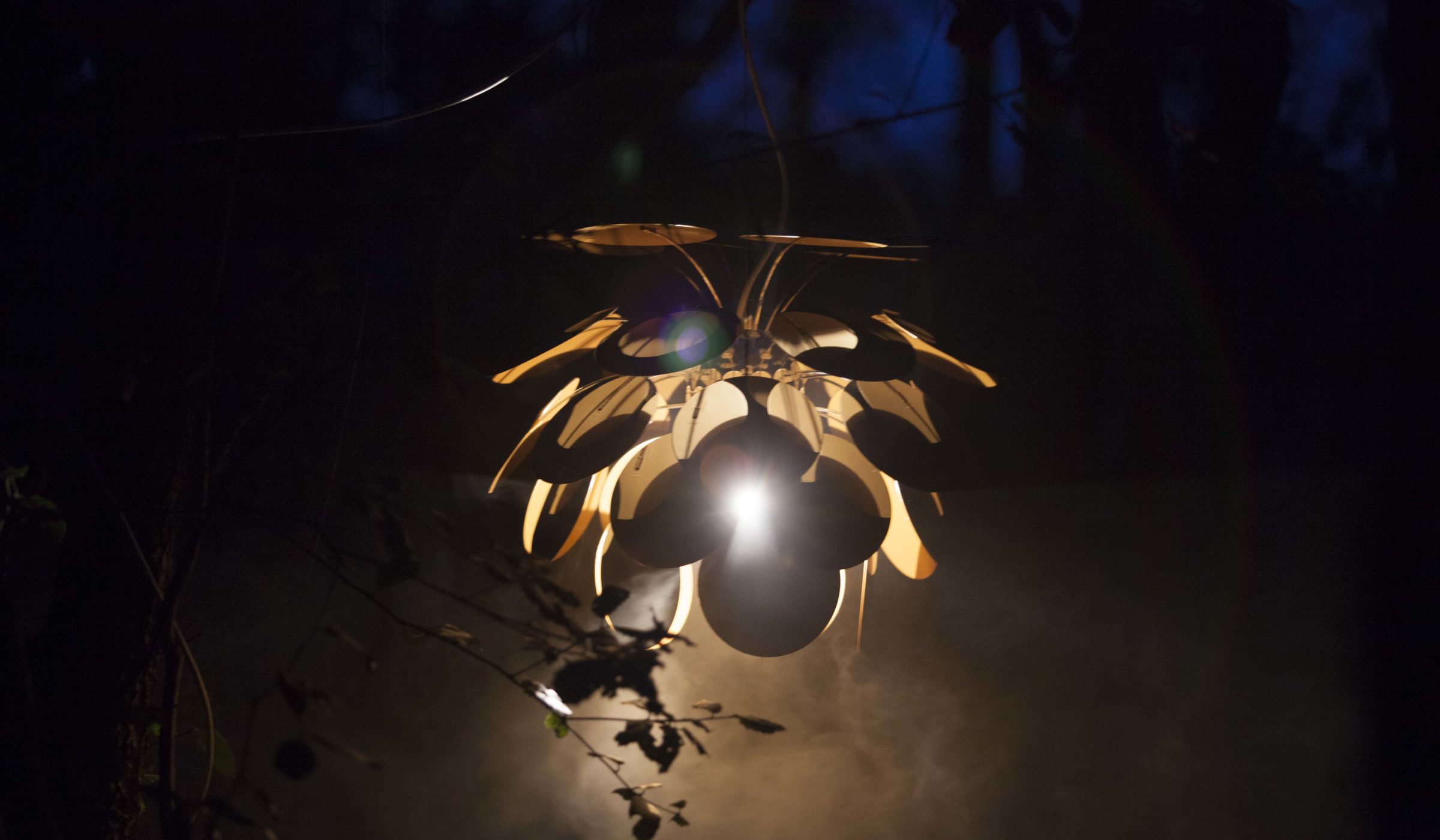
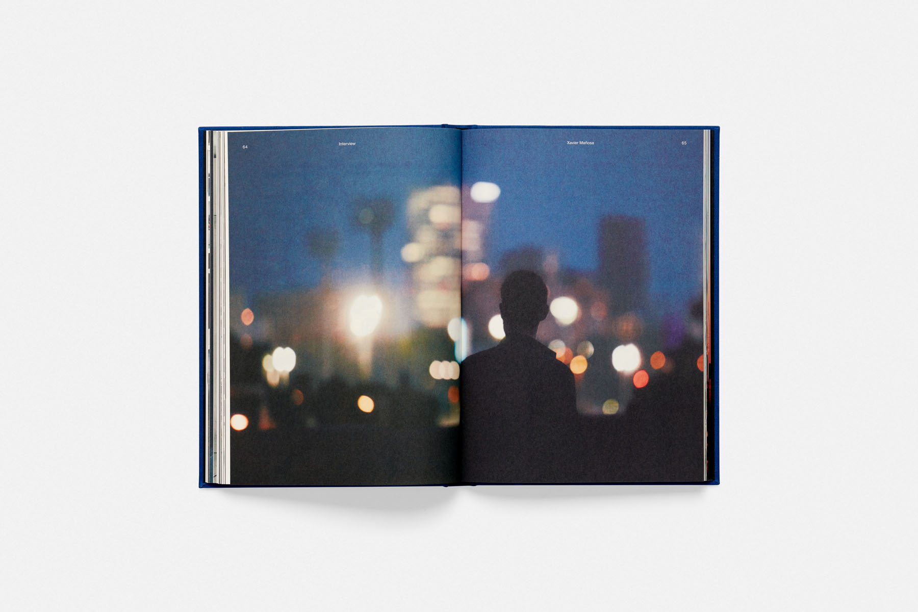
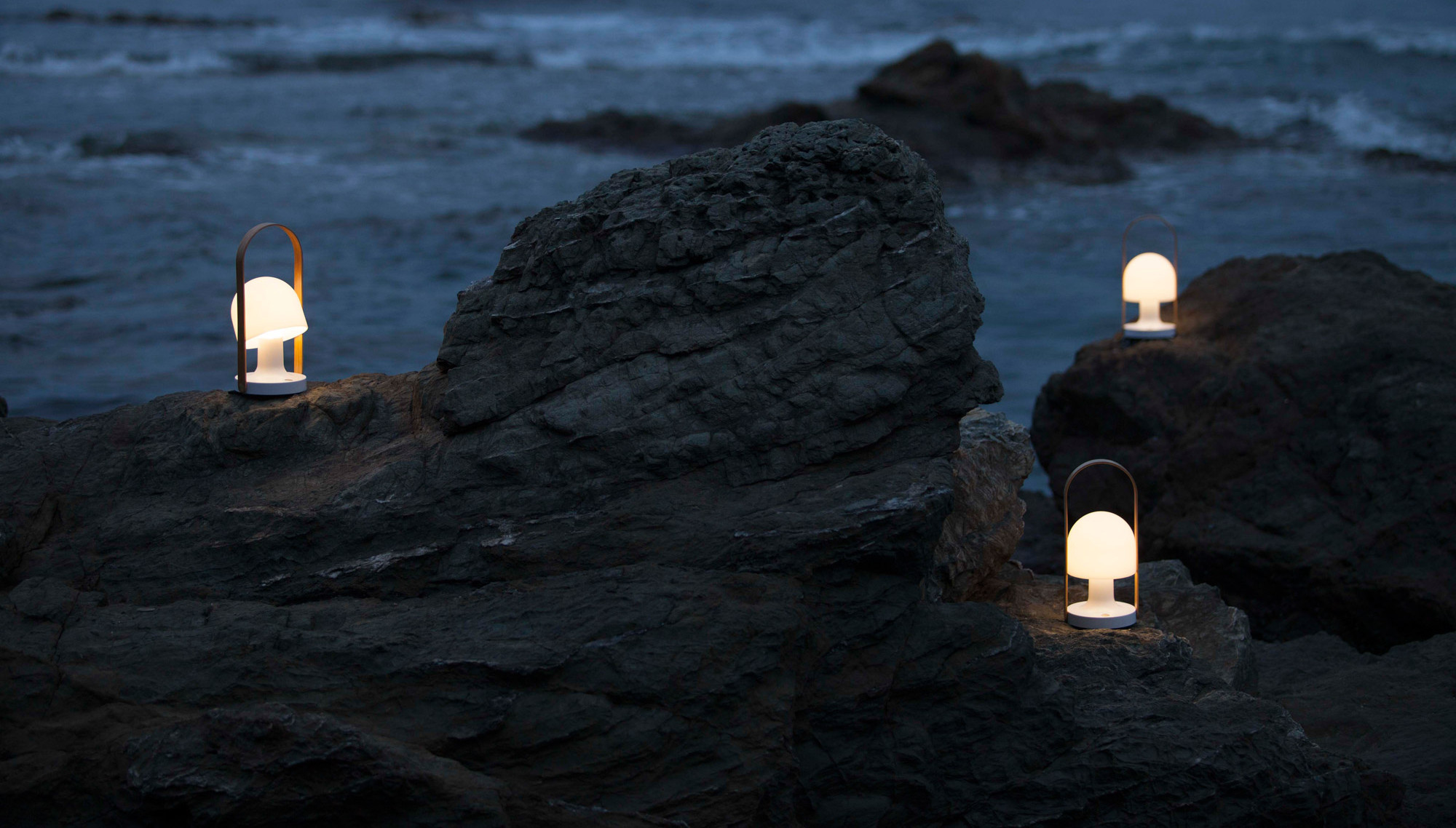
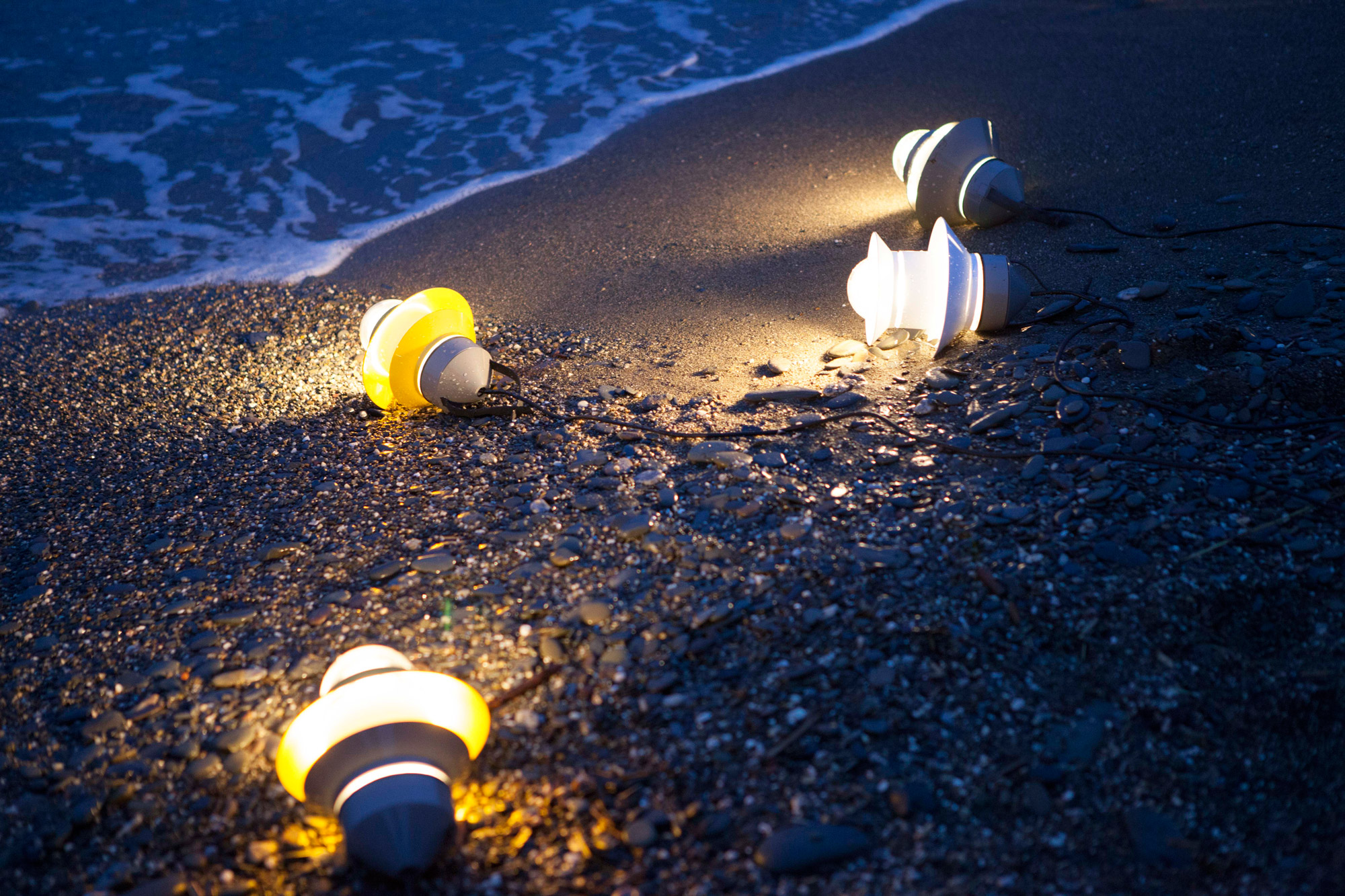
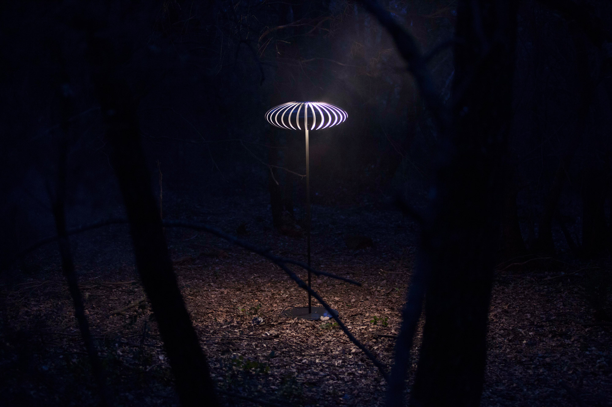
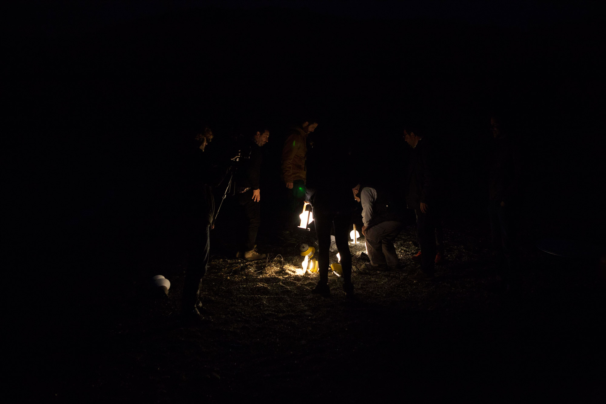
The short films released in collaboration with the Barcelona-based video producer Goroka (already our partner for this short film, just selected for Laus Awards 2015) delve into the design processes and the personalities of each designer. The video interviews with the designers and architects are set in characteristic and charming places around Catalonia, phased with the addition of beautiful shots of the products out of context, immersed in the outdoors. The concept behind the campaign focuses on the people, their different ideas, creative visions and intriguing backgrounds. This creates an emotional bond with the customers and is essential for brand experience and audience engagement.
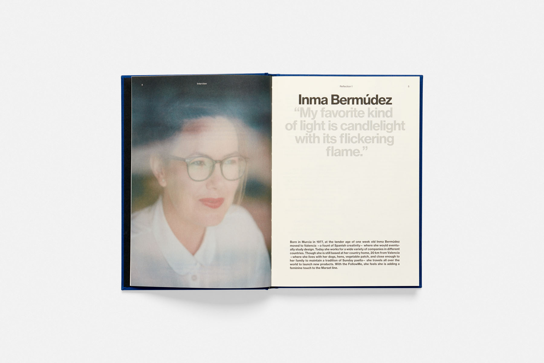
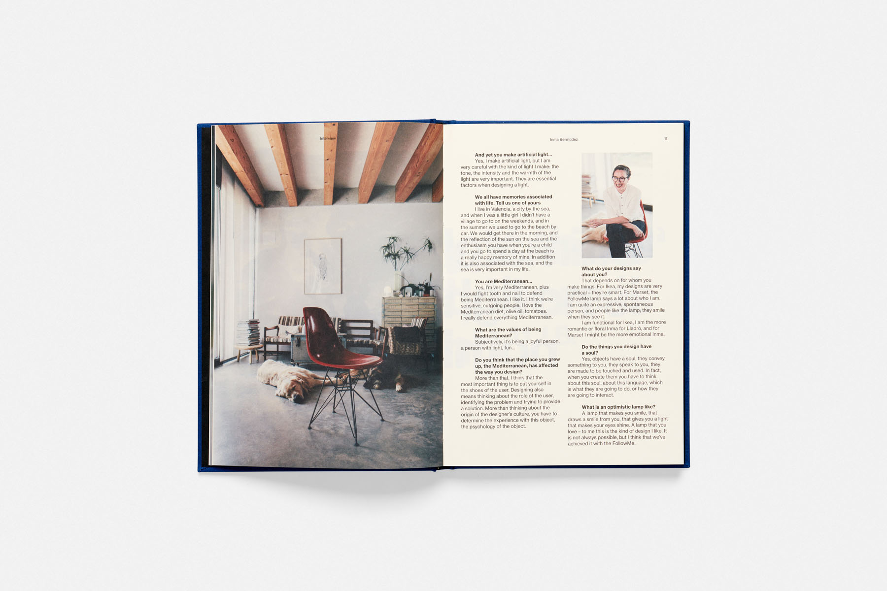
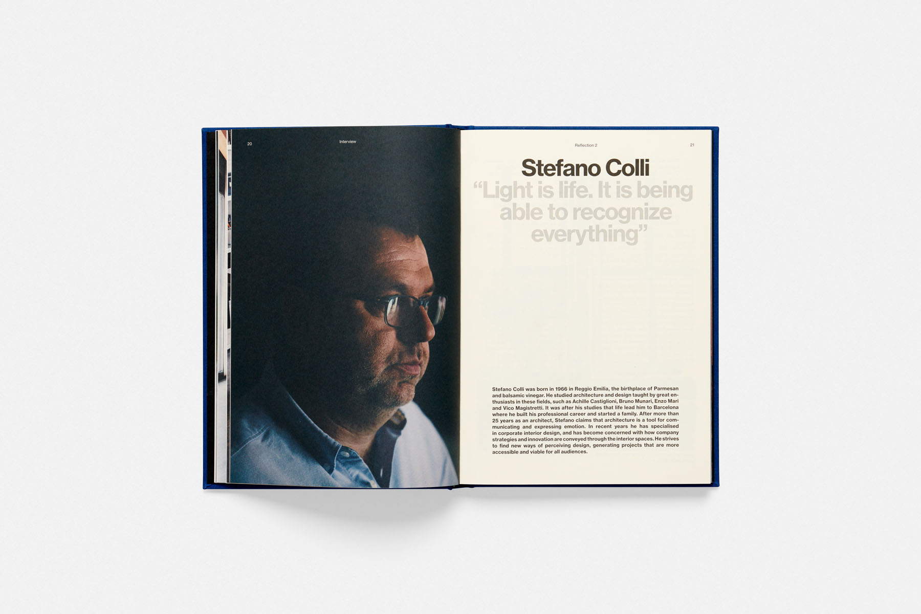
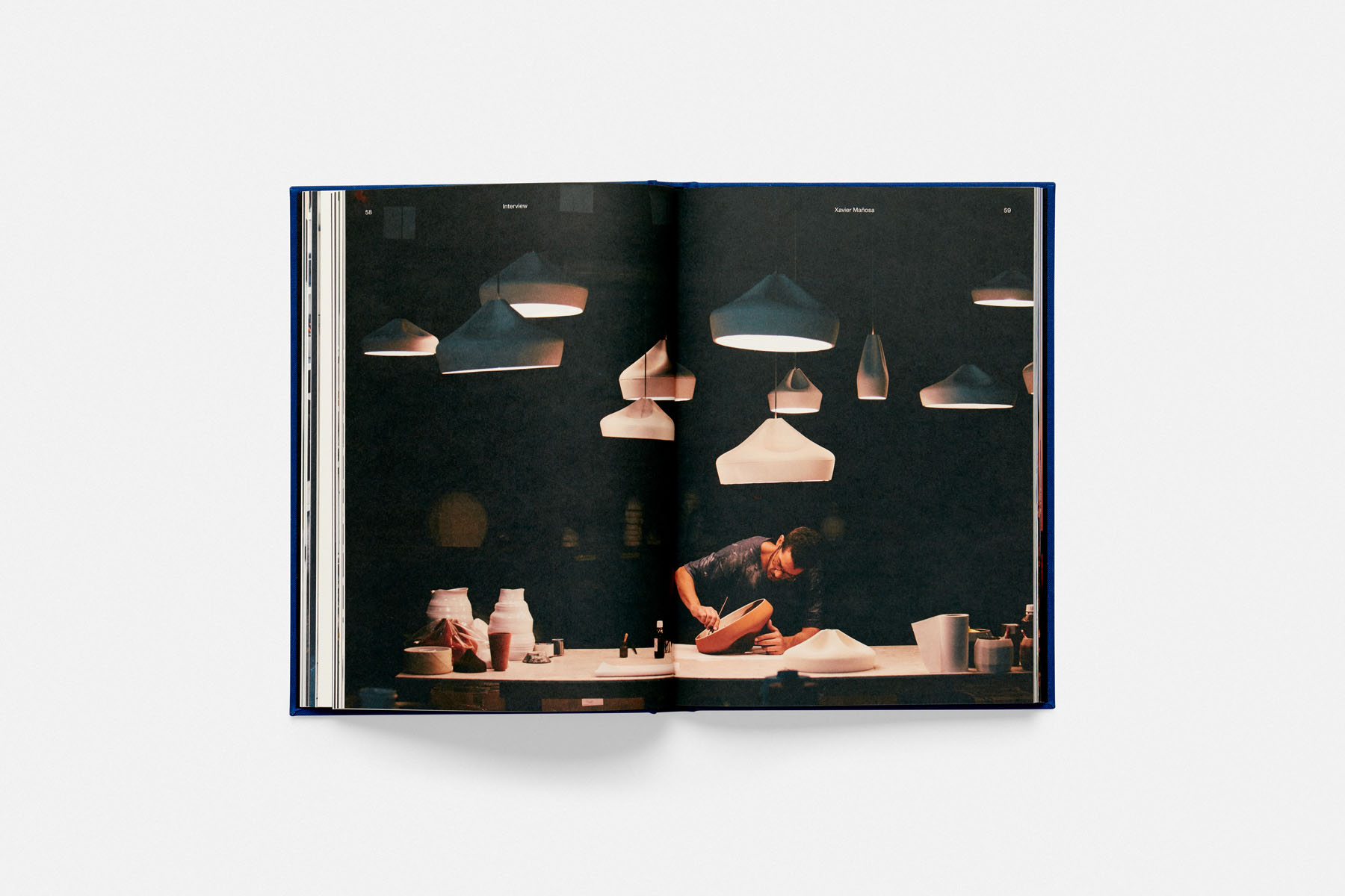
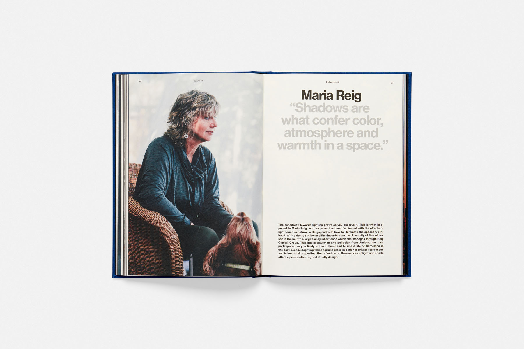
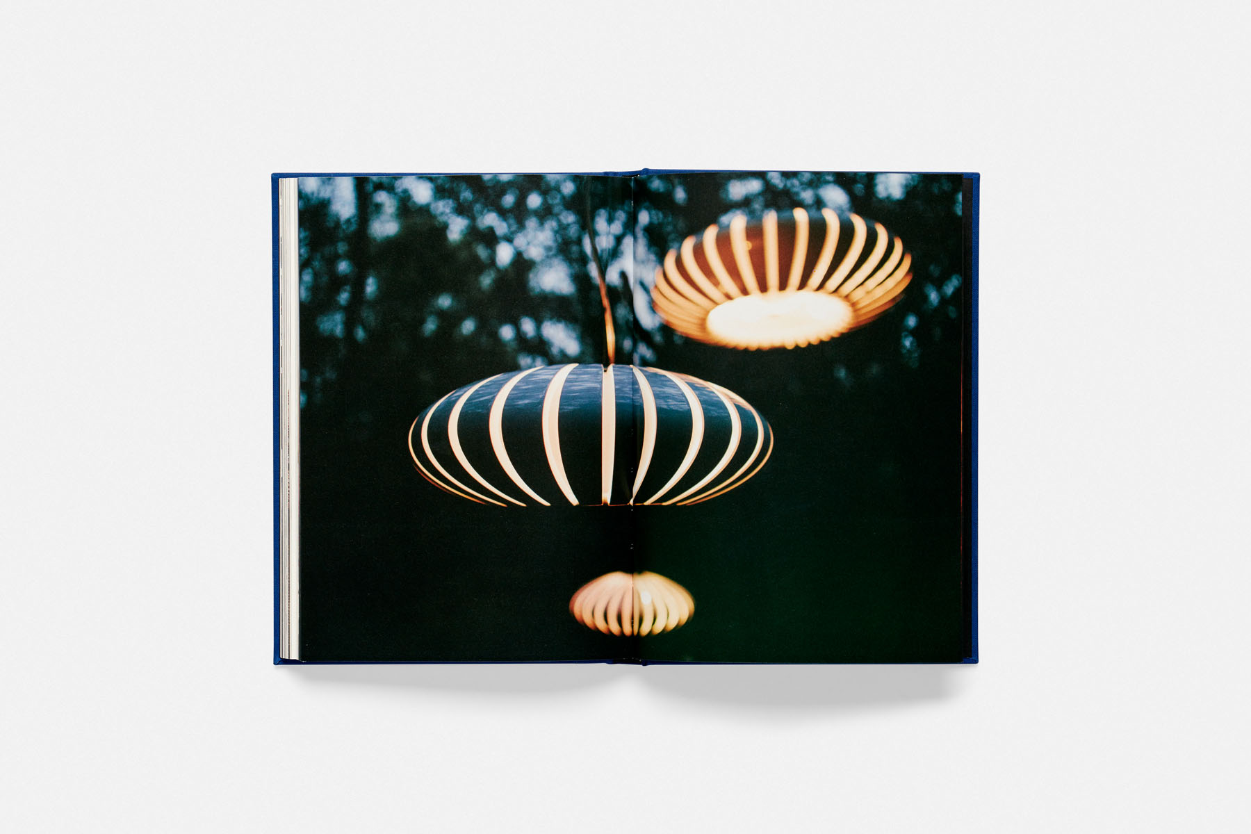
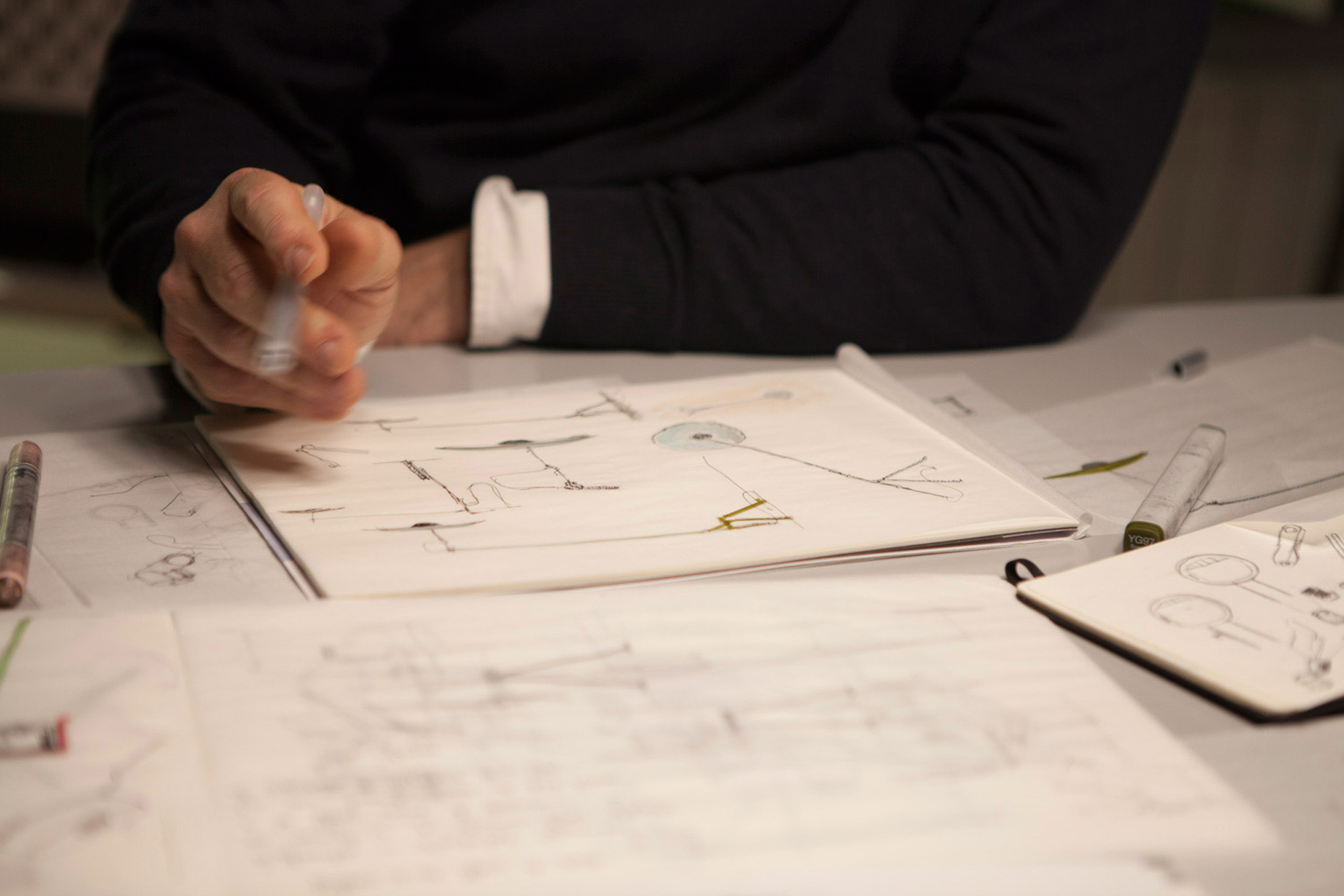
The second publication we designed under the name ‘Reflections on light’ works as an inspirational piece where insightful reflections about light, combined with documentary photographs of the designers, architects and entrepreneurs in their natural environments. This publication is more detailed and contains more extensive interviews with the seven featured personalities. The key was to make the designer’s ideas visible, as well as reflecting the thoughts behind each of the products, the creative vision and background from which ideas are born, also the importance of well-made objects. The photographic approach was cinematic and natural always focused on light. The use of light is key to portraying the designers through photography, capturing the feeling in their natural locations and creating an emotional bond, something that the photographer Leo García Méndez captured perfectly.
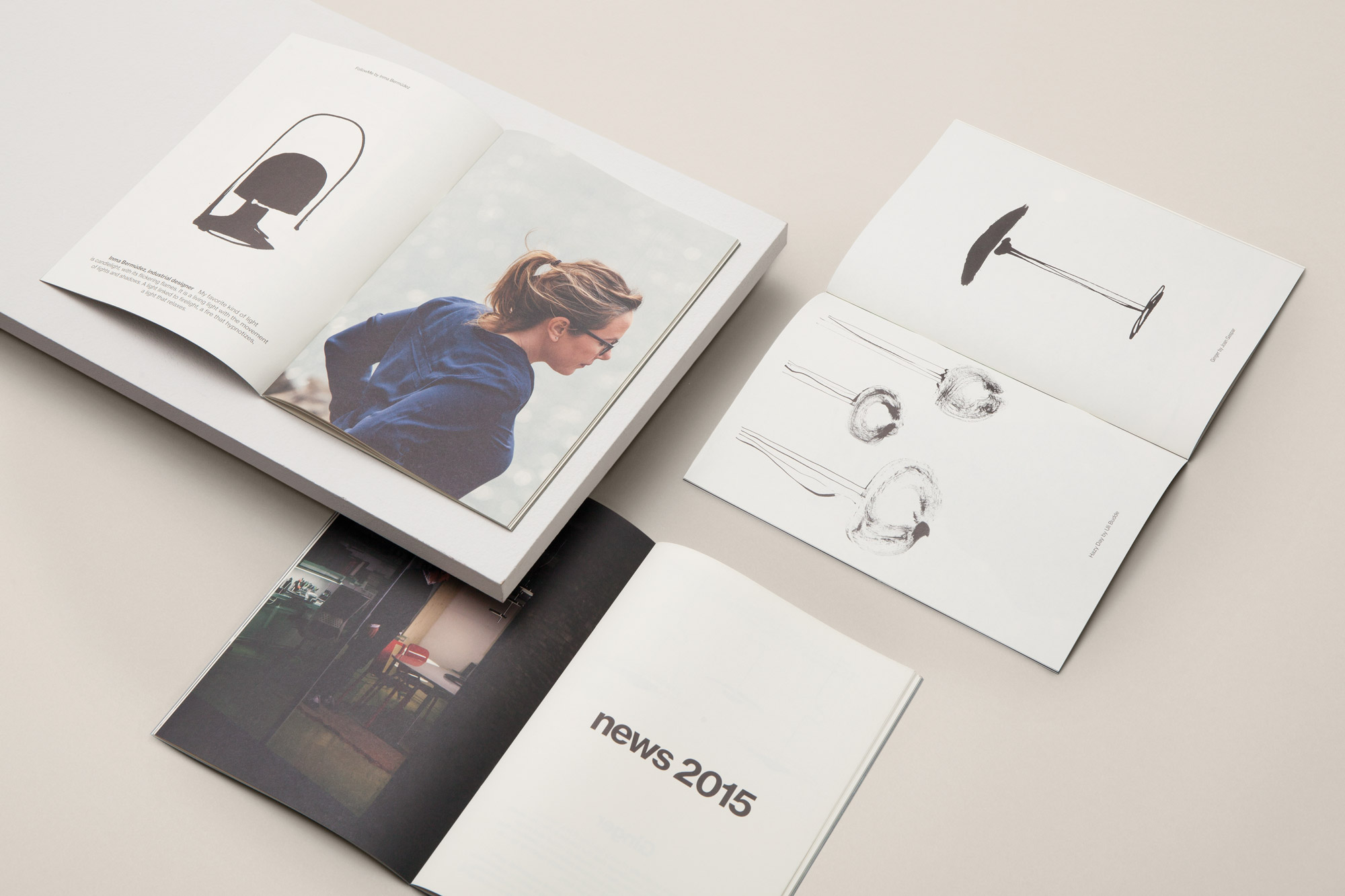
Illustrations by Pol Montserrat
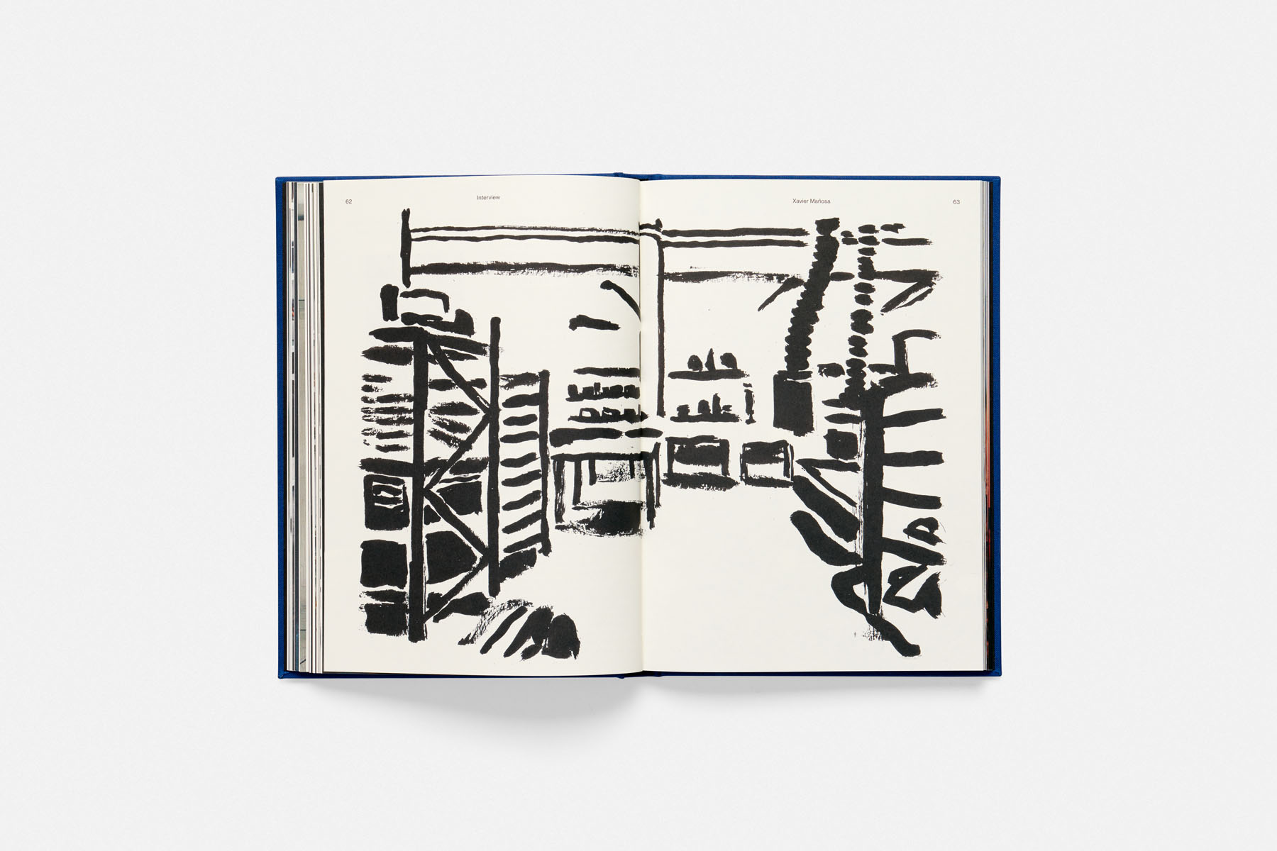
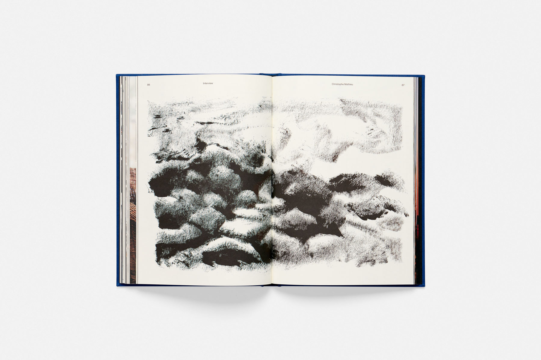
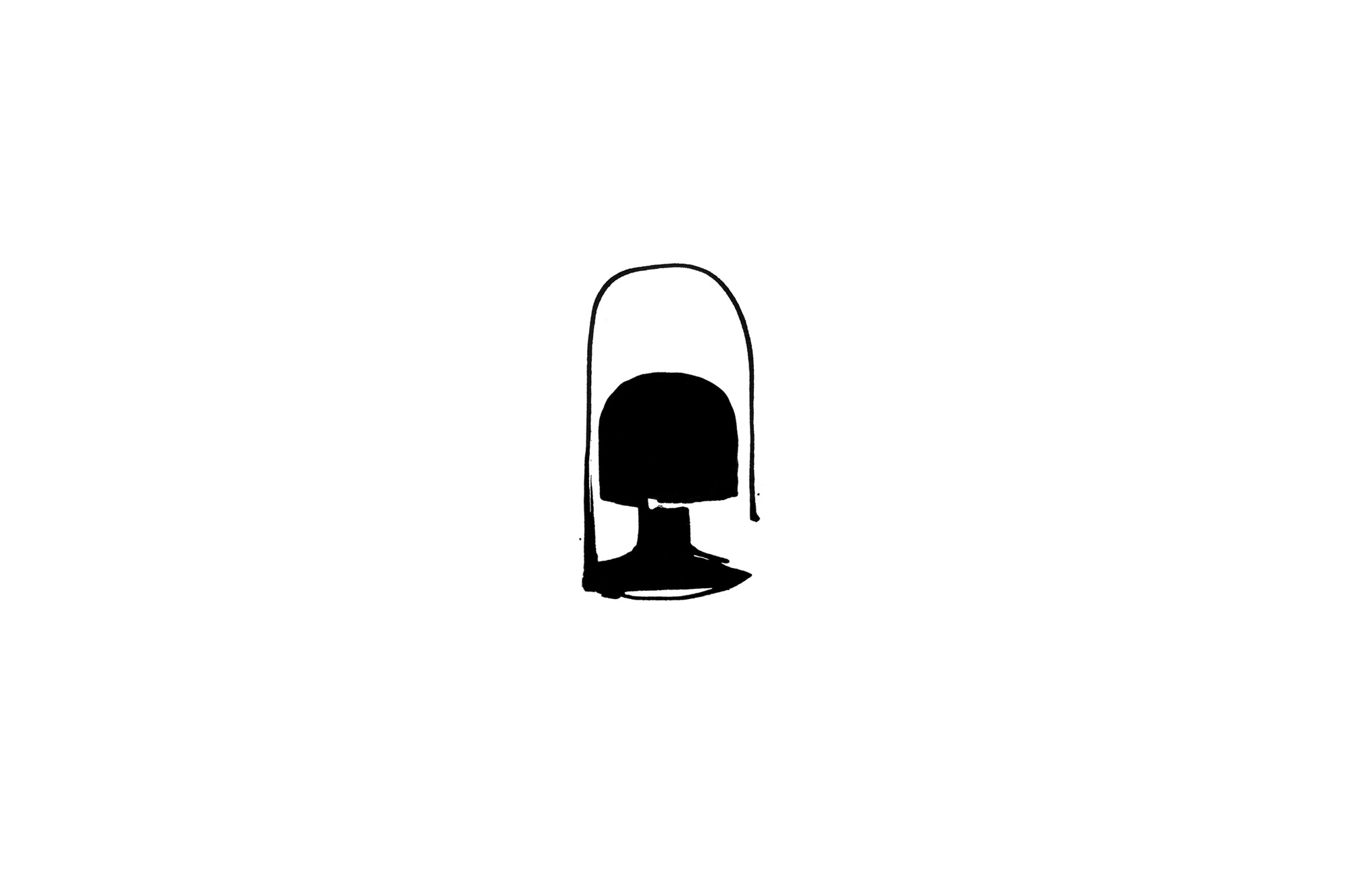
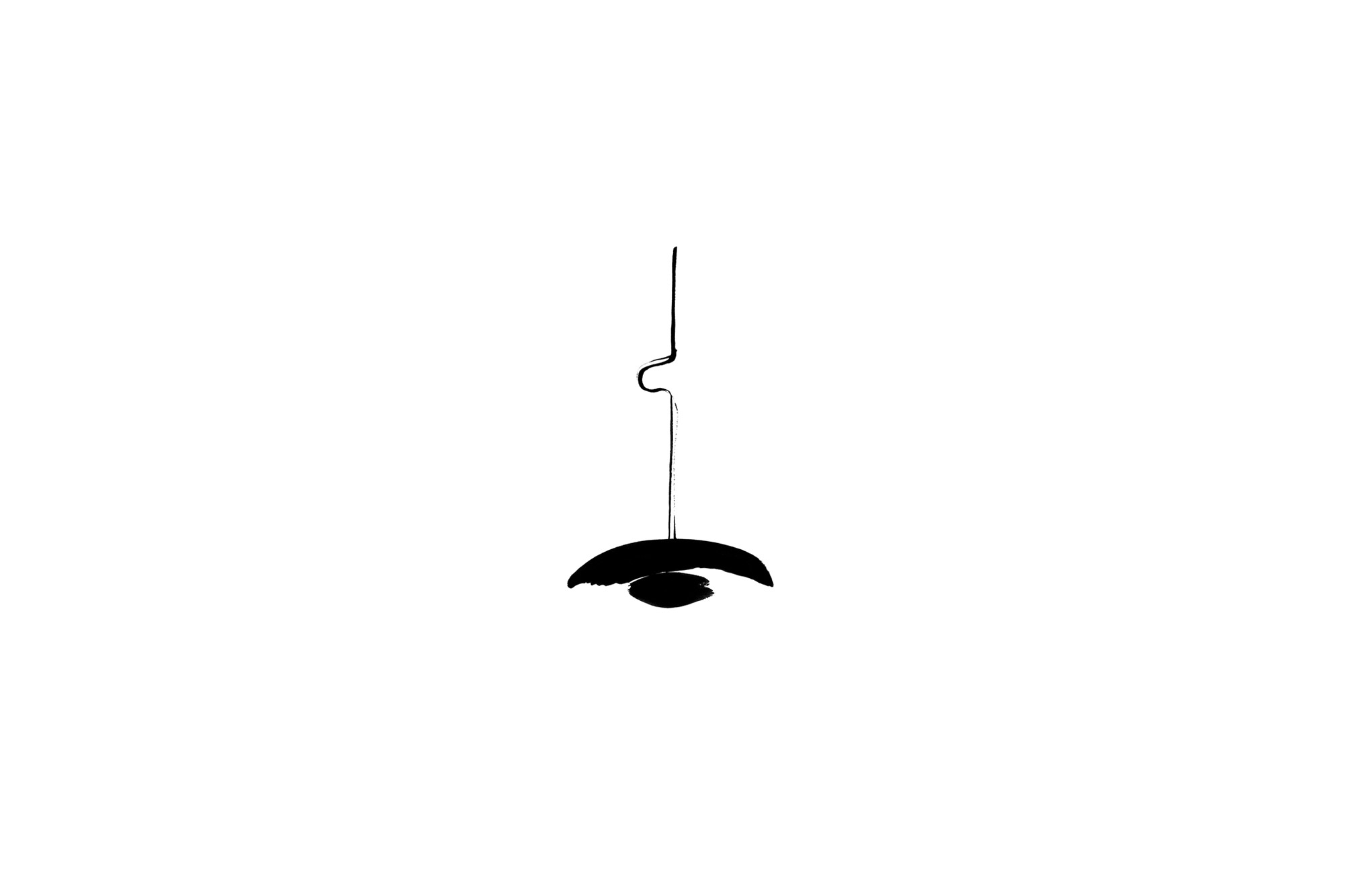
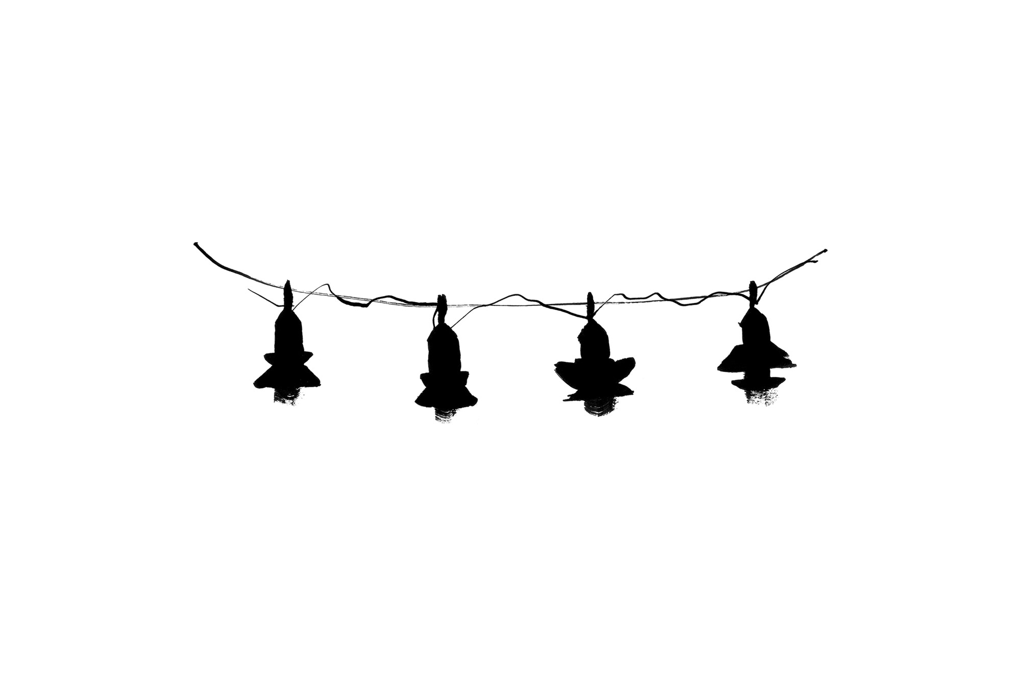
With only photography is was hard to capture the complexity of an idea or imagination. We wanted to avoid any figurative representation of the products. Instead we wanted to capture the mood of the reflections and hide the products under artistic abstraction. We commissioned the artist Pol Montserrat to portray the products in a veil of abstraction through his expressful rough drawings. With the same rugged aesthetics he transmitted the mood of the abstract reflections and thoughts of the protagonists. The rough and bare illustrations are giving a serenity to the reader through the beautiful broken brushstrokes.
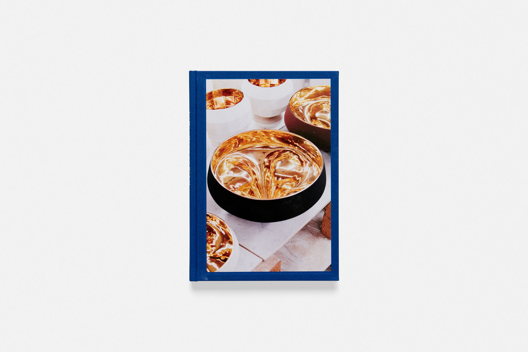
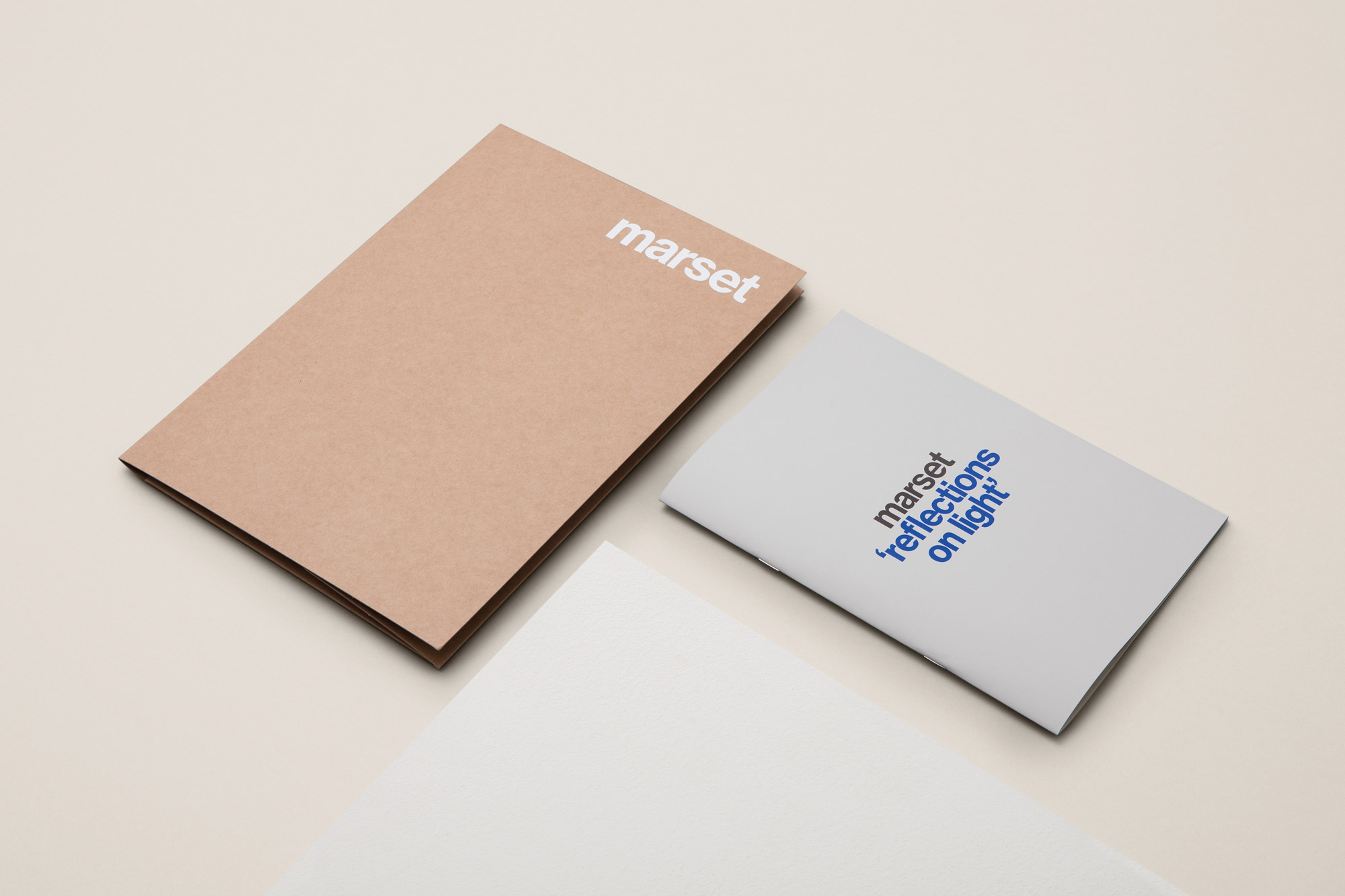
The textile cover in the key colour blue features a blind embossing with a picture of a lamp from Xavier Mañosa’s workspace. An essential silk-screened white text on the back cover caps the publications. The publication sets an expressive, emotional and tactile mood through carefully crafted text, imagery and design.
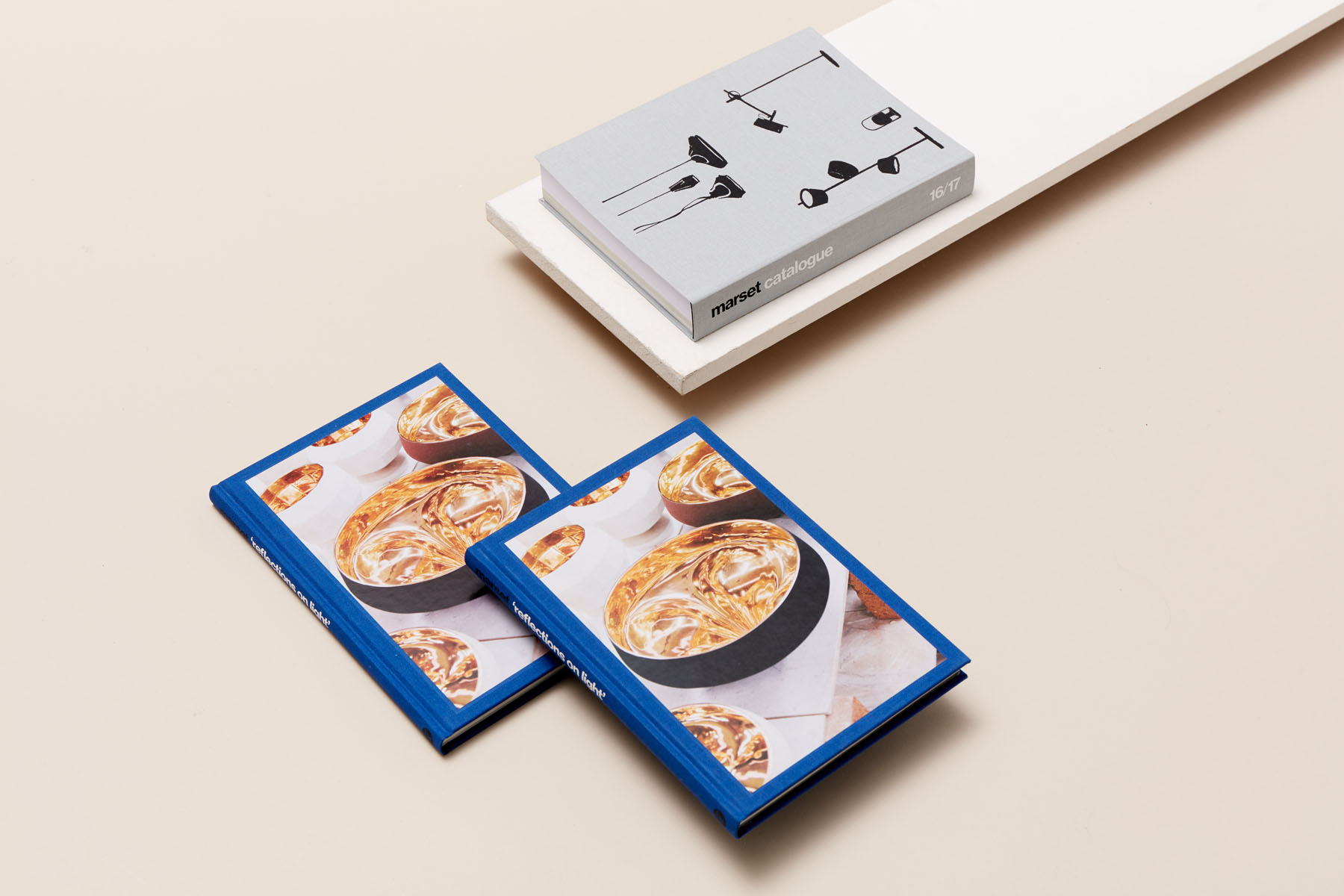
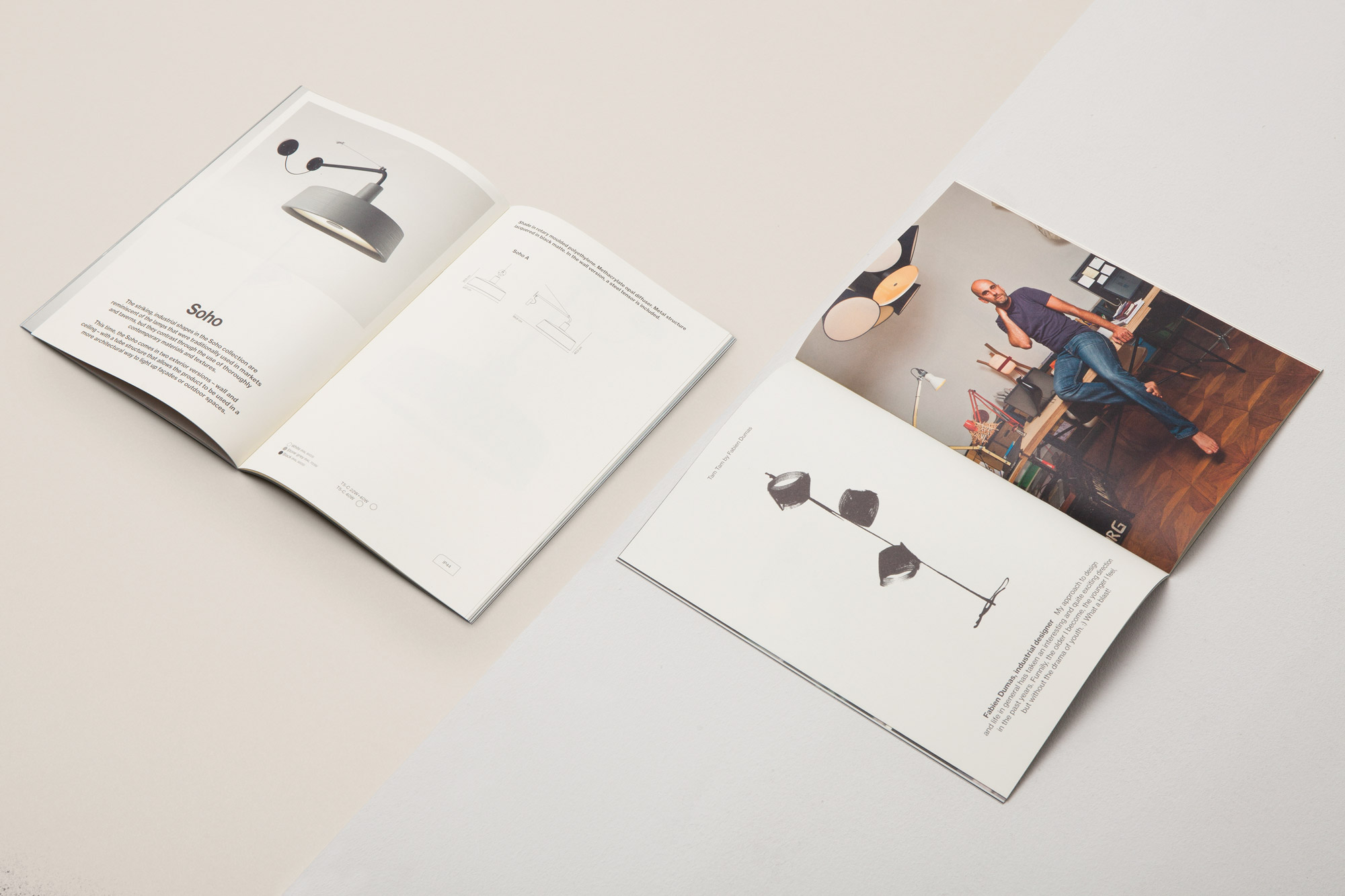
For the first publication we made designed for Marset, we partnered with the talented illustrator Pol Montserrat in order to “hide” the products under a veil of abstraction with his beautifully rough drawings of the lamps. These, accompanied with the designers portraits by Alexis Taulé, the still life photos by Leo García Méndez, and a short text of their considerations on light, place emphasis on the process and raise the value of the brand, avoiding any figurative representation of the product.
“The philosophical conversations with Stefano Colli and the daylight filtering the trees of Maria Reig’s place by the sea; eating paella on Inma Bermudez enchanting patio surrounded by vegetation and Xavi Mañosa’s white workshop filled with golden sparks… The chance to work together with every one of Marset’s creators made for a very gratifying experience” Leo García Méndez, photographer
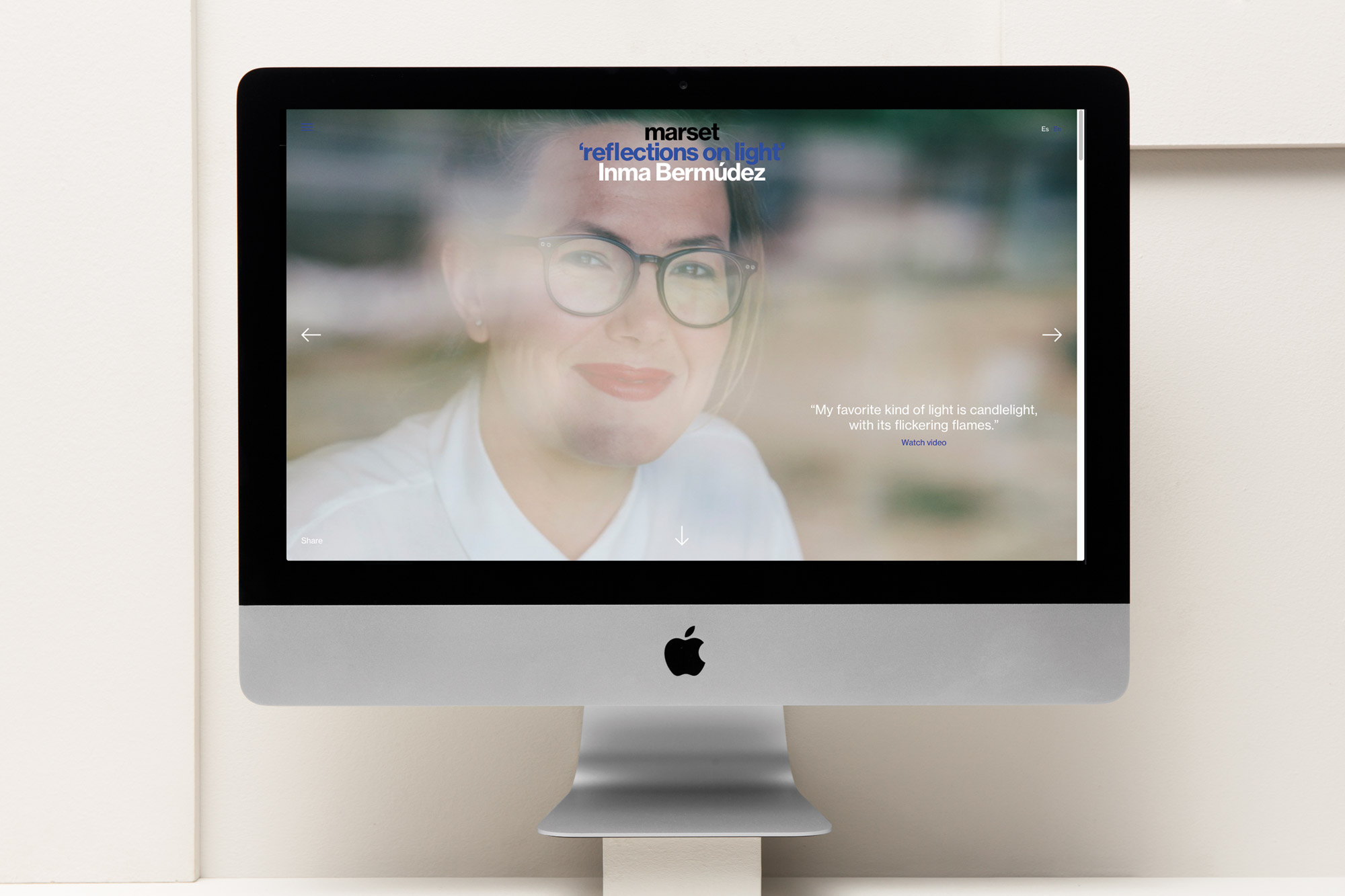
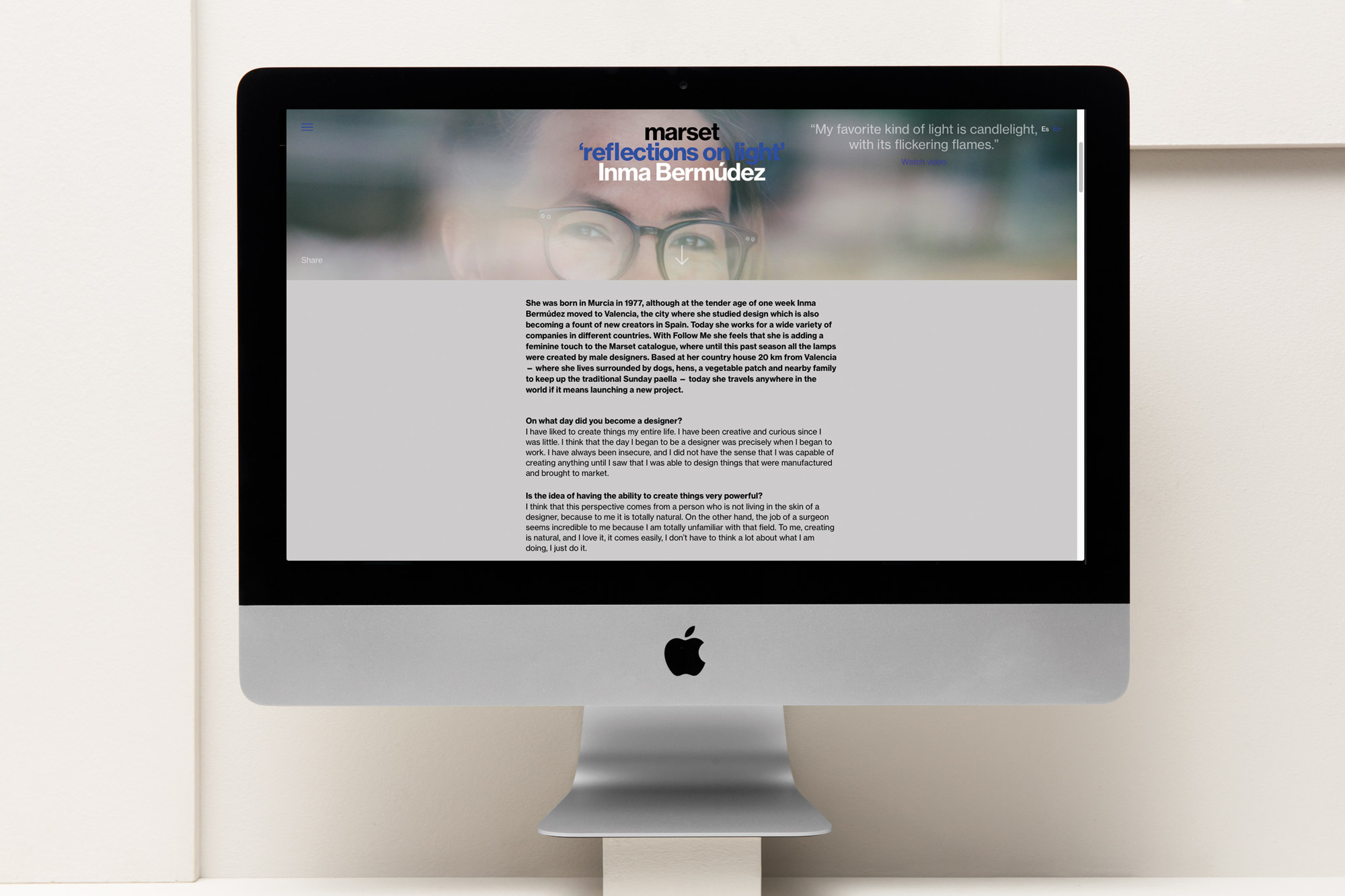
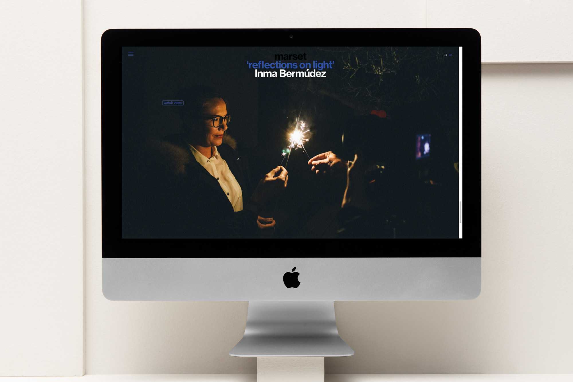
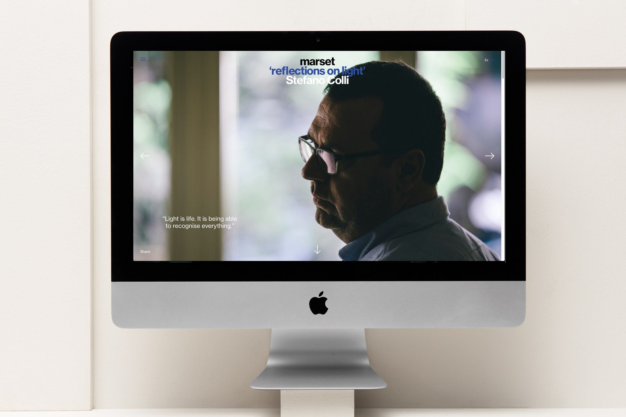
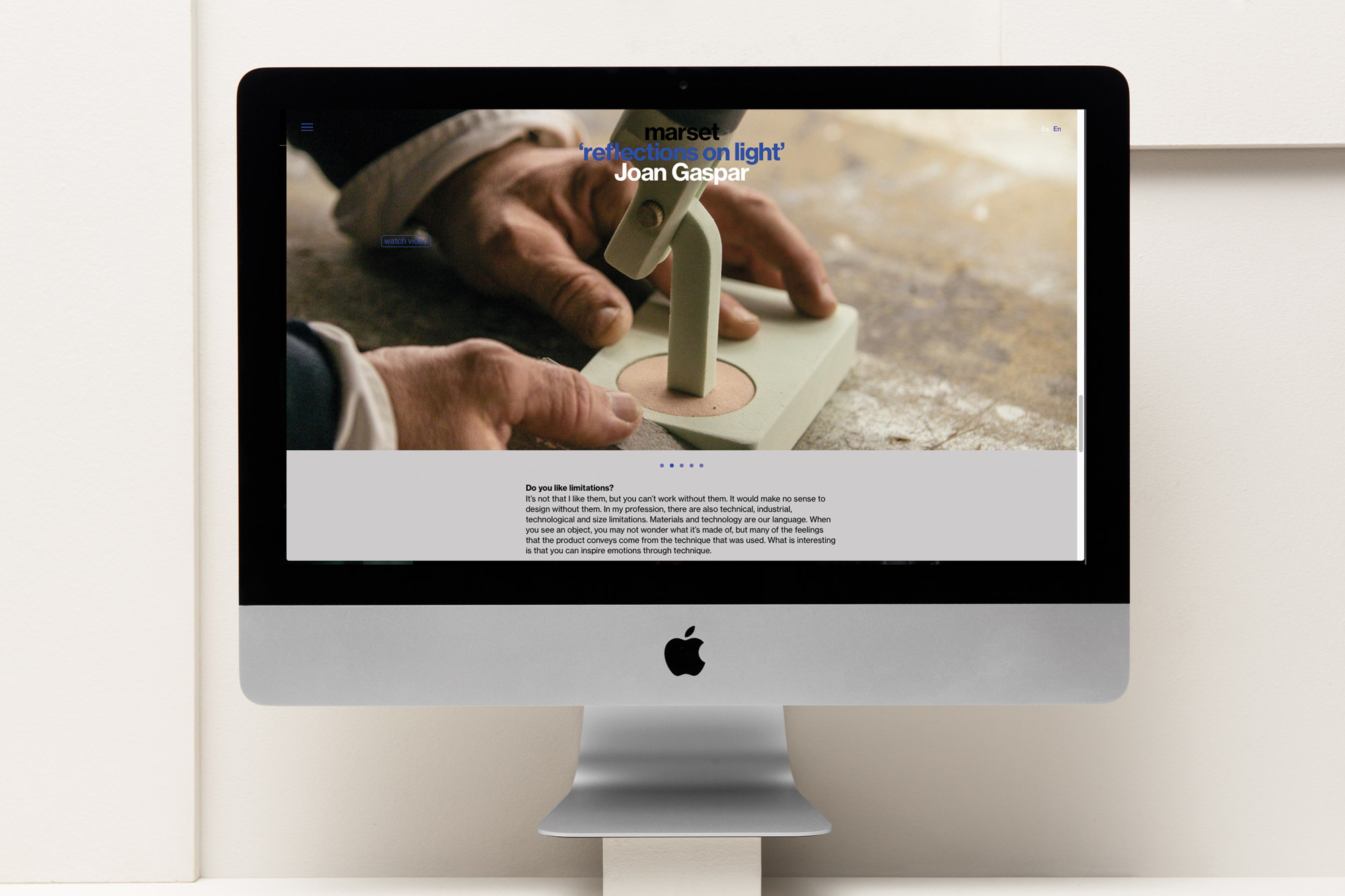
The mini-platform we developed for Marset offers interviews with the three protagonists of the campaign.
This renovation process is naturally completed by the identity redesign, which follows the new more mature brand image we were seeking. With the goal of discarding any decor or superfluous detail, we reduced the identity to the minimum, producing a new Marset logo that reflected a confident simplistic nature. The previous communication system combined two different typefaces — a grotesk and a serif. Having phased out the Hoefler Text we replaced the original Helvetica with Neue Haas, a typeface inspired by the Swiss classic, recently digitised by the type designer Christian Schwartz.
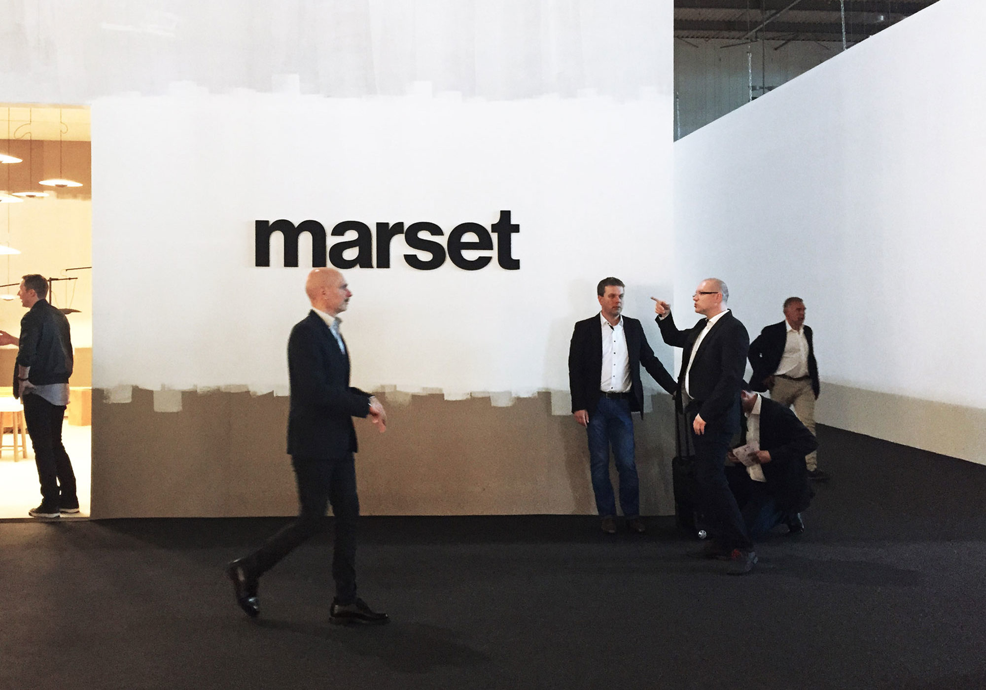
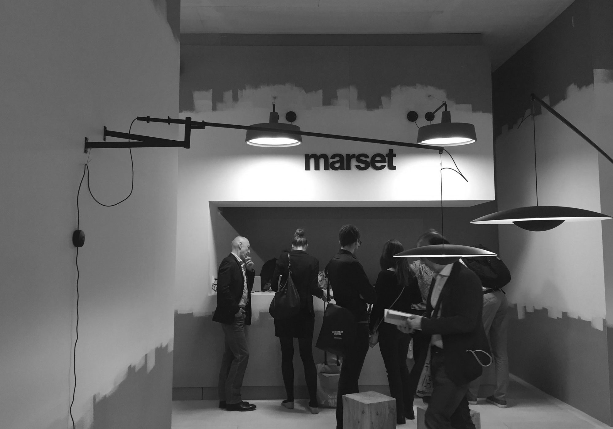
Marset’s stand at Salone del Mobile, Milan


