Year: 2015
Tags: Art Direction and Design, Brand Narrative, Creative Production, Strategy and Design Thinking
Art direction by Folch
Art direction by Folch
Folch got selected among many other studios in Barcelona to redesign the inhouse publication ‘People’. The magazine is a product by Puig, a family-owned fashion and fragrance business based in Barcelona with prestigious brands such as Carolina Herrera, Nina Ricci, Paco Rabanne and Jean Paul Gaultier among other brands and celebrity fragrances in their repertoire. The corporate publication needed a new face and a content restructure to achieve a clear direction and elegant design that could meet the standards of the brands. The aim of the publication is to make the workers behind the brands feel part of something bigger, keep track with the different fashion house’s around the world and unite them under one common denominator; Puig.
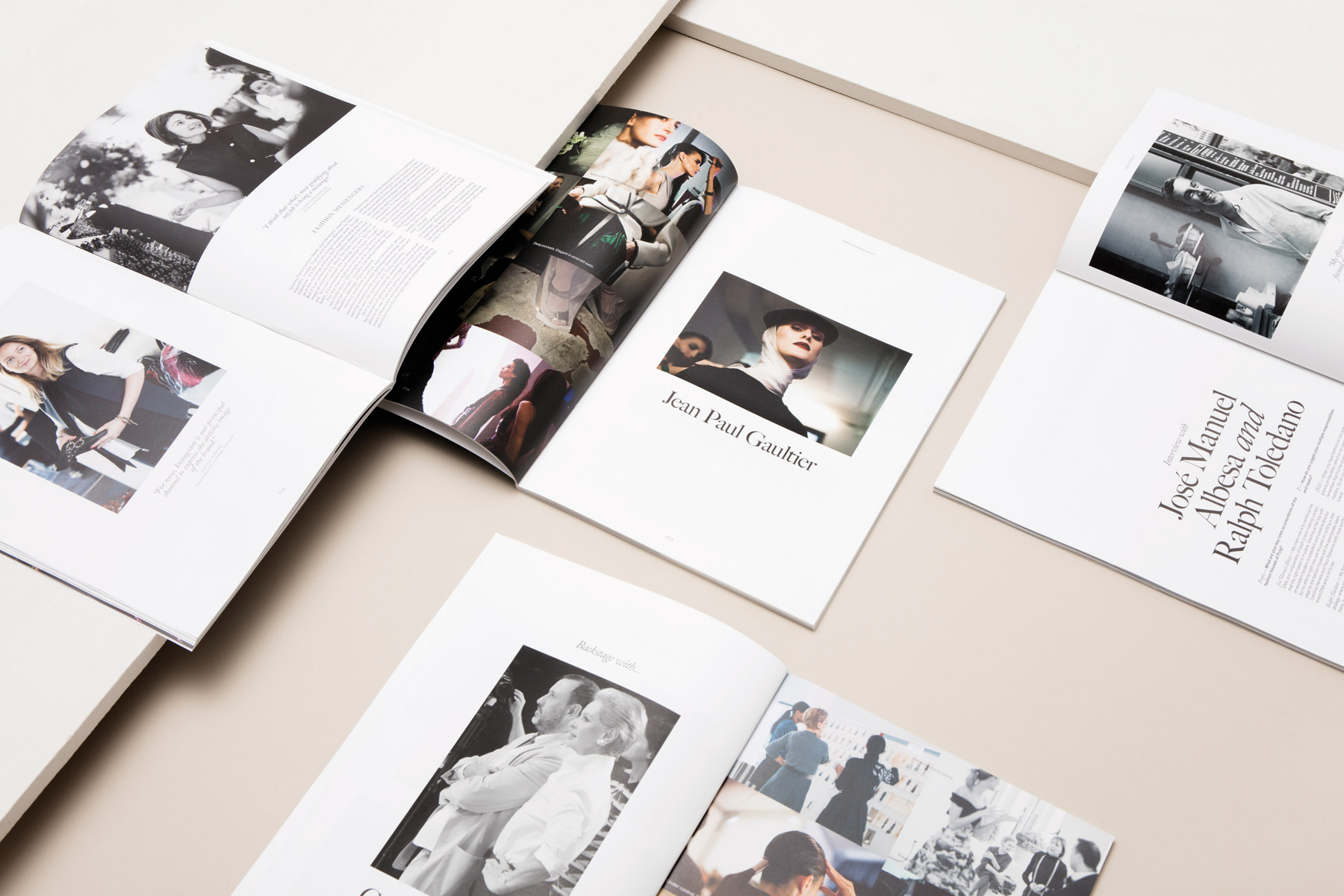
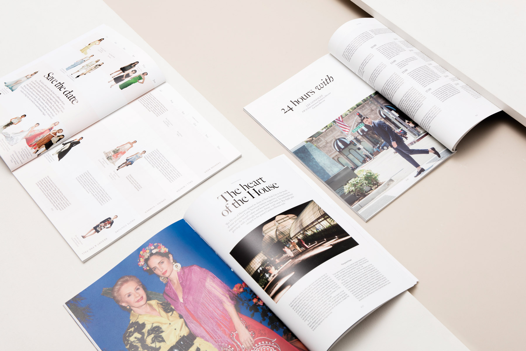
The structure is mainly built upon the importance of the photography. Fashion is visual, but yet, we wanted to highlight the interviews and the reportages about the people. Together with image and content director Alba Guerra Recas, coordinator of production Mariona Palau, editorial supervisor Sheila Mooney, translation and style coordinator Manuela Corigliano, director Marta Sanz Esteve and the Editor in Chief Moìnica PerpinÞaì-Robert we gathered the material, reconstructed, reduced and balanced it. We avoided long and dense texts and instead put importance to the breathability of both written and visual content. Through a combination between text, photography and illustrations we created an elegant harmony of visual and corporate insights.
Collaborators: Alba Guerra Recas, Mariona Palau, Sheila Mooney, Manuela Corigliano, Marta Sanz Esteve, Moìnica PerpinÞaì-Robert Photographers: Salva Lopez, Amets Irondo, Iciìar J. Carrasco and Grégoire Elroy, Roberto Castelli, Christina Holmes, Mimi Ritzen Crawford, Robert Dickehut Illustrator Pol Montserrat
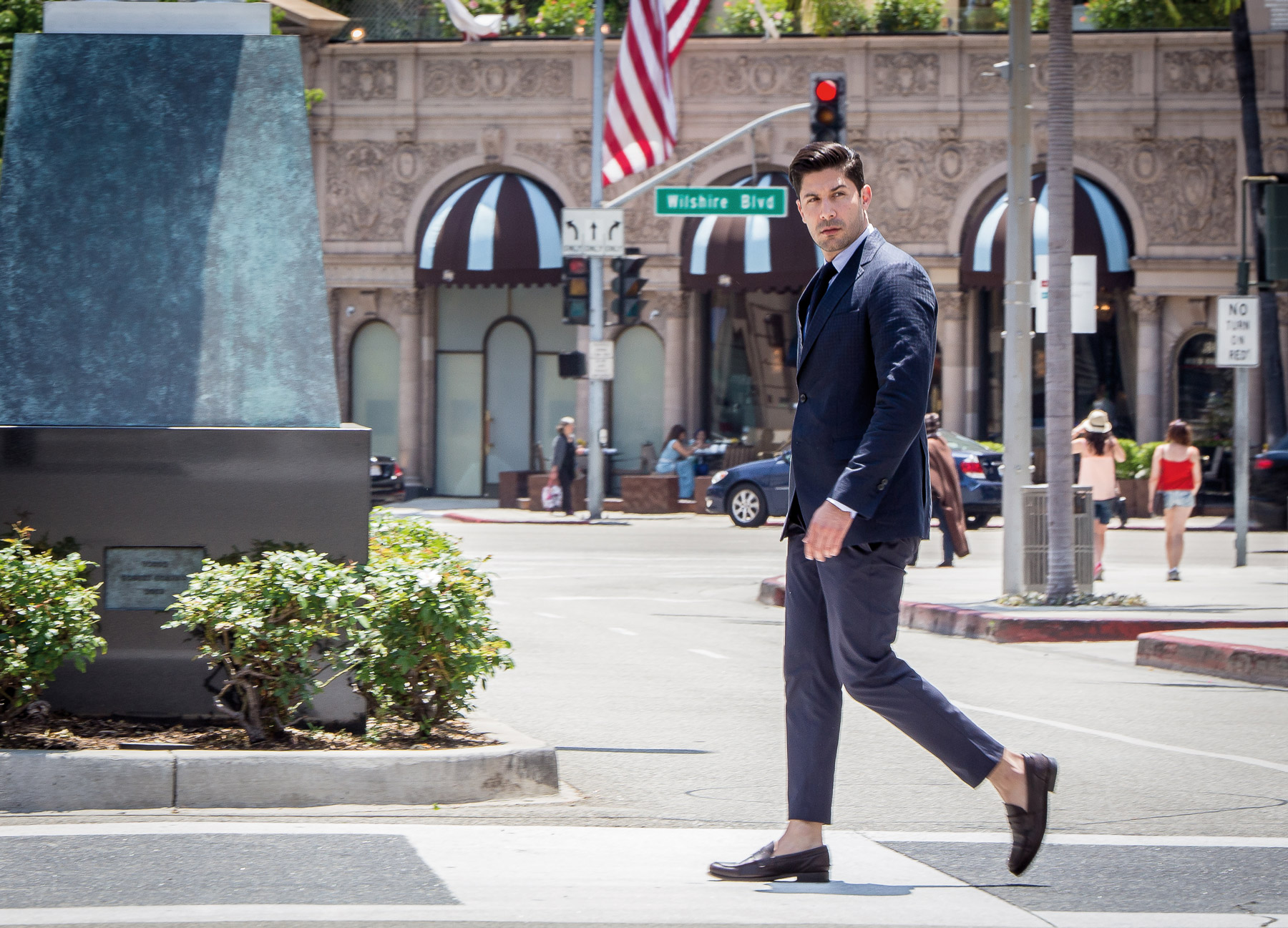
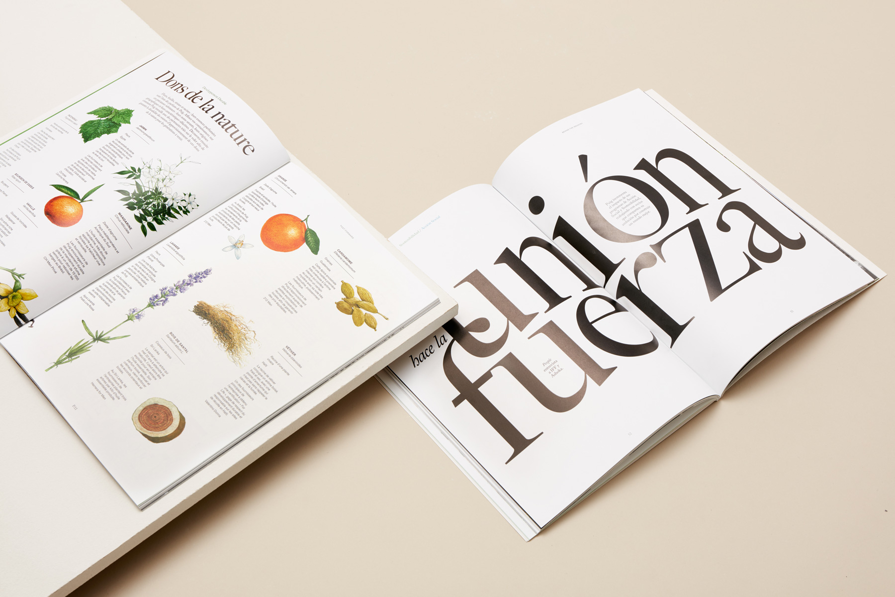
Each issue features a wide range of articles all focused on the people behind the brands, the locations, the space where they work, the fashion universe and conversations between the creatives of the fashion houses. The fundamental approach was to catch people in action, capture the energetic and dynamic situations backstage of the fashion shows and elegant shootings. With clear directions of photography, we collaborated with talented photographers on different locations around the globe in order to reflect the globality of Puig and create the visual content for People Magazine. Salva Lopez has been contributing with photography from the Barcelona area, Amets Irondo, Iciìar J. Carrasco and Grégoire Elroy were operating from Paris, Roberto Castelli in Madrid, Christina Holmes based in the states together with Mimi Ritzen Crawford in New York and Robert Dickehut in Los Angeles. Pol Montserrat contributed with his stylish watercolour illustrations capturing the connection between scents and fashion.
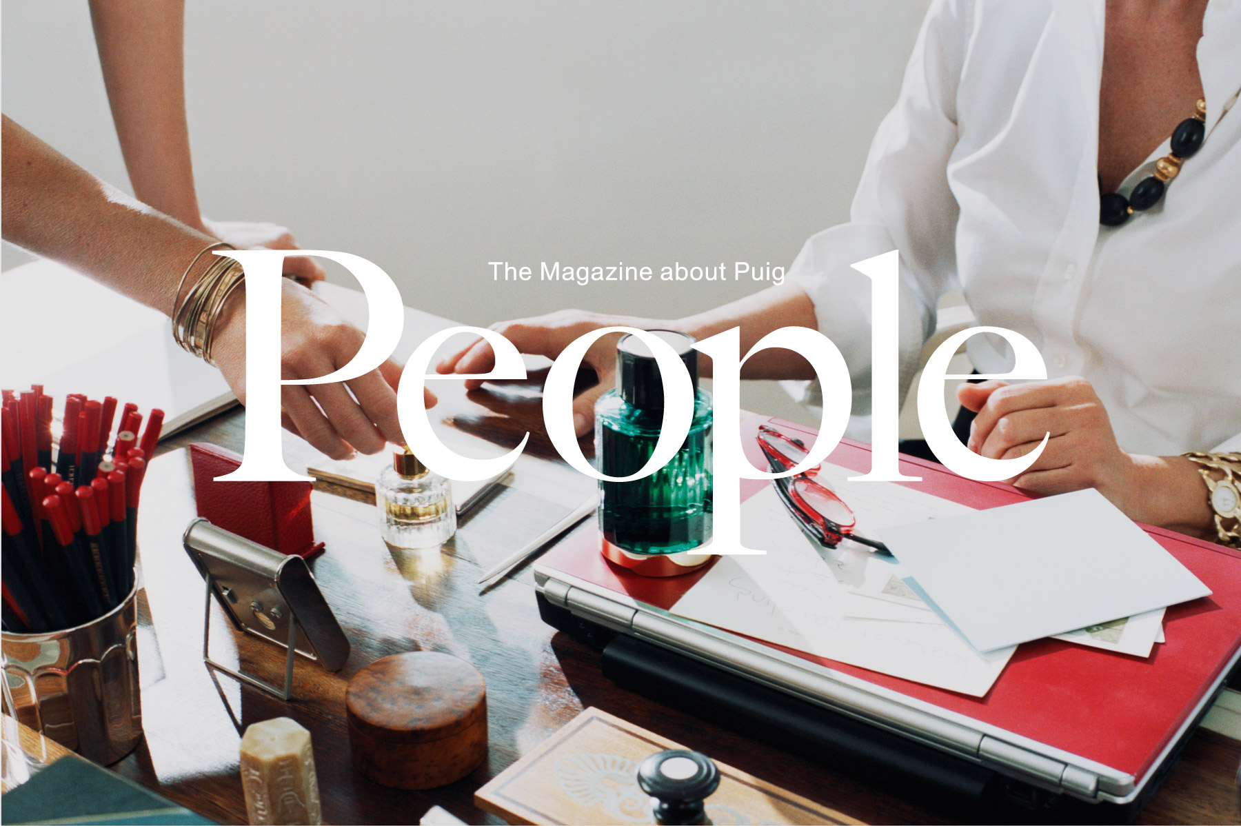
The cover logo is an elegant, yet bold, combination between the serif typeface Caslon and the sans-serif Union, the same typefaces used for titles and texts throughout the magazine. The previous combination of serif and sans-serif was still a good editorial decision but we had to rethink the choices of typography to reach a sophisticated and refined look. Caslon was a natural choice because of its readability and timeless beauty, coupled with the sophisticated and consistent Union gave us a perfect match with many variations and levels.
The key was to inform, entertain and above all to pay attention to the people behind the brands and connect them. People Magazine issue number 15 is therefore centered around the four main fashion houses, the corner pieces, the soul and scents of Puig. The written content and the structure of the sections and articles were already set by Puig, our job was to create the visual content that would meet the requirements and to capture the soul of the company through art direction, photography and inspirational portraits.
The universe of Puig was recreated in the covers of People Magazine ’15, which comes in four different versions, each cover representing one of the fashion house’s through photography of the season’s backstage highlights. “Fashion as a whole universe”, “agenda management” and “behind the scenes” were the keywords and leitmotifs behind the art creation of the covers. In order to optimise the reading experience through well executed images and clear headlines and text spreads we used the textured paper Springo for the cover and Symbol Tatami for the internal pages. Two beautifully produced papers, which fulfill the requirements of excellent printing results for both photography and typography.
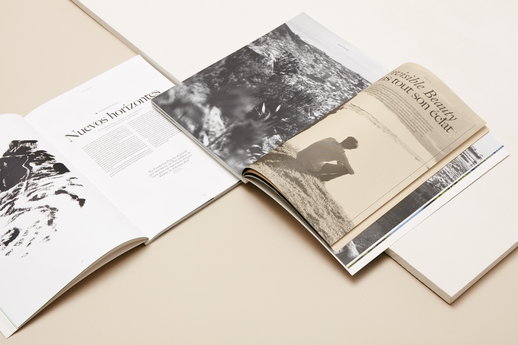
Issue number 16 embraces the topics of sustainability and social action. Dedicated to the most up to date matters on a global perspective, the family business wants to explain the programs developed for reaching certain goals and reducing the carbon footprints throughout the production. Despite the change of theme from previous issue, the agenda is still the same; to to inform, unite and strive for a common goal. In this issue we introduced a booklet inside the magazine describing the ‘Invisible Beauty’ a foundation created in order to encourage entrepreneurship among young people. Besides the booklet we also introduced infographics to easier explain the quite complex data and processes around the topic.
We defined two colours for the concepts that would recurrent throughout the issue.The charts gave us the idea to reproduce the usually occurring touching circle diagrams into a graphic expression. We teamed up with the artist Ángela Palacios and through her watercolour textures in blue and green the cover was created as an introduction to the issue.
The cover is printed on the 100% recycled Particles Show Keaykolour and the booklet paper is from the Popset collection, both from the leading paper manufacturer Arjowiggins. The internal pages are as always printed on the FSC certified Symbol Tatami to keep a coherency and stay true to the concept and values of Puig.
