Tags: Art Direction, Branding, Graphic Design, Identity
Client: Ajuntament de Barcelona
Year: 2019/2020
Client: Ajuntament de Barcelona
Year: 2019/2020
The Ajuntament de Barcelona wanted to give new life to the Rec Comtal, a hydraulic structure that until the 19th century was one of the main water suppliers for the city. It was essential to create a new graphic identity for the project, one that was easily recognizable across all applications and uses. The program was developed together with architects Mikel Soberón, Ferran Sagarra, Xavi Llobet and Eva Jiménez.

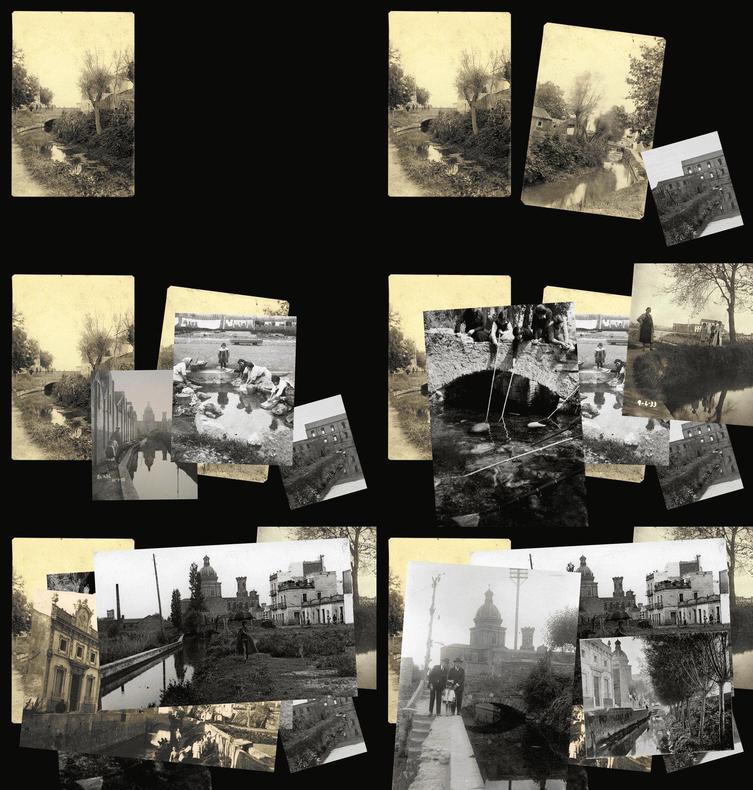
The Rec Comtal was an open channel built in the time of Count Miró I, in the middle of the 10th century. For almost a millennium it was a vital artery in Barcelona and was used for water supplies, to run the mills and, later, to supply the textile industries. The Rec Comtal passes, in the current geography of the city through the districts of Ciutat Vella, Sant Martí, Eixample, Sant Andreu and Nou Barris.
The Ajuntament de Barcelona proposes to revive 22 zones with recreational areas, rest areas and interpretations of archeological remains. The project has brought together professionals from different fields to obtain results that do justice to the historic Rec Comtal.
“Rec Comtal is a type of project that allows to define a voice of a potential city branding emphasizing citizen participation rather than just promoting the brand by saying come and visit us.”
Rafa Martínez, COO, Partner & Brand Strategist, Folch
We wanted to design a warm and appealing visual identity that would speak to an audience of all ages across such a multicultural city. We planned to spread a message through social media as well as physical interventions that highlighted the channel’s historical relevance.
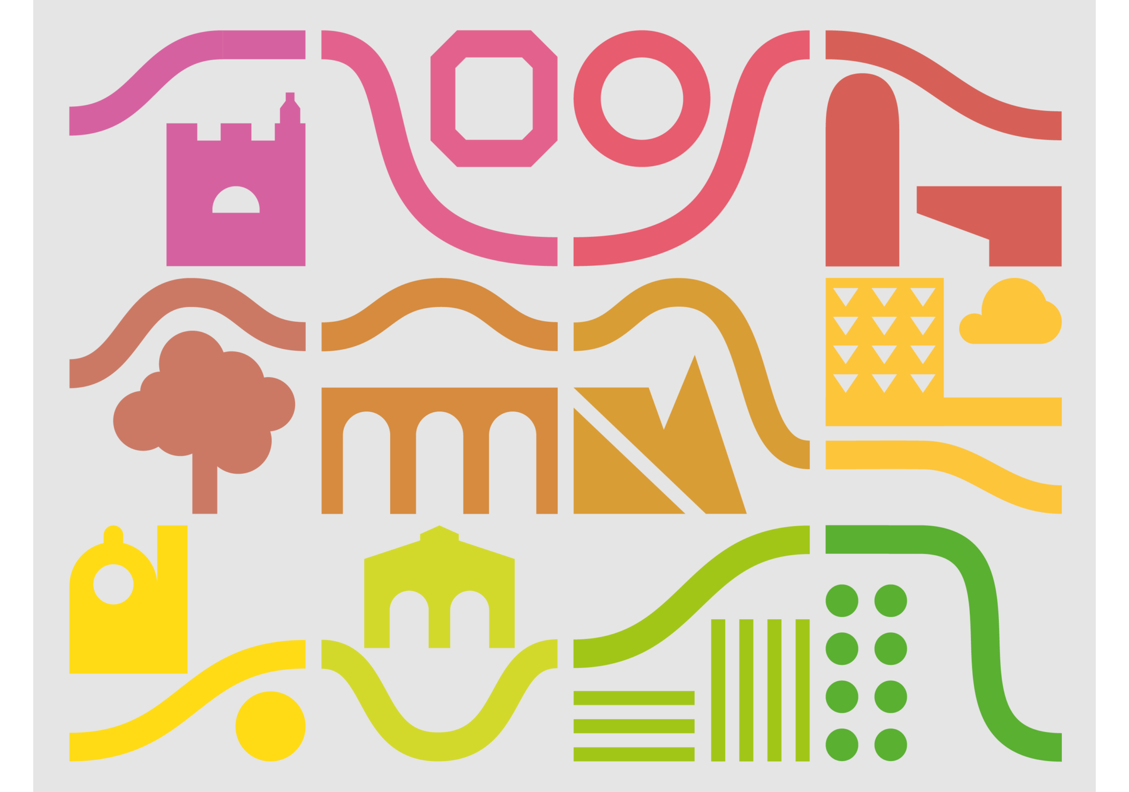
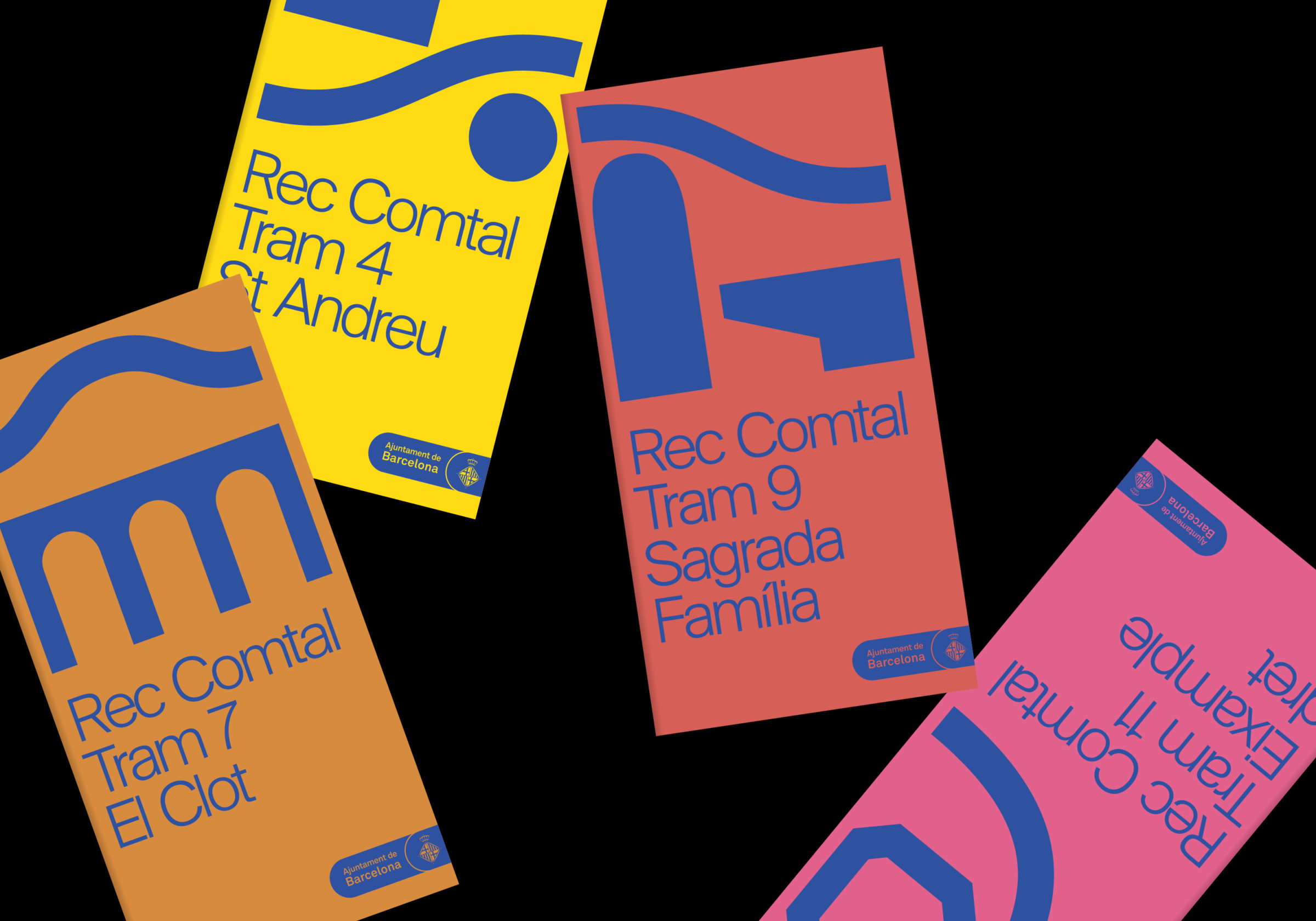
To define the new use of the Rec Comtal, we had to create an identity in accordance with the regulations of the consistory of Barcelona. The various actions focus on the division of tracts of land across the city, in order to highlight the idiosyncrasies in each of them. To highlight each area, we used a gradient of different colors that represents the variety of spaces and landscapes around the route of the Rec Comtal.
Each section is represented by a mark and a symbol, as a representation of the singular environment and neighborhood of each section so we can construct a global map of the whole channel.
“We wanted to graphically represent the course of irrigation in the different neighborhoods through which it passes. Using different colors we can make each stretch identifiable in a unique way, creating at the same time a general cohesion between each neighborhood.”
Oriol Corsà, Junior Designer at Folch

In order to disseminate the activities carried out around the Rec Comtal, we believed it was essential to promote them through social networks, in order to convey a local project to a global audience. We also committed to the use of a website as a channel for information and preservation of the project.
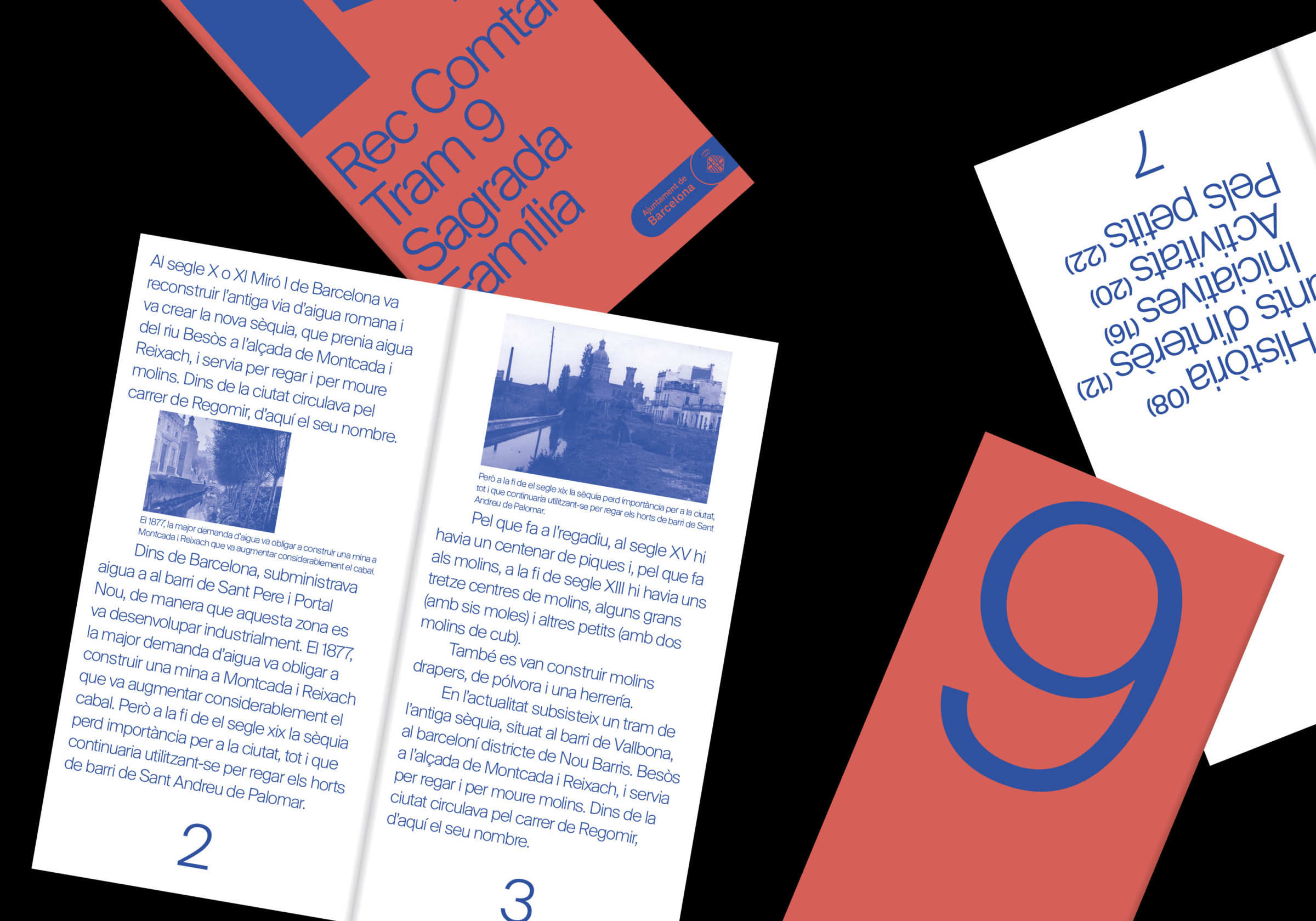
For this project we wanted to emphasize the use of communication through physical elements. We proposed the use of panels as an informative channel for each section of the Rec Comtal. We also develop a programme of activities on a regular basis, to inform through institutions and public spaces and to facilitate collaboration among local citizens.

