Year: 2016
Tags: Art Direction and Design, Creative Direction and Filmmaking, Strategy and Design Thinking
Stradivarius Facebook
+4.8m followers
Stradivarius Instagram
+3.2m followers
Stradivarius Facebook
+4.8m followers
Stradivarius Instagram
+3.2m followers
Sometimes the solution is looking at what you already have. With a long tradition in the area of women’s clothing, Stradivarius was ready to launch a male collection, yet they encountered difficulties when it came to including the newly created male characteristics into their brand and communication, one they saw as 100% feminine. Having worked with Stradivarius in the past for The Event Paper and thus understanding the structure of their communication and global work context, we offered a different approach to a complex question through design thinking.
The original brief was to launch the new male line by extracting it from its female counterpart using a new sub brand called ‘Str Man’. Analysing the market we deducted this was, in fact, unnecessary and might lead to confusion and superfluous efforts in the communication field as this also meant creating two separate entities within the same company. In current times of constant change and with a society of people apt to accept changes for brands, we discovered that what Stradivarius needed was a subtle change of identity, a rebranding, that would allow the male and female line to coexist in one brand.
“Sometimes a solution is too obvious to be seen from the inside. To us it was pretty clear we didn’t need to create something new, as introducing a new brand for the male line would have meant big efforts in terms of global communication and resources. It was simple: stradivarius could be a brand for men too.” Rafa Martínez, COO, Partner & Brand Strategist at Folch
For Stradivarius as a brand it was key that the new identity safeguarded its long tradition of creating female fashion, while simultaneously becoming more gender neutral in order to allow a male line to enter the brand’s connotations and customers’ perceptions. While we were at it, we also wanted to include a more modern and sophisticated mood for Stradivarius without changing its core values and feel.
After investigating the brand’s legacy and past designs, we came to the conclusion that the typography and logo of Stradivarius could be very much improved. Stradivarius also needed a typography more fit to be displayed in big sizes; one that would increase the logo’s letters’ readability and harmony. We also concluded the logo needed more contrast to evoke thoughts of elegance, vinculated to the brand, and needed to be able to stand on its own as a word to give flexibility to the message of Stradivarius. When word and symbol came together, there was also missing some coherence, a style element we were keen on fixing.
The answer to our goals was Lyon Display by Commercial Type, a young, modern and gender neutral typeface.
Stradivarius’ treble clef is key to their identity as a brand, yet it didn’t work on its own as a symbol when removed from the brand name. At the same time the goal was to bring the symbol closer to the world of fashion by reducing its graphic complexity. By doing so the symbol would gain more customers recognition, harmony and contemporaneity. We created various options during the design process and ended up with the last symbol (see below), which manifested all the goals we had set out to achieve. It also enabled Stradivarius to act more creative and diverse when it came to combining both symbol and brand name, or even to use them as two separate and equally strong campaign elements.
For the digital environment of Stradivarius Man, a special campaign was thought out for the launch of the new line and online store. The campaign revolved around George Alsford (+21k followers on Facebook), who represented everything the new male line and its world entailed. The concept was translated into the design and implementation of a home and landing page, adapted to current transmedia consumption on mobile devices using video, images, slideshows and a collage-like design. For the fashion film featured on the home page we gave the camera to Pol Gonzalez, film maker at White Horse: a creative company for production and activation by Folch.
“With this fashion video we aimed to characterise what kind of person the Stradivarius Man really is, how he sees himself, what sort of things he likes.” Pol Gonzales, director at White Horse
After the launch of the male line, we brought the male and female counterparts of the one brand together in a specially designed landing page. We took the stylistic characters of the Man homepage to create an editorial campaign for the s/s 2017 collection we called ‘Wanderlust’, featuring both the new male and female line and reassuring us and the client that both lines can indeed exist under the same brand, up until the point where they can even come together. Similar to the Man campaign, the concept of collage comes back to mind, using quotes and videos on top of images or the other way around.
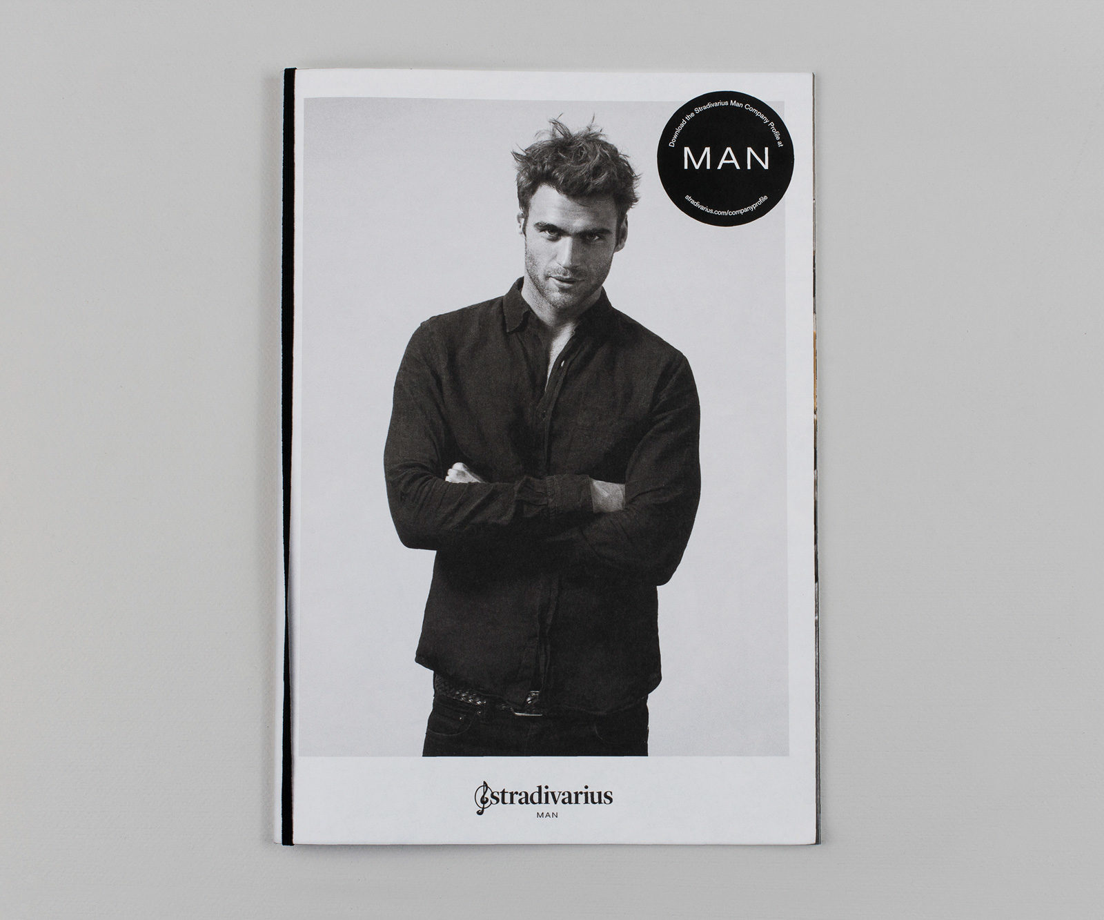
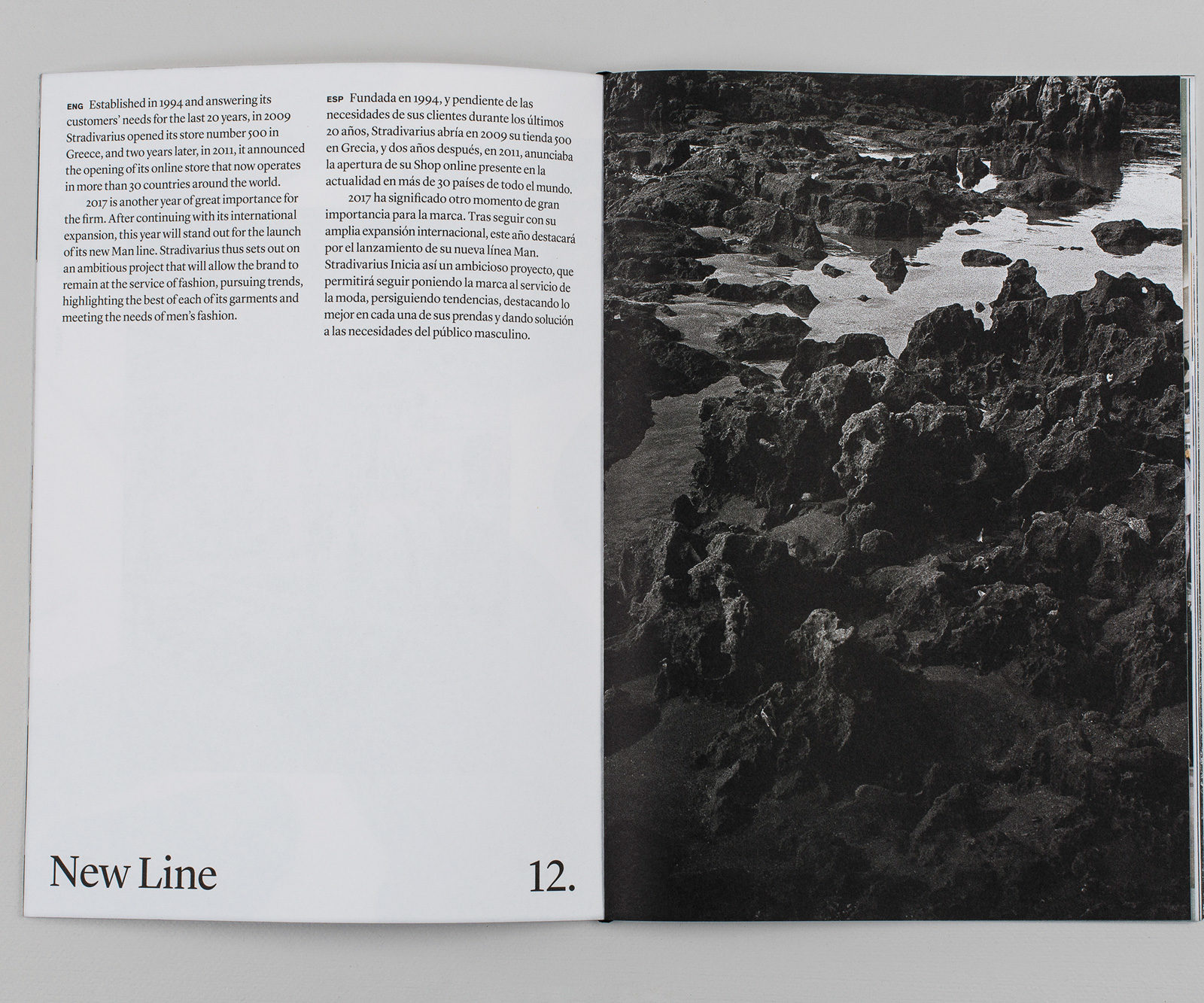
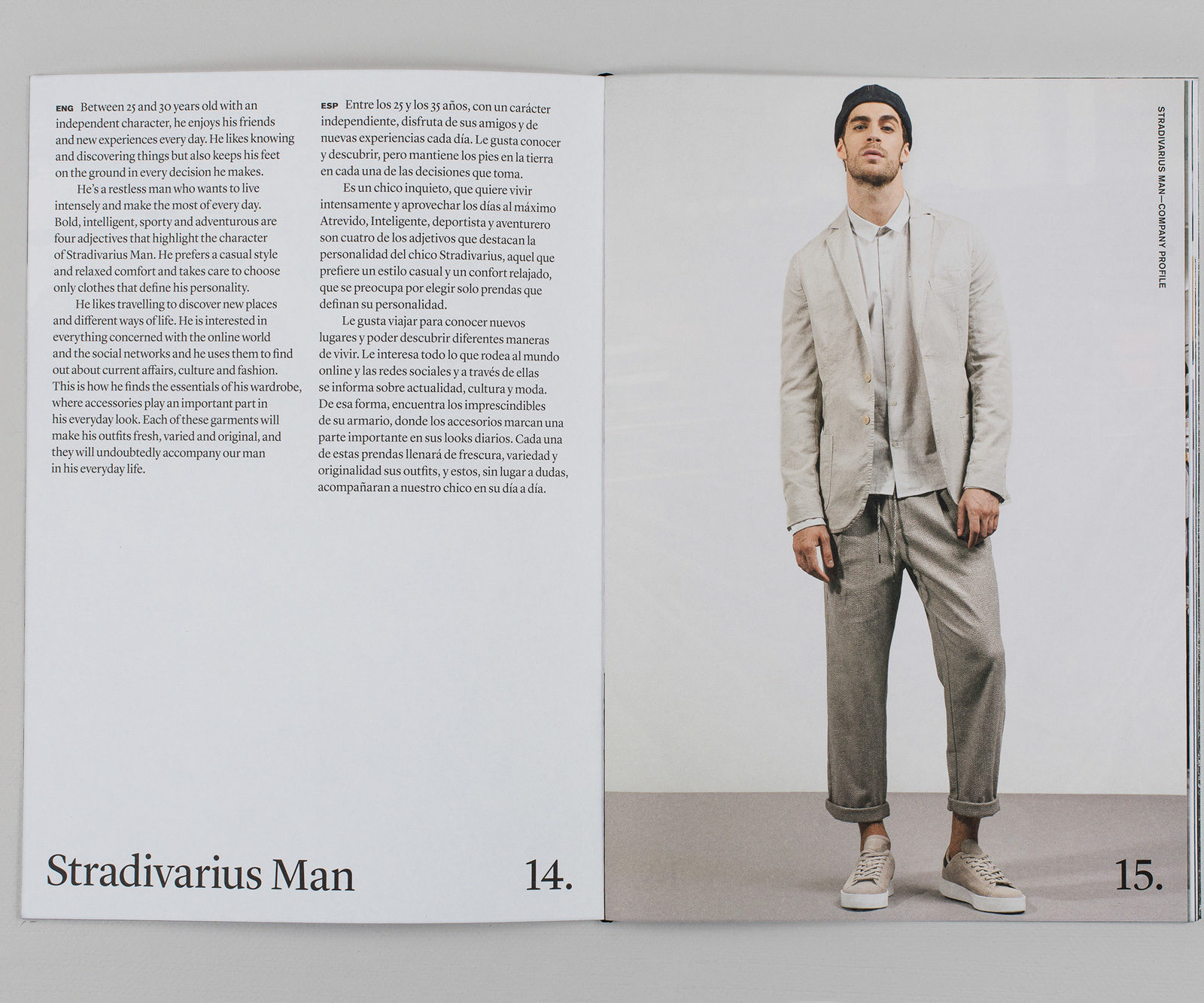
Under the guidance of Artifact, we wanted to design a magazine for Stradivarius that functioned as a company report. The publication included store photographs, product still lifes, infographics and textual information on the brand and company. It had to be a piece every man would like to put in his bag; one which welcomed people into the mood surrounding the lifestyle of the modern-day man.
As the Stradivarius Man stores would have an industrial feel to it, we also transferred this onto the publication using close-ups of materials, a big size paper for the magazine and its typefaces, as well as a robust touch.


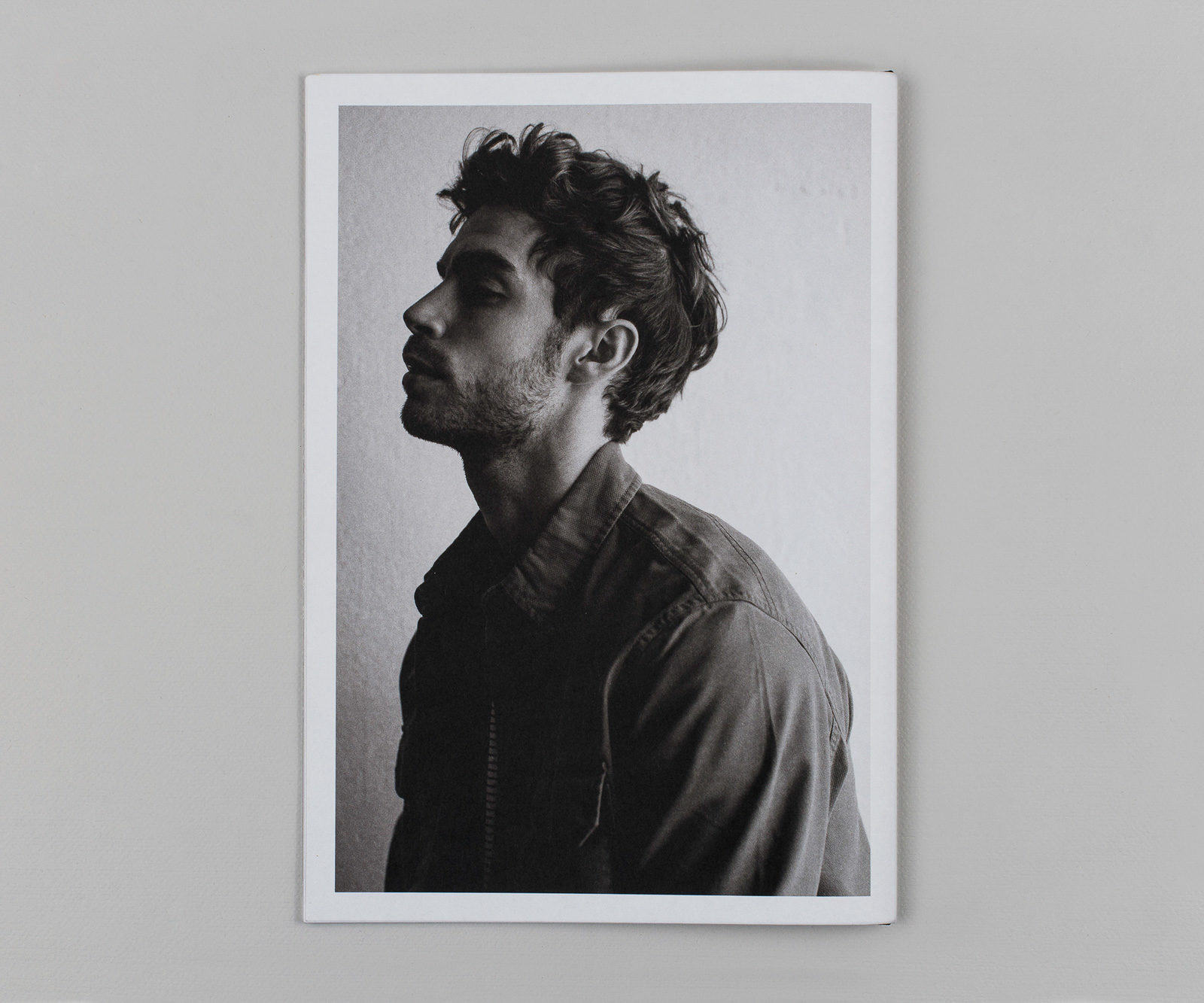
Inside the report went the lookbook, divided into sections that described current trends in fashion. While Akzidenz Grotesk Pro appears as a typeface, giving the publication a more gender neutral and minimalist design, the grey cover of the lookbook gives the publication the elegant character Stradivarius was looking for. Because of the male lookbook’s great success, a female version was also created, this time with a cover in a sophisticated, soft pink. All created under the creative direction in production by Artifact.