Year: 2013
Tags: Art Direction and Design, Creative Direction and Filmmaking, Strategy and Design Thinking, Animation, Art Direction, Branding, Type design
Mapping musical stories
For the ones who often watch the Spanish channel TV2 (RTE), this will sound pretty familiar. For those who don’t, Mapa Sonoro is a musical program with the look of a road movie that tracks the most exciting proposals on the current scene. It is a program focused on quality independent music. The show is primarily centered around pop and indie rock, but it doesn’t overlook hip hop, electronic music, flamenco, jazz, singer-songwriters and folk. The program develops through a character who is never seen, but who takes center stage with his voiceover. Mapa Sonoro is a cult program, unique in its kind. This is why we were really happy when Goroka, the video producer behind Mapa Sonoro, contacted us to renew the overall graphic design. The program’s graphic design hadn’t been changed in many years: the past design started to look pretty obsolete and the producers wanted a new modern appearance for the show.
A nocturne redesign
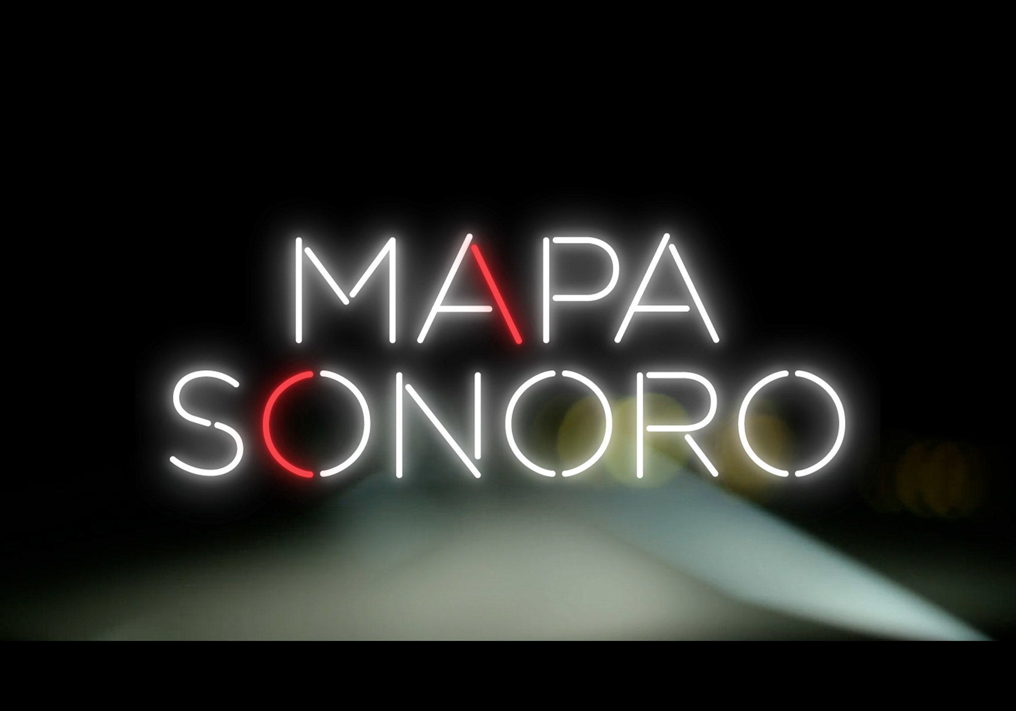
Night is when most music happens. When lights turn off in concert venues and stages are lit only by flashing neons and spotlights. Somewhere in the middle between Bauhaus experimental type and a club neon sign, the custom typography system we designed for Mapa Sonoro had all the elements we needed to create a nocturne, dark and attractive look. The modular geometric typeface is the core of a bold and recognisable graphic system where the use of rational and geometric letterforms and the strokes’ uniform thickness, paired with the charming neon lights, achieve a bold and recognisable identity and a unique personality.
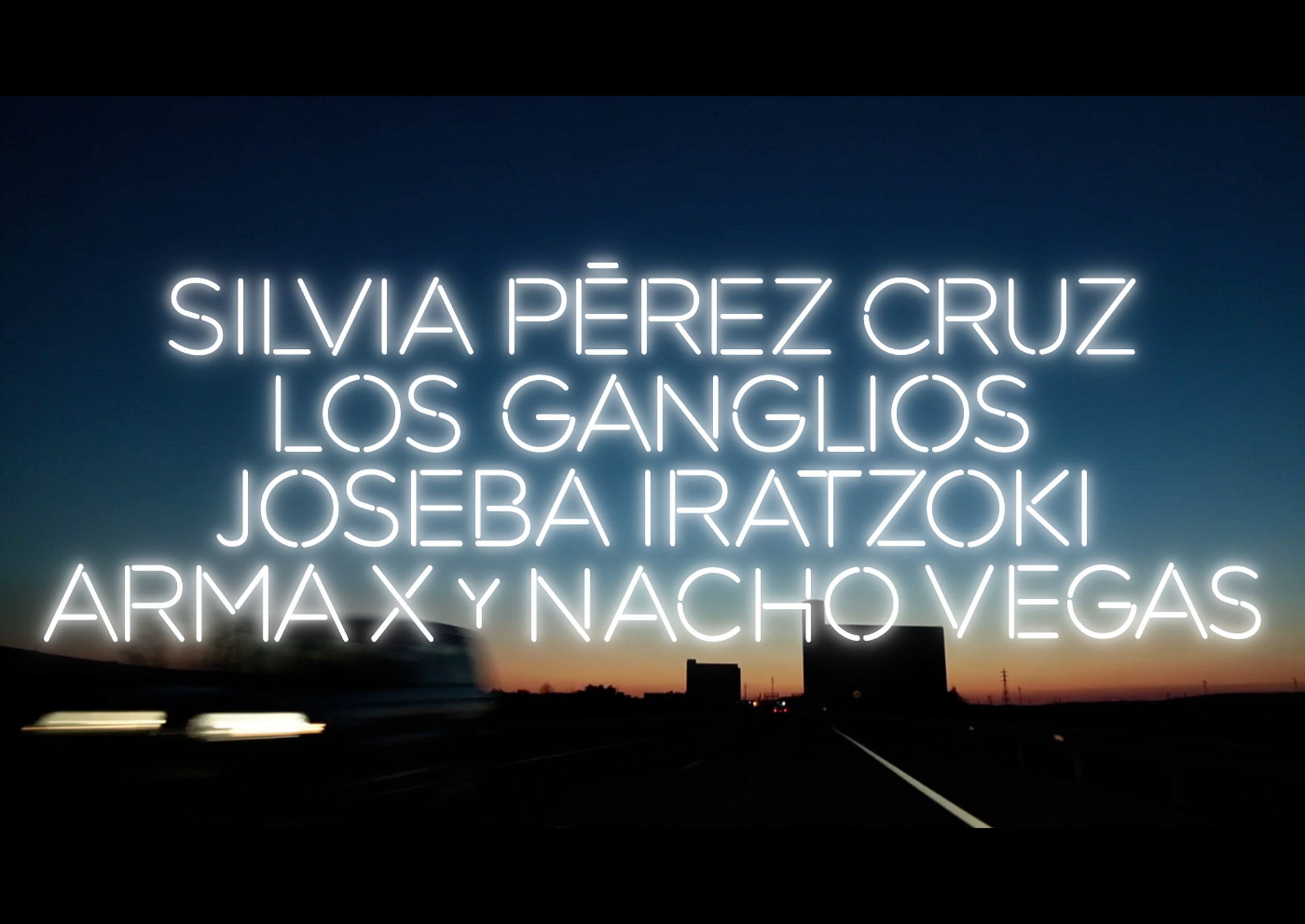
The custom typeface designed for Mapa Sonoro is based on Gotham, a typeface designed by Hoefler & Co. In a way, it was like closing the circle, being the font family designed by Hoefler a celebration of the city lettering of big American metropolis, “those letters of paint, plaster, neon, glass and steel that figure so prominently in the urban landscape.” After having meticulously designed the whole typeface, we started studying the perfect animation that we needed to achieve.
Finding the right point
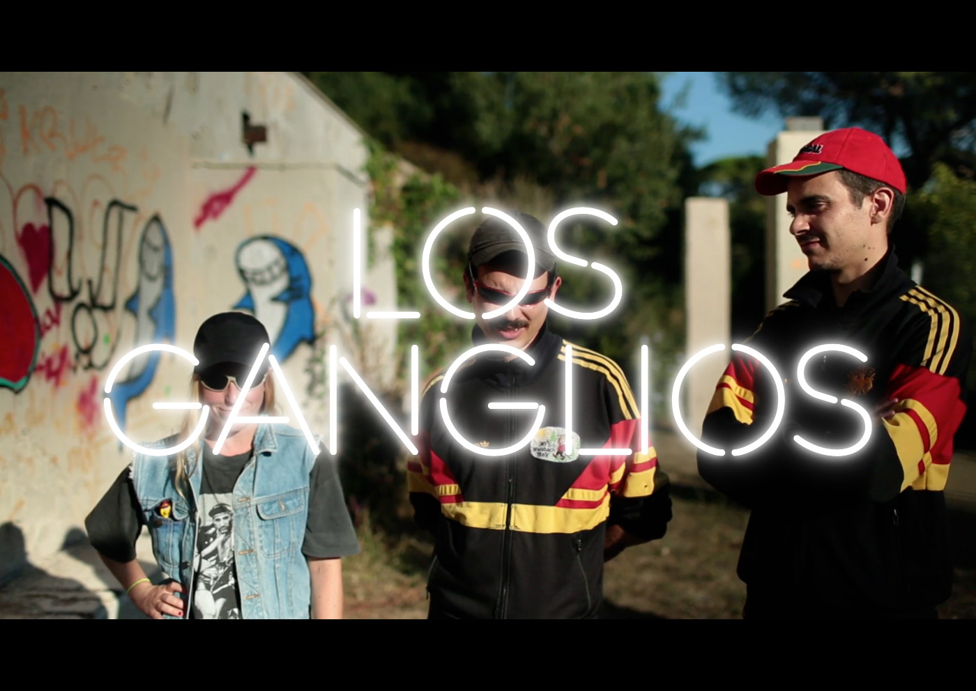
The animation should naturally simulate the neon lights and even a little imperfection would have undermined the quality of the whole project. Together with the team of Goroka we carefully refined and improved the animation and the glow around letters until we felt it was perfectly fluid. The glyphs would show up gradually until the whole lettering appears. Almost stepping into art direction, we provided the Mapa Sonoro team with guidelines on how to better use the different graphic elements, depending on the frame, the background, the tone of colours.
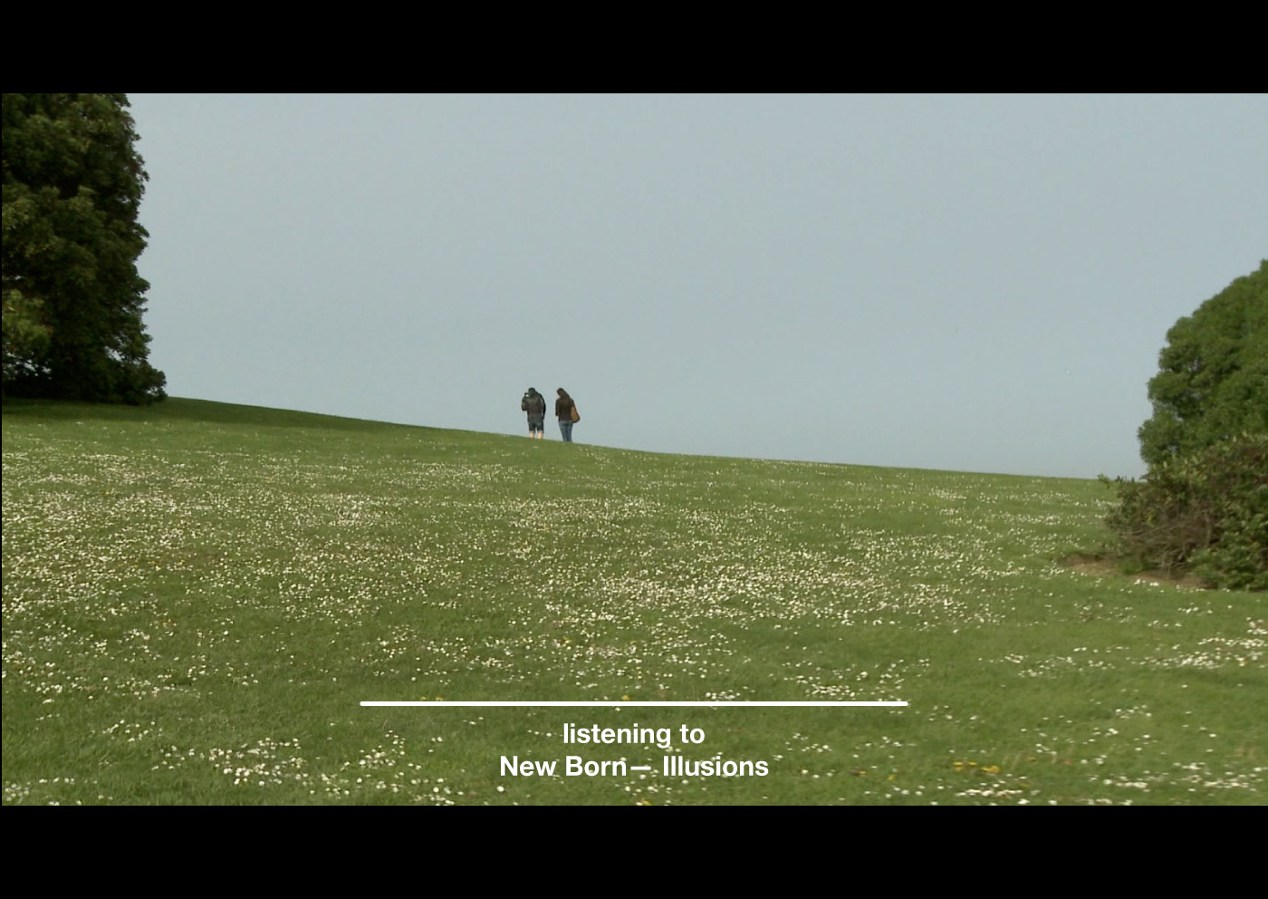
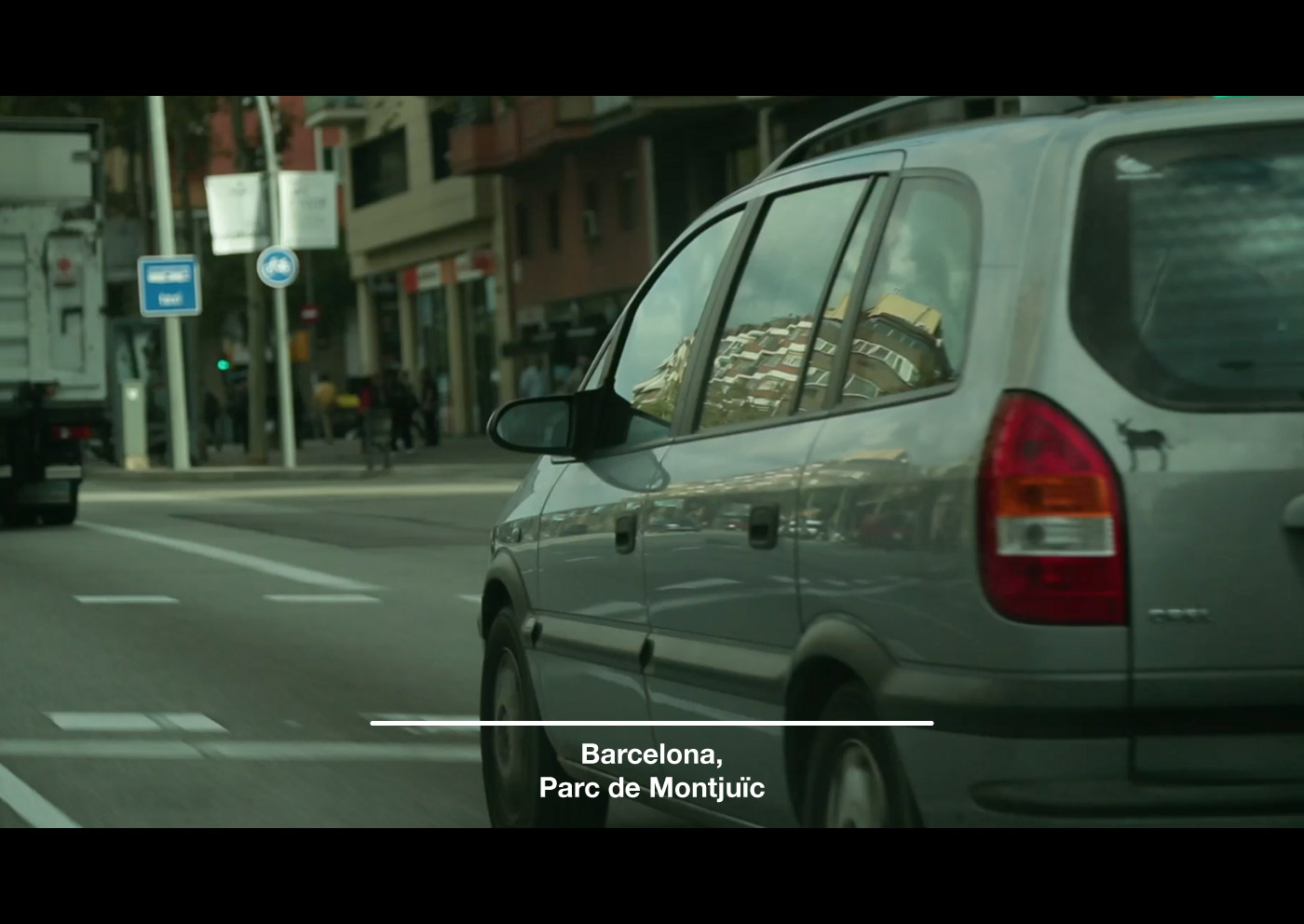
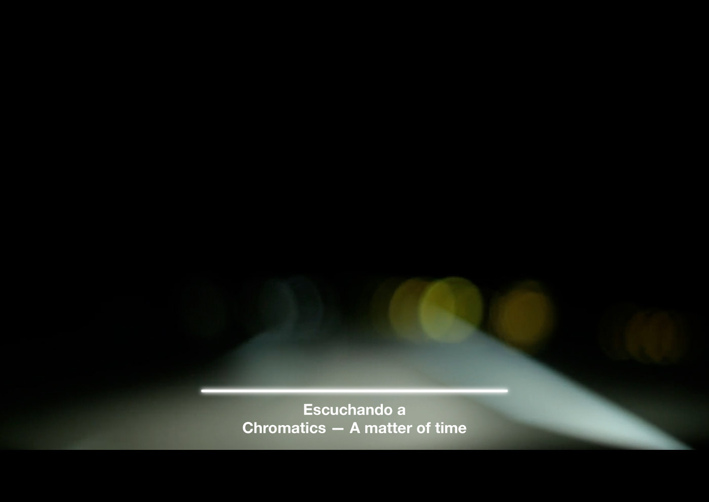
For each show of the season we defined a distinctive colour, so that every episode felt like a closed capsule and a part of the whole; on the other hand, this chromatic variation gives dynamism to the graphic system. Through developing the Mapa Sonoro project, we designed the graphic superimposed information system for the tv show, ranging from program logo, the titles, the closing credits as well as all the types of chyrons needed. During the design of the whole system we aimed at maintaining graphic coherence throughout, avoiding neon letterforms when small sizes wouldn’t allow a perfect readability. As a secondary typeface we selected the perfect and accurate proportions of Helvetica Neue.
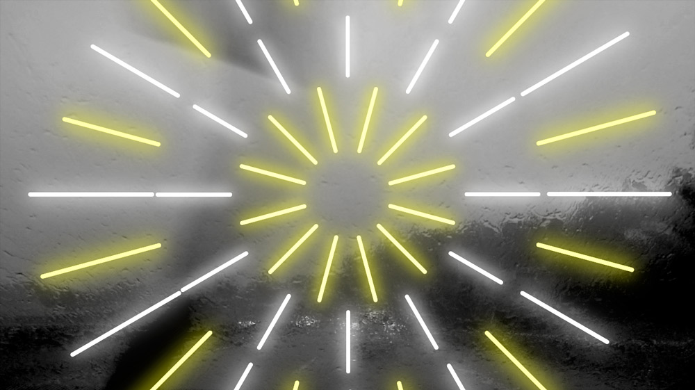
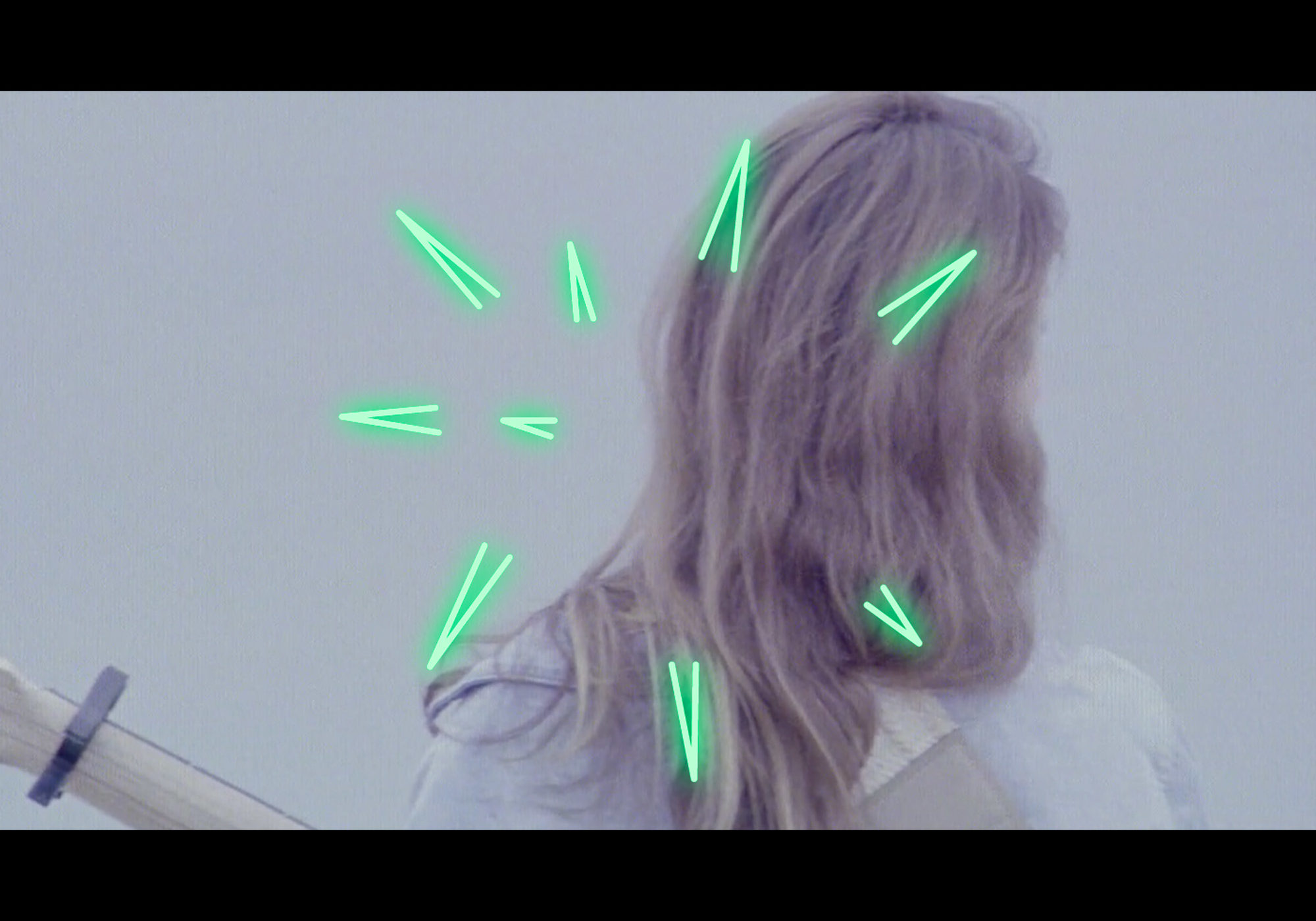
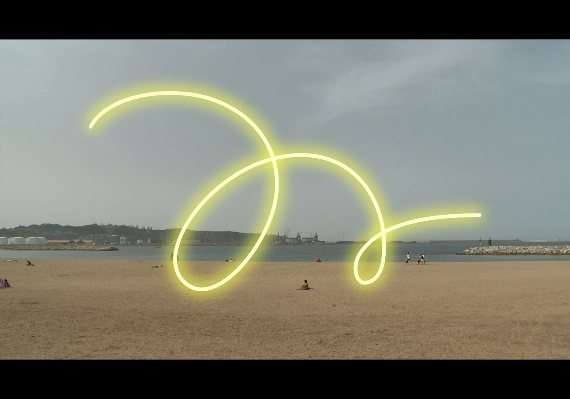
Eventually we got carried away and developed neon-lit illustrations which could increase the personality and add visual value to the project.
