Year: 2016, 2017
Tags: Art Direction and Design, Brand Journalism, Brand Narrative, Creative Direction and Filmmaking, Creative Production, Digital Activation, Identity, Strategy and Design Thinking
Photos from Mari Luz Vidal, Openhouse Magazine
Photos from Mari Luz Vidal, Openhouse Magazine
With the goal to not only rebrand the company but to also project a new way of understanding real estate, we delved into the strategy and branding of Metrovacesa. We wanted to give them a new discourse: a voice and image that was able to adapt to the digitisation of society and the new understanding of the world and its communication, both in terms of content and opinion, while at the same time reflecting the trustworthiness of the major company. We came to the conclusion that Metrovacesa had to be relaunched in two aspects; on the one hand as a new post-modern brand for their clients, on the other as a solid recognisable landmark for investors.
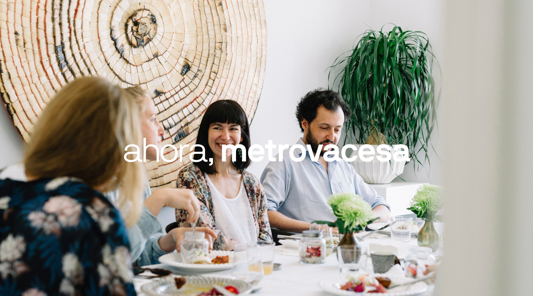
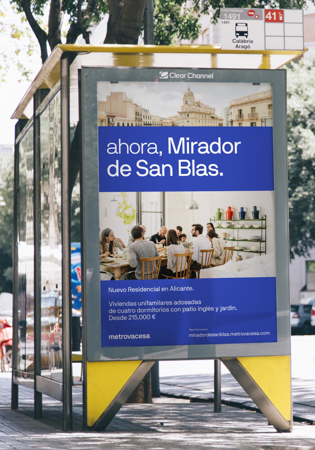
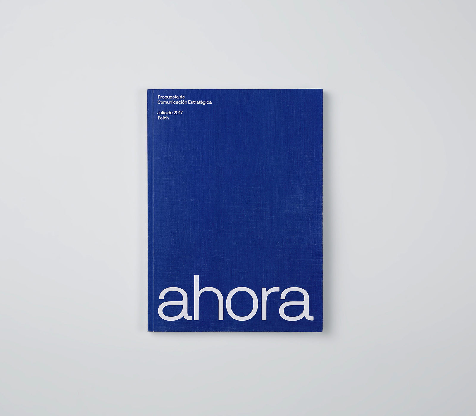
“ahora,” is a claim embodying in its radical simplicity a triple call to action: it resembles the recovering of the great heritage of the brand together with its modernisation; it invites the audience to discover a place and embrace a new life. Finally, the dynamic claim ‘ahora’ talks to stakeholders by bringing attention to the opportunity of believing in a company that has just been reborn, ready for our contemporary times.
In 2008, Spanish property company Metrovacesa went through a rough fall because of the financial crisis. They were bought by Banco Santander and BBVA, two dominant banks who still own shares until today. Carried out a capital increase of 1,108 million euros through the transfer of assets of its main shareholders, 8 years later Metrovacesa regained a leader position in the market again with a now, global portfolio of 6 million square metres – equivalent to 40,000 homes. The wide mistrust in the banking sector and real estate companies caused by the crisis was evident for many years and is still noticeable within the field. This already existing gap between the company and clients is also enhanced by another important fact: a new generation, born into the reality of the crisis and digital shift, that has become the new client, setting the requirements for the market.
“Rebranding metrovacesa wasn´t just about rebranding a company, but rather reshaping the way real estate could be perceived. After being knocked down by digitalization and crisis, the insights had to go beyond a new name, a new logo and a new identity: it was about being perceived as something domestic, close to people, experiential and, somehow, not transcendental at all.”
Rafa Martínez, COO, Partner & Brand Strategist, Folch
To meet the idea of communication as an experience, we needed to reduce the scale of the company. This meant bringing the company from a grandiloquence throne down to a ground level, with a voice more closely aligned to the client and his needs. It also meant less focus on the buildings and moving the spotlight to the interiors while simultaneously turning them into liveable experiences. A move to make the process of purchasing a home a memorable decision.
For the middle class, buying a property means making one of the most important life decisions, especially considering their inaccessibility to the market after the housing crises of 2008. Metrovacesa’s commitment is therefore to facilitate and simplify this decision to its maximum extent. We concluded that in order to do so, the company had to also commit to providing truthful information and making it accessible through digital technology, allowing to lighten the weight of the purchase decision while also easing the process in the meanwhile. As a result, the company can now grow a relationship with the client and move closer to their needs and expectations.
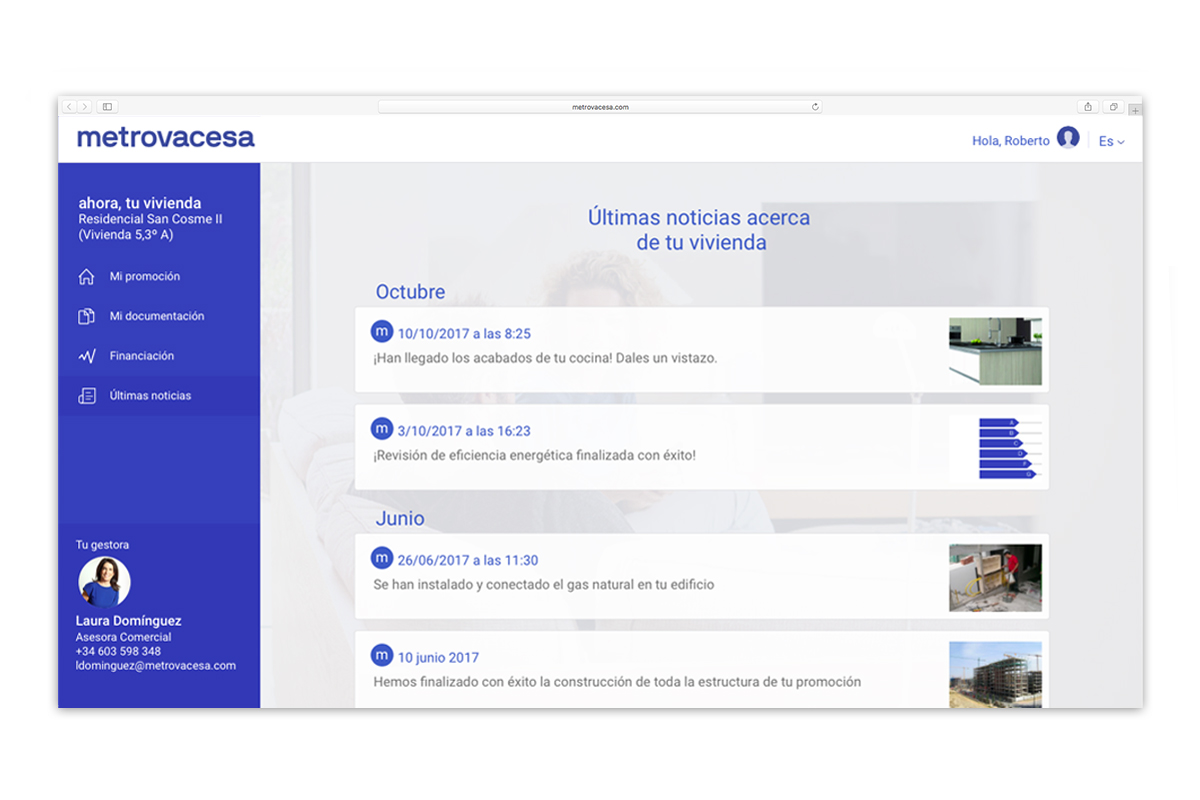
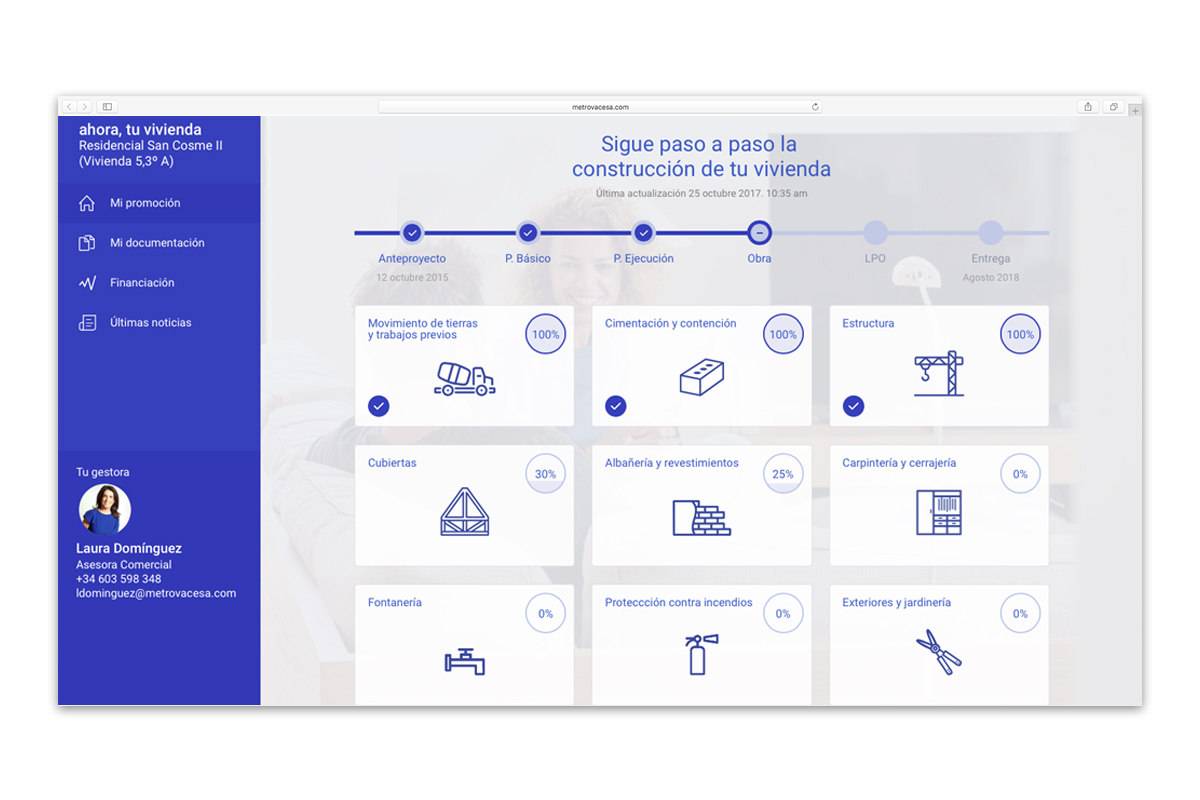
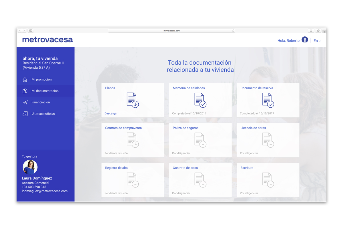
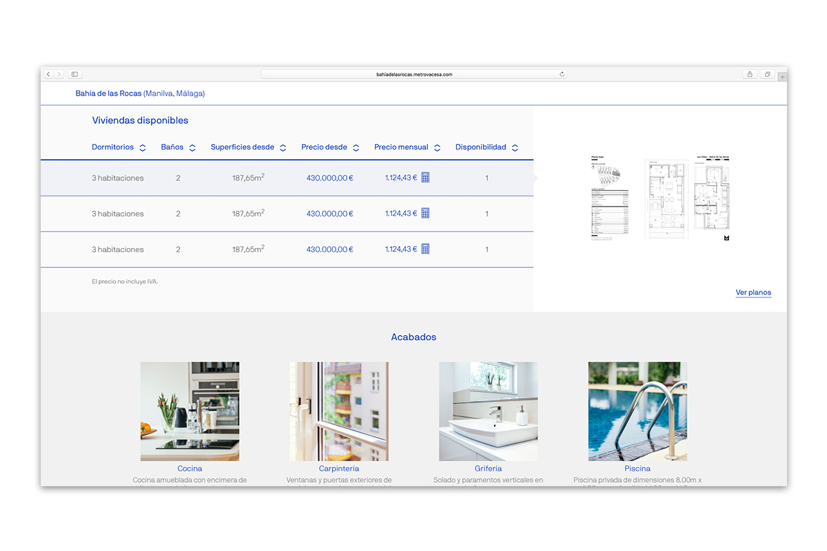
To create a highly customised service for the customer and to reflect the company’s transparency, we created an internal platform designed exclusively for customers in order to keep them informed after purchasing Metrovacesa real estate. Accessing the platform, the client is provided with an overview allowing him/her to experience the entire process of his/her property, generated by a timeline and percentages which visually demonstrate progress as well as notifications keeping the client updated with the latest news. Another section was added to also give a clear overview of (un)finished paperwork, with a personalised contact person from the company at the disposal of the client at all times.
Art Direction by Folch, photography by Mari Luz Vidal via Openhouse Magazine
The relationships we as consumers established with our suppliers –everything from goods to services, has evolved the digitalised experience of a la carte services, personalisation, immediacy and proximity. The companies willing to reform their modus operandi are clearly the winners in the long run, exploring the idea that experiences are the new luxury. Subsequently, for Metrovacesa, we chose to base our strategy on the concept of inbound marketing; a method which combines marketing and publicity (content marketing, SEO, SEM, social media etc.) to speak to the audience without intruding him/her in terms of user experience, but instead create content and a way of introducing commercial information which adds value through brand experience.
In order to achieve our goals we had to create a digital ecosystem for Metrovacesa. In alignment with the digitization of society, the base for this structure had to be a digital environment in which content, offers and values of the company could flow, grow and be shared. We therefore opted for an open system in which separate components could be vinculated, or in other words a communication system in which every element of the structure strengthens the digital and commercial universe of the brand, connecting corporate information, content and inbound marketing while also creating coherence between graphics and editorial.
Once this Insight was defined, the graphic approach of the project had to take a new turn to match with the focus. The importance lied in a recognisable brand with high appeal aligning with the defined values. Through the use of typography, colour and composition we were able to generate a graphic style that could be adapted in any graphic application, be it digital or print.
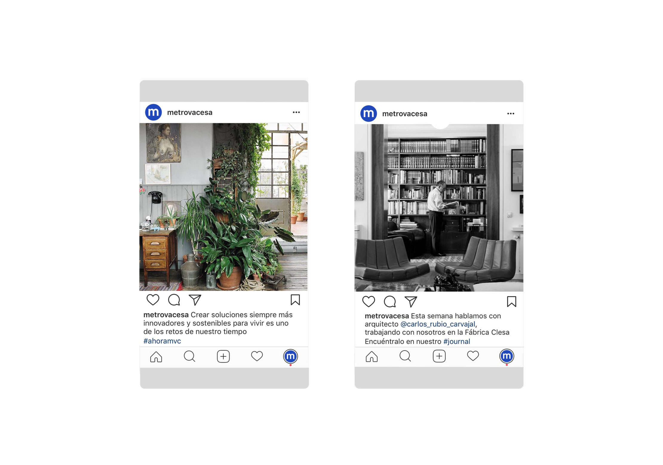
Key to building and expanding the Metrovacesa universe was the branded content. Rather than approaching the Metrovacesa audience with blank commercial content, we chose to use our experience in the editorial field to create a narrative for the Metrovacesa brand, relating topics from the company’s universe; the architects they work with, the housing they are building, the region in which these are build, interior designs, sustainability, tips to buy a house, amongst many others. This idea was translated into a journal, an editorial voice and narrative platform meant to introduce, to both clients and investors, relevant topics, characters and news related to the brand. On another level, this branded content was also transferred to Metrovacesa’s social media.
The importance of visual content today is as important, or maybe even more, as graphics. The necessity of an own visual language that accompanies the identity is solved through an art direction in photography and video, strictly aligned with the key values. In essence, Metrovacesa is given a prism of its own to show the world, both on a thematic and style level, allowing the brand to have its own visual voice and achieving differentiation from its competition. Aside from finding a visual language, the tone of voice had a big impact on the brand language and had to work in parallel with the visual image.
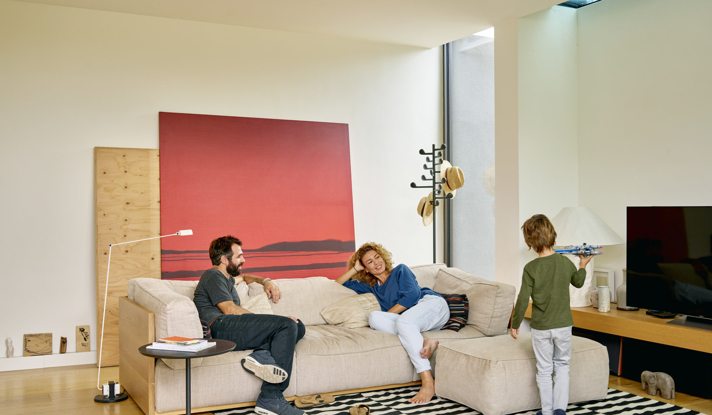
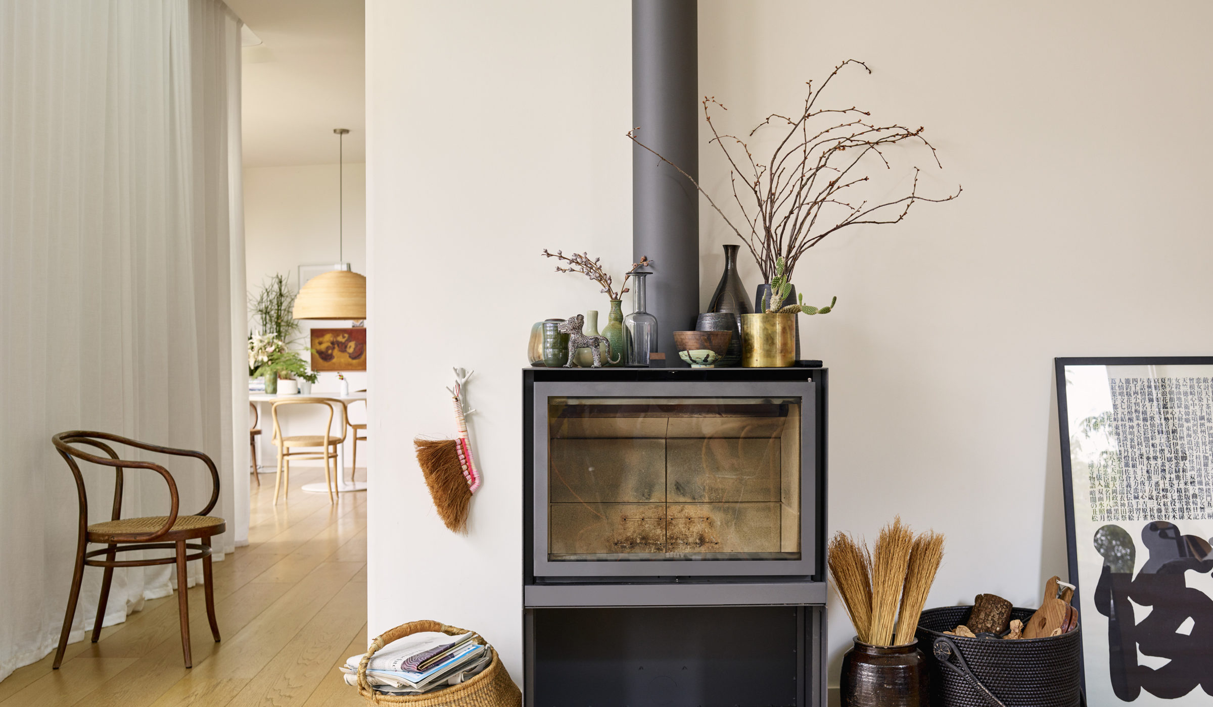
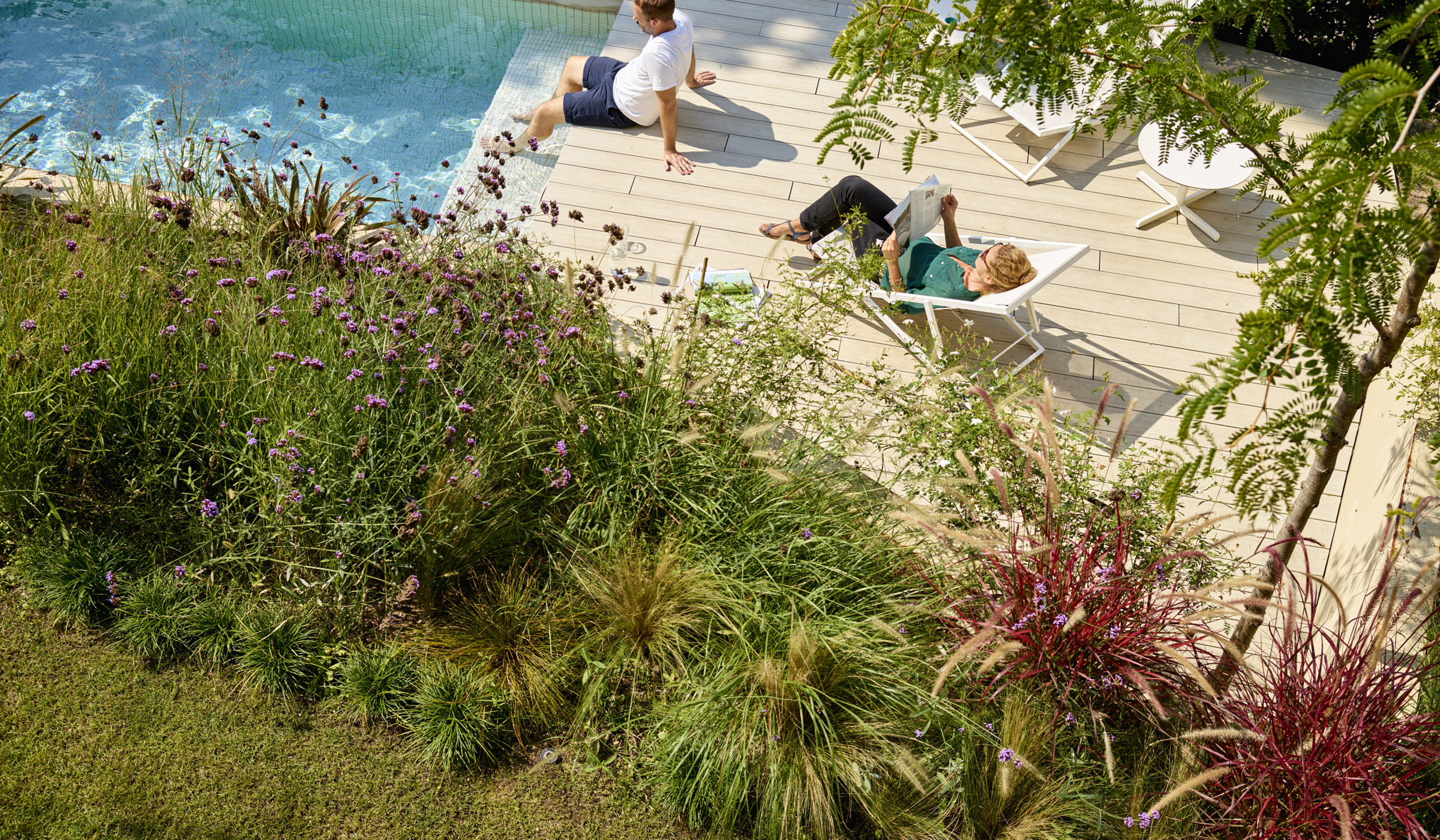
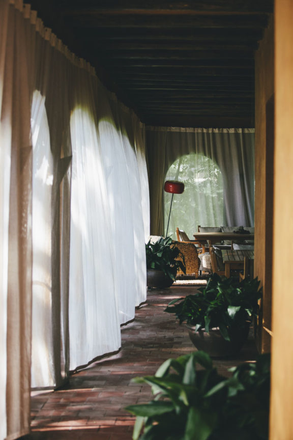
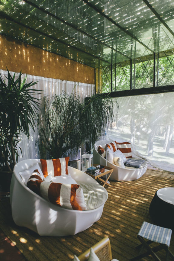
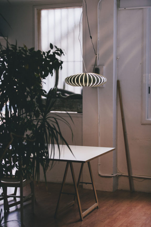
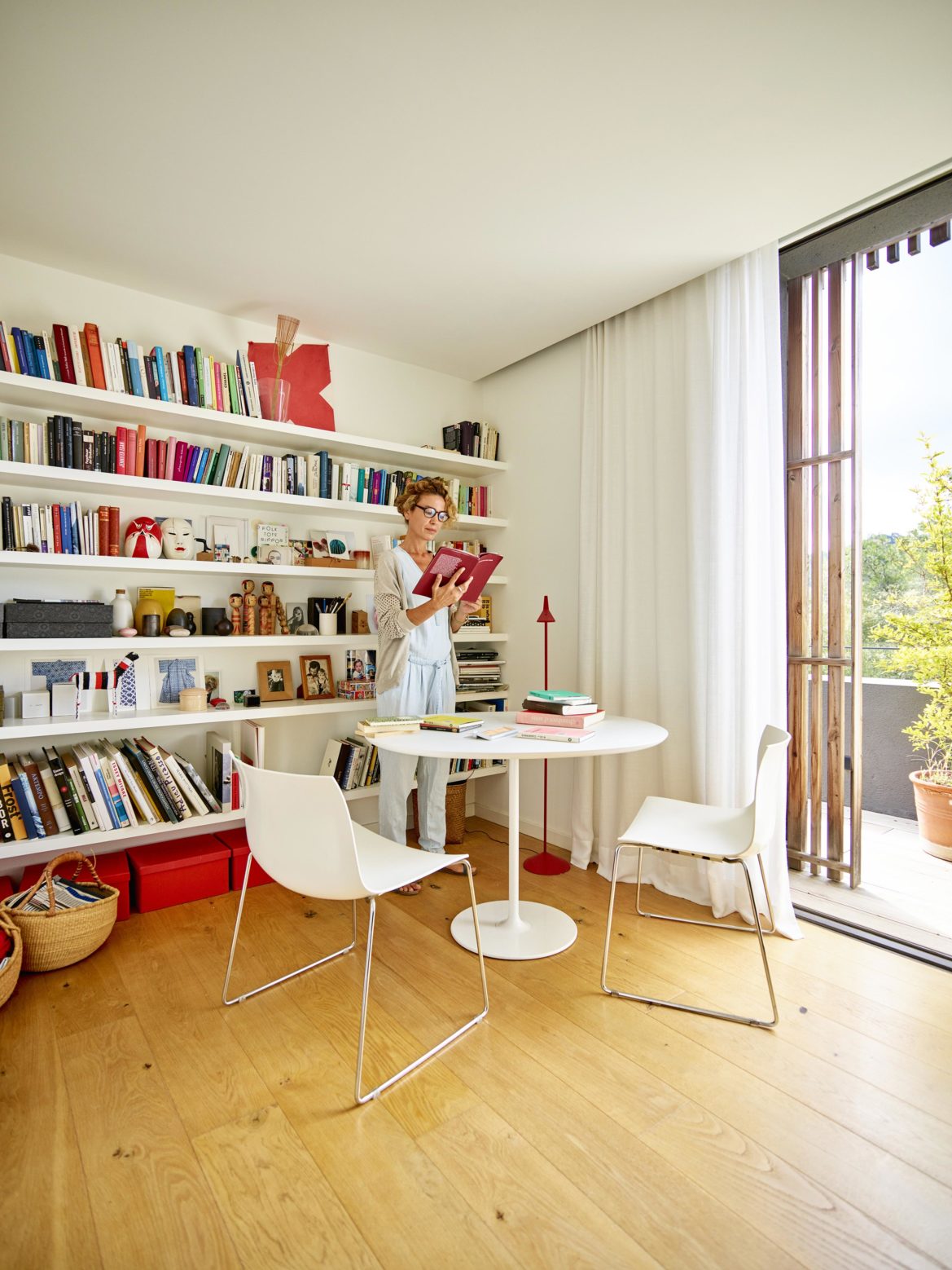
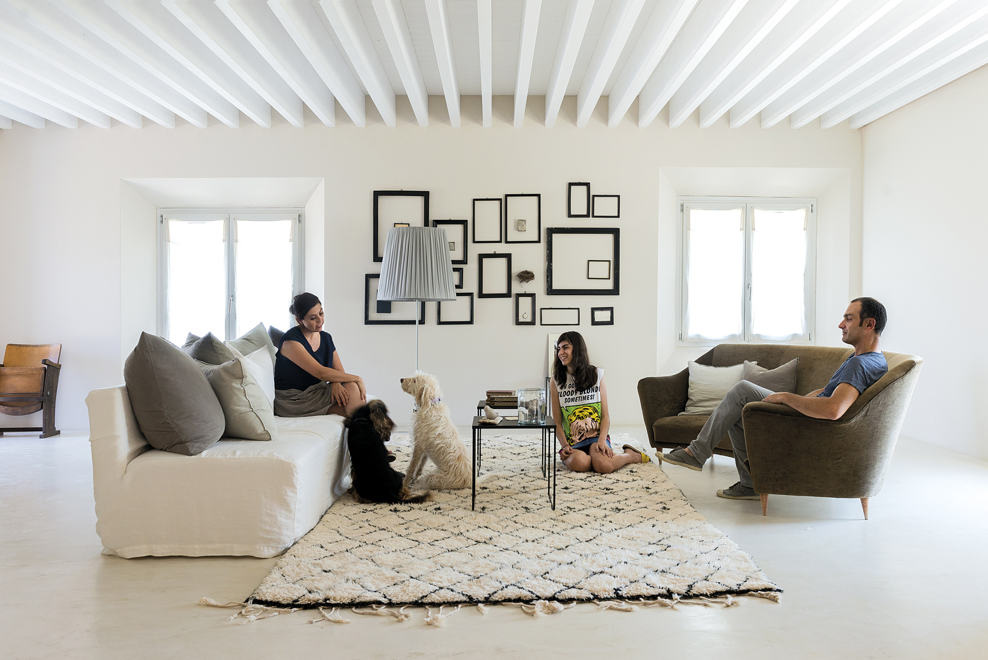
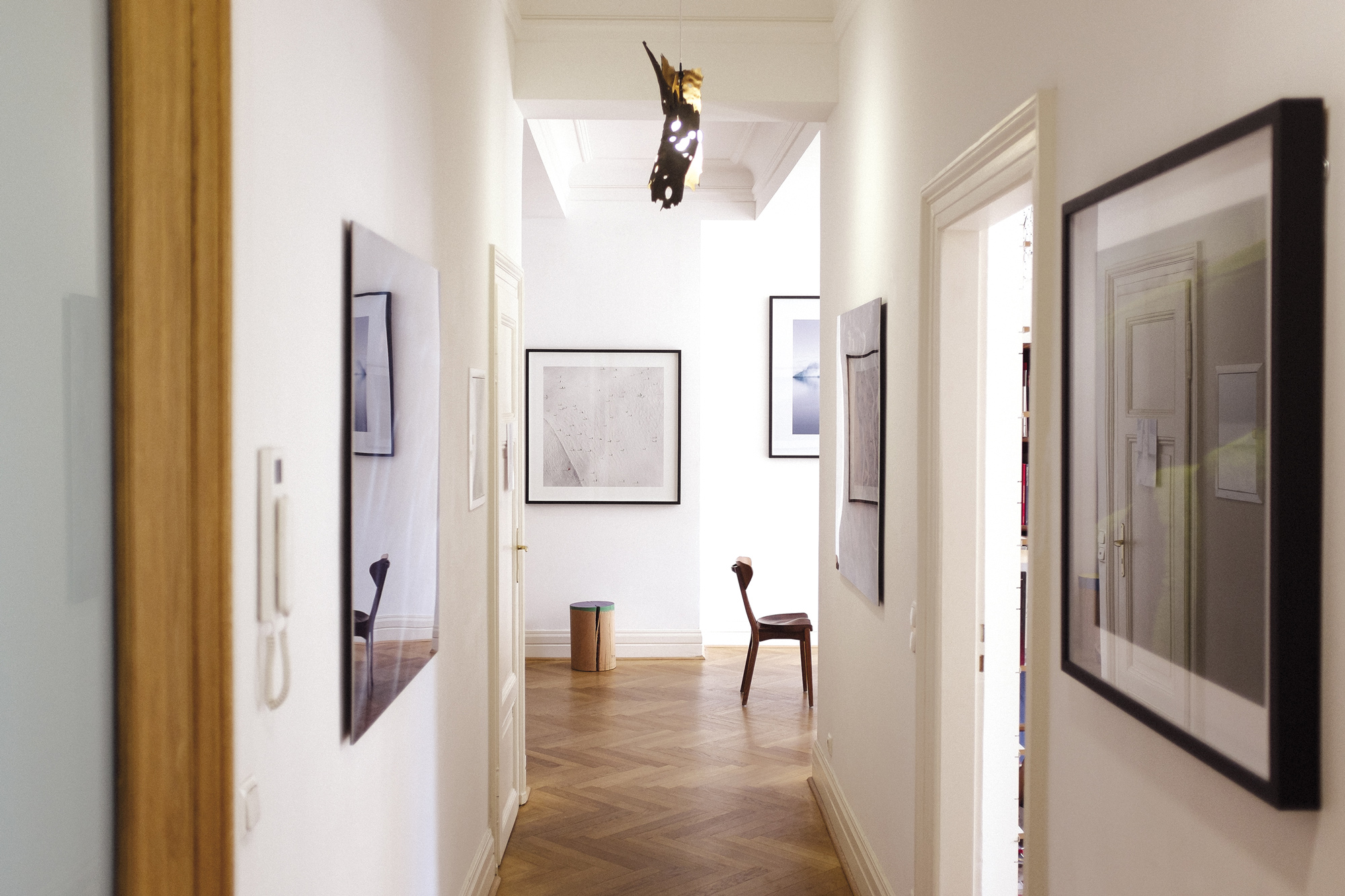
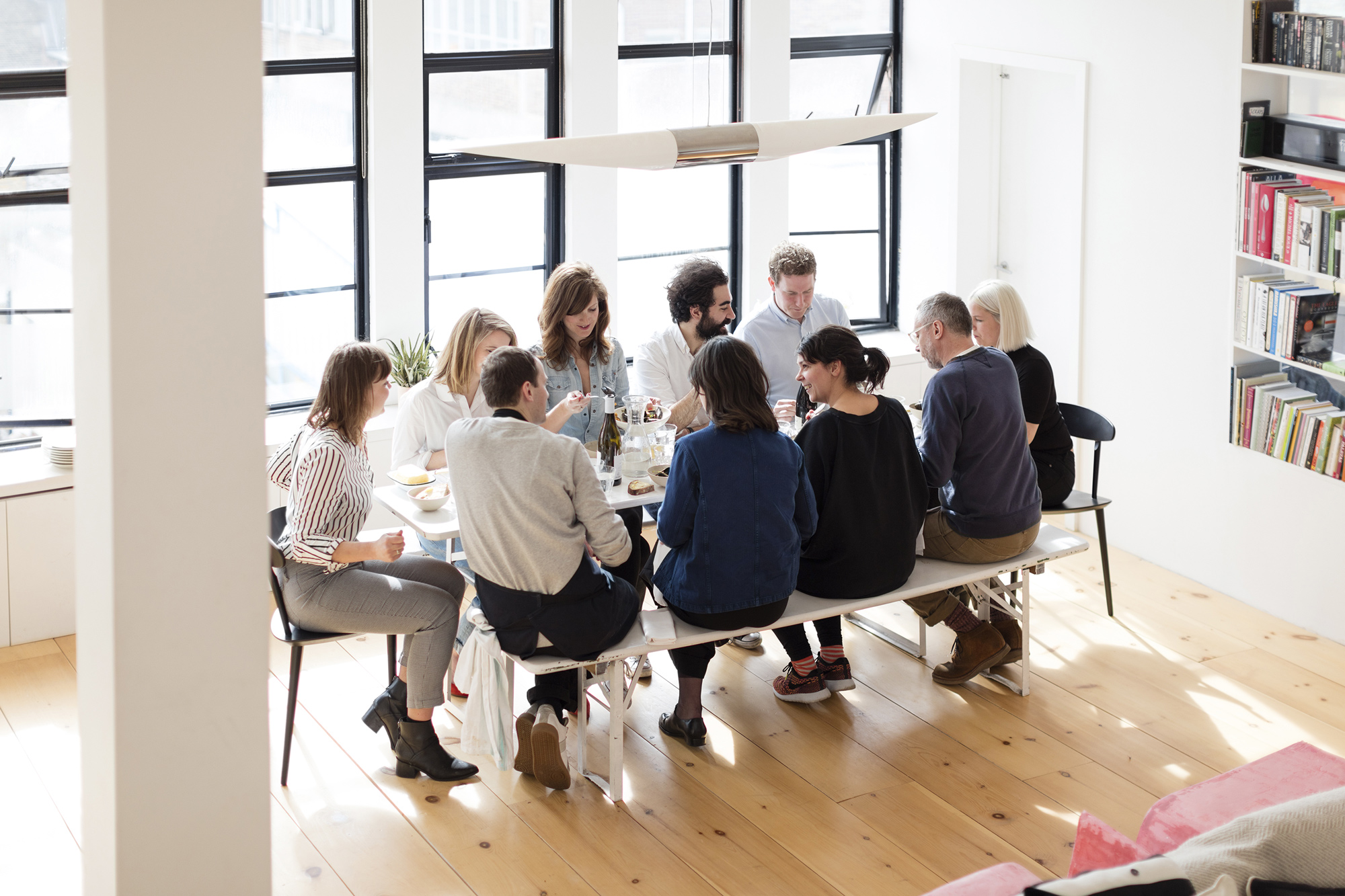
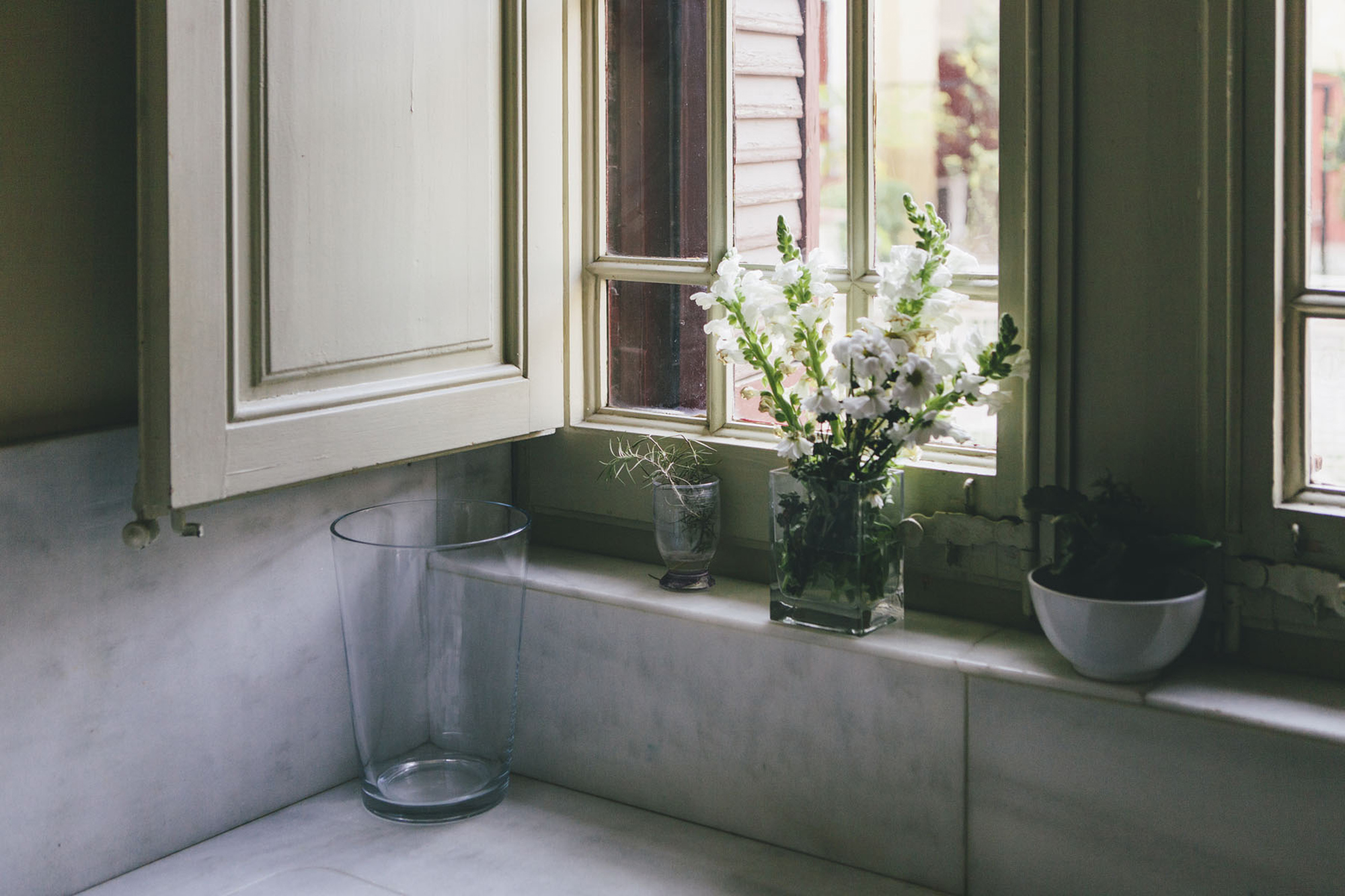
The experience of having a home of your own is the essence of the product and had to be reflected in the communication. The lived space became essential to the direction of art in photography. Inspirational images showing life in a warm and close environment became the main support of the promotions in digital and print. More so it also became crucial to contextualise the sites with attractive images of the close-by environments – always looking for horizontality in the mood as well as the closeness and beauty of everyday life.
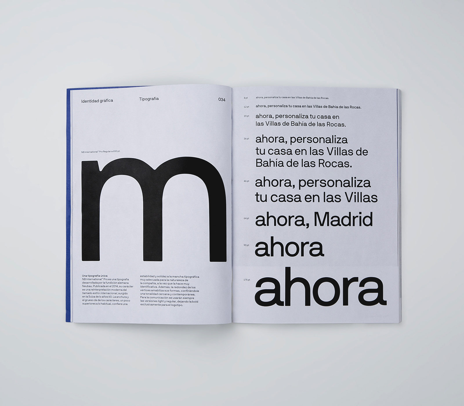
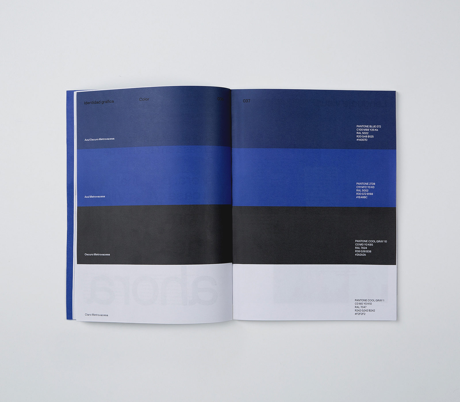
Appeal and recognition depends to a large extent on the ability to be very consistent in all communication elements; For this, the identity works with one single typography, NB International ™ Pro – developed by the German type foundry Neubau – whose design embodies the perfect balance between modernity, stability and fair peculiarity. Similarly, the reduction of the color spectrum, limited to one main color and three secondary tones, unifies and uniforms all the elements. Due to the diversity and the large number of communication applications it was crucial to create a recognisable graphic system. This powerful, attractive and easy-to-apply system is based upon a modular structure which responds to needs of application.
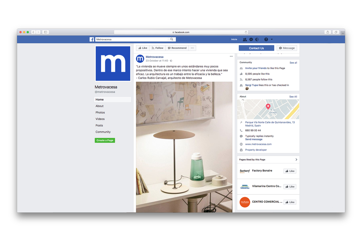
As to fully integrate Metrovacesa into the digital community, the company also needed a change in its digital strategy. We used Metrovacesa’s Own Media (Facebook, Instagram, Twitter and LinkedIn) to create a narrative for each of them, adapted to their respective use and function, and project an inspirational mood. This would enable Metrovacesa to help the company to expand in Earned Media, translating itself in a rise in followers, engagement and brand awareness, as well as enabling new ways of transferring the universe, values and voice of the company.
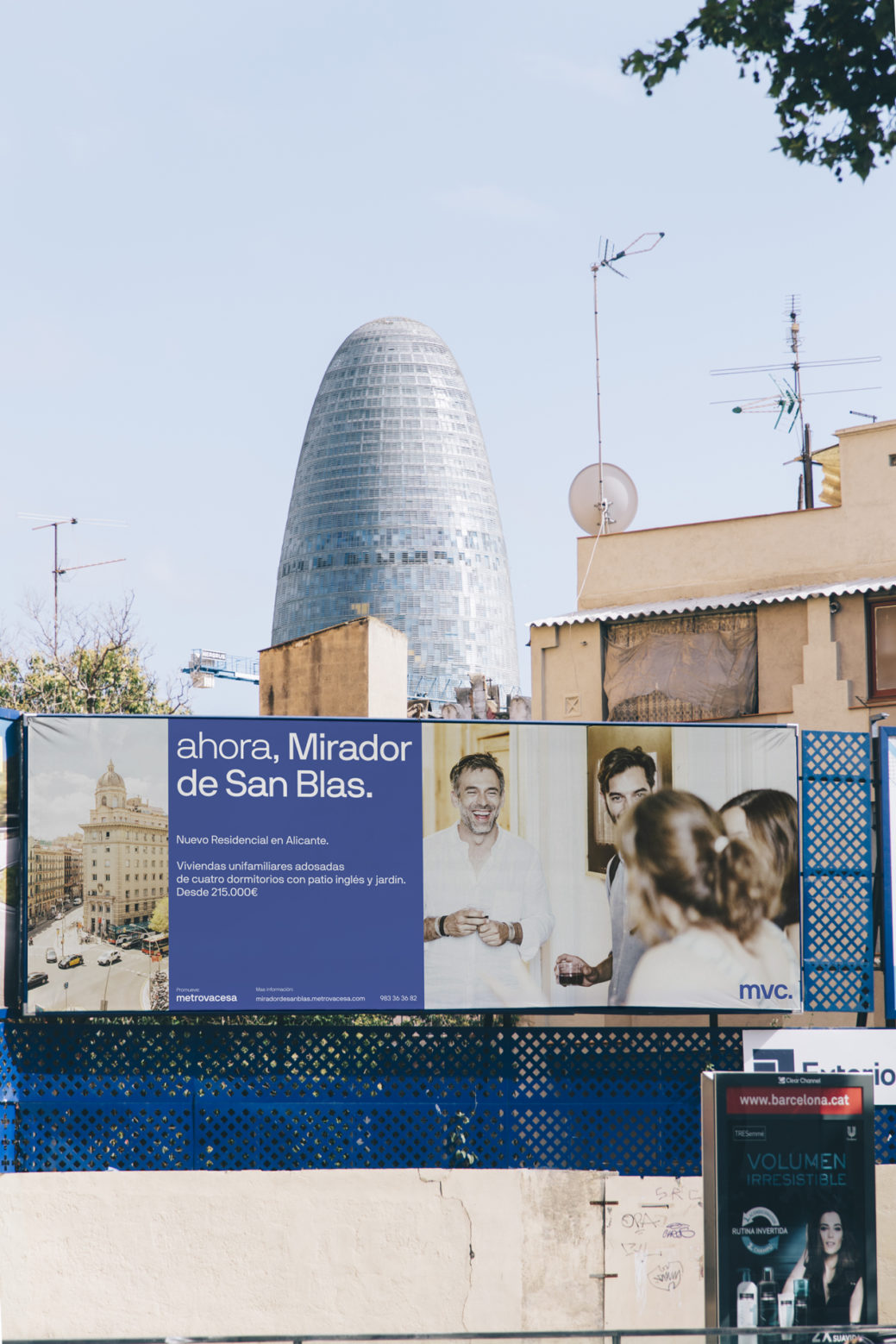
As to reinforce the organic campaign, we carefully and creatively designed sponsored content that would enter the digital sphere, leading those organically unreached segments of the target audience to the journalistic and commercial content of Metrovacesa. Once approved, the ads were adjusted to each and every digital format, depending on the nature of every distribution channel (social media, housing search engines, digital media etc.). Contrary to the organic narrative online, this activation campaign focused on Metrovacesa’s product; the specific housing that is up for sale in different areas across Spain.
For Metrovacesa, we applied a funnel advertising strategy divided into three stages mainly: awareness, consideration and decision. We adapted the message of each piece in each channel according to client purchase consideration; a broad target segmentation that allows us to be much more precise and maximize outcomes of campaign costs. Pau Marí, Digital Brand Manager at Folch
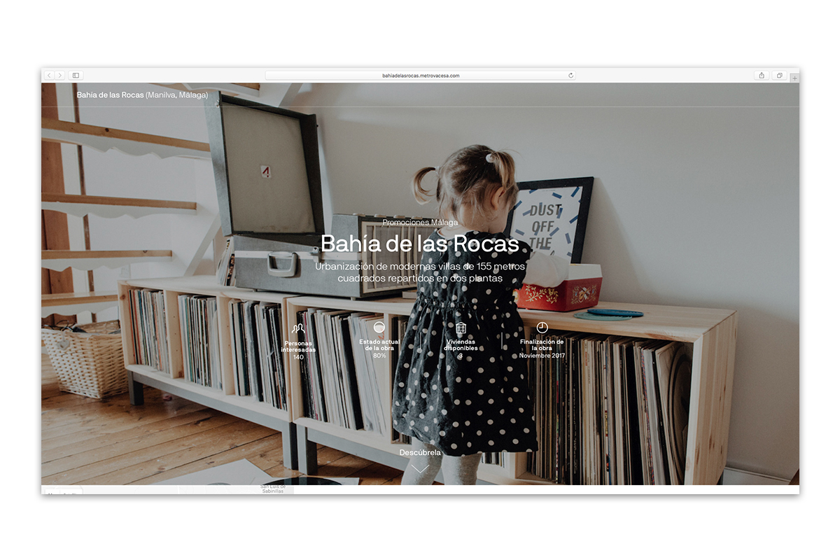
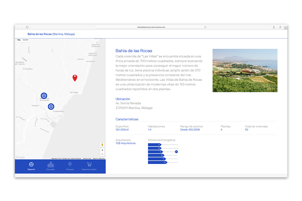
The use of simulations is fundamental for any promoter when it comes to selling sites under construction. What is differentiating Metrovacesa from the rest of its competitors is the ability to maintain a coherency and clear style in all its renders, both indoors and outdoors. The interiors had to flee from the excessive cleanliness and sense of unreal order, so we created closer frames and added everyday objects to the images with a correct selection of furniture, decoration and materials elements in the simulation. The exteriors also had to be presented from a human point of view, avoiding any kind of megalithic figure of the building and instead reach a real and detailed look.
The new graphic identity of Metrovacesa has been designed to respond to three clear criteria; closeness, appeal and systematisation. The use of lowercase letters instead of the previous capital letters is a clear statement for the rebranding of Metrovacesa – leaving behind the megalithic attitude and moving to a down-to-earth communication.
The studio looks after a number of brands across different markets. Why do you think Metrovacesa started a conversation with Folch?
RAFA For the same reason that many large brands have started to work with medium size studios at an international level; because they can give you evidence and a way of understanding communication that may be slightly different from a traditional agency approach. Large brands are looking for ambitious people who are able to connect with a special kind of sensitivity, or with a particular generation. The history of Folch in the interior design field, with projects like Apartmento Magazine as well as collaborations with Openhouse, gives us some familiarity with the private sector. This approach positioned us quite well in terms of branding Metrovacesa.
ALBERT We asked ourselves, ‘Why did they choose us?’ I think they felt attracted by our less orthodox methodologies. Actually, during the presentation, it was already noticeable that our approach was going to be sui generis by the way we explained what we do and how we understand communication. We did not mince our words, we did not pretend to indulge them; we talked about reality in simple terms, and we believe that’s how it should work.
What was Metrovacesa looking for?
ALBERT They had entered a new market and therefore they had to think of a name, an identity, and a strategic communication plan. They went public with a name that had an accumulated history, and we had to develop an identity and communicate a series of visions, values and products for the company.
RAFA They also sought to radically change the image that is associated with real estate. They realized that, after everything that had happened in Spain in the last ten years, they needed to reposition the whole concept.
What do you think were the most critical points of that operation?
ALBERT The reinterpretation of the concept of real estate, seeing it in a completely different way, was critical. This virtually meant repositioning the entire market. Since this is the company with the most planned homes in the next few years, the associated image was of the whole market and not just a single company.
In what areas of rebranding has Folch been involved?
ALBERT We had the capacity to make a change, but I believe that in our work we also need to know how to detect what must remain the same; we must know when to preserve what we already have.
RAFA We added a strategic communication strategy that tries to define certain key areas of product commercialization. The big challenge was putting together a strategy that would allow for commercial success through fluid and accessible communication.
ALBERT Basically, we highlighted a series of strong values related to the product that we wanted to associate with their new way of building and to understand their role in a society that has been punished and disappointed by the construction crisis.
An important part of the redesign has been through photographs and texts, plus a new brand narrative. How has this whole process been?
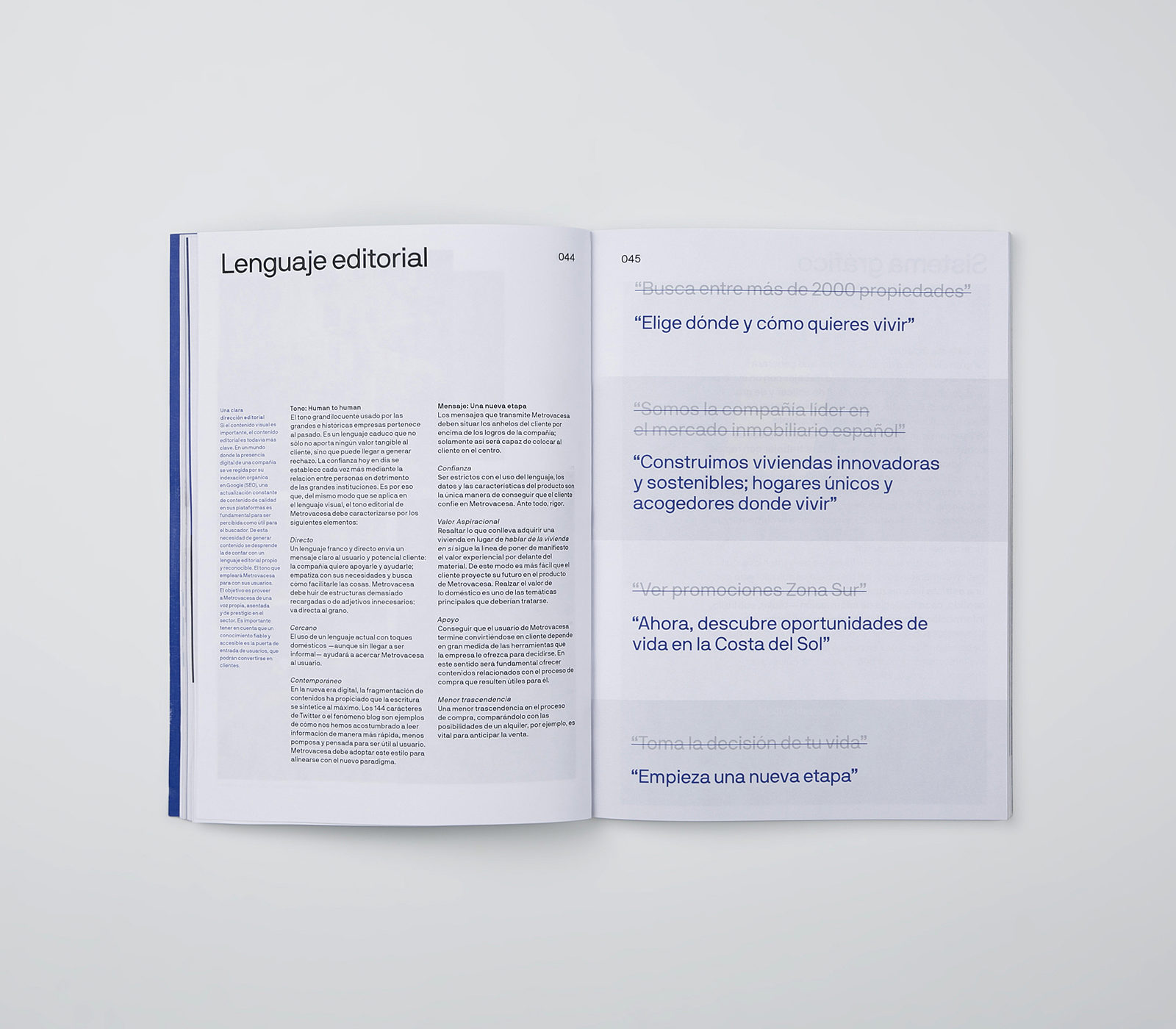
RAFA Today what is often needed most is a redesign in terms of narrative. The complexity of products, services, values, and environments demanded a flexible approach. Apart from branding, we made a substantial effort to generate sales-oriented communication. We developed branding, not on the basis of graphic design but the other way around; thinking about how we were going to solve a sales problem and then how it would affect the company in terms of branding.
How did you transform those concepts and ideas into a visual language?
ALBERT We responded to the post-crisis context from which the brand had come. Metrovacesa already had a logo, and we wanted to escape from a very logocentric execution of the brand. Real estate is always shown from the outside, for example, images with a tall building, vanishing points, renders etc. In this case, we used that kind of content on a secondary level because we wanted to get away from traditional branding. Instead, we focused on an internal, slanted image; it does not speak of a specific room, but speaks of life within the room.
RAFA One needs to connect with clients in an emotional way because otherwise we will not understand their needs, their concerns. We had this in mind when we did the art direction for the photography, especially after Apartamento’s success. Once we understood interiors in that way, there was no turning back. The uninhabited and perfect spaces of the past, are no longer believable. I think showing the true reality of a space gives necessary credibility to the Metrovacesa product.
And what are the consequences of it in terms of the brand’s voice?
ALBERT The same we did with the language and images of Metrovacesa. We did not talk about big numbers, big buildings; we talked about where and how people want to live.
RAFA In the end we looked for a friendly, warm and sincere tone. We wanted to get away from the idea of a big company that sells a lot of products. We wanted to get closer to what motivates people, what they like, and what they may be interested in, so they can connect with it. That is the language we were looking for.
Metrovacesa has a corporate language, but also the possibility to use a more editorial language for the journal. What is behind this decision?
ALBERT Metrovacesa is focused on advancing the sale of houses as much as possible through pre-order and reservation. In order for that to happen, it is necessary to provide a series of reports, such as talking about a neighborhood that is expanding or becoming popular, to make it clear that housing will be a good investment in a specific neighborhood. We needed a context in which to reveal this information and the journal was the right platform for this.
How do you use content and how do we get to that content?
ALBERT There is an example that explains it very well. We overvalue people’s intelligence. It was thought that building an airport in Castellon would take people to Castellon, but it has been proven not to. Having an airport in Alguaire does not bring people there to ski, you have to give people reasons to go and then build the infrastructures that are needed depending on the location. It’s the same in this case; before building the big ‘airport’ we have built a series of actions that give people the tools to be able to reach a website where they can find out more information.
You mentioned the new paradigm of communication, and that brands have transformed. What do you think brands have switched to nowadays?
RAFA Rather than brands, what has transformed most is society, the way of perceiving reality and the way of relating to it. And that transformation has substantially changed the way brands communicate. Nowadays, each of us are, in a way, a brand, which changes the way we communicate.
ALBERT Everyone is a medium for diffusion. Everyone has the capacity to reach other people – some more, others less – but a person can be very influential. This is something that must be taken into account in every factor of communication.
RAFA Companies do not understand that the way to reach and expand is through the influence of people and not just the media. Many media outlets have even lost their influence in favor of a more fragmented way of communicating. Each person is a potential influencer, a potential brand, which must be seduced. Brand communication has to be oriented in that direction. We need to try to seduce with insight and with new information. At the end of the day, we are generating content so that people want to recommend us to a friend, to associate or to empathize with us. If we do not understand that, and if we continue to think customers are only there to buy a product, without taking the first step of empathizing, they will lose interest.
The case of Metrovacesa is interesting because it ceased its activities in 2009 and since then the economy has gone through a crisis and changed in many ways. Many companies feel the need to renew themselves by adapting to a contemporary model while maintaining their heritage, as in the case of Metrovacesa.
RAFA My radical answer is this: companies that think they need to renew themselves are dead. On the other hand, companies that think they need to be transformed will see the light. Transforming means applying disruptive models and distinctive criteria. These days, the way people have to live, consume, share, collaborate and interact has changed in a substantial way. The general perception is completely different. I think, deep down, our work for Metrovacesa was exactly that: transformation rather than renewal.
ALBERT To summarize, a company must project a different understanding of reality. That’s why Apple’s “Think Different” is so successful: if you don’t think differently you will not show a different understanding. And that is what Rafa was referring to, not to adapt, but rather to radically change your way of thinking and approaching your objective and audience.
RAFA And that could be the answer to the first question ‘Why Folch?’ Maybe we are willing to say and do things that an agency that seeks to get linked into a company or a project ‘shouldn’t’ say. We have the courage to do it and say it, being well aware of its good and bad implications. I believe that many companies approach us because of our well-understood radicalism, as a sign of the need to transform companies. You can transform a company in terms of economic structure, communicative model, or design management. There are many ways to change, but what is certain is that companies need to transform to fit today’s reality.


