Year: 2013
Tags: Art Direction and Design, Brand Narrative, Digital Activation, Strategy and Design Thinking
-
 Share
Share
2,870 views
Representing a directing studio from NYC
From the first time we met the directing duo, we knew they had clear ideas. At that point, there were no conditions for us to work together. But we were pleased as they didn’t change their initial plans and waited almost two years to collect the resources in order to work with us. Based in New York City but working on a global scale, the video production company —whose focus are commercials and music videos— seeked a strong identity that could resemble their skills, their youth, their strong conviction and ambition. They needed a brand that could stand out, being recognisable and enduring.
Pensacola for Open Ceremony
The directing duo got involved in projects of major importance for clients like Coca Cola China, Asos, Open Ceremony, ID Mag and Hewlett Packard, among others. Pensacola also produced the teaser for our Odiseo Vol. 3.
Pensacola for Coca Cola China
Geometrically seductive
Since the beginning of the design process, we shared with the guys from Pensacola the vision that the identity had to be mainly typographic. We wanted it to be geometrical but groovy, seductive and friendly while awe-inspiring. We finally obtained the corporate identity for Pensacola with an reduction-addition process: first, we took it to its essential. Then, we started playing with this slim core, adding lines, details, thickness, substance. The outcome is bold graphic design thought for giving its best on screens, perfect for being animated and maintaining a strong brand identity while allowing wide possibilities of variations for motion graphics, TV bumpers and curtains.
The generative process of the logotype.
Somehow applying to graphics that industrial design principle of creating something always recognisable even if broken apart, we designed Pensacola identity thinking that the singular alternance of curvy details and slim lines in every detail of the logo would make every letter unique and easy to identify.

The final identity for Pensacola
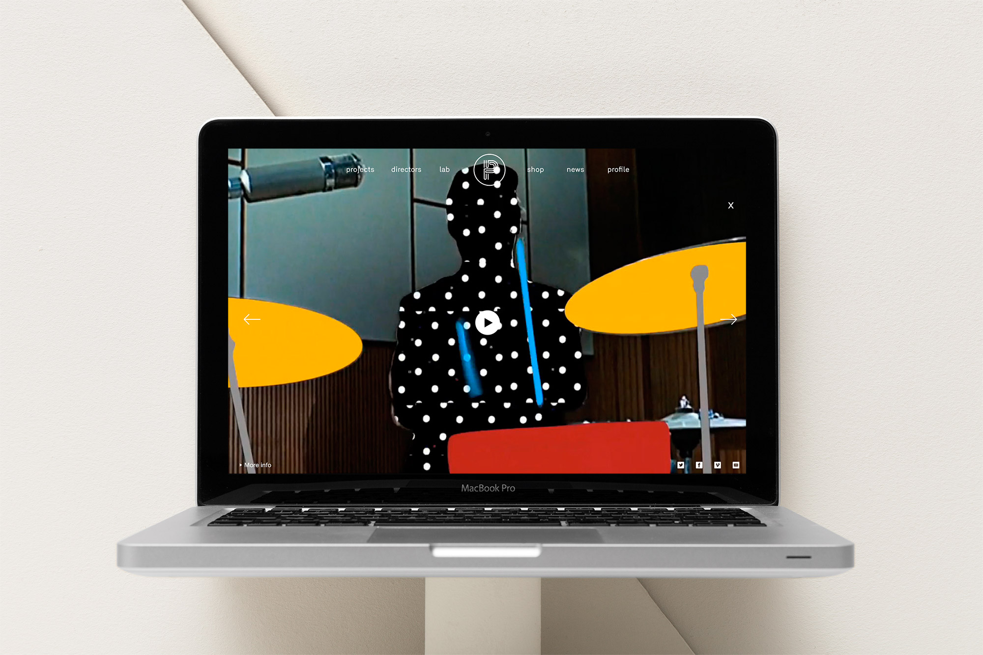
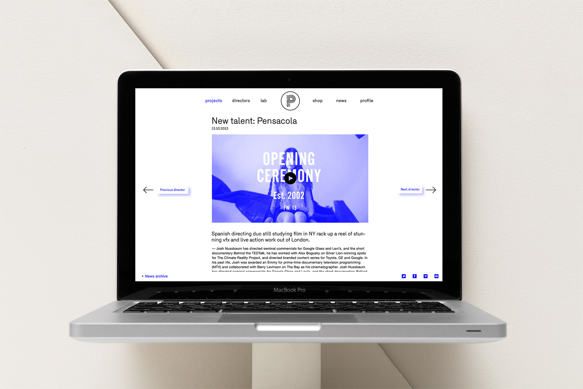
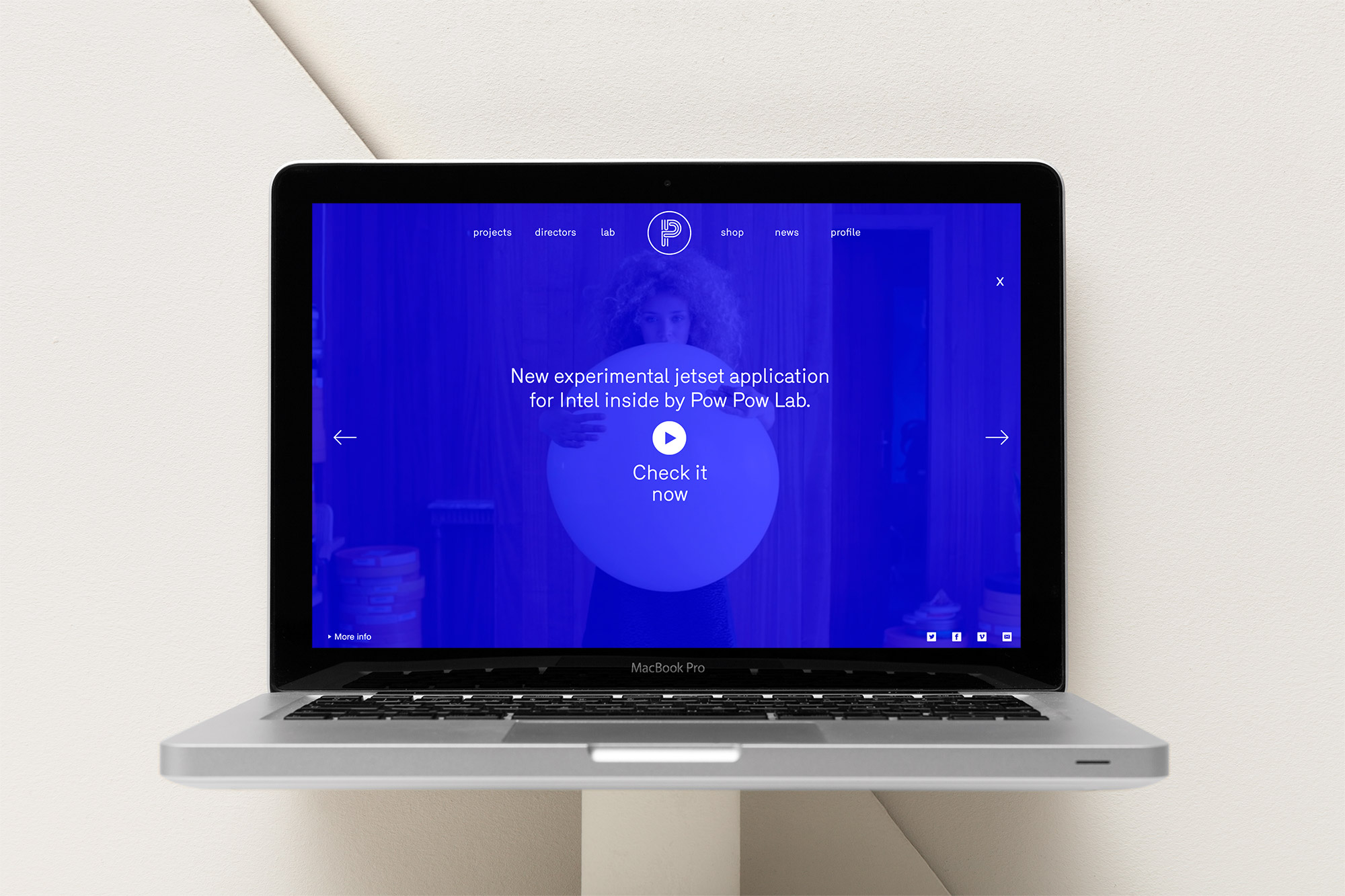
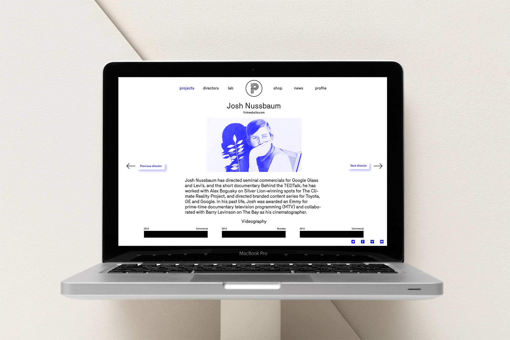
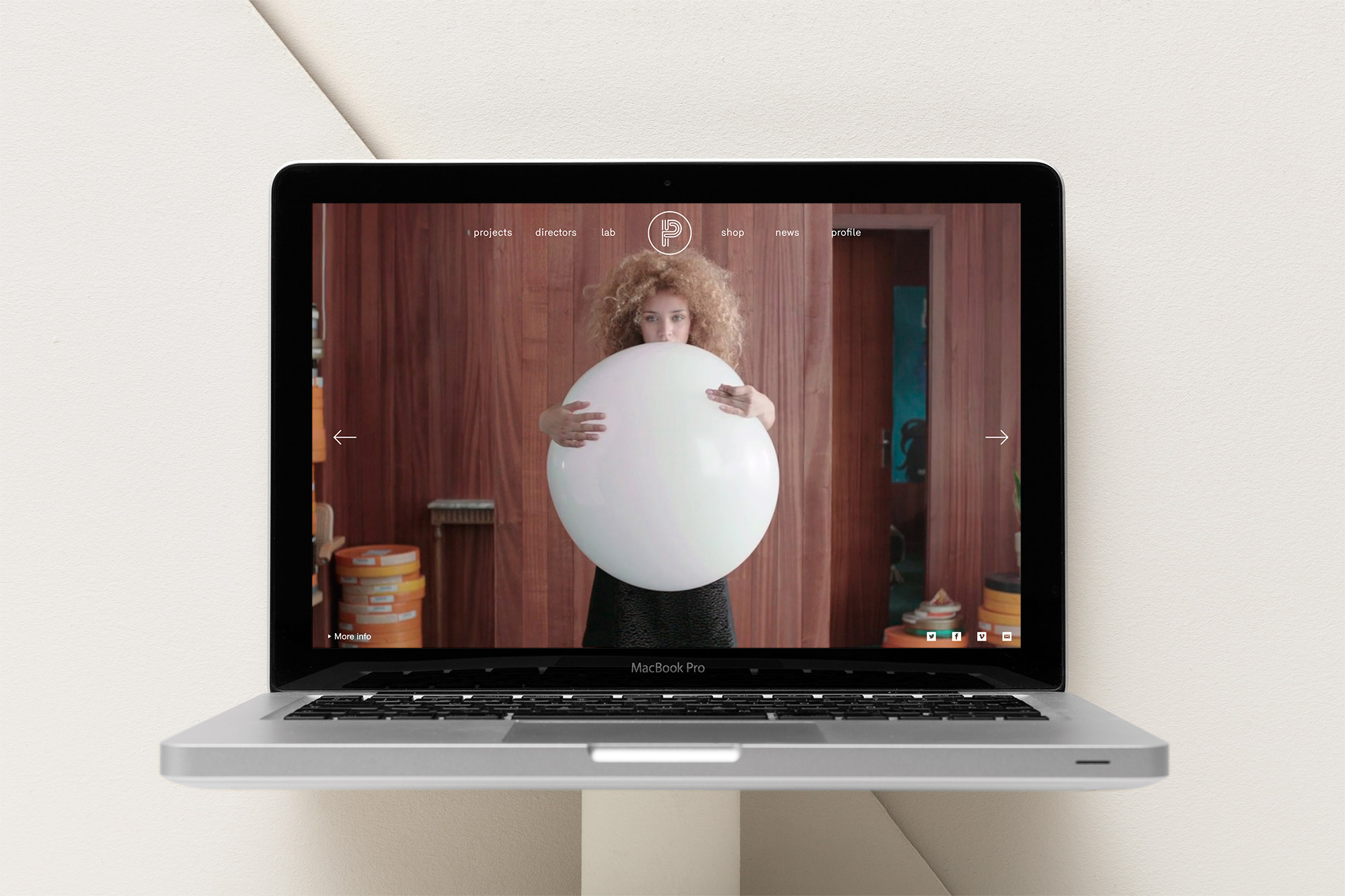
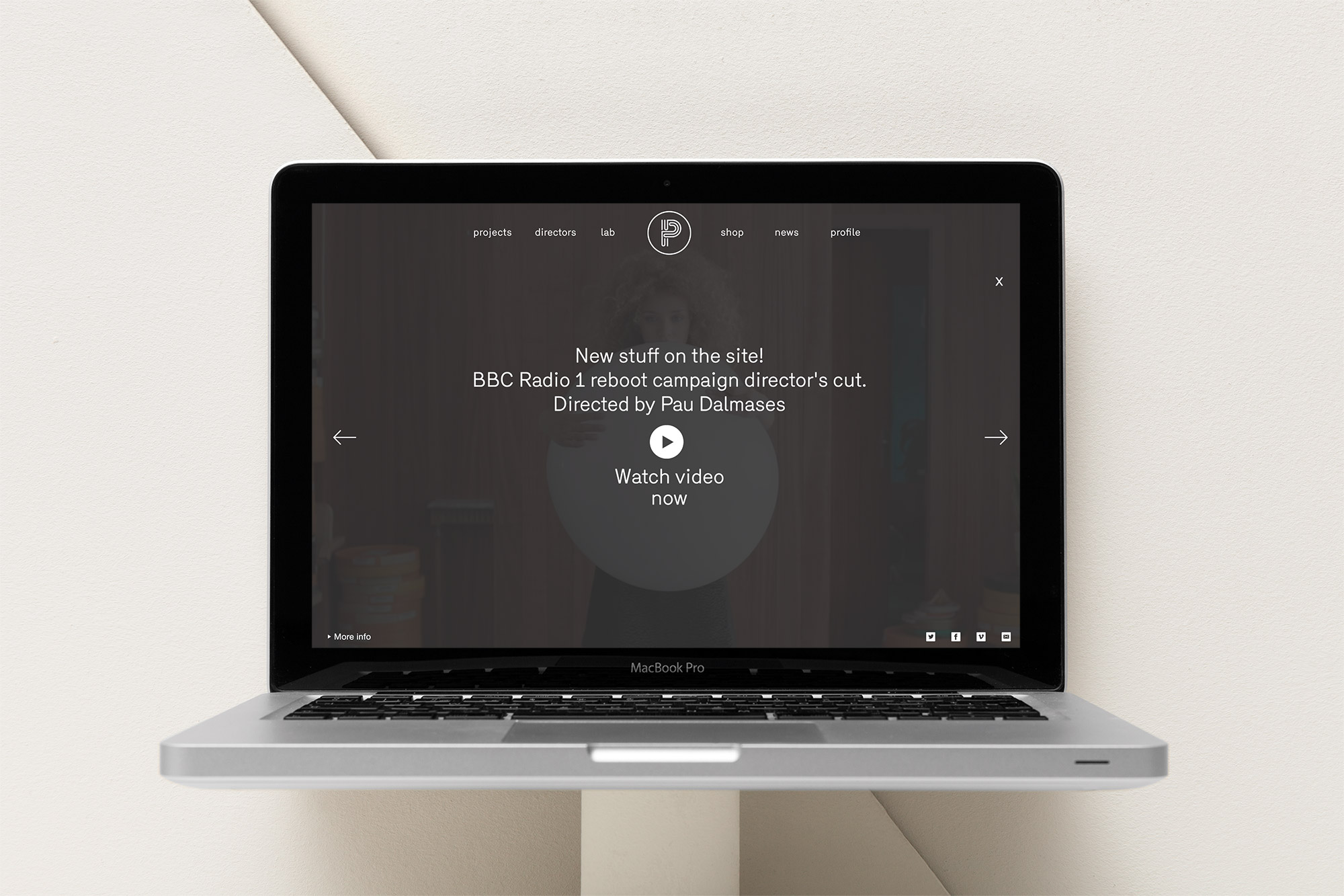
An essential website that goes straight to the point
Refusing any ornaments, long texts, ‘about’ pages and any kind of superfluous content, we were sure that the guys from Pensacola should show their work in the best way as possible: that is ironically by just showing their work. The website we designed was giving total prominence to their productions, featuring as its main characteristic full screen videos, together with a extreme care of the rest of graphic and typographic elements as well as an easy and intuitive user experience. The dark tones, the white typography, and the total protagonism given to the video productions work almost as a statement, as we believe that a strong and good design should manage to drive attention on what really cares. The typography chosen for Pensacola communication is the LL Circular by Lineto, whose purely geometric approach mingles purity with warmth.