Year: 2017
Tags: Art Direction and Design, Brand Narrative
-
 Share
Share
6,673 views
By acknowledging one simple fact – that a narrative defines a brand, not an identity – our commission to rethink the approach of the retail brand WOUF took shape. Pablo and Alice, founders of WOUF, had already made a name for themselves with their cheerful printed bean bags, laptop cases, purses and bags. Now the time had come to reinvent the brand and bring it into another universe.
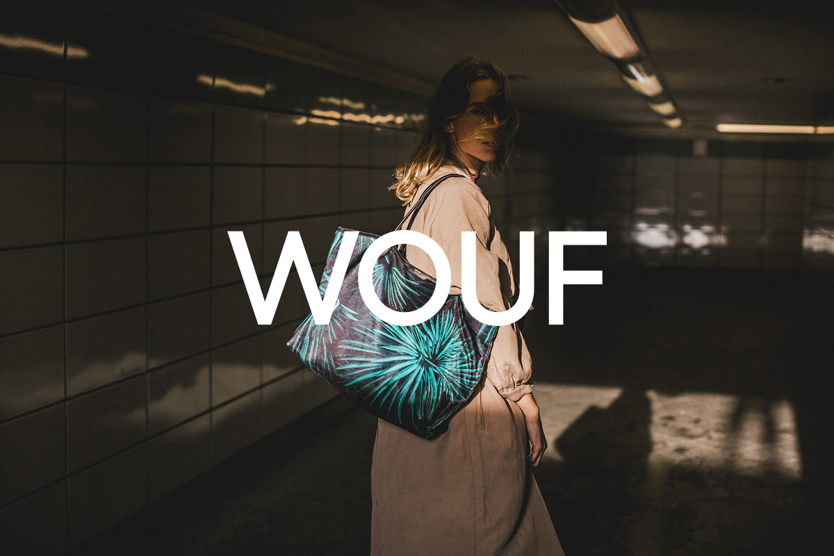
From joyful product to fashion narratives
By leaving their playful identity behind, as well as the whimsical images connected to it, we could reposition WOUF as a contemporary lifestyle brand. With this insight we entered a more sophisticated realm where the importance lies in the narrative and environment of a brand, rather than the existing product.
“From my point of view the most interesting move was to convince WOOUF to reduce their name by one “O”. From a playful, onomatopoeic beginning, WOUF became a real and trusted lifestyle brand.”
Rafa Martínez, COO & Brand Strategist at Folch
Enable presence and stability
We came to realise that the name and brand itself lacked some major thought and reflection. Woouf (previous spelling) was difficult to spell out and hampered the brand’s accessibility online. We proposed to wipe out one of the “o”s and built a confident brand with four stable capitals. Although WOUF’s main focus is a female audience we also had to consider the potential expansion of the brand and therefore we created a neutral expression for the new identity. The legible Hellix by Martin Vácha from Displaay Type Foundry, and its geometric characters, makes it suitable for any application – from online to offline, homeware to fashion.
Eliminating one O from the logo allowed the background content to speak out, as well as giving a more clean and contemporary feel to the brand. Josep Puy, Senior Designer and Art Director
-
 Shareof
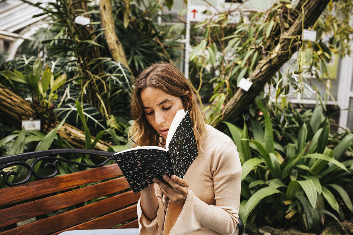
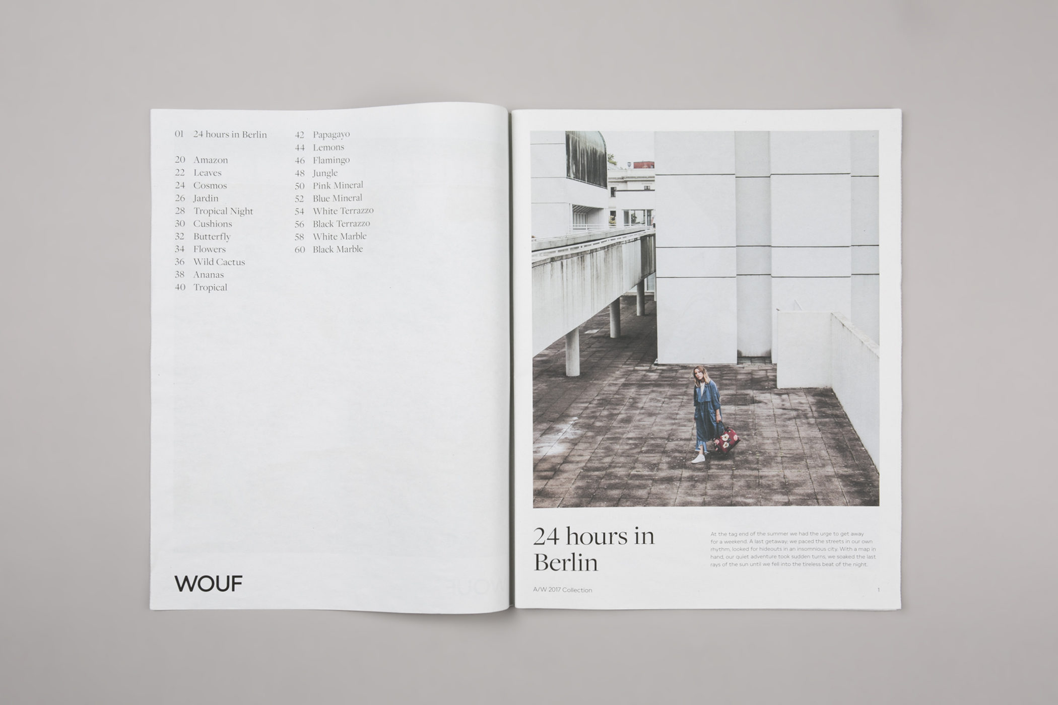
Brand narratives as a core
The most powerful tool is a strong narrative, a story that encapsulates the values and personality of the brand. With WOUF’s stories we wanted to create a line of “real” narratives – beyond traditional fashion editorials, we aimed to treat the story as a journal, a natural red line from morning to night, with a real couple exploring a city.
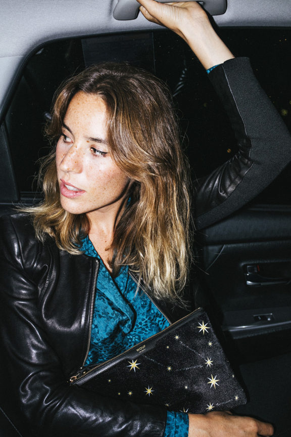
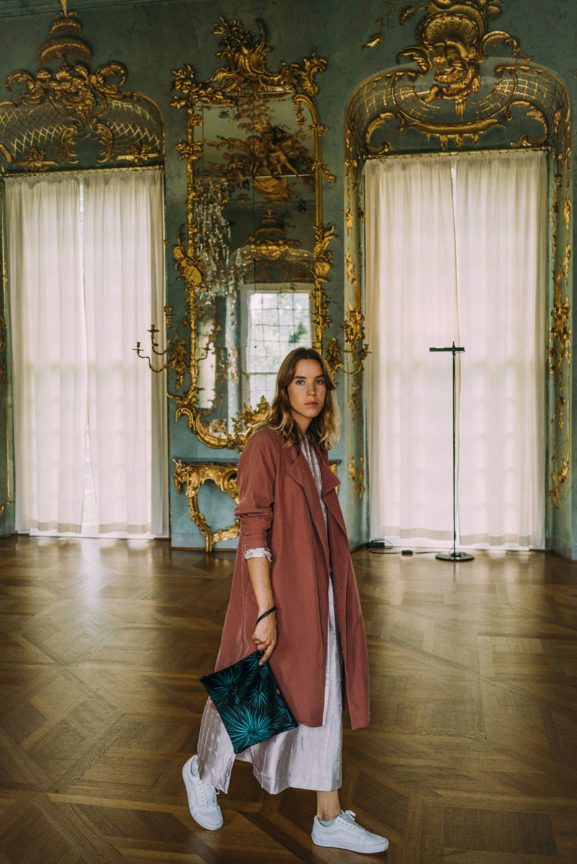
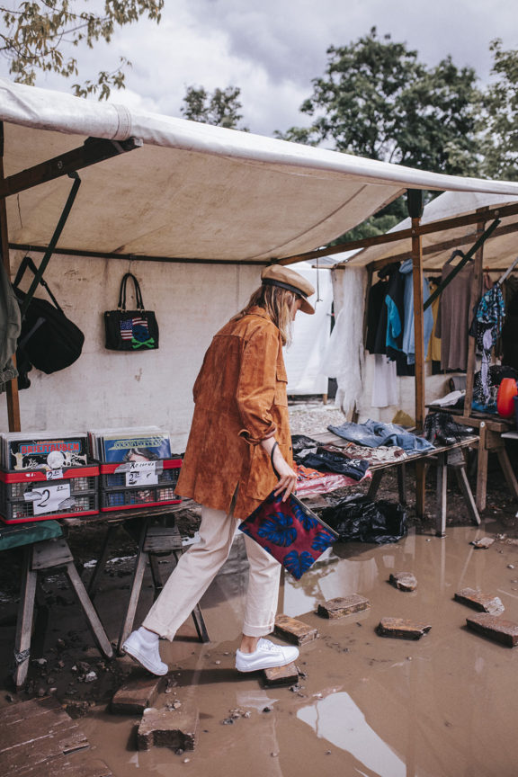
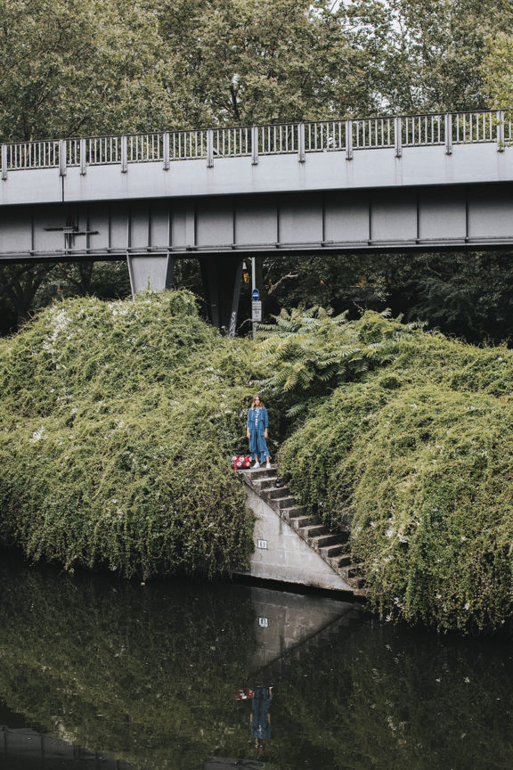
Capturing the essence of the brand
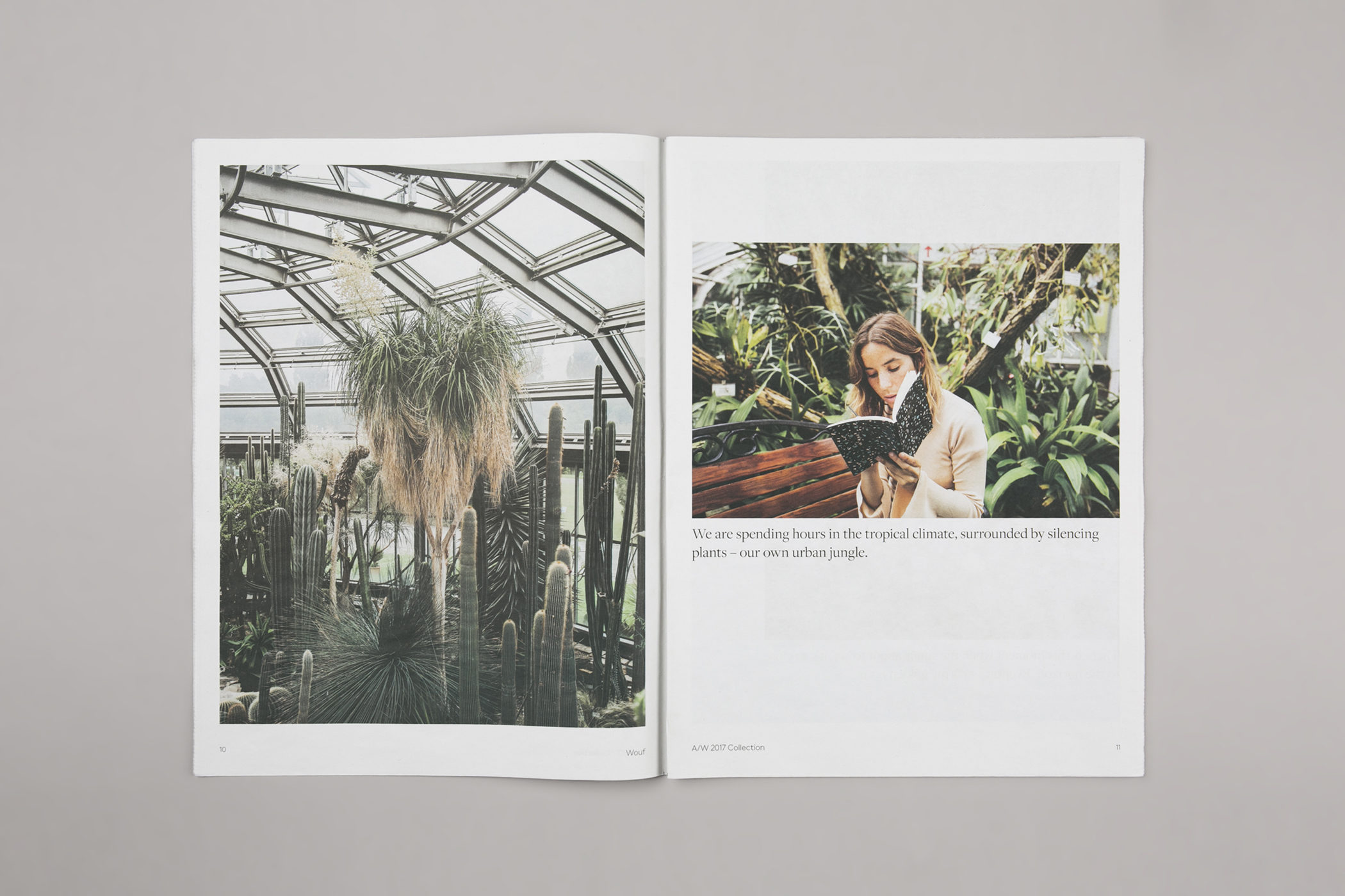
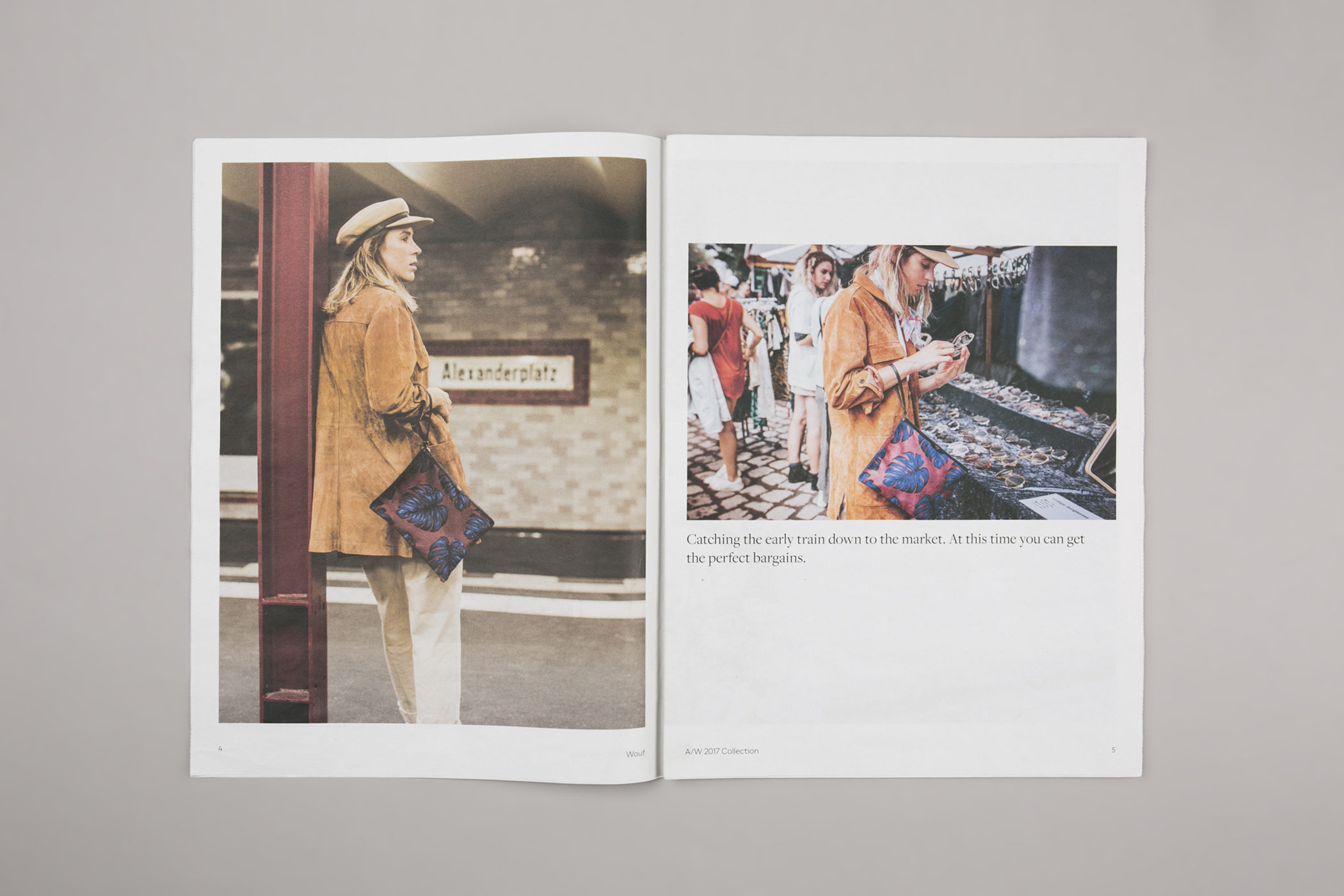
We contacted the model and influencer Nuria Val and the photographer Coke Bartrina to be the protagonists in a city weekend story for WOUF. Their skills in capturing the essence of a real moment would be essential during production. “24 hours in Berlin” is based upon a real life trip to the capital of Germany where the couple discover the city’s hidden corners featuring WOUF’s new line of purses and cases. From silent moments in the park to sleepless nights, the story follows the theme and rhythm of the collection.
Implementing the brand narrative
Through this story we were able to add another layer to the brand language. The photography is accompanied by short paragraphs in direct, yet poetic jargon, which can then be edited and shaped for every channel including web, social networks and printed media.
Across a range of supports
As a part of the repositioning, the website needed a complete renovation – a 360º turn in terms of supporting the new narrative – plus we took on the extensive assignment of shooting more than 1000 photos of the collection. Aiming for a layout close to that of a fashion brand, the modular system allows for variation in the home page where the content is split into different levels, combining both product and mood images. The website gives visual importance to the products and it has an elegant navigation system, user friendly features guide the customer throughout the purchase process.
-
 Shareof
 -
 Shareof
 -
 Shareof
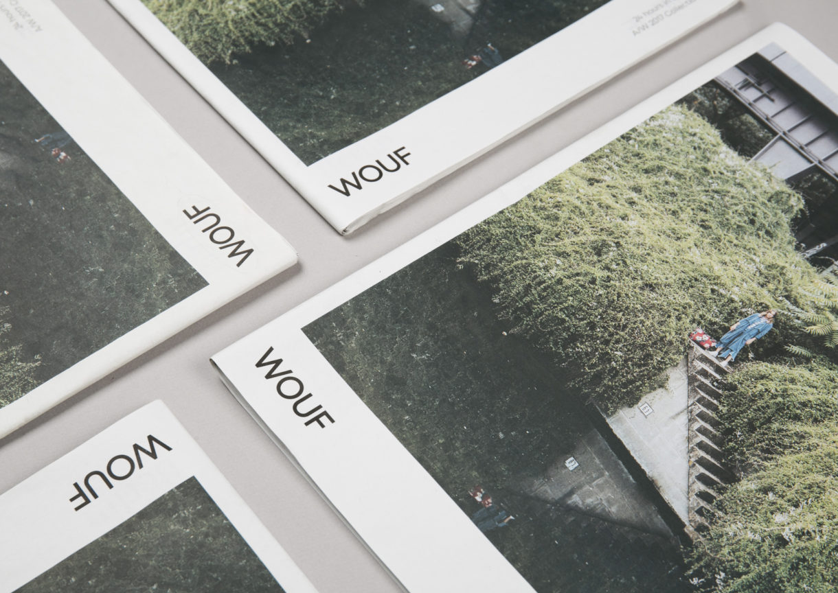
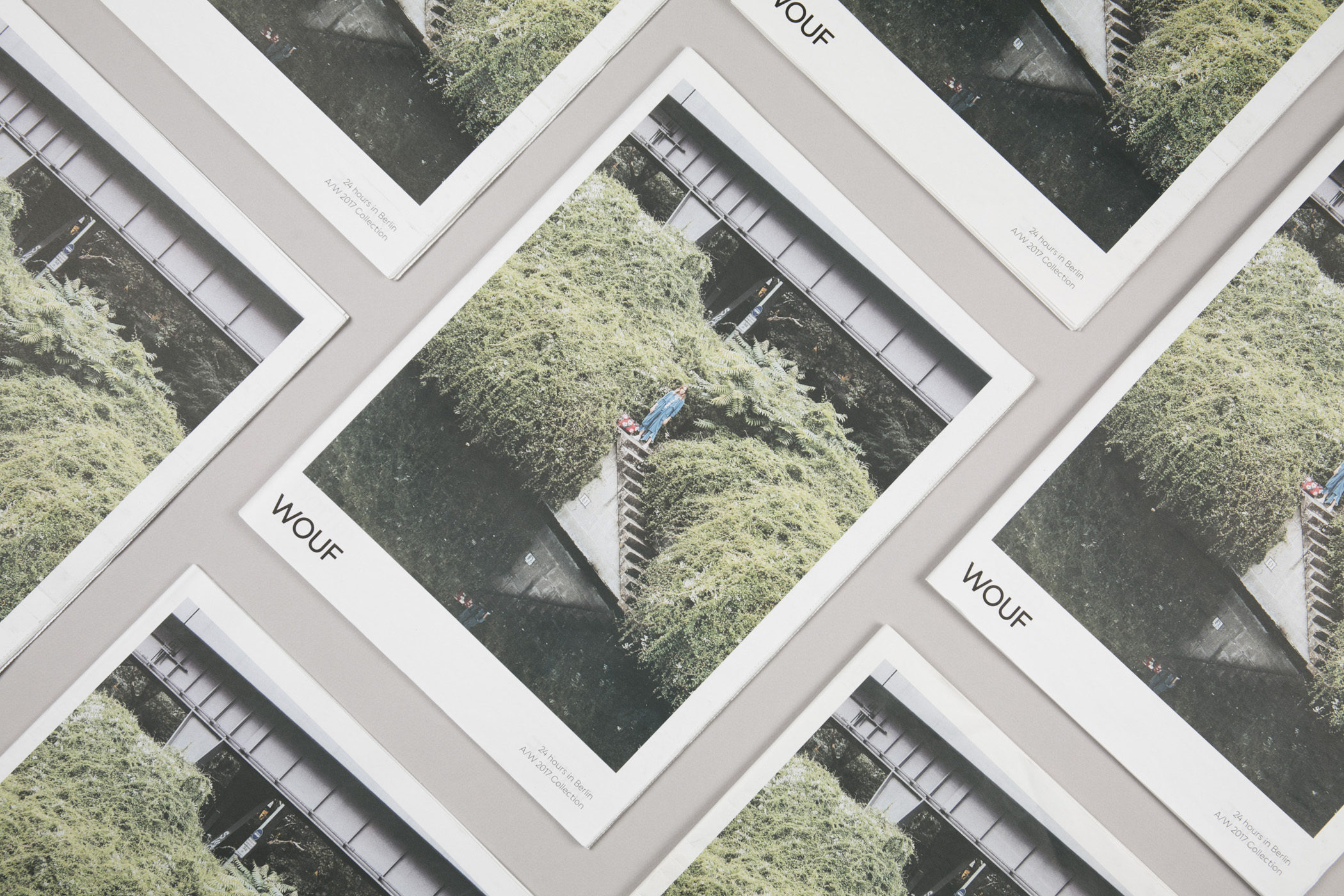
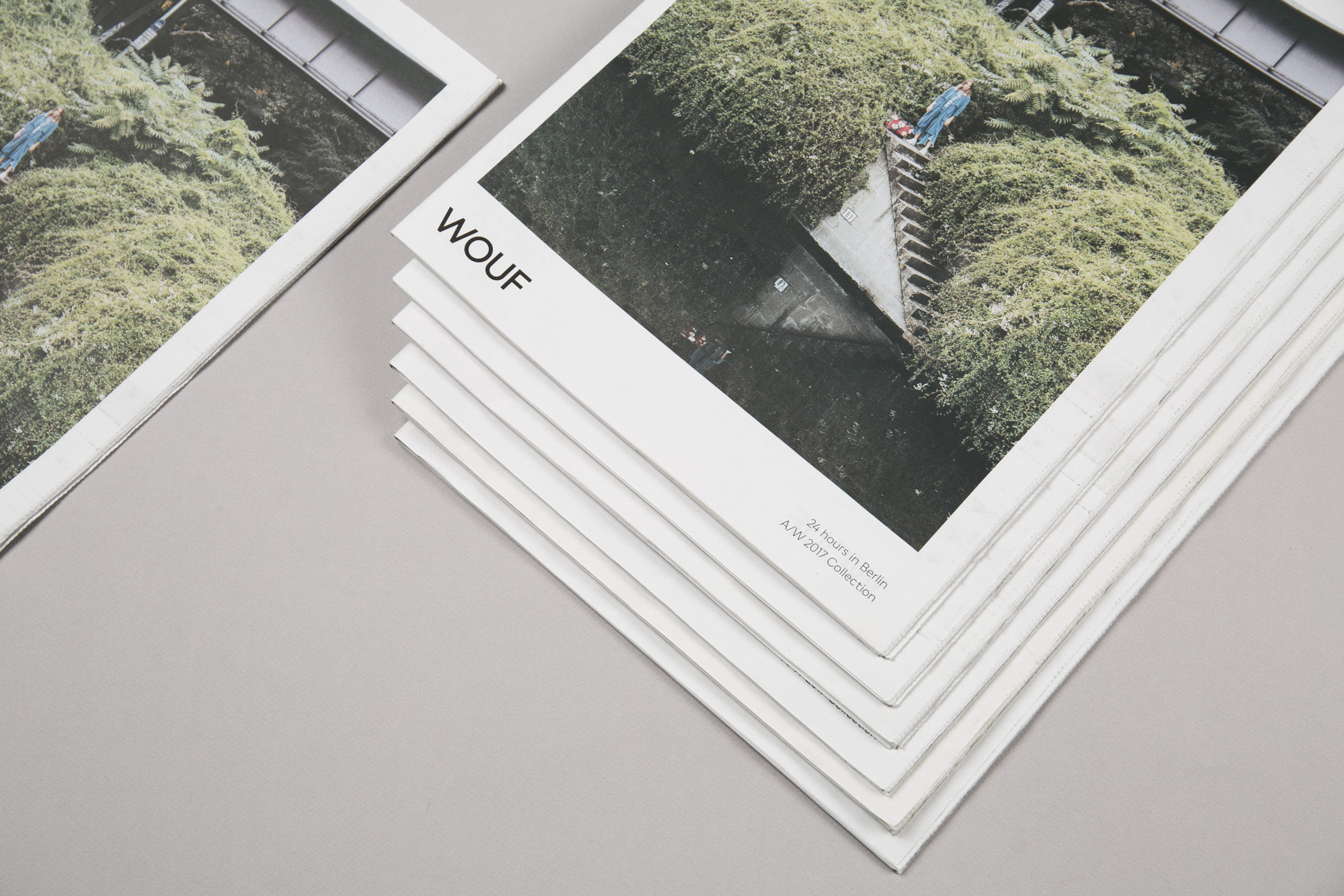
Inspirational stories in an ephemeral format
Besides the website we created a printed support in the shape of a newspaper, which acts both as a catalogue and inspirational lookbook. The layout follows the story with a mix of contrasting mood and product images. Again, emphasis is placed on the visual impact while simultaneously highlighting the narrative structure.
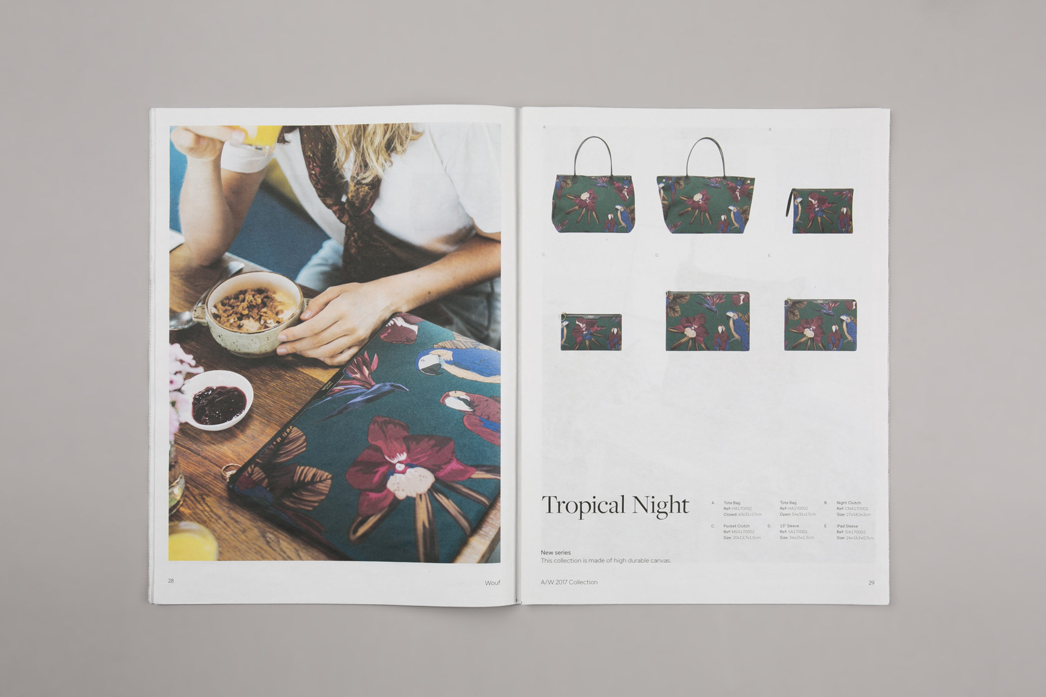
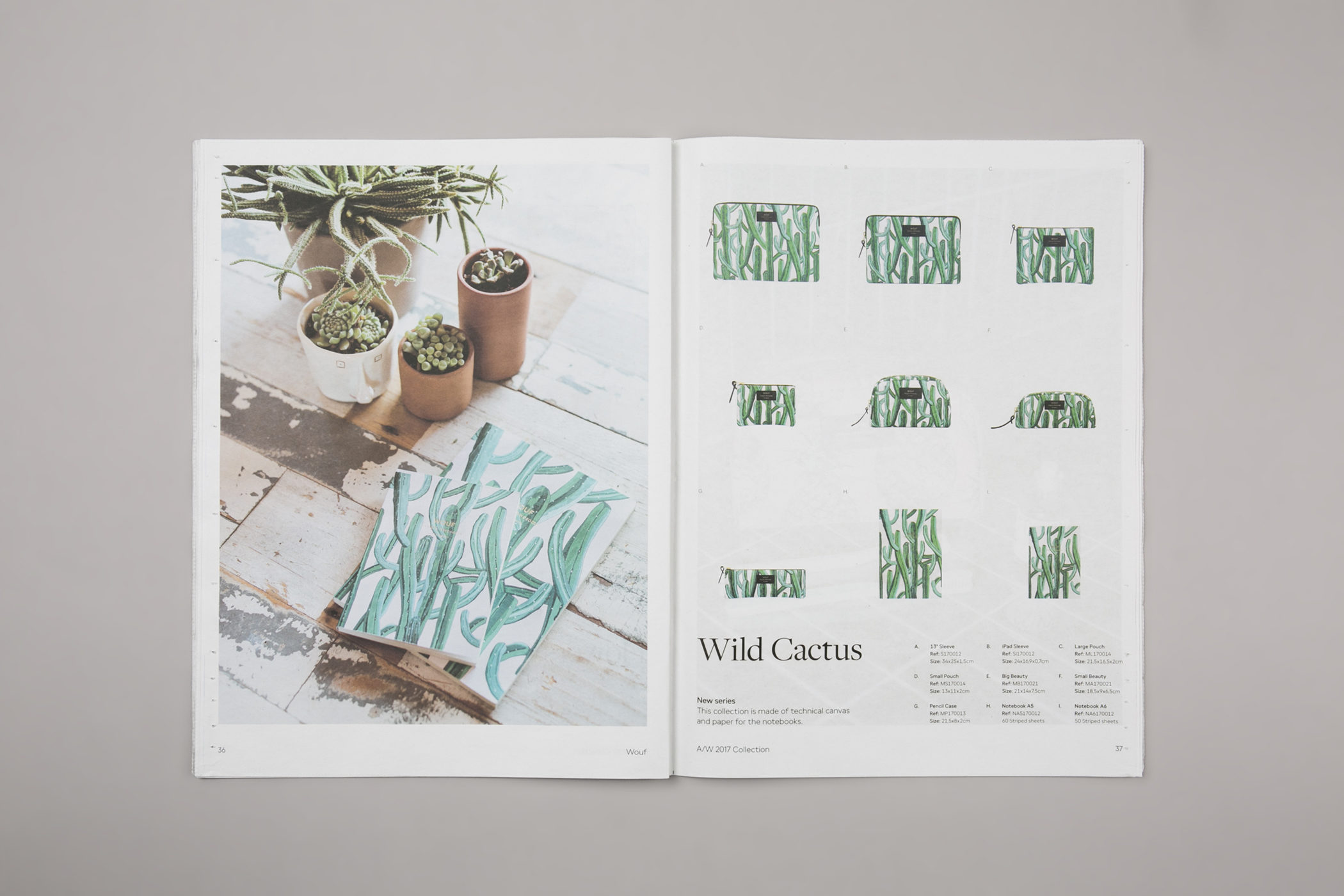
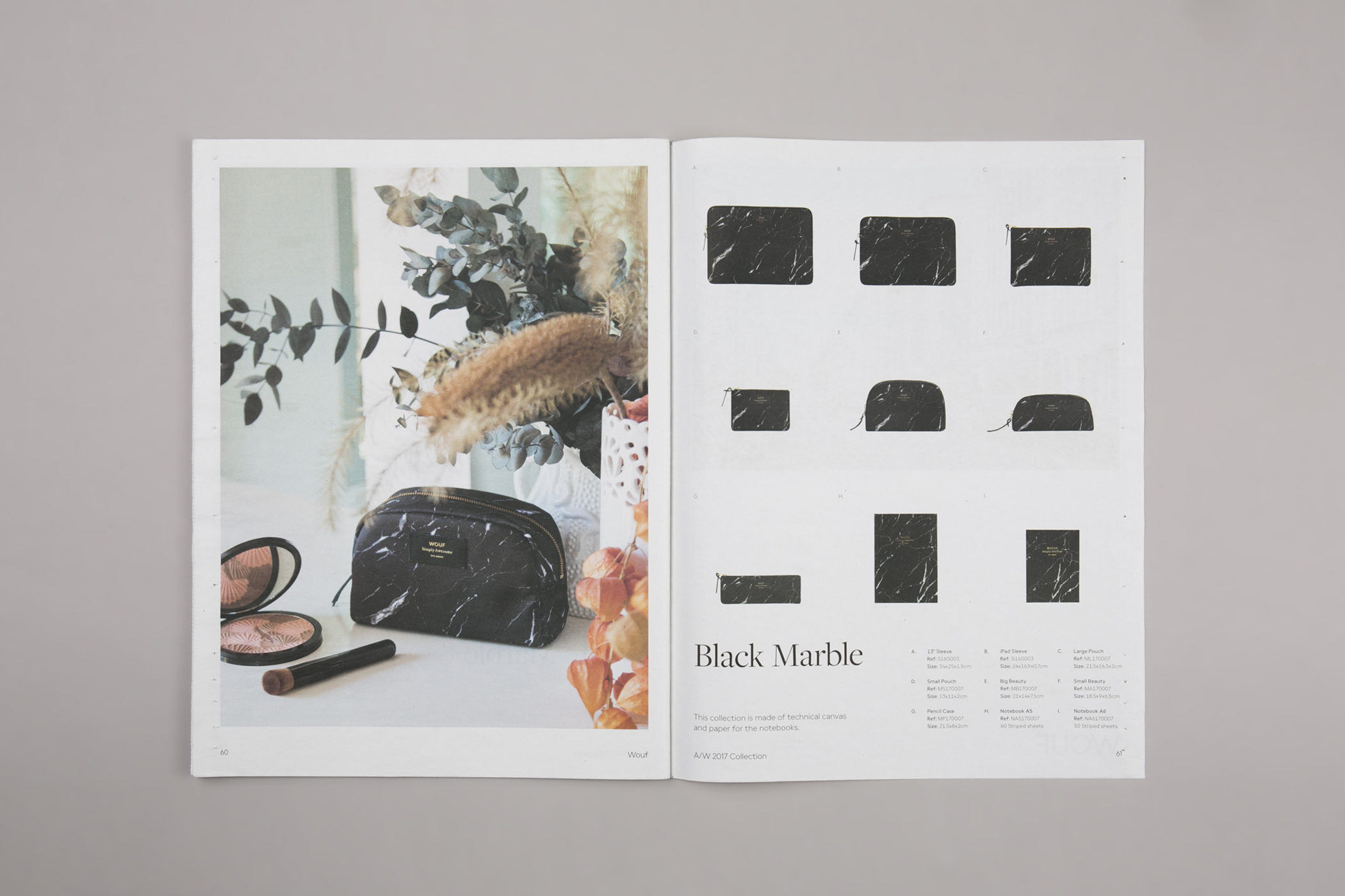
The logotype blindly embossed embellishes the structured paper and gives the packaging the sophisticated, contemporary look we were aiming for.
-
 Shareof
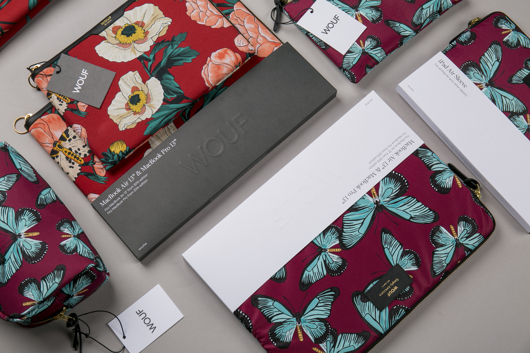
Aiming for a contemporary look
The packaging embraces a new simplicity in production and look. The bands are placed at the bottom of each product, lifting the product for display with a sophisticated and neutral appearance. Divided into two colours –white and black used depending on the contrasting colours of the product– the patterns of the products are still the main focus.


