Tags: Art Direction and Design, Branding, Identity, Web design
Design by Folch
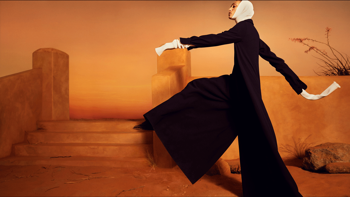
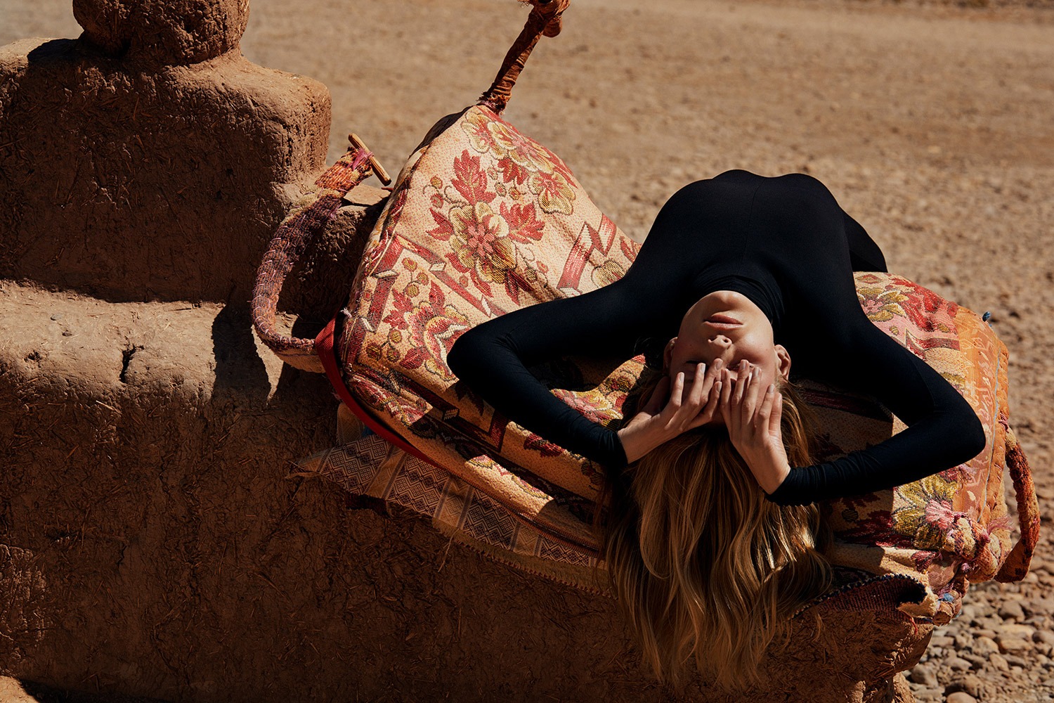
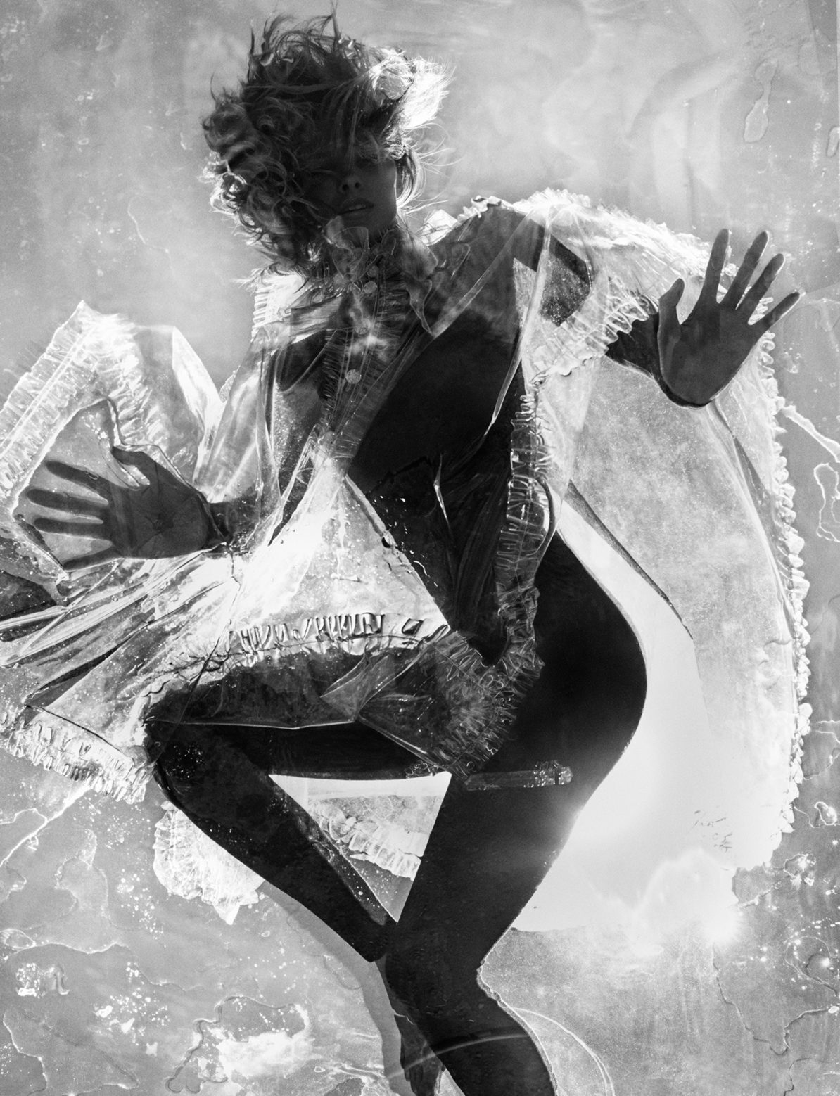
Header photo by Txema Yeste
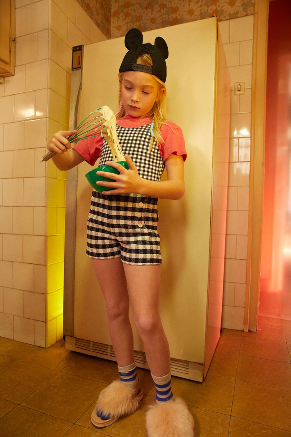
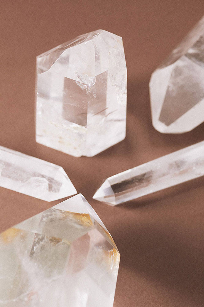
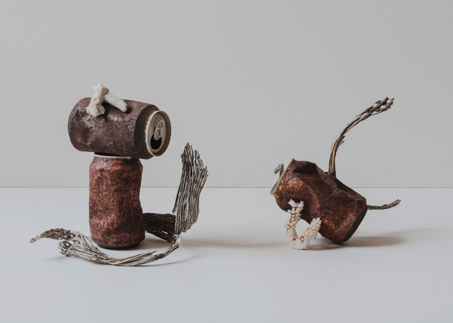
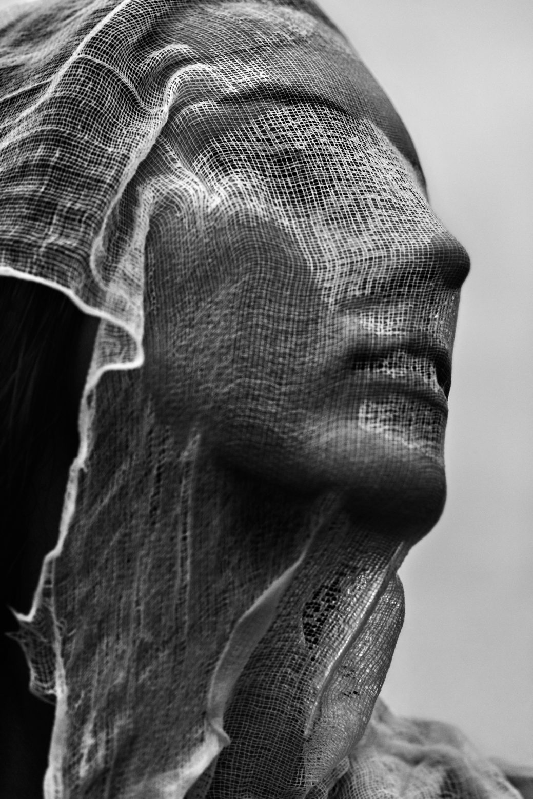
Photos from atelier Ramos
Text by Emmy Koski
Edited by Bis Turnor
Design by Folch
Header photo by Txema Yeste
Photos from atelier Ramos
Text by Emmy Koski
Edited by Bis Turnor
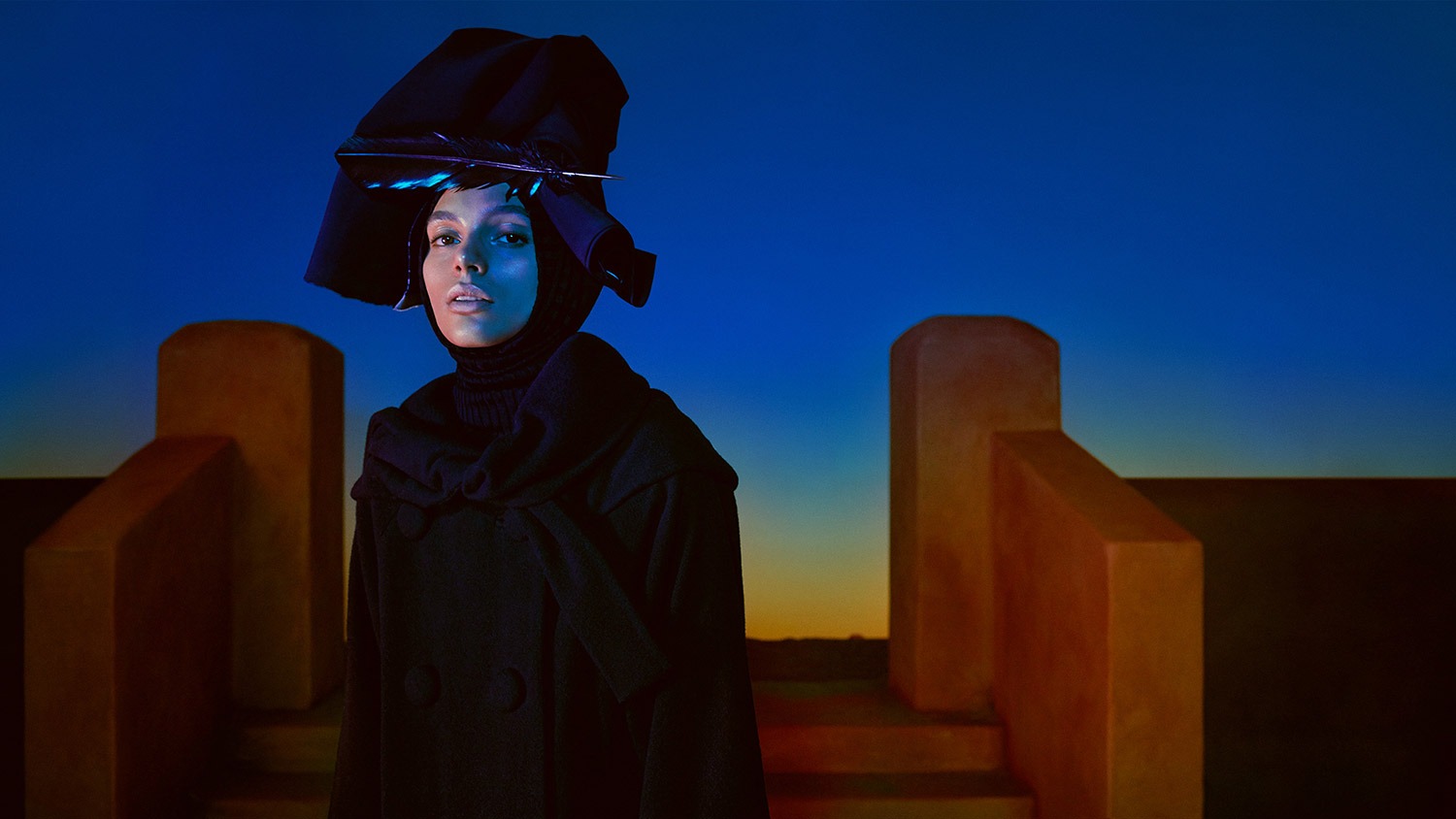
Cristina Ramos, our go-to set designer for clients like Fluvia, Doiy and Carolina Herrera, has experienced huge success in the last few years. With projects such as Dream Magazine, created together with photographer Txema Yeste, and new challenges in retail, fashion and industrial design for clients such as Louis Vuitton, Vogue, and H&M among others, Cristina has taken another big step forwards within her field. Her atelier needed to match this evolution along with her ambition.
“Given the growth of the company and the fact that we work more and more as a company rather than as a group of freelancers, I thought it was right to loose “Cristina” from the name, keeping the surname to associate myself as the creative director. In this industry it’s all about the personal touches and as much as I love working as a team, we needed to explain all of this in just one name.”
Cristina Ramos, Creative Director, atelier Ramos.
Atelier Cristina Ramos needed a re-think in terms of naming. Her team has grown and she has started collaborating with a variety of other artists and creatives. Moving away from a one-person studio, we gave the name a sense of collectivity by removing “Cristina”, forming the more universal, sophisticated alternative: atelier Ramos.
The evolution of the studio’s identity had to be a smooth one: we found comfort in the serif that had become a big part of its personality, above all linking it to the field of fashion. The brand needed to reflect a contemporary vision, whilst maintaining a classical edge. A combination of SangBleu Serif and SangBleu Kingdom from Swiss Typefaces became our answer, helping us reach a stronger, more unique result.
By changing the first character of the word atelier to lowercase, it no longer represents a name and brings the brand into the shape of a collective. The logotype needed to be crafted to unify its characters, producing a smooth, functional visual effect. Furthermore, a classical approach was taken when designing the stationary.
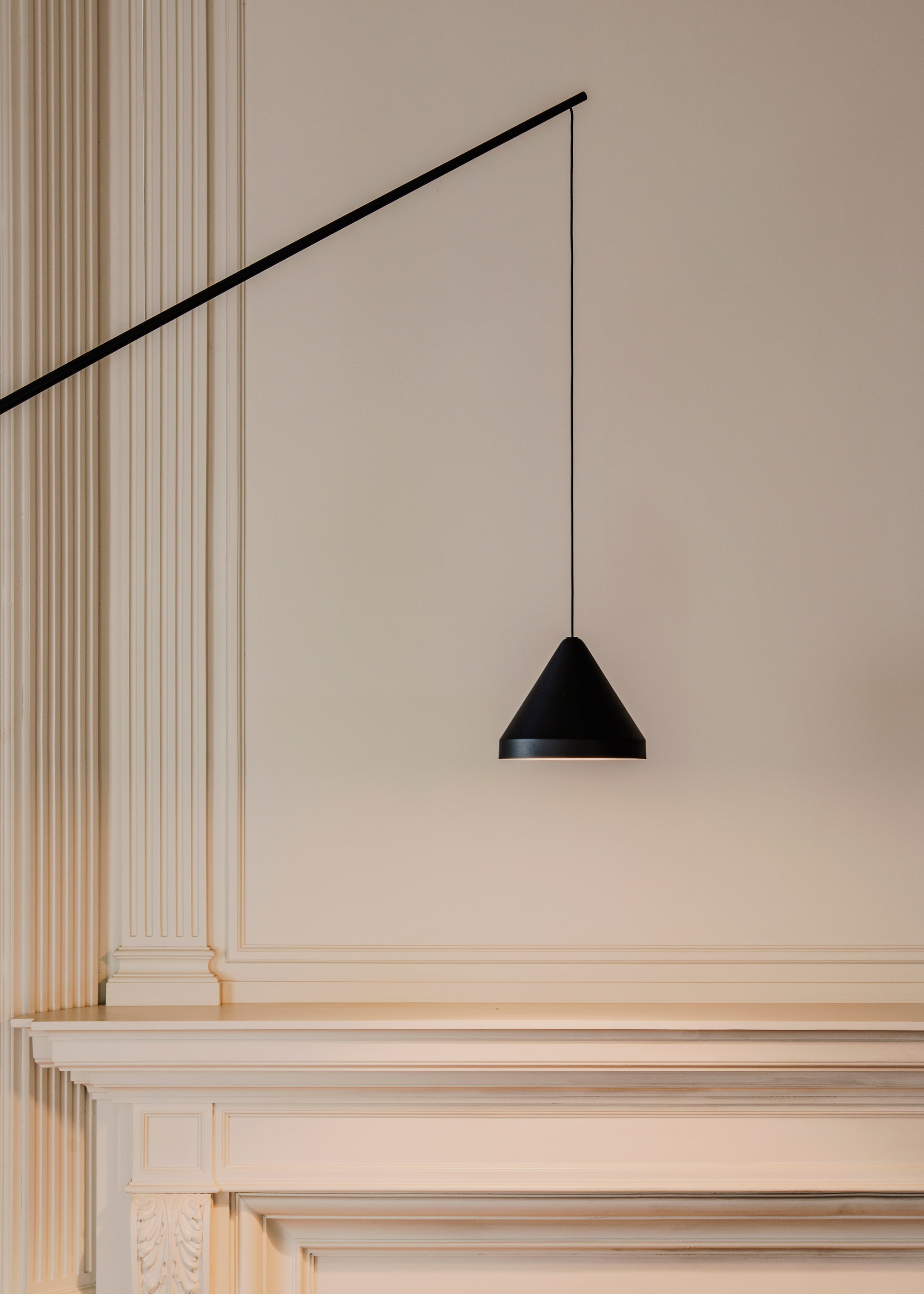
In terms of digital presence, we needed to find a new solution to showcase the work of the atelier. The website needed to work as a showcase so it was fundamental to focus on photography. Big pictures in contrast with fine, smaller typographic treatment were key. Built on a 3 column grid the layout offers flexibility for all different types of visual content.
The homepage features the most recent works with a contrasting graphic system. Navigating from the works page we introduced very specific visual filters for the user to create their own mood boards for referencing. The user can now categorise and create a mood through colour, location and field. Each project is elegantly laid out in a horizontal scroll with small introductory texts and satisfying sliding details when selecting an image.